How to Create a Maintenance Work Orders Dashboard
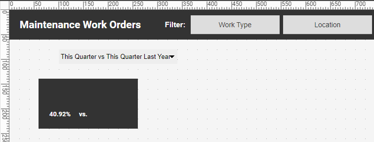
This document will explain how to create a maintenance dashboard such as the one at right using dashboard creation software from InetSoft. A working version of this dashboard can be found in the InetSoft Gallery. This dashboard has a very large number of components, but these are primarily text KPIs, along with some filter components and simple charts. The dashboard also incorporates some scripts that set various parameters based on user input. Below, we will examine how you can create all these different elements. (Note that the data source used by the dashboard contains a randomized element, so the data appears to be different every time the dashboard refreshes.)
Contents What is a Maintenance Dashboard? Create a Maintenance Work Order Dashboard Add Filters Add a Menu Add a Parameter Processing Script Add Text KPIs Create a Sparkline Chart Create a Multiple Measure Chart Add a Donut Chart Add a Borderless Chart Summary

What is a Maintenance Dashboard?
A maintenance dashboard is a visual representation or interface that provides an overview of maintenance-related information and key performance indicators (KPIs) in an organized and easily understandable manner. It is typically used by maintenance managers, supervisors, and technicians to monitor and manage maintenance activities within a facility or organization.
- Equipment status: An overview of the operational status of critical assets, indicating whether they are running normally, in need of maintenance, or experiencing issues.
- Work order management: A summary of work orders, including their status, priority, assigned technicians, estimated completion time, and any pending or overdue tasks.
- Key performance indicators (KPIs): Metrics related to maintenance performance, such as mean time between failures (MTBF), mean time to repair (MTTR), equipment uptime, maintenance costs, and overall equipment effectiveness (OEE).
- Preventive maintenance schedule: A calendar or timeline view of planned preventive maintenance activities, including upcoming tasks, due dates, and progress.
- Resource allocation: Information on the availability and allocation of maintenance staff, tools, spare parts, and other resources required for maintenance activities.
- Notifications and alerts: Real-time notifications and alerts regarding critical equipment issues, maintenance delays, or deviations from predefined thresholds.
By utilizing a maintenance dashboard, maintenance personnel can have a comprehensive view of the maintenance operations, identify bottlenecks, prioritize tasks, allocate resources effectively, and make data-driven decisions to optimize equipment reliability, minimize downtime, and reduce overall maintenance costs.
Create a Maintenance Work Order Dashboard
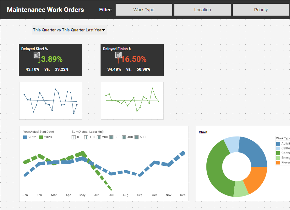
For the example maintenance work order dashboard found on the InetSoft Gallery, we will consider the creation of some of the main elements:
- Top filters ('Work Type', 'Location', 'Priority')
- 'Compare' menu to select comparison type ('This Quarter vs. Last Quarter', etc.)
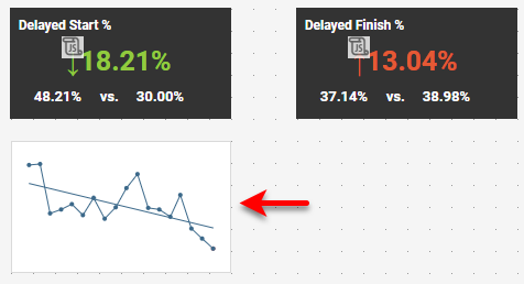
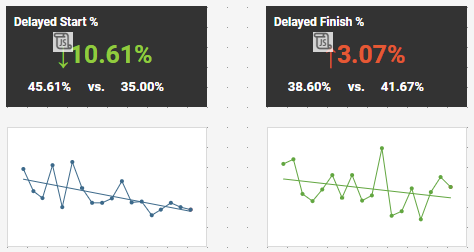
- 'Delayed Start' and 'Delayed Finish' KPIs. (The others are similar.)
- Mini-charts for 'Delayed Start' and 'Delayed Finish'. (The others are similar.)
- Left-bottom Line Chart
- Right-bottom Donut Chart
- Top borderless Bar Chart
The following sections will illustrate the steps required to design this primary functionality. The remaining components can be added in much the same manner.
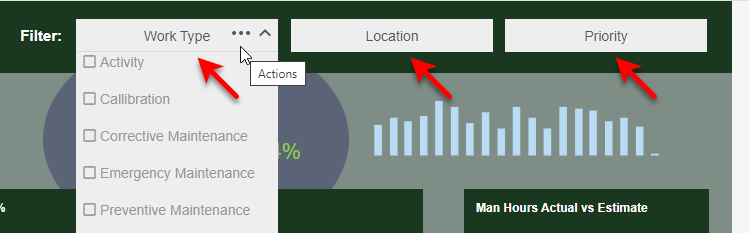
Add Filters
First consider the following Selection List filters, which restrict the data displayed on the dashboard by work type, location, and priority.
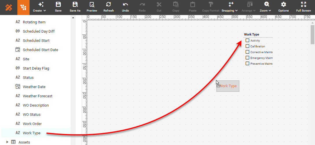
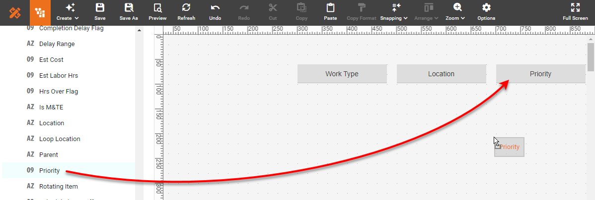
To create these Selection Lists, first drag the 'Work Type' field from the data source into the dashboard using Visual Composer. This creates a new Selection List.
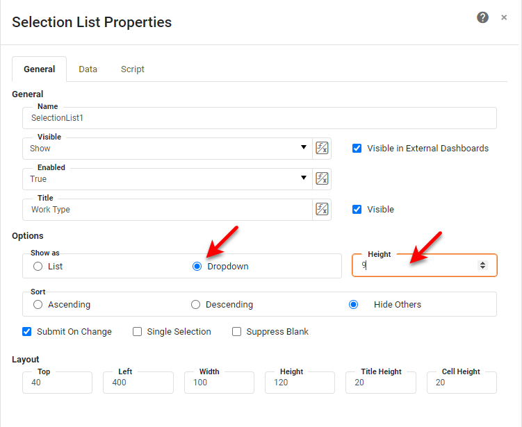
Right-click the new Selection List and select 'Properties' from the menu. On the General tab, select the Dropdown option and set the height to 9. Press OK.
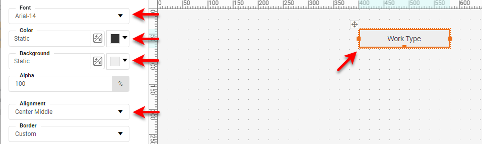
Drag the component handles or borders to resize the Selection List, and use the Format panel to style the component as desired:
Copy and paste this Selection List twice. Drag the 'Location' field from the data source onto the second Selection List, and drag the 'Priority' field onto the third Selection List.
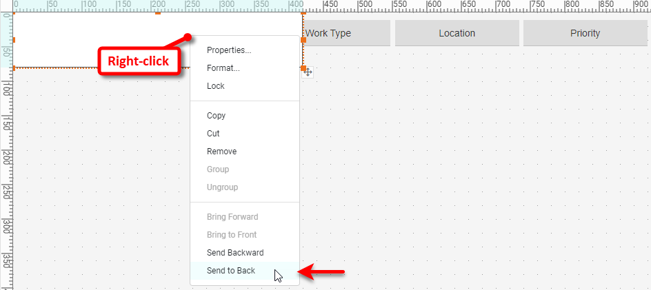
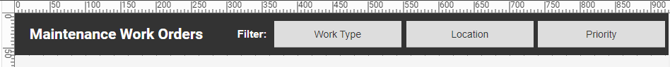
Add two Text elements to the left of the Selection Lists to provide a "Filters" label and the title of the dashboard, "Maintenance Work Orders". Style the Text using the Format panel, as you did for the Selection Lists. If you want to match the appearance of the dashboard on InetSoft Gallery, drag a Rectangle component from the Toolbox into the dashboard, and place it behind the Selection Lists and Text. You can do this by right-clicking the Rectangle and selecting Send to Back.
Then use the Format panel to style the Rectangle and Text as desired (dark Rectangle fill, and white text color).
Add a Menu
We will now add a menu that allows the user to select what type of comparison they wish to see in the dashboard. Note that the menu is just the input interface. The actual filtering will be performed by a combination of script and a condition that you will add in subsequent sections.
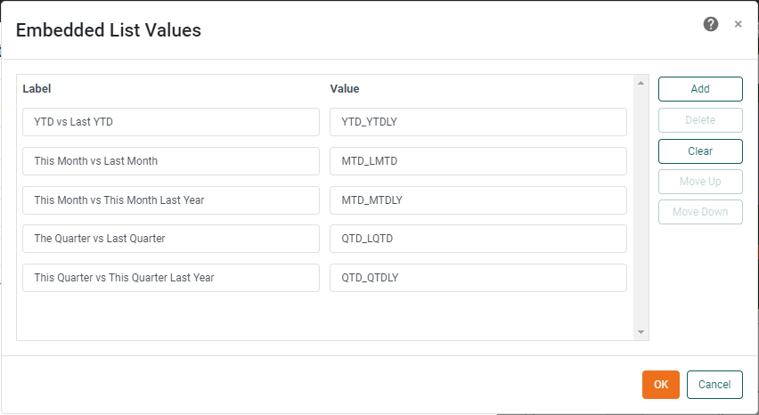
Drag a ComboBox into the dashboard. Right-click the ComboBox, and select Properties. In the 'ComboBox Properties' dialog box, under the General tab, enter "PeriodCB" for the 'Name' of the component. Then press the Edit button in the 'Embedded' region, and enter the following label/value pairs:
This creates the desired menu. Because additional processing this user input is needed, we will use a script to set the desired filtering parameters based on the selections in the menu.
Press the Options button in the dashboard toolbar, and select the Script tab. Enter the following Script, and select the onRefresh action.
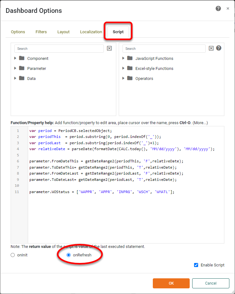
This script processes the selection that the user makes in the PeriodCB ComboBox to obtain the following four parameters: 'FromDateThis', 'ToDateThis', 'FromDateLast', 'ToDateLast'. These parameters will be used in the filtering conditions that we will add in a subsequent section. Note that the getDateRange2() function is a custom function that uses the codes in the PeriodCB ComboBox values to return the appropriate dates based on the user selection. We do not need to be concerned about the details here; the function listing is provided at the end of the document. (The last line of the script above, setting parameter 'MOStatus', will not be discussed in this document.)
We will now add several Text KPIs. To begin, drag two Text components from the Toolbox into the dashboard. Set the text of one of them to "vs." and drag the 'Start Delay Flag' field from the data source onto the other.
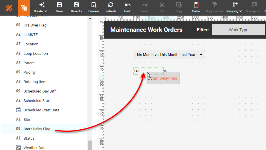
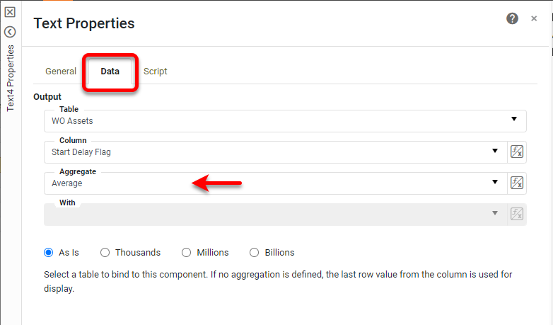
Right-click this last Text component and select 'Properties' from the menu. In the General tab of the 'Text Properties' dialog box, enter the text "KPI1Last" for the 'Name' property. Under the Data tab, set the 'Aggregate' to Average. Press OK.
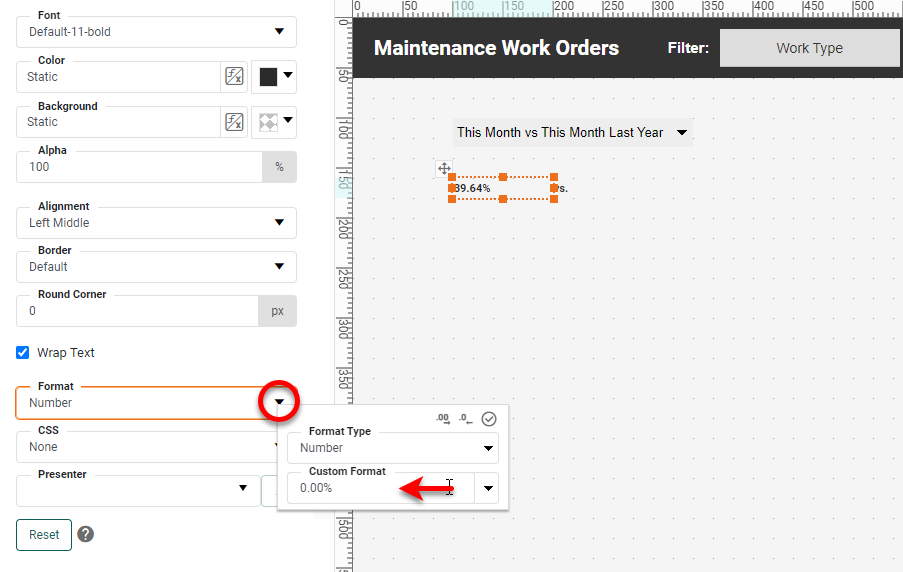
Select the Format tab, and apply the following Number format: "0.00%".
Style the Text as desired under the Format tab, and add a Rectangle background if you want to match the design of the InetSoft Gallery example.
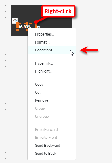
Right-click the KPI1Last component, and select 'Conditions'.
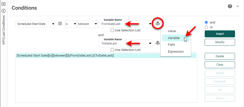
In the 'Conditions' dialog box, select 'Scheduled Start Date' from the first menu, 'between' from the third menu, and then press the Change Value Type button and select Variable. Enter "FromDateLast" in the first 'Variable Name' field. Repeat and enter "ToDateLast" in the second 'Variable Name' field. Press OK to close the dialog box and apply the condition.
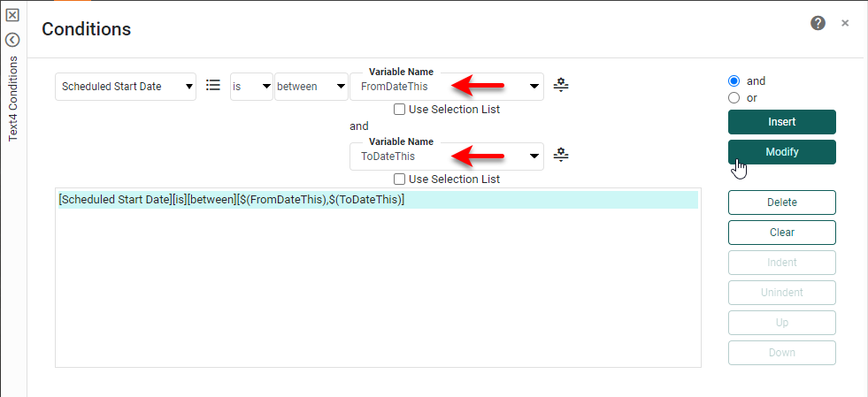
Copy and paste the KPI1Last Text component, and open the 'Text Properties' dialog box for the copy. Set the 'Name' property to "KPI1First", and press OK. Open the 'Conditions' dialog box for the new KPI1First component, and modify the condition as follows. Press Modify and then OK to make the change.
Add two more Text components above the previous Text components. For the first, enter the text "Delayed Start %" and format as desired (white, bold). For the second, you will set the value using a script. To do this, right-click the Text component and select 'Properties' from the menu. In the 'Text Properties' dialog box, select the Script tab. Enter the script shown below.
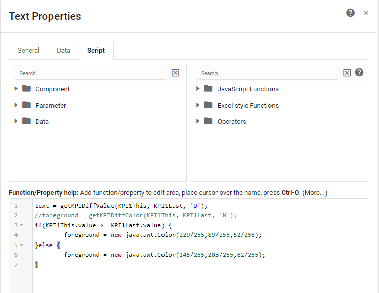
The script sets the contents of the Text component to the difference between this period's and last period's KPIs, with color assigned based on whether this value if positive or negative. The getKPIDiffValue() function is a user-defined function created in Style Studio. The function code can be found at the end of this document.
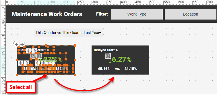
Copy and paste the entire group of Text components and Rectangle. (You can select them all by dragging across the whole group.)
Make the following changes to the new copy:
- For the left Text element, open the 'Text Properties' dialog box, and under the Data tab, change the 'Column' to 'Completion Delay Flag', and 'Aggregate' to Average. Under the General tab, change the 'Name' to "KPI2Last".
- For the right Text element, open the 'Text Properties' dialog box, and under the Data tab, change the 'Column' to 'Completion Delay Flag', and 'Aggregate' to Average. Under the General tab, change the 'Name' to "KPI2This".
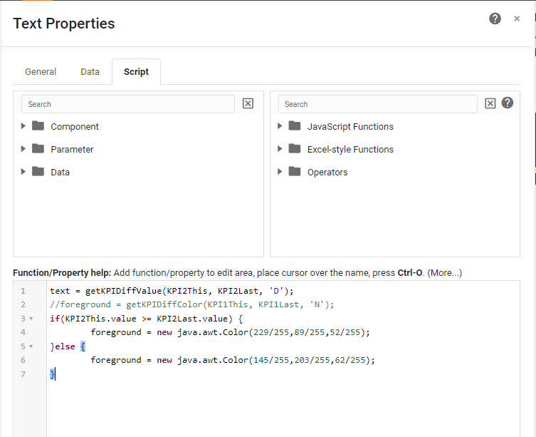
- Change the top Text component to say "Delayed Finish %".
- Change the Script on the scripted Text component to reference KPI2Last and KPI2This, as shown below.
This concludes the creation of the two groups of KPIs. The other KPI blocks can be created in the same way.
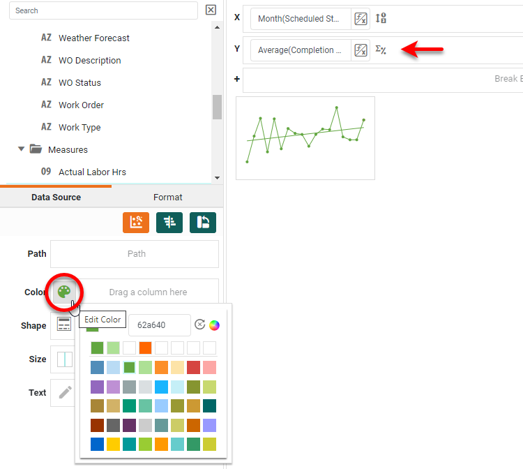
We will now create the sparkline chart below the KPIs. Drag a Chart component from the Toolbox into the dashboard, and resize the chart to fit under the Rectangle containing the KPIs. Press the Edit button on the Chart. In the Chart Editor, press the Select Chart Style button and choose Line, then drag 'Scheduled Start Date' field to X and 'Start Delay Flag' field to Y. Press the Edit Dimension button, and select Month as the 'Level', and press the Edit Measure button and choose Average as the 'Aggregate'.
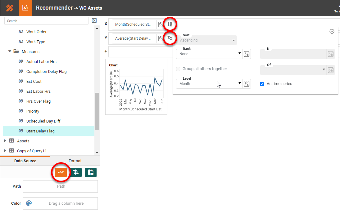
Right-click the Chart and select 'Properties'. Under the Advanced tab, select Sparkline and Show Points. Under the Line tab, select Linear from 'Trend Line'. Under the General tab, turn off Visibility for the Chart 'Title' and press OK.
Copy the Chart and paste it below the Delayed Finish % KPIs. Change the 'Measure' of the new Chart to 'Completion Delay Flag', and press the Edit Color button to change the color to green.
You now have two of the KPI blocks and mini-charts from the InetSoft Gallery example. You can add the other two sets of KPIs and charts in a similar manner. For brevity, we omit the instructions for creating the remaining charts.
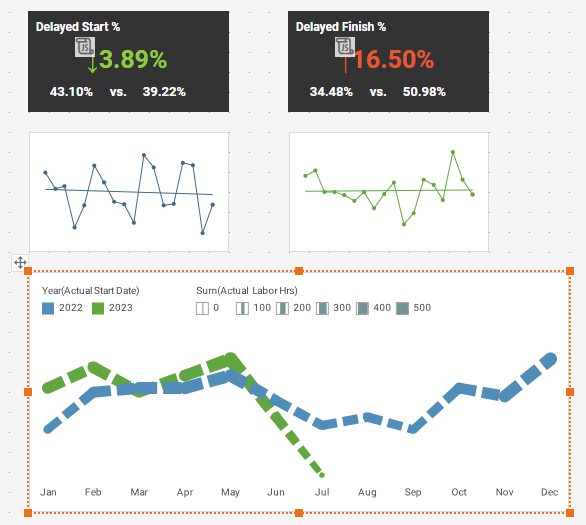
We will now create the multiple-measure chart at the bottom-left of the Gallery dashboard. Drag a new Chart component into the dashboard, and press the Edit button to open the Chart Editor. Configure the Chart as follows:
- Drag the 'Actual Start Date' field from the Dimension folder to the X region. Press the Edit Dimension button, and set the 'Aggregate' to MonthOfYear.
- Right-click the 'Work Order' field in the Dimension folder, and select Convert to Measure from the context menu. This moves the 'Work Order' field to the Measure folder.
- Drag the 'Work Order' field from the Measure folder to the Y region. Press the Edit Measure button, and set the 'Aggregate' to Count.
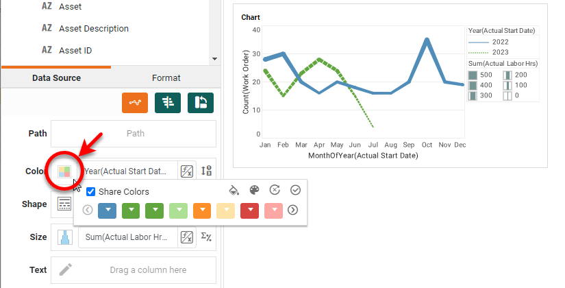
- Drag the 'Actual Start Date' field (again) from the Dimension folder to the Color region. Press the Edit Dimension button and select Year as the 'Level'.
- Optional: Drag the 'Actual Start Date' field (again) from the Dimension folder to the Shape region. Press the Edit Dimension button and select Year as the 'Level'. If you want both lines to have the same line pattern, just press the Edit Shape button, and select the desired dashed line.
- Drag the 'Actual Labor Hours' field (again) from the Measure folder to the Size region. Press the Edit Measure button and select Sum as the 'Aggregate'. Press the Edit Size button, and adjust the size range slider as desired.
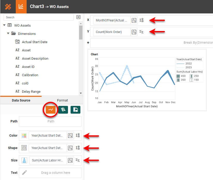
Press the Edit Color button and change the two colors as shown below.
Make the following additional changes:
- Drag the two legends to the top of the chart.
- Right-click the Chart and select 'Properties'. Under the General tab, turn off the Visibility property for the 'Chart Title'. Under the Line tab, set Y-grid to None, and press OK.
- Right-click each axis title, and select 'Hide Title' from the menu.
- Right-click the Y-axis, and select 'Hide Axis'.
- Right-click the X-axis and select 'Axis Properties'. Under the Line tab, disable Show Axis Line, and press OK.
- Right-click the legend, and select Legend Properties. Set the 'Legend Border' to NONE.
The Chart should appear as:
Next you will add the bottom-right chart, which is a Donut chart. Drag a new Chart component into the dashboard, and press the Edit button to open the Chart Editor. Press the Select Chart Style button and choose Donut. Drag the 'Actual Labor Hours' field from the Measures folder to the Y region, and drag the 'Work Type' field from the Dimensions folder to Color. Then hide the axis and chart title as you did for the previous chart.
Finally, let's add a borderless chart. Drag a new Chart component into the dashboard and open the Chart Editor. Then make the following adjustments:
- Drag 'Actual Start Date' to the X region, press the Edit Dimension button, and set the 'Level' to Month.
- Right-click on the 'Work Order' field in the Dimensions folder, and select Convert to Measure.
- Drag the 'Work Order' field from the Measures folder to the Y region, press the Edit Measure button, and set the 'Aggregate' to Count.
- Press Select Chart Style and choose the Bar type chart.
- Hide all of the axis labels and titles.
- Set a transparent background color, and a light blue color for the bars, and close the Chart Editor.
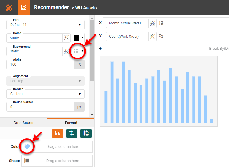
Click the Chart, and select the Format tab. Use the Border property to set all borders to None.
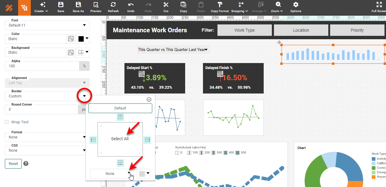
If desired, place a filled Rectangle behind the chart and KPIs, as shown in the InetSoft Gallery example.

The rest of the Gallery dashboard example can be constructed by repeating the steps shown previously to add the additional Charts and KPIs.
Summary
This document has illustrated a few of the techniques used to create a dynamic and powerful Maintenance Dashboard. You saw how to create dynamic scripted KPIs, sparkline charts, pop-up Selection Lists, Form components, multiple-measure charts and other chart types. It should be clear that InetSoft makes it quick and easy to display charts and KPIs in a wide variety of different modalities for exploration and interaction. InetSoft additionally provides many other features to facilitate the creation of professional dashboards, such as embedding, hyperlinks, drill-downs, positioning and sizing aids, device-adaptive layout, advanced scripting, and much more. InetSoft provides a complete solution for modern, powerful, and effective dashboards.
Script Appendix
function getDateRange2(range, rangeEnd,relativeDate) {
  var t = relativeDate;
  var dt = CALC.day(t);
  var returnDate = null;
  var qtr = ['','01/01/', '04/01/', '07/01/', '10/01/'];
  if(rangeEnd == 'F' || rangeEnd == 'From') {
    if(range == 'YTD') {
       returnDate = parseDate('01/01/' + year(t) + ' 00:00:00', 'MM/dd/yyyy hh:mm:ss');
    }
    else if(range == 'YTDLY') {
       returnDate = dateAdd('yyyy', -1, getDateRange2('YTD','F',t));
    }
    else if(range == 'MTD') {
       returnDate = dateAdd('d', -1 *  (CALC.day(t) -1), t);
    }
    else if(range == 'MTDLY') {
     returnDate = dateAdd('yyyy', -1, getDateRange2('MTD','F',t));
    }
    else if(range == 'LMTD') {
     returnDate = dateAdd('m', -1, getDateRange2('MTD', 'F',t));
    }
    else if(range == 'QTD') {
     returnDate = parseDate(qtr[CALC.quarter(t)] + year(t) + ' 00:00:00', 'MM/dd/yyyy hh:mm:ss');
    }
    else if(range == 'QTDLY') {
     returnDate = dateAdd('yyyy', -1, getDateRange2('QTD','F',t));
    }
    else if(range == 'LQTD') {
     returnDate = dateAdd('q', -1, getDateRange2('QTD','F',t));
    }
  }
  else {
     if(range == 'YTD' || range == 'MTD' || range == 'QTD') {
        returnDate = t;
     }
     else if(range == 'YTDLY' || range == 'MTDLY' || range == 'QTDLY') {
        returnDate = dateAdd('yyyy', -1, getDateRange2('QTD', 'T',t));
     }
     else if(range == 'LMTD') {
        returnDate = dateAdd('m', -1,getDateRange2('MTD','T',t));
     }
     else if(range == 'LQTD') {
        returnDate = dateAdd('q', -1,getDateRange2('QTD','T',t));
     }
  }
  return returnDate;
}
function getKPIDiffValue(TextThis, TextLast, diffType) {
   if(isNull(diffType)) {
   	diffType = 'P';
   }
	if(isNull(TextLast.value) || TextLast.value == 0 || TextThis.value == TextLast.value) {
		return '\u2194';
	}
	else if(TextThis.value > TextLast.value) {
	   if(diffType == 'P') {
			return '\u2191' + formatNumber(Math.abs((TextThis.value/TextLast.value - 1)),'0.00%');
		}
		else {
			return '\u2191' + formatNumber(Math.abs((TextThis.value - TextLast.value)),'0.00%');
		}
	}
	else {
	   if(diffType == 'P') {
			return '\u2193' + formatNumber(Math.abs((TextThis.value/TextLast.value - 1)),'0.00%');
		}
		else {
			return '\u2193' + formatNumber(Math.abs((TextThis.value - TextLast.value)),'0.00%');
		}
	}
}