Dashboard Design Examples
The key to good dashboard design is to make as much information accessible through filtering, selection lists, sorting tooltip, and other built-in interactivity and to make the dashboard pleasing to look at. While attractive design might be subjective, goals are to look modern and up-to-date, use a nice combination of colors, and to lay out objects in an evenly spaced grid. Take a look at this collection of examples built with InetSoft's tool plus our top 6 list of design tips.
Dashboard with Pastel Color Palette
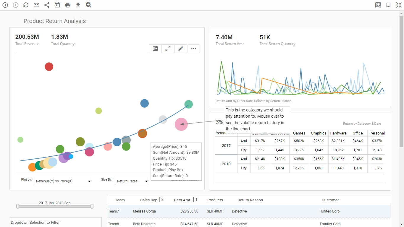
This product return analysis dashboard highlights how a dashboard can incorporate many different pastel shades and not be overwhelming.
This allows color to be used as an additional dimension on both dashboard charts. Hovering the mouse over any of the colored data points reveals which categories are signified by which colors.
Dashboard with Simple 2-Color Design
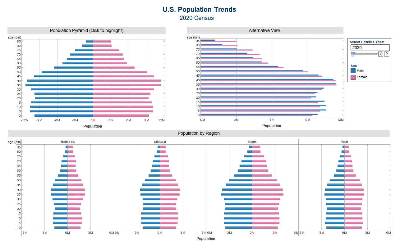
This U.S. population trends by gender dashboard illustrates how using only a few colors is often more communicative than a palette of many different shades. The dashboards charts are broken down by gender, with the traditional pink signifying female and blue signifying male. Using common color signifiers makes the dashboard easy to understand.
Dashboard Using Solid Color Backgrounds
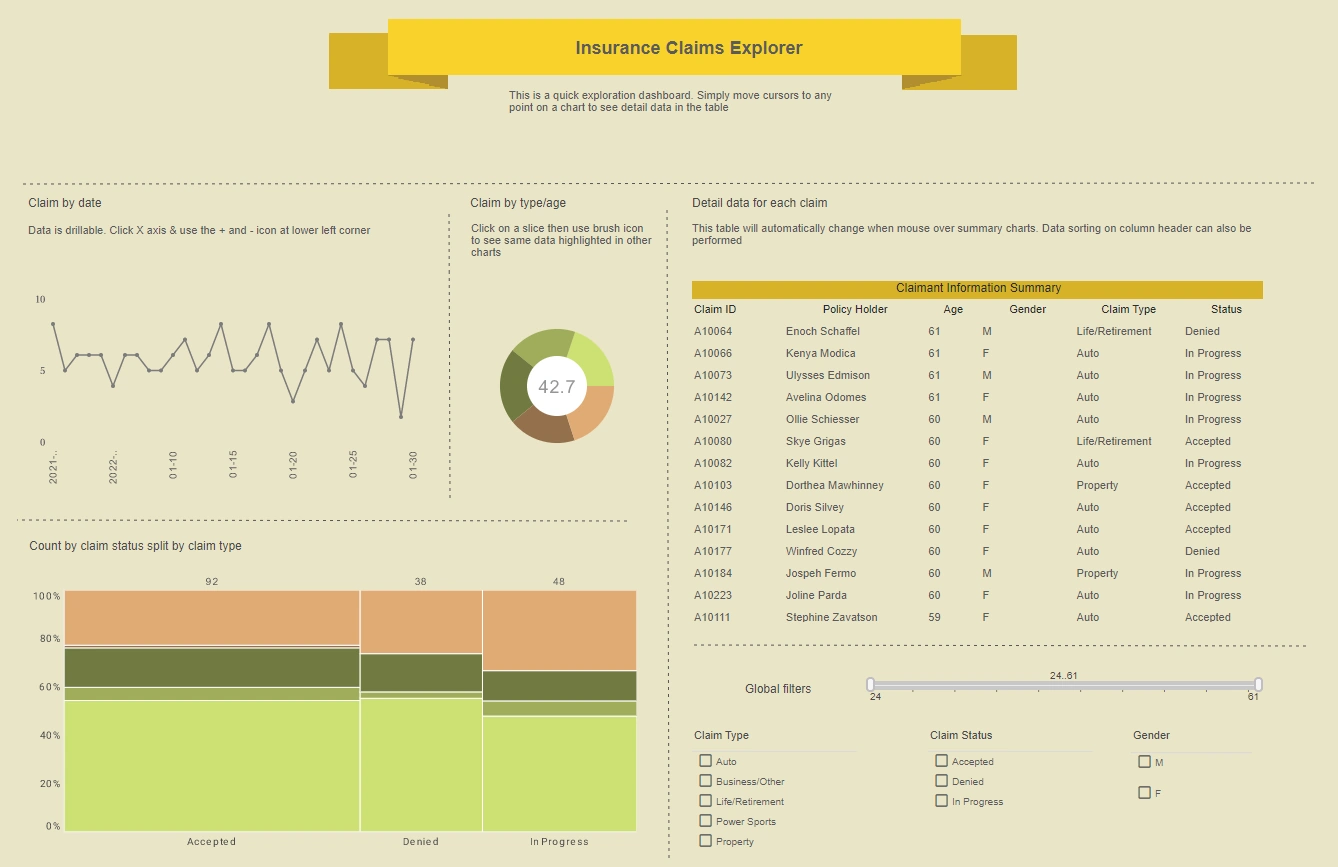
This insurance claims dashboard shows how having a muted background color can be easier on the eyes than having elements against a white background. The dashboard's charts also use muted colors so as to not clash with the background.
Dashboard with Monochromatic Scaling by Value
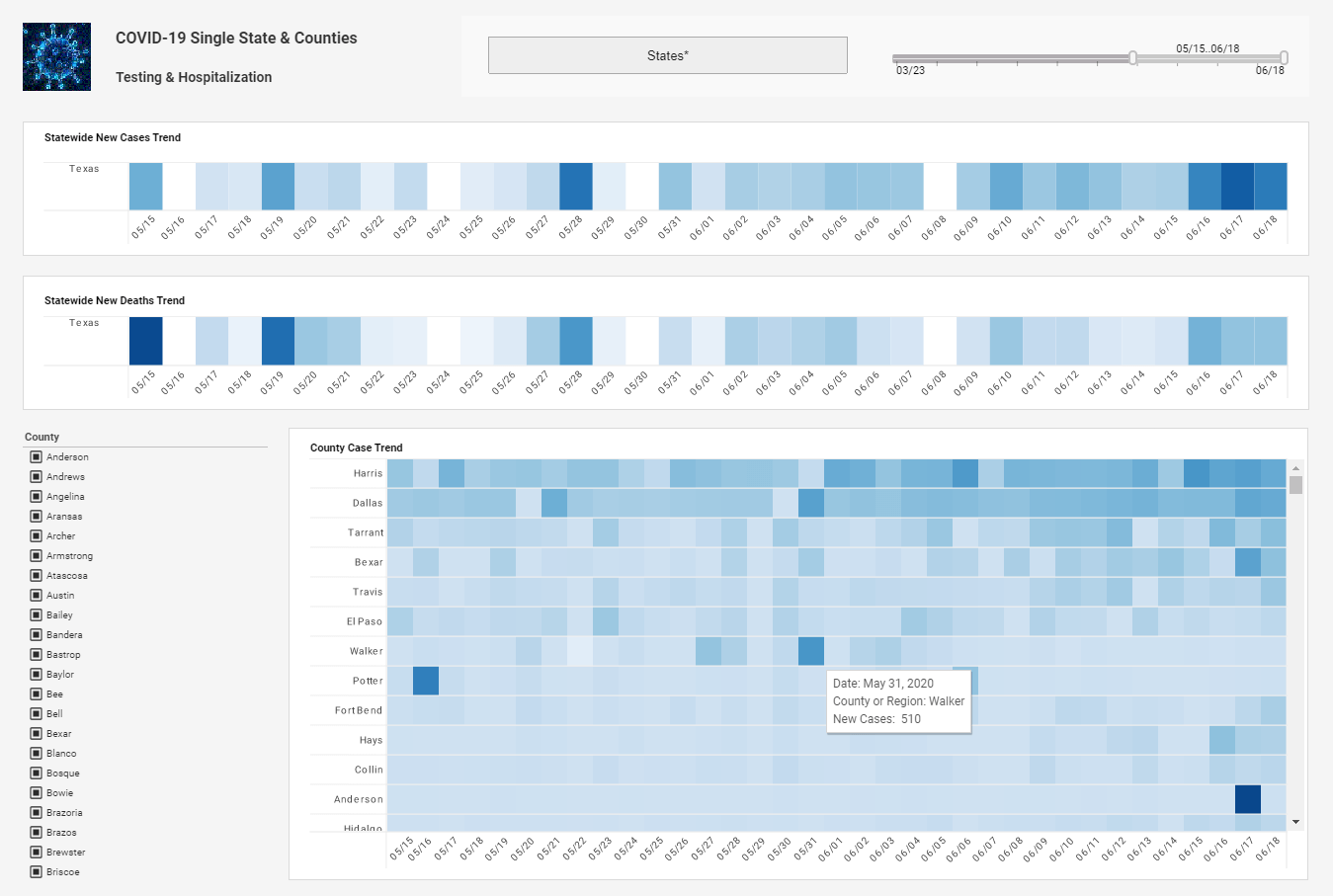
This COVID-19 dashboard uses monochromatic scaling, or different shades of the same color, to display the number of new cases each day. Whereas distinct colors in a dashboard usually signify the discrete categories of a dimension, multiple shades of the same color signify a measure.
Dashboard with High Contrast Heatmaps
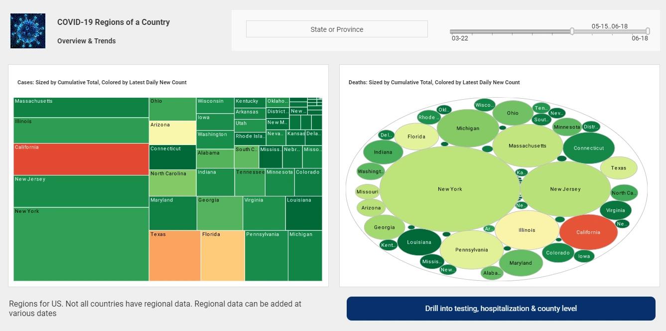
This second COVID-19 dashboard shows how using a contrasting color can be used to draw attention to certain data points. Whereas most of the states are colored varying shades of green, the top states for COVID cases are colored orange, and the state with the highest cases colored red. Once again, the the use of traditional color signifiers (red signifying something unwanted) makes the dashboard easy to understand.
Dashboard with Geographical Map
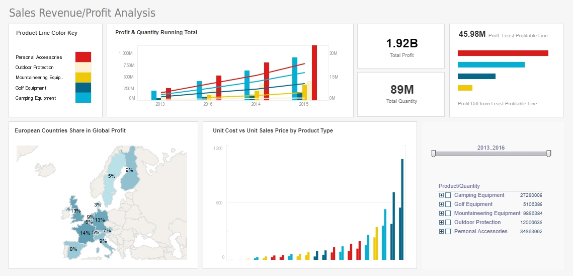
This sales and profits dashboard features a geographical map chart, displaying each country's share of global profit, colored once again using monochromatic scaling. Since countries are recognizable by shape, a map chart can omit country names, making the chart less cluttered. While color shade gives an overall visual impression of how particular nations compare to the rest, the addition of text labels enables the viewer to compare nations with similar figures.
Using Brushing on a Dashboard
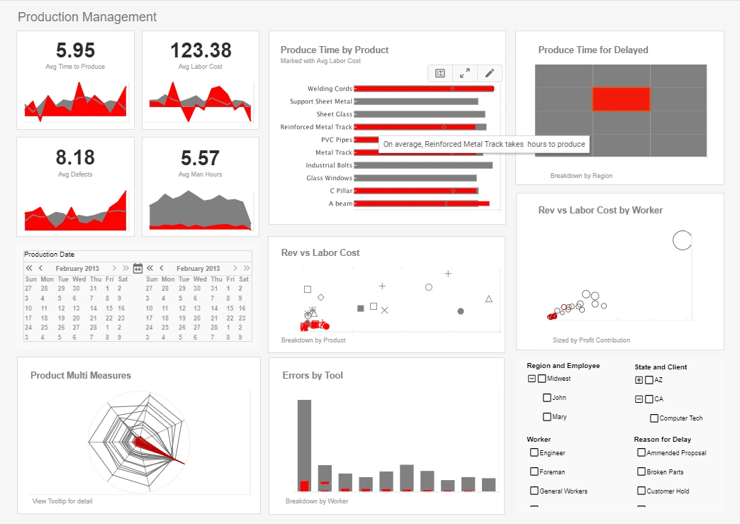
The use of the brushing feature in this production dashboard enables a data point from the "Produce Time for Delayed" to be displayed proportionately on other charts throughout the dashboard. This reveals a host of details about the data point which would not be observable using other features.
Using Gauges or Donuts on a Dashboard
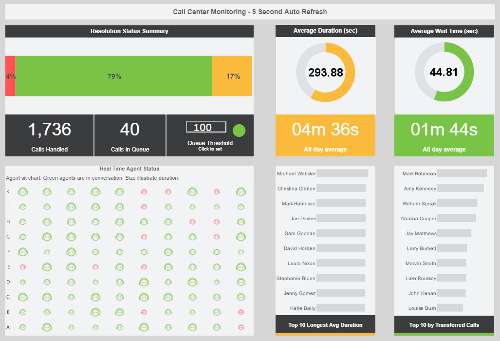
This call center dashboard includes guages displaying average call duration and average wait times.
The guages include the same data displayed as text KPIs within them, providing another level of more precise information.
Good Dashboard Design Principles
- Try to avoid having to scroll or switch between multiple screens. Ideally you want to see everything at once. Design for a screen size of 1100x860 assuming the majority of usage is from a PC or laptop
- Generally avoid gauges because they take up so much space for the amount of information. However some KPI dashboards do look good with them. A doughnut-style gauge face is current, while automotive-gauges are tacky
- Limit decimal places to 2 or less and reduce large numbers to use K or M (e.g. 34,365,434 to 34.5M.)
- Choose measures that really show the change or variation readily. Think about calculating for example the percentage change between the actual and the budget rather than plotting both on a graph.
- Do not overuse color. A color scheme of 2 or 3 colors with varying shades for chart data is most appealing. Flat colors are in style with free tools like https://www.flatuicolorpicker.com/ to help pick them. Use gray for text and lines with white backgrounds for your charts and dashboard canvas.
- Maximize the ''Data to Ink'' ratio. Eliminate grid lines, outlines and tick marks on graphs.
For a good external resource on design tips, check out http://www.perceptualedge.com/blog/

