Gauge Charts - Definition, When To Use, and Types
This article will discuss the uses of Gauge Charts, how you can create them in Excel and InetSoft, and will provide access to a free online tool for creating Gauge Charts as well as complete functioning business intelligence dashboards.
Contents Definition of a Gauge Chart Why Use a Gauge Chart? Types of Gauge Charts with Examples How to Make a Gauge Chart How to Create a Gauge Chart in Google Sheets Tool to Make Gauge Charts Online for Free

Definition of a Gauge Chart
A Gauge Chart is a graphical display in the form of a gauge, such as a speedometer, and displays the value of a metric by using a needle, but in some cases by using color alone. While the vast majority of gauge charts display a single aggregated value or KPI such as 'total sales' or 'average population', advanced charts may break out the metric along a dimension to create the effect of a donut chart that displays the association of metric with dimension in circular gauge format.
Why Use a Gauge Chart?
A gauge chart is typically used when there are certain KPIs that must be immediately brought to the user's attention. The gauge format is large and immediately recognizable to almost everyone. Just as the speedometer is prominent on a car's dashboard, the presence of a gauge on a report or dashboard grabs the user's attention and instantly communicates that the data being represented on the gauge is highly significant. The gauge effectively says "Look at me first." This is extremely important for business users and executives who may not have time to study complex traditional charts or tables. The Gauge Chart delivers at a quick glance the most significant information the business user needs.
To serve the end of conveying key information rapidly, the gauge is designed to be easy to read in one or two seconds. Its simplicity is its chief benefit. Although the Gauge Chart presents typically only a single value, and is therefore far inferior to charts and tables in terms of quantity of information conveyed, that poverty of information is exactly the strong suit of the Gauge Chart. Strategically using one or more Gauge Charts in a conspicuous location on a report or dashboard can make the delivery of information much more effective than burying the same information at the bottom of a table or within a complicated traditional chart.
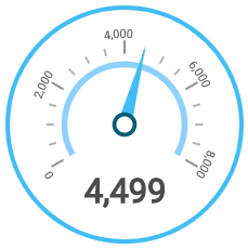
Needle Gauge
The appearance of gauge charts can be as varied as the traditional gauges (e.g., speedometers) that they are designed to emulate. They can be as simple as a dial and a needle, as to the right:
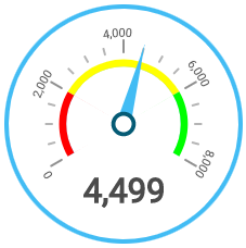
Colored Range Gauge
Gauges also often incorporate colored ranges (e.g., red, yellow, green) to indicate the significance of the numerical measurement. With these colored ranges in place, the gauge itself answers the question of "What does this value mean?" The user may not care so much about the exact numerical value, but if they see the needle in the red zone, they know immediately that there is a problem that needs to be addressed.
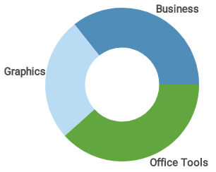
Pie Chart Gauge
To add some more sophistication to the Chart, it is also possible to display the metric broken out along a dimension. While preserving the appearance of the Gauge Chart above, the chart below is actually more akin to a pie chart in terms of its information payload.
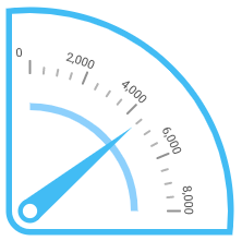
Wedge Gauge
Naturally, a variety of other gauge styles are available to suit individual tastes and presentation needs such as layout and space considerations, such as the "wedge" style shown here but the styles shown above represent the majority of types that will be found in typical production reports and dashboards.
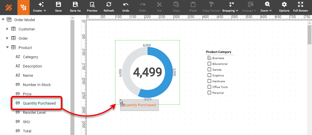
Creating a Gauge Chart with InetSoft software is extremely simple because the app provides a dedicated component for this purpose, the Gauge component. You can simply add a Gauge into a dashboard in Visual Composer, and then drag a measure from your data source onto the Gauge:
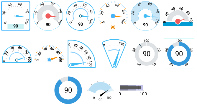
Many Other Types of Gauges to Choose From
Choose from the wide variety of Gauge faces provided in the Gauge Properties dialog box:
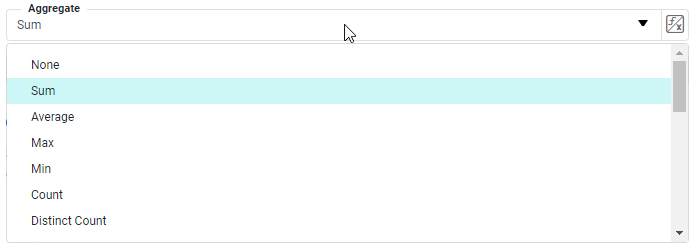
Then select the method by which the Gauge should aggregate the data, for example by summing or averaging.
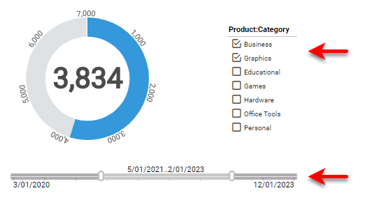
To filter the data displayed on the Gauge, simply add Filter components to the dashboard, such as Selection Lists and Range Sliders:
Now you have completed creating your Gauge Chart, fully functional and interactive in a few easy steps.
Why Choose InetSoft for Your Dashboarding Solution?
Easy- Deliver dashboards in minutes with a drag-and-drop interface
- Empower users with intuitive, web-based access to dashboards
- Embed dashboards in your application with ease
- Connect to any data source, including big data and cloud sources
- Blend data from multiple sources without complex ETL processes
- Make it easy for analysts & administrators; no SQL experience required
- Scale up with zero-client deployment and no per-user licensing
- Provide maximum self-service through ad hoc and visualization analysis
- Enable self-service also at data level: end-user defined data mashup
- Accommodate quick, formal, and experimental changes
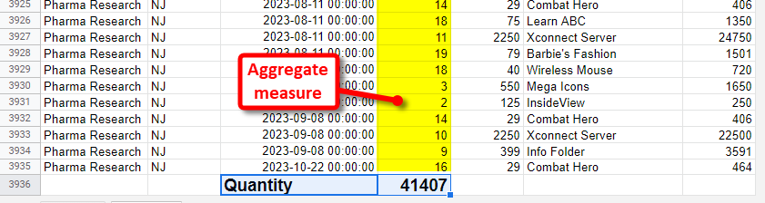
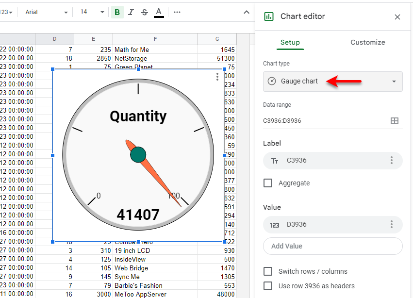
To create a Gauge Chart in Google Sheets, you must first aggregate the data that you want to create the measure you want to display. So, for example, you could sum or average a range of cells.
You can then select the aggregate you computed, and choose to add a Chart from the Insert menu. Use the Chart Editor to choose the Gauge chart type.
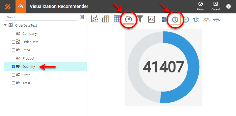
To easily and quickly create Gauge Charts online for free, create a Free Individual Account on the InetSoft website. You will then be able to upload a spreadsheet data set, as shown below:

Once you have done that, you will be able to proceed to the Visualization Recommender, which will get you started creating a dashboard. To start with a Gauge Chart, select a measure that you want to display, and choose the desired gauge from the top bar of the Recommender.
After you press Finish to leave the Visualization Recommender, you can continue to add additional Gauges or other components using the Visual Composer shown earlier.