Dashboard Samples from InetSoft
Are you looking for a dashboard application for your business? Preview some dashboard examples below or check out a large visualization gallery for a better look at the possibilities.
Global Agriculture Dashboard Sample
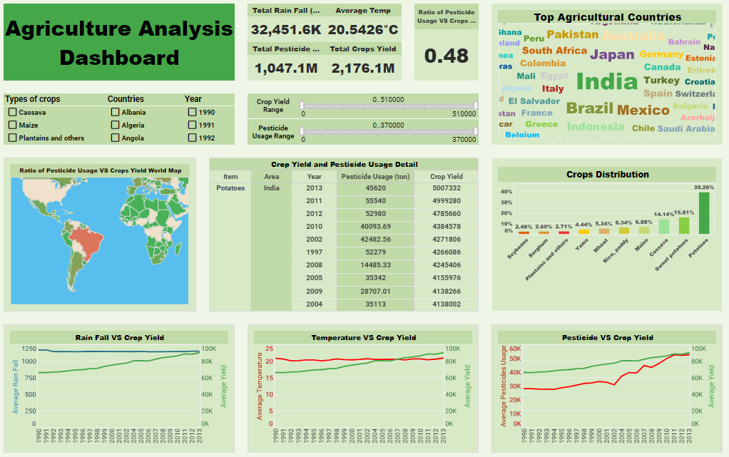
This corporate global agriculture dashboard sample is designed to provide big agra execs with a comprehensive understanding of global agricultural production and crop yield in different nations. The dashboard created with InetSoft integrates a range of data, including crop types, national statistics, weather conditions, pesticide usage, yield data, and more, to empower you to make informed agricultural decisions. This InetSoft dashboard incorporates various visualization tools, such as tables, bar charts, line graphs, maps, and more, to assist you in gaining a better understanding of the data and its underlying insights. With the use of filters, it also helps you swiftly pinpoint your areas of interest, for example, countries, crop types, and years. The use of dual axis charts helps in the comparison of metrics with different scales, such as rain fall, temperature, and pesticide use compared to crop yield.
College Admissions DEI Dashboard Sample
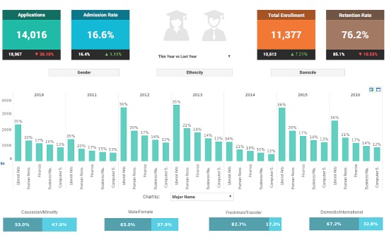
This college admissions DEI dashboard sample helps DEI track the success or failure of university DEI initiatives by breaking down the student population into various demographics, including race, gender, and other categories.
The option to visually break down demographic data by class and major makes it easier for schools to implement and track the progress of diversity initiatives and see how far they still have to go.
Large, easy to read text KPIs display the dashboard's most important aggregates, with percent change from previous period displayed underneath them, giving college presidents an at a glance view of educational and social progress.
Customer Service Calls Dashboard Sample
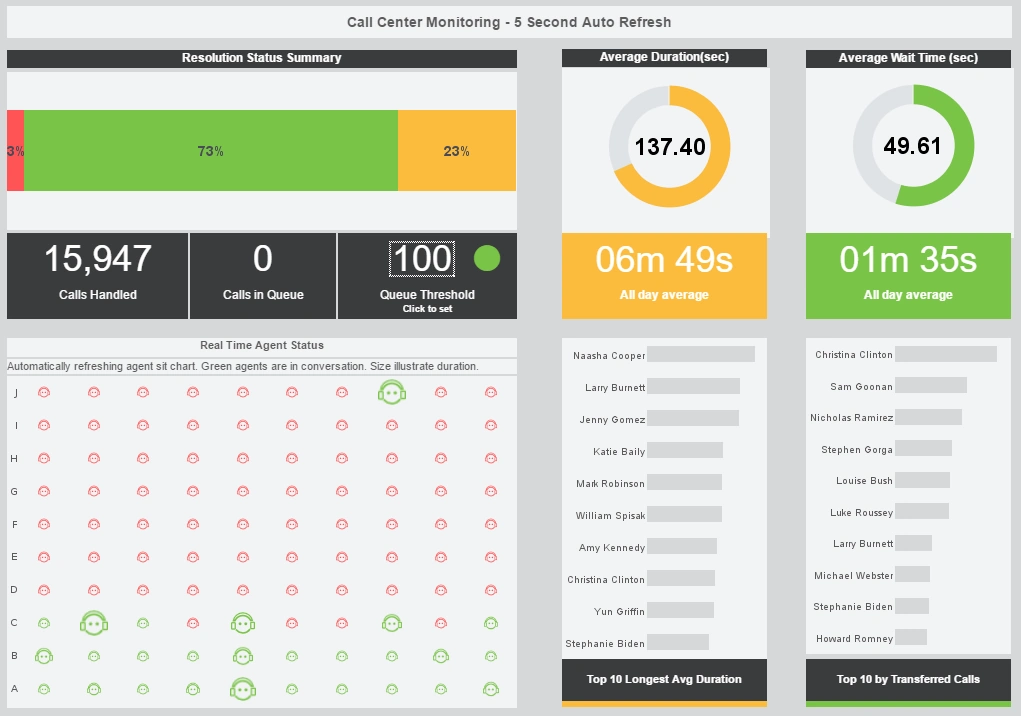
This live customer service calls dashboard sample helps call center managers supervise their customer service reps and monitor how their call and wait times compare to goals. An adjustable threshold turns from green to red when there are too many calls in queue.
After goals are met, the threshold can be set lower, increasing the standard for customer service wait times. An agent status chart shows, in real time, who is on the phone and for how long.
Large KPIs provide the daily call and wait time average, giving managers an at-a-glance picture of customer service quality.
Lead Source Dashboard Sample
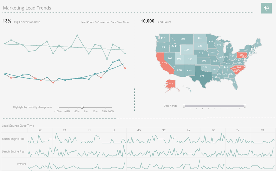
This marketing lead source dashboard sample compares lead volume and conversion rates against benchmarks set by marketing managers. A large map chart displaying new leads by state displays states with lead amounts that reach goal in a different color. A line chart showing lead conversion rate shows a red highlight when conversion rate dips by too large an amount. A slider below the line charts modifies the change rate that results in a chart highlight, allowing conversion goals to be increased over time.
Social Media Campaign Dashboard Sample
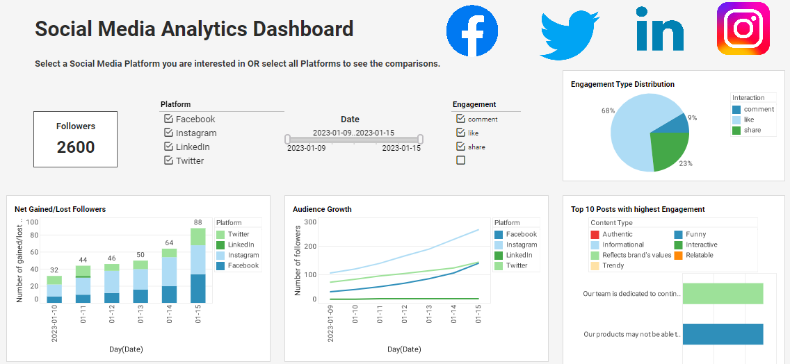
This social media campaign dashboard sample can free business users from juggling multiple social media accounts across various platforms, and allow them to monitor accounts and track engagement metrics all in one place. The dashboard consists of a combination of easy-to-understand charts such as summary charts, line charts, bar charts, and pie charts to present engagement information across multiple platforms, and uses interactive filters to simplify the process of making analysis and comparisons.
Global Hotel Chain Dashboard Sample
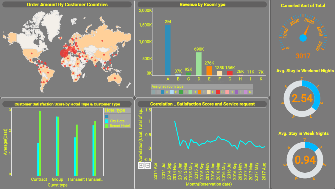
The corporate global hotel chain dashboard sample embodies InetSoft's commitment to 'Intelligence With Style'. Beyond its sleek, user-friendly interface lies a powerful engine capable of processing multi-dimensional data, providing hotel managers with the foresight to anticipate hospitality market trends and guest needs. It's an essential tool for anyone in the hospitality industry looking to elevate their operational efficiency, enhance guest experiences, and drive profitability.
Hospital Operations Dashboard Sample
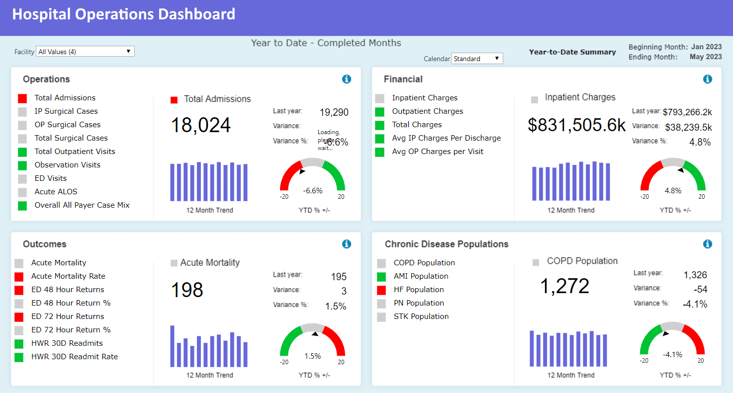
This hospital operations dashboard sample gives clinical and administrative leaders a single-pane view of capacity, staffing, and patient flow to support timely operational decisions. It consolidates live feeds from electronic health records, bed management systems, and staffing rosters to display occupancy rates, average length of stay, surgical suite utilization, and bed turnover by ward. The dashboard highlights bottlenecks with color-coded thresholds, lets managers drill into pending discharges and transfer needs, and correlates admission sources with resource demand. Predictive modules estimate expected admissions and staffing shortfalls, while inventory KPIs surface critical supply levels (PPE, meds) tied to case volume. Interactive filters let leaders view metrics by department, shift, or attending physician, enabling targeted operational interventions that reduce wait times and improve throughput while preserving quality of care and regulatory compliance.
I-Beam Distribution Dashboard Sample
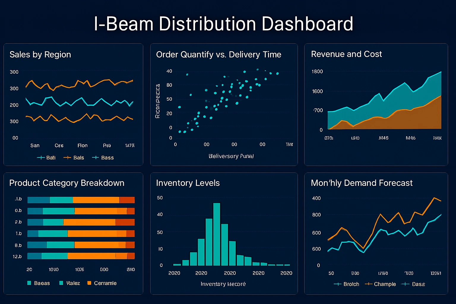
This i-beam distribution dashboard sample is tailored for steel fabricators and logistics teams who manage heavy structural materials across plants and construction sites. It tracks inventory levels of standard and custom beam sizes, monitors inbound mill shipments, and shows fulfillment status for open orders by region. The dashboard overlays production yield and cut-to-length efficiency against demand forecasts to optimize batching and reduce scrap. Transportation widgets show truck availability, routing performance, and weight distribution per load to ensure regulatory compliance and maximize trailer capacity. Alerts flag delayed shipments or low stock for critical profiles, and interactive pivoting allows planners to analyze lead times, supplier reliability, and on-hand safety stock — helping reduce downtime, improve delivery SLAs, and lower carrying costs across the supply chain.
Incident Management Dashboard Sample
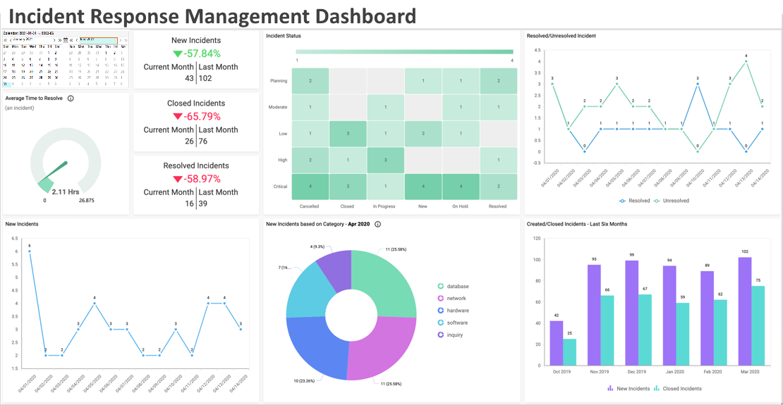
This incident management dashboard sample centralizes operational visibility for incident response teams — whether public safety dispatch, facilities, or IT operations. It aggregates incoming events, assigns priorities and resources, and displays incident status with timelines that show detection, dispatch, arrival, and resolution milestones. The dashboard includes heatmaps of incident density, resource availability by shift, and severity scoring to support rapid triage. It surfaces correlated incidents (common root causes), supporting faster containment, and provides post-incident analytics for trend identification and continuous improvement. Managers can set SLA thresholds, monitor open backlog by category, and filter by geography or business unit, enabling smarter resource allocation and faster mean time to resolution while improving stakeholder communication during high-volume periods.
Incident Response Time Dashboard Sample
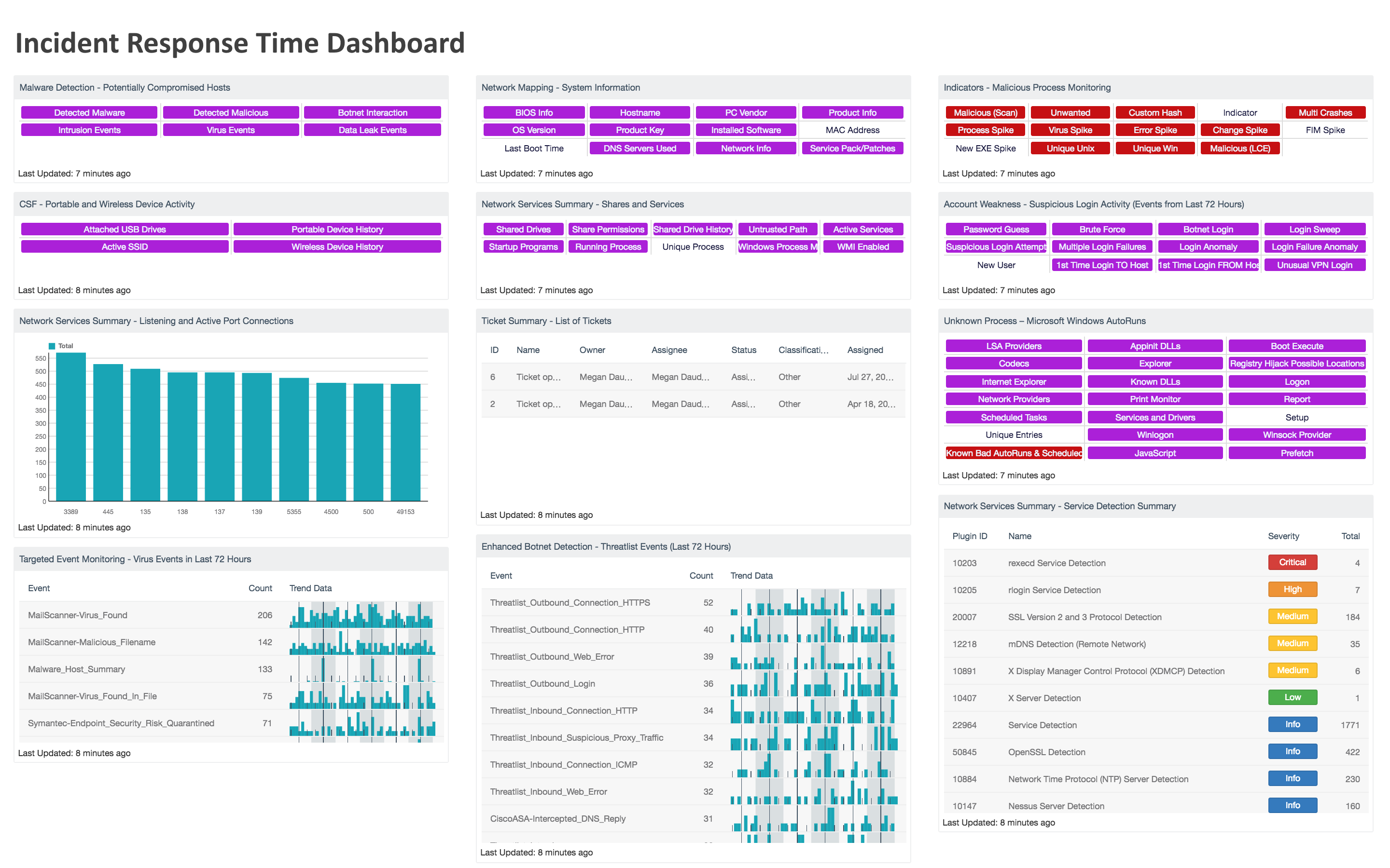
This incident response time dashboard sample zeroes in on SLA-oriented metrics and timing performance for response teams. It visualizes mean time to acknowledge, mean time to respond, and mean time to resolve across categories, teams, and regions. Trend charts reveal improvements or regressions over time, while histogram and boxplot components expose distribution and outliers so managers can understand whether a few slow incidents are skewing averages. The dashboard supports SLA adherence monitoring with alerts for breached thresholds and drilldowns to show contributing factors such as resource shortage, high severity spikes, or geographic constraints. Combining time-series analysis with root-cause tagging enables targeted process changes, more accurate staffing predictions, and a continuous feedback loop to shorten response windows and improve customer or citizen satisfaction.
Industrial Waste Management KPI Dashboard Sample
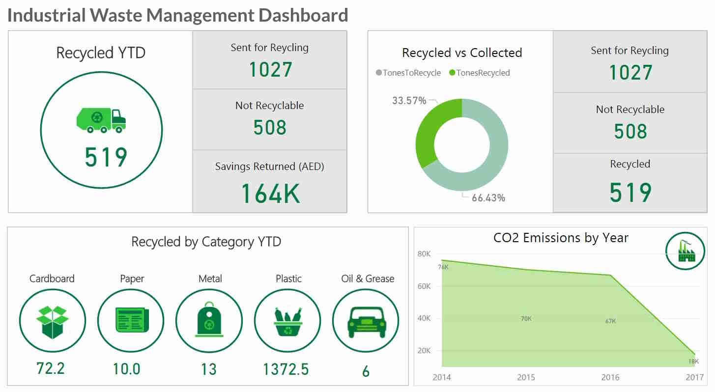
This industrial waste management KPI dashboard sample helps environmental compliance and operations teams monitor waste streams, treatment performance, and permit limits in one place. It tracks volumes by waste type, treatment cycle efficiency, discharge quality metrics, and cumulative reporting against regulatory thresholds. The dashboard correlates process variables with waste outputs to identify production steps that increase disposal burden, highlights cost centers for off-site treatment, and alerts on exceedances requiring corrective action. Sampling results, chain-of-custody status, and remediation timelines are linked to individual incidents to provide audit-ready evidence. Interactive scenario analysis lets teams model the impact of process adjustments or capacity investments, enabling data-driven decisions that reduce environmental risk, lower handling costs, and demonstrate responsible stewardship to regulators and stakeholders.
Insurance Claims Distribution Dashboard Sample
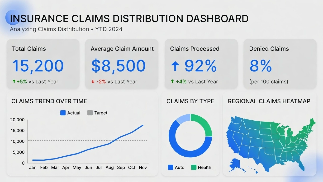
This insurance claims distribution dashboard sample gives underwriting and claims teams a comprehensive look at claims volume, severity, and settlement velocity across products and regions. It displays claim counts by type (auto, property, liability), average paid amount, open reserve totals, and time-to-settlement distributions. Fraud indicators and anomaly detection widgets help flag outliers for investigations, while adjuster performance metrics expose workload imbalances and training needs. Geographic heatmaps show regional concentrations, and cohort analyses reveal patterns by policy age, broker, or risk score. The dashboard supports reinsurance planning and reserve forecasting by projecting incurred but not reported (IBNR) trends and aggregating exposure across portfolios — enabling data-driven reserving and more efficient claims handling.