What Is The Difference Between a Visualization and a Dashboard?
Making sense of data in a way that is simple to understand is becoming more and more crucial as organizations continue to gather enormous volumes of data. Dashboards and visualizations may help with this.
There are important distinctions between visualizations and dashboards, despite the fact that they both convey data visually. In this post, we'll examine the distinctions between dashboards and visualizations and explain why companies would want to use them.
What Is a Visualization?
A visualization is a graphic depiction of facts that makes it simple and fast to comprehend. Data is presented in an understandable fashion using visualizations, which might include charts, graphs, and diagrams. Data patterns, trends, and linkages that may not be readily obvious from a spreadsheet or database can be found using visualizations.
Complex data sets are often simplified via visualizations, making them more approachable to a larger audience. They are helpful for spotting outliers, which may help in spotting issues or possibilities within a firm. Spreadsheet applications, specialist software, and computer languages like Python and R may all be used to produce visualizations. Line charts, bar charts, pie charts, and scatter plots are a few examples of typical visualizations.
What Is a Dashboard?
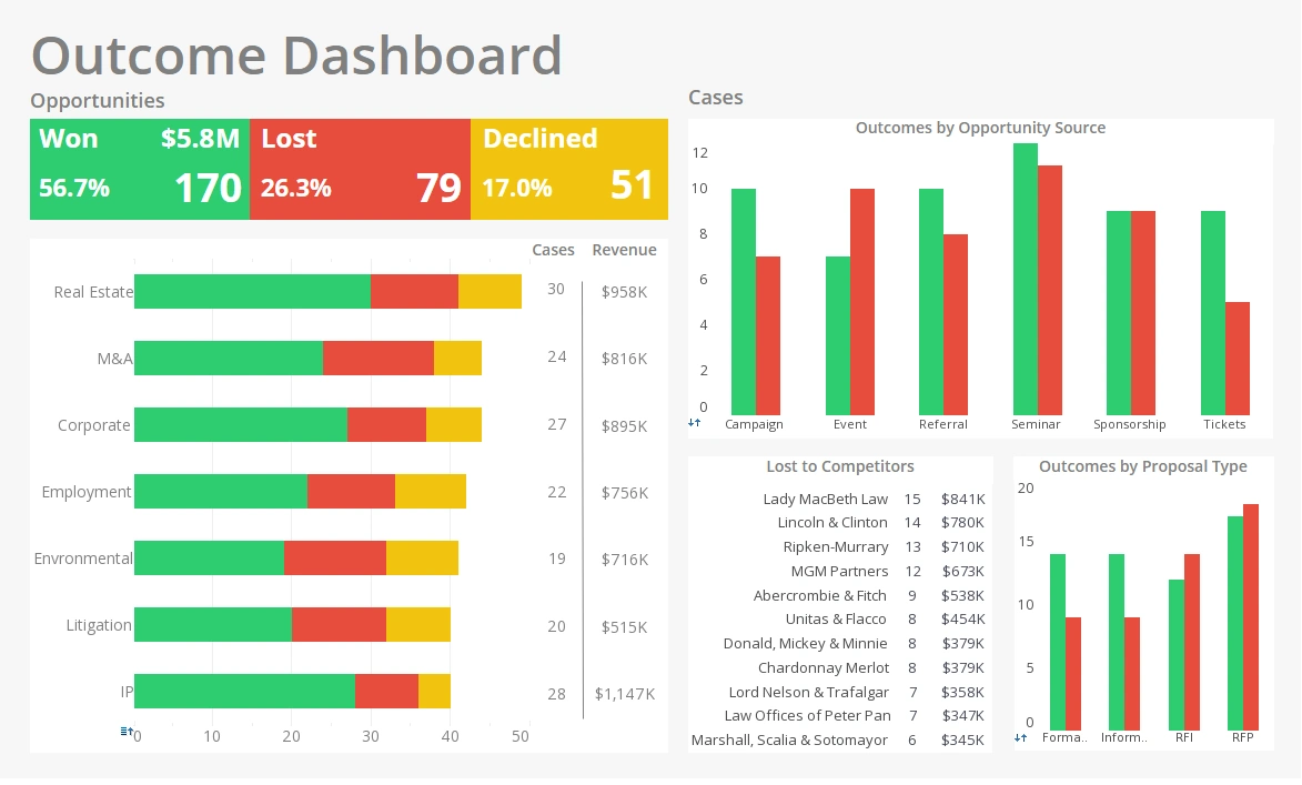
A dashboard is a visual representation of key performance indicators (KPIs) that enables organizations to monitor their progress toward their objectives. A dashboard often consists of a number of visualizations that are intended to provide users an immediate and simple overview of important indicators.
Dashboards are often used to track company performance in real-time, enabling companies to immediately see possible issues or opportunities. They may be used to monitor a number of variables, like as sales, revenue, customer happiness, and staff performance.
Spreadsheet applications, specialist software, and computer languages like Python and R may all be used to generate dashboards. Executive dashboards, operational dashboards, and analytical dashboards are a few examples of frequent dashboard kinds.
Differences between Visualizations and Dashboards
There are several significant variations between visualizations and dashboards, despite the fact that both convey data visually.
Purpose
Data presentation in an understandable manner is the fundamental goal of a visualization. In order to spot patterns, trends, and correlations in the data that may not be immediately apparent from a spreadsheet or database, visualizations are often utilized. They may be used to streamline complex data sets, enhancing accessibility for a larger audience.
A dashboard's primary function is to provide a rapid and simple summary of important indicators. Dashboards are often used to track company performance in real-time, enabling companies to immediately see possible issues or opportunities. They may be used to monitor a number of variables, like as sales, revenue, customer happiness, and staff performance.
Content
Visualizations often concentrate on displaying a specific data set or a single element of a data collection. They are often used to compare data points, spot trends, or depict data patterns. Data may be presented in a number of different ways using visualizations, such as line charts, bar charts, pie charts, and scatter plots.
Dashboards, on the other hand, often include many visualizations that are designed to provide a rapid and simple overview of important metrics. Dashboards often include charts, graphs, and tables, and they are generally divided into tabs or sections that correlate to various facets of the company.
Interactivity
Depending on the method used to make them, visualizations may be interactive or non-interactive. Users may engage with the data by zooming in on a specific data point, choosing several factors to compare, or hovering over a data point to get additional details via interactive visualizations.
Dashboards are virtually usually interactive, enabling users to tailor the dashboard to their requirements. Users may often change the date range, filter the data, or dive down into certain metrics for more in-depth information.
Audience
Visualizations are often used to convey data to a wide audience, including those who may not have a thorough grasp of the data or the company. Visualizations are often used in presentations, reports, or on websites to provide a quick and easy way to understand complex data.
Those that are very acquainted with the data and the company are often the ones who utilize dashboards. They are often used by executives, managers, or analysts who need to keep an eye on crucial indicators in real-time and base choices on that information.
Design
Visualizations are often made to be both aesthetically pleasing and simple to understand. They often concentrate on a specific data set or a single feature of a data set and utilize colors, typefaces, and other graphic elements to emphasize significant information.
Dashboards are likewise made to be aesthetically pleasing and simple to read, but they often include several visualizations and are designed to provide a rapid and simple summary of critical indicators. In order to make it simple for users to comprehend and analyze the data, dashboards often use a uniform design language throughout all of the visualizations.


