Fractal Charts Definition and Tools to Create for Free
This page explains how you can create fractal charts such as the Mandelbrot Set in both Google Sheets and InetSoft. This page also provides access to a free online tool for creating charts and complete functioning business intelligence dashboards.
Contents
Definition of a Fractal Chart
How to Create the Mandlebrot Set and Fractal Chart
How to Create a Fractal Chart in Google
Tool to Make Fractal Charts Online for Free

Definition of a Fractal Chart
A fractal is a complex, self-similar pattern that is found in nature and can be described mathematically. The term "fractal" was coined by mathematician Benoit Mandelbrot in 1975 and comes from the Latin word "fractus", which means "broken" or "fractured". In mathematics, a fractal is a geometric shape that has the property of self-similarity, meaning that it looks similar to a smaller or larger version of itself. This self-similarity is demonstrated over an infinite number of scales and can result in very complex and detailed patterns.
Fractals have also been applied in the field of education, where online math teachers use these patterns to explain complex concepts more effectively. By leveraging the self-similar nature of fractals, online math teachers can help students visualize mathematical principles in a more intuitive way. This approach not only enhances understanding but also fosters a deeper appreciation for the beauty of mathematics.Fractals are commonly found in many areas of science, including mathematics, physics, biology, and computer graphics. They are used to describe natural phenomena such as coastlines, mountain ranges, and cloud formations, as well as in artificial designs, such as computer-generated graphics and computer simulations.
The Mandelbrot set is a famous and important fractal that is defined as the set of complex numbers that remain bounded under a certain iterative process. The iterative process used to generate the Mandelbrot set is known as the "Mandelbrot iteration" and involves the repeated application of a simple mathematical formula to a complex number. The formula involves taking the complex number and squaring it, and then adding the original complex number back in. This process is repeated many times, and the number is considered to be part of the Mandelbrot set if the magnitude of the result remains bounded, no matter how much iteration is performed, although in actual implementation a limit must be imposed on the number of allowed iterations.
The boundary of the Mandelbrot set is a fractal and has a very complex and intricate structure. It is one of the most famous fractals in mathematics, and it has been studied and explored by mathematicians, computer scientists, and artists. The Mandelbrot set is often visualized and studied through computer graphics, and it is used in many areas of science and engineering, including chaos theory, complex dynamics, and computer graphics. It is also used for aesthetic purposes and is considered to be a work of mathematical art.
How to Create the Mandlebrot Set in InetSoft
The key step in plotting the Mandelbrot set is to obtain the number of iterations for each value in the domain, which for the X axis is (-2.00, 0.47) and for the Y axis is (-1.12, 1.12). You can implement the algorithm within an Expression Column of a Data Worksheet. To do this, follow the steps below.
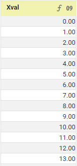
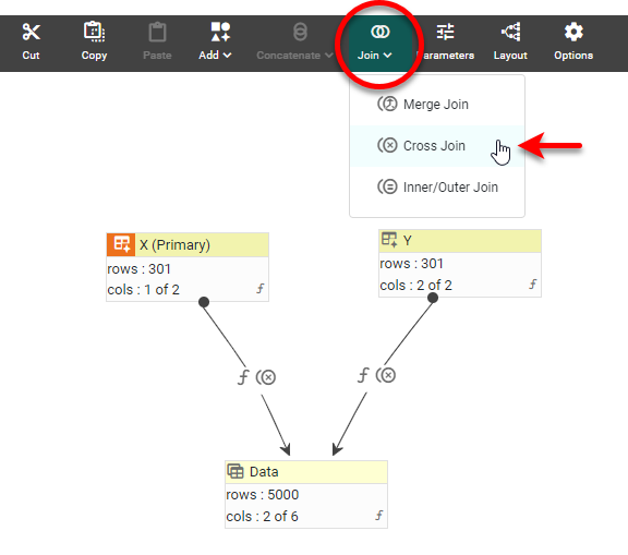
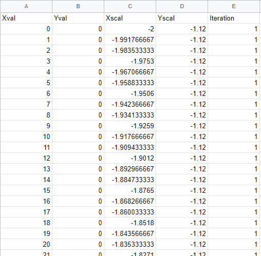
Create a new Data Worksheet, and create a new data block that has all the X and Y values in column form, such as shown below:
An easy way to construct this is to first create two Embedded Tables, each containing positive integers from 0 to the number of rows. Such a data block can be populated with data using the following simple script in an Expression Column:
Use the Join button in the toolbar to cross-join the two data blocks.
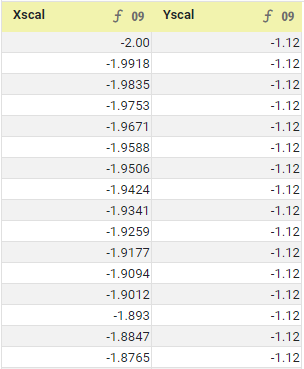
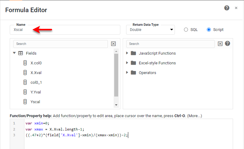
You can then convert the Xval and Yval values to the domain of the Mandelbrot function, given by Xscal and Yscal, by using Expression Columns with the following scripts:
Using the resulting Xscal and Yscal domain values, you can execute the Mandelbrot iteration. To keep the dashboard based on this Data Worksheet responsive, the max number of iterations should be capped at a low value (125 here).
The Expression Column returns the number of iterations (iter), and it is this value that will be mapped to a color spectrum in the Chart Editor.
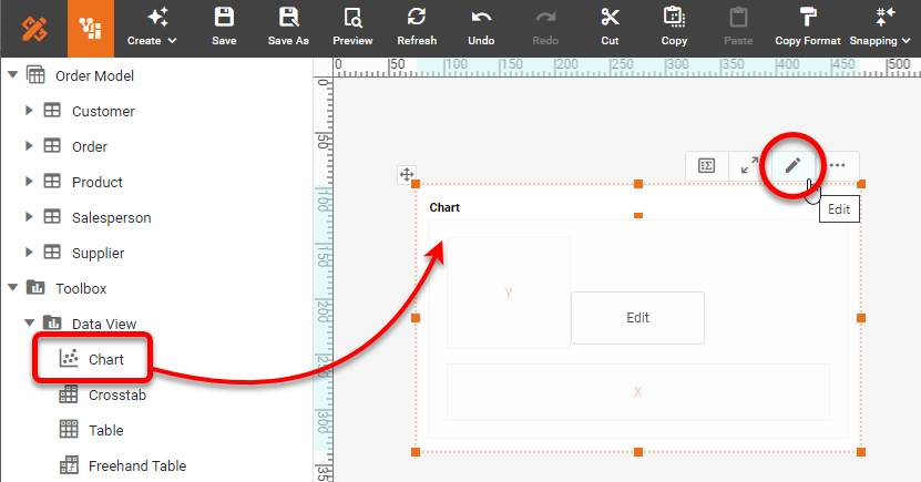
When you have data in the correct configuration, drag a Chart component from the Toolbox panel into a dashboard in Visual Composer, and then press the Edit button to open the Chart Editor. NOTE: Because this Chart takes a long time to render, you may want to enable 'Use Metadata' in the 'Viewsheet Options' dialog box.
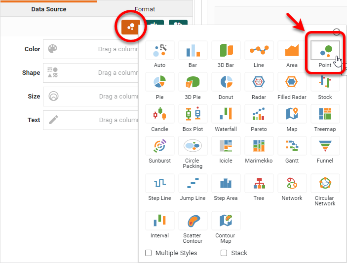
Press the 'Select Chart Style' button. Choose the 'Point' style and press 'Apply'.
Add the 'Xval', 'Yval', and 'Iteration' measures in the Chart Editor as shown below.
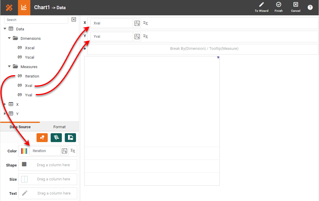
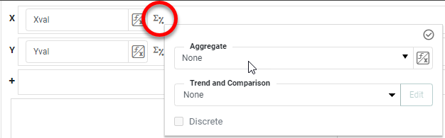
Press the 'Edit Measure' button for all the measures and set 'Aggregate' to 'None'.
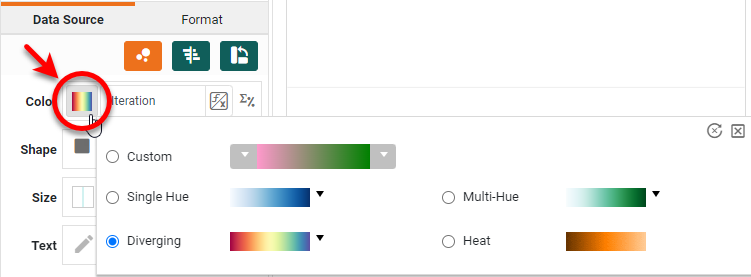
Press the 'Edit Color' button next to the 'Color' region and choose a desired color mapping.
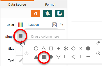
Set the 'Shape' field to a solid square or circle, and set the 'Size' field to the smallest possible size.
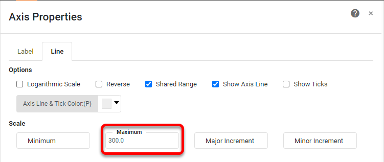
Right-click on each axis, and select 'Axis Properties' from the right-click menu. Under the Line tab, set the 'Maximum' for each axis to 300 so that the Chart will exactly contain the values on the axes.
Right-click the Y-title and X-title in turn, and select Hide Title. Do the same for the legend (Hide Legend) and both axes (Hide Axis). Edit the Chart Title as desired and use the Format tab to format the text. Press Finish to exit the Chart Editor, and press 'Preview' to see the Chart.
Note that this Chart cannot be zoomed like a typical Chart using a toolbar button. However, you could easily implement a zoom function by allowing the user to alter the maximum and minimum axis values and recomputing the Iteration column in the Data Worksheet based on those values.

How to Create a Fractal Chart in Google
It is not possible to create exactly the same chart using Google Sheets. However, you can create something close. Create a Google Sheet with the same data used to plot the InetSoft Chart. (You can export this data from the Data Worksheet to Excel format, and then import it to Google Sheets.)
Select the columns that you want to include in the Chart (e.g., 'Xval', 'Yval', and 'Iteration'), and select Insert > Chart. From the Chart type menu in the Chart Editor, select Bubble chart, and configure the Chart as shown below to display the Mandelbrot set:
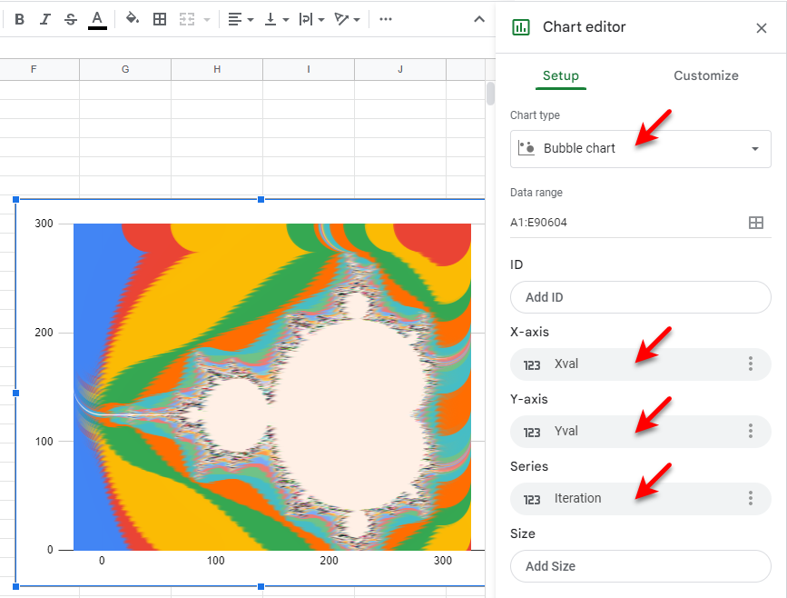
Note that the resolution of the Mandelbrot set is limited by the automatic sizing of the bubbles, and the ability to change the color pallete is very limited.
Tool to Make Fractal Charts Online for Free
To easily and quickly create Fractal Charts online for free, create a Free Individual Account on the InetSoft website. You will then be able to upload a text data set, as shown below:

Once you have done that, you will be able to proceed to the Visualization Recommender, which will get you started creating a dashboard. To start with a fractal plot, though, you can skip the Recommender by pressing the Finish button at the top bar of the Recommender. Then press Continue to go to Visual Composer.
Proceed to add a Chart component using Visual Composer, and follow the steps shown earlier to create the desired fractal chart.