Funnel Charts - Definition, Examples, and How-To
This article will discuss the uses of Funnel Charts, how you can create them in Google Sheets and InetSoft, and will provide access to a free online tool for creating Funnel Charts and complete functioning business intelligence dashboards.
Contents
Definition of a Funnel Chart
Why Use a Funnel Chart?
How to Make a Funnel Chart
How to Create a Chart in Google Sheets
Tool to Make Funnel Charts Online for Free

Definition of a Funnel Chart
A Funnel Chart typically displays the sequential stages of a process, where the aggregate for each stage represents a subset of the aggregate from the previous stage. This results in the characteristic monotonic narrowing that creates the "funnel" shape. An example is shown below:
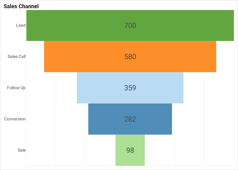
Here each stage in a sales process represents a refinement of the stage above it: Only a fraction of sales leads produce sales calls, while only a fraction of those sales calls yield follow-ups, and so on until the channel ends with the final successful sales numbers. This "funnel" representation is simply a helpful way to visualize the narrowing or "winnowing" of data in each successive stage.
Why Use a Funnel Chart?
The benefit of the Funnel Chart is purely in its aesthetic aspect. A basic Bar Chart can display the same information, and can of course also be sorted to arrange the bars by decreasing value, but the "filter" shape of the Funnel Chart better highlights the relationship of each stage to the prior one, which is successive reduction or limitation of data from the prior level. For some applications or business users, this type of graphic might prove easier to understand than a traditional Bar Chart.
How to Make a Funnel Chart in InetSoft
Creating a Funnel Chart with InetSoft software is extremely simple. The data can be arranged in two different ways. The first arrangement contains the aggregated data exactly as it should appear on the chart. For example:
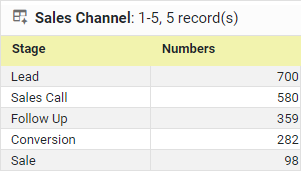
Since this data is already aggregated, the Funnel Chart does not need to aggregate any data; it merely displays the already-aggregated data in graphical form, each row of the table becoming a bar in the chart.
The second arrangement of data is a pre-aggregate data set representing the individual opportunities and their current stages (rightmost column, 'Stage'):
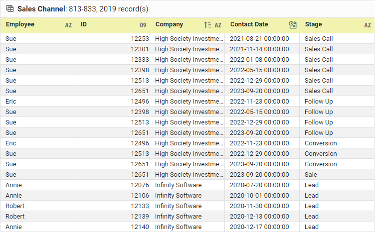
In this data set, individual entries are repeated for each stage that they have passed through; for example, an opportunity in "Follow Up" stage is also present within the data set in "Sales Call" and "Leads" stages. This ensures that each stage in the Funnel Chart represents a restriction on the previous stage. NOTE: Although it would be possible to create a chart without ensuring that each opportunity in a given stage is present also in the previous stages, the result of doing so might be a chart in which the number of items in "Sale" stage is greater than the number of items in "Conversion" stage because the items in the different stages are actually different opportunities. While such a graph may provide an interesting "snapshot" of how many opportunities currently inhabit each stage of the channel, it would not represent the process of how opportunities are moving through the channel, and would not necessarily have a "funnel" appearance.
To create a Funnel Chart based on either of the data arrangements described above, drag a Chart component from the Toolbox panel into a dashboard in Visual Composer, and then press the Edit button to open the Chart Editor.
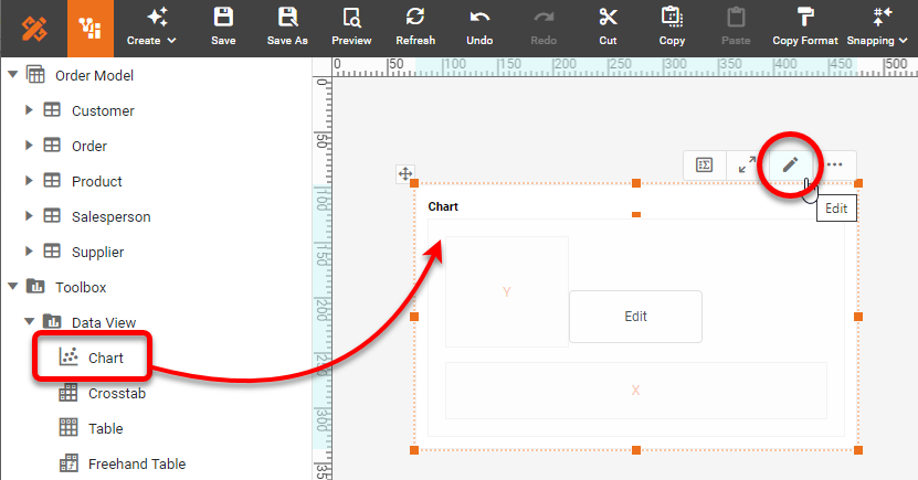
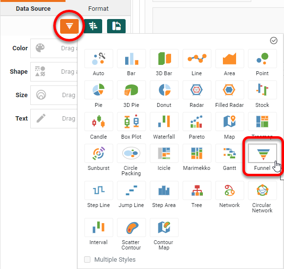
In the Chart Editor, set the Chart Style to Funnel.
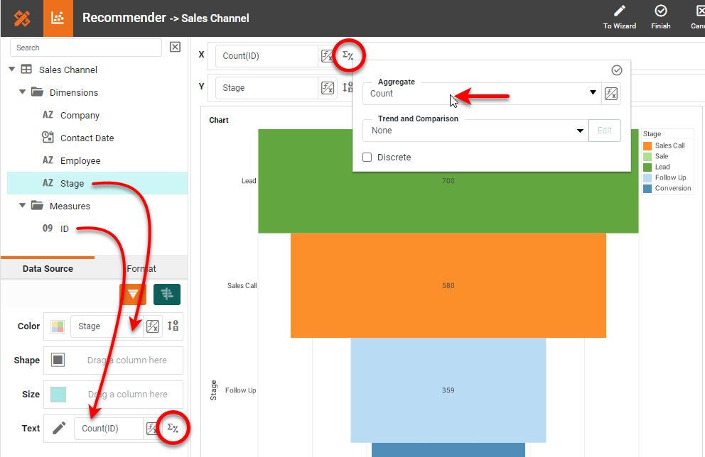
Drag the 'Stage' dimension to the Y region and also the Color region in the Chart Editor. Drag the desired measure (typically the ID that you want to count) to the X region. Press the Edit Measure button next to the measure and choose a desired Aggregate, such as Count or Distinct Count.
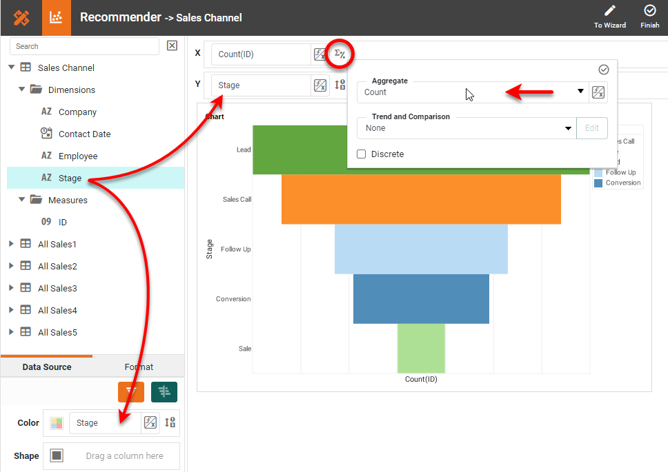
To display the value of the aggregated measure for each stage, drag the measure field to the Text binding in the Chart Editor, and then set the Aggregate appropriately.
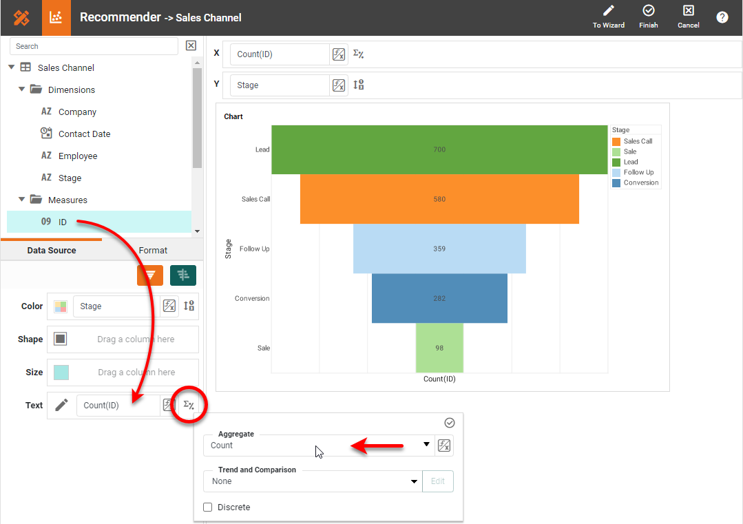
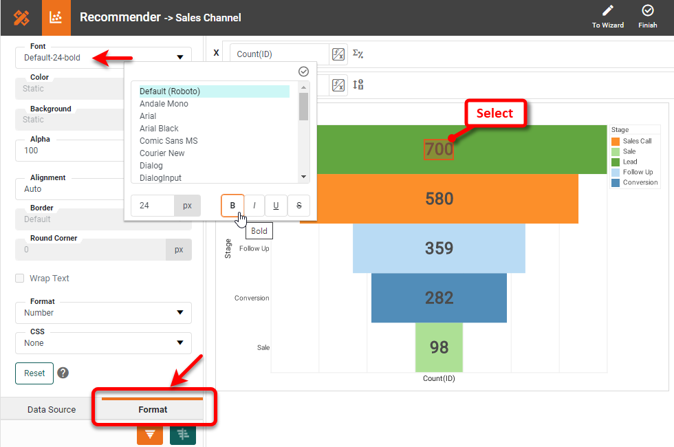
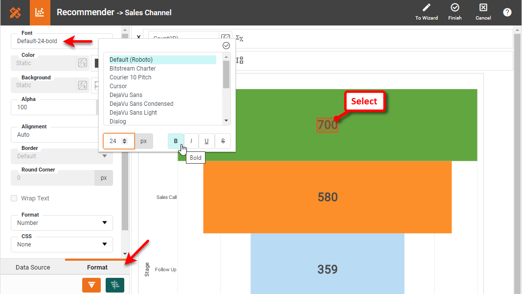
To format the displayed values, select a value on the Chart, and open the Format tab in the left panel.
Press Finish to close the Chart Editor. The Funnel Chart is complete. You can choose to add a chart title and hide the axis titles and legend, since for this type of chart they only add clutter.

How to Create a Funnel Chart in Google Sheets
Creating a Funnel Chart in Google Sheets is cumbersome, because Google Sheets does not natively support this chart type. Instead, hacks must be used to force a regular horizontal bar chart to approximate the appearance of a Funnel Chart. If using aggregated data, the data should be configured as follows:
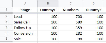
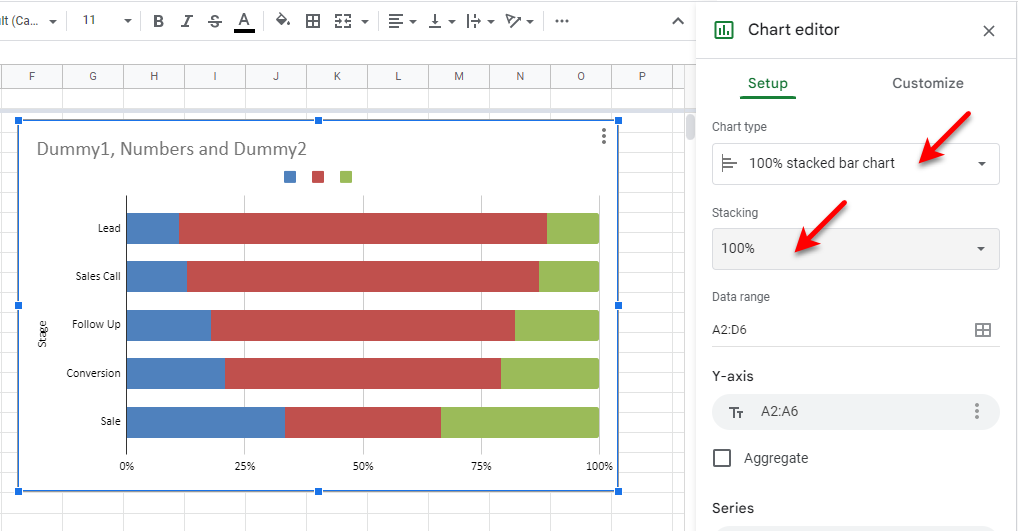
Note that the two "dummy" columns need to be used as padding to center the actual sales channel data, otherwise the chart will not have the appearance of a funnel. Once the data is prepared, add a Chart from the Insert menu, and use the Chart Editor to choose the Bar chart type, and set Stacking to 100%.
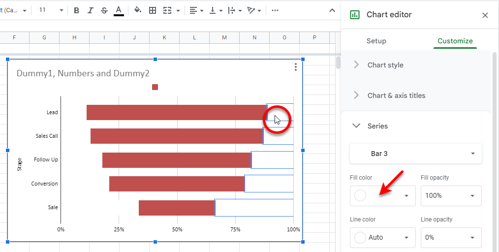
Click on one of the "dummy" bars, and set its Fill color to white. Repeat for the other "dummy" series.
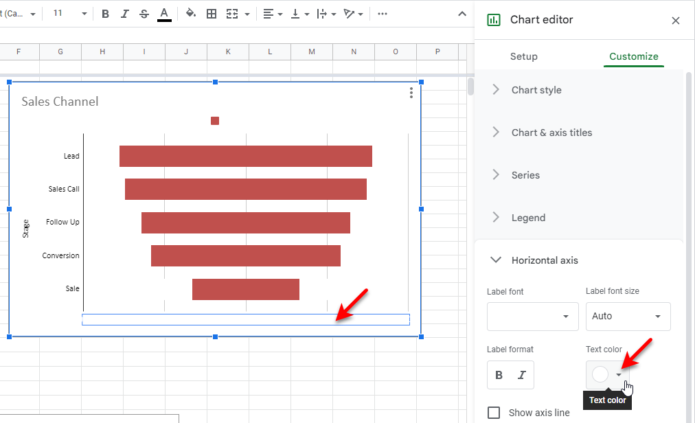
Edit the chart title as desired, and hide the labels on the X-axis by setting their Text color to white.
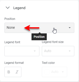
Hide the legend:
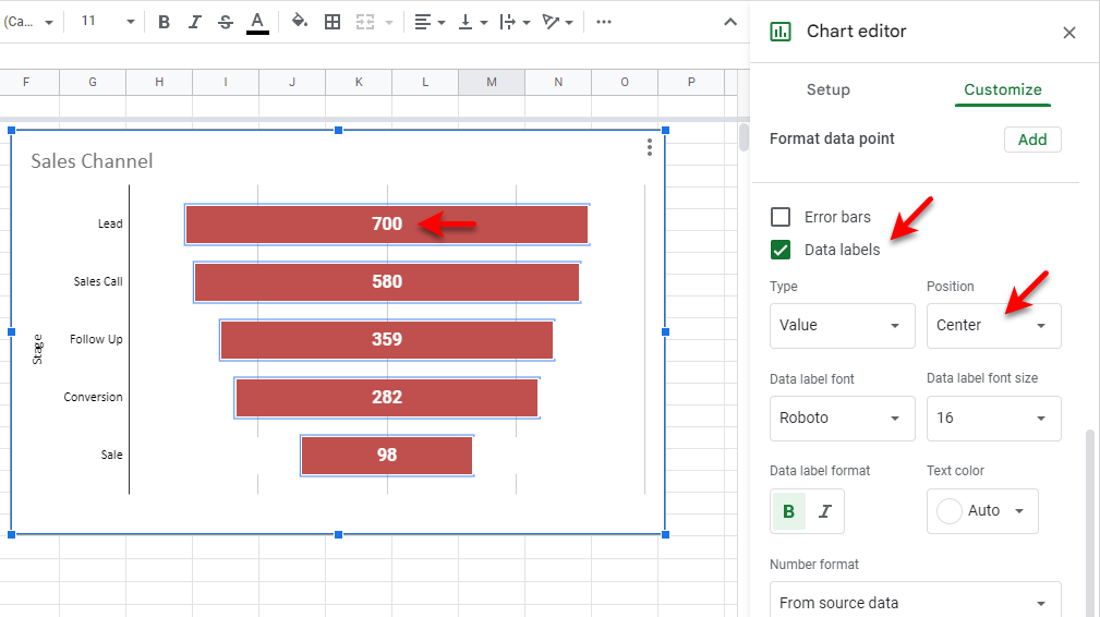
Double-click on one of the bars, and enable Data labels. Set the desired font, position, size, etc.
If desired, set the bars to different colors. To do this, double-click a bar, and set the Fill color for the bar:
It is not possible to move the bars closer together, so this is the best approximation of a Funnel Chart that can be achieved in Google Sheets.
Tool to Make Funnel Charts Online for Free
To easily and quickly create Funnel Charts online for free, create a Free Individual Account on the InetSoft website. You will then be able to upload a spreadsheet data set, as shown below:

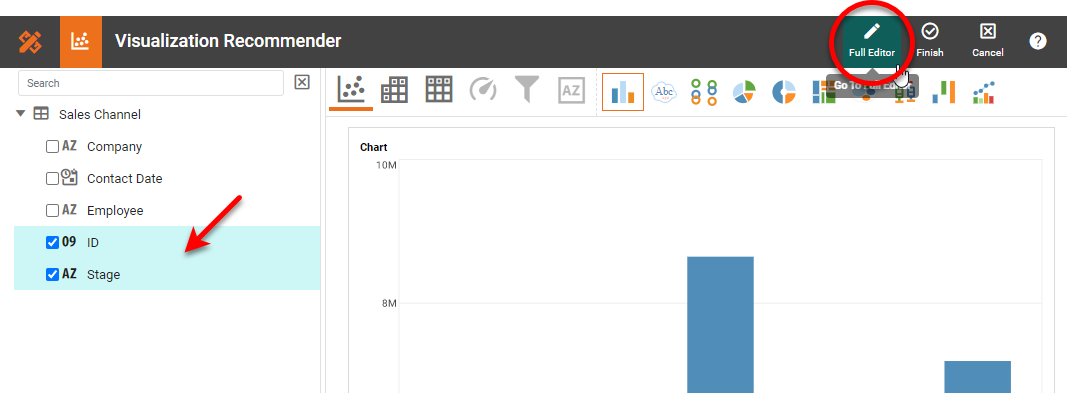
Once you have done that, you will be able to proceed to the Visualization Recommender, which will get you started creating a dashboard. To start with a Funnel Chart, select the 'Stage' field and a measure (e.g., 'ID') that you want to use, and then press the Full Editor button at the top bar of the Recommender.
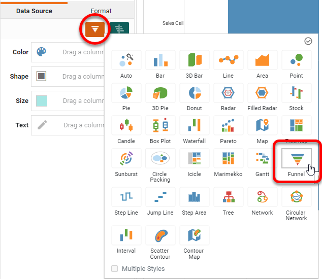
Press Select Chart Style and choose the Funnel option.
Drag the 'Stage' field to the Color region, drag the measure to the Text region, and then set the desired Aggregate for the measure.
Right-click on the legend and select Hide Legend. Click on one of the values displayed on the bars, and select the Format tab. Adjust the font and size as desired.
Press Finish to leave the Visualization Recommender. You can continue to modify the Chart or add other components using the Visual Composer shown earlier.