Great Dashboards for Different Roles: Sales, Finance, Operations, and More
When people search for “great dashboards,” they often overlook one critical factor: greatness depends on the user’s role. A dashboard that works for a sales manager may fail for a finance analyst or an operations director. By tailoring dashboards to specific roles, you ensure that each user sees the most relevant data, in the right format, to take immediate, informed action.


What Makes a Dashboard Great?
Across all roles, a great dashboard should be:
- Clear and uncluttered
- Visually intuitive with appropriate charts
- Fast-loading with accurate, up-to-date data
- Interactive with drill-down capabilities
- Accessible on devices used in daily workflows
However, the content and layout of a dashboard should change based on user needs. Here is how to define what makes a dashboard great for different roles within your organization.
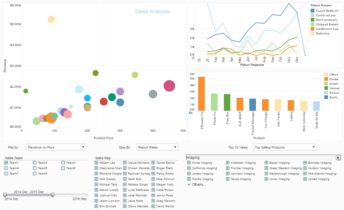
1. Great Dashboards for Sales Teams
Sales dashboards should help teams monitor performance against goals, identify pipeline bottlenecks, and focus on high-value opportunities. Key features include:
- Leaderboard charts showing top performers
- Pipeline funnel visualizations
- Sales vs. quota tracking by rep, region, and product line
- Deal stage analysis to detect where deals are getting stuck
- Real-time alerts on new leads or closed deals
Great sales dashboards use bar charts, funnel charts, and trend lines, keeping visuals colorful but not overwhelming to drive motivation and focus.
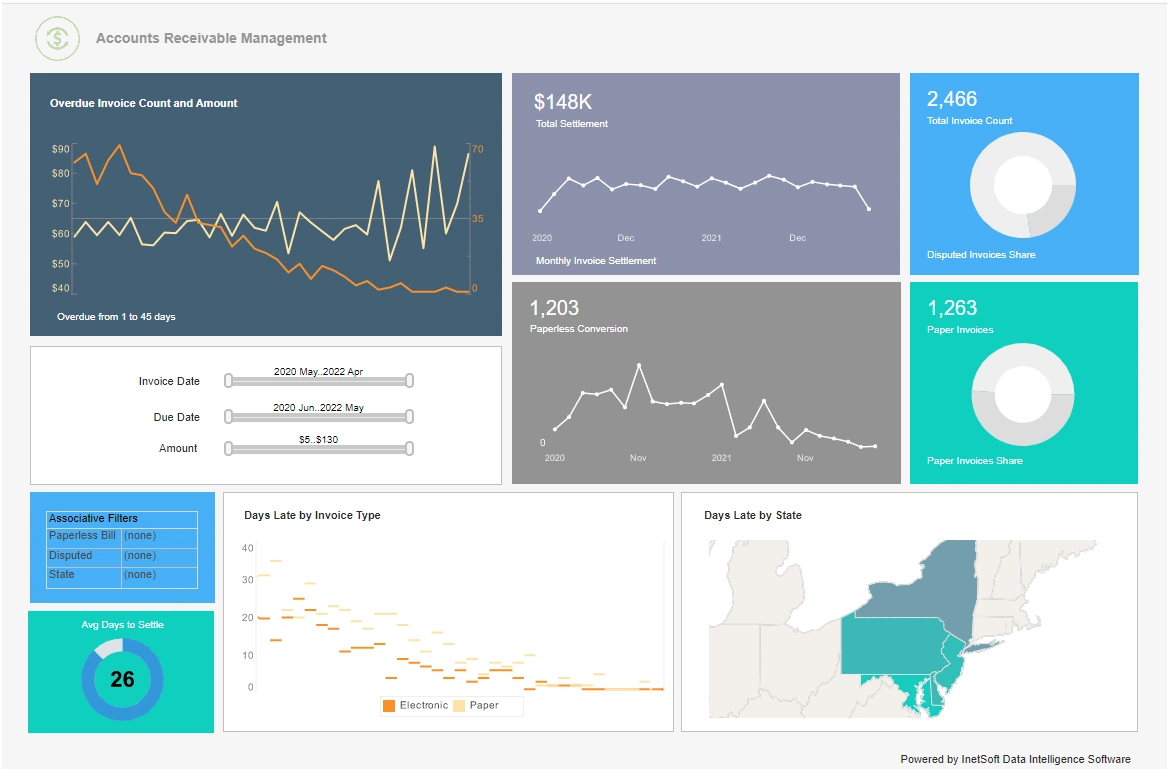
2. Great Dashboards for Finance Teams
Finance teams need dashboards that emphasize accuracy, trends, and forecasting. These dashboards typically feature:
- Cash flow tracking with daily, weekly, and monthly views
- Expense vs. budget variance analysis
- Profitability KPIs such as gross margin and net income
- Forecast vs. actual comparisons
- Balance sheet summaries
Line charts, waterfall charts, and heatmaps are often effective, along with conditional formatting to highlight variances that require attention.
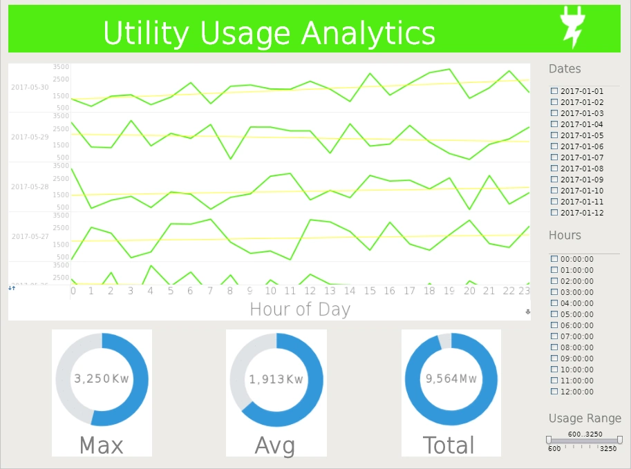
3. Great Dashboards for Operations Teams
Operations managers rely on dashboards to monitor process efficiency, track KPIs, and address bottlenecks in real time. Key elements include:
- Production or delivery KPIs against daily targets
- Quality control metrics such as defect rates
- Inventory levels and turnover rates
- Cycle time and throughput visualizations
- Heatmaps for geographic or equipment performance
Great operations dashboards favor bullet charts, gauges, and color-coded indicators for rapid scanning during daily standups or shift handoffs.
4. Great Dashboards for Marketing Teams
Marketing teams need dashboards that demonstrate campaign performance, audience engagement, and lead generation effectiveness to optimize spend and strategy. Great marketing dashboards typically include:
- Traffic source breakdowns by channel and campaign
- Conversion funnel visualizations from visitor to lead to customer
- Cost per lead (CPL) and return on ad spend (ROAS) tracking
- Social media engagement metrics
- Email campaign open and click-through rates
Effective marketing dashboards often use stacked bar charts, funnel charts, and line charts with clear color coding to quickly spot which channels and campaigns are driving performance while identifying underperforming areas for optimization.
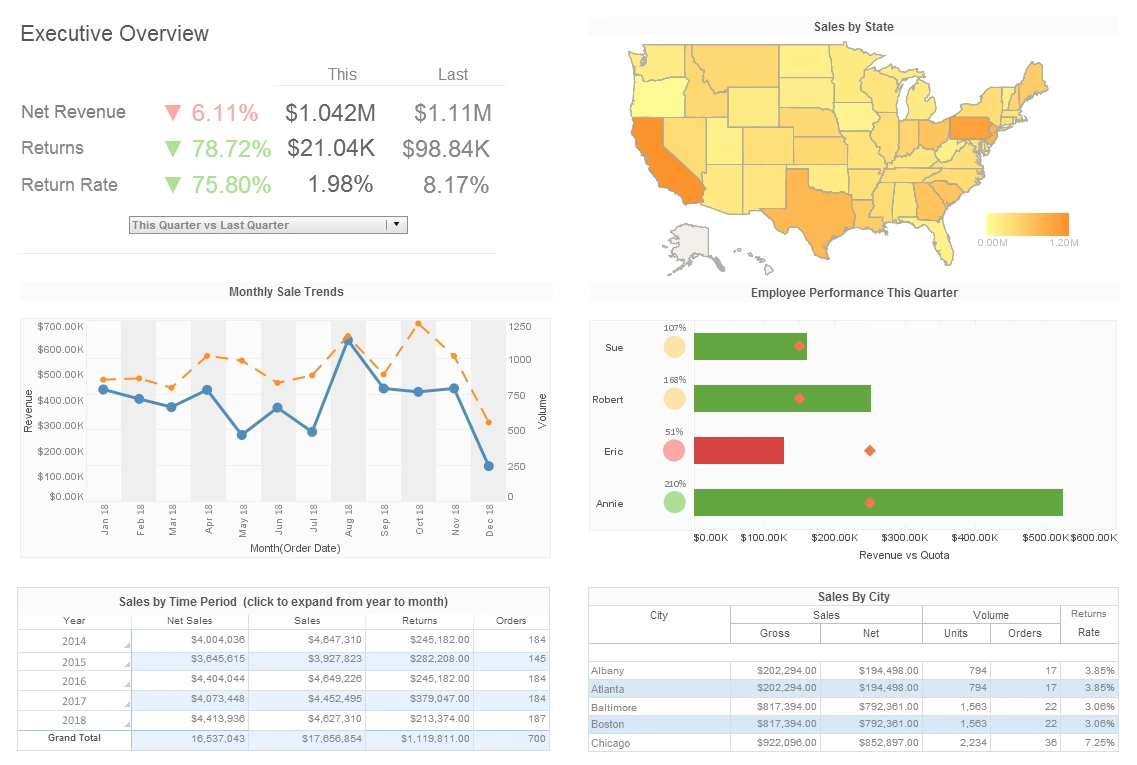
5. Great Dashboards for Executive Teams
Executives need high-level, strategic dashboards that provide a clear snapshot of the organization's health. These dashboards often include:
- Revenue, profitability, and cash metrics
- Top-level sales and pipeline summaries
- Customer satisfaction or NPS scores
- Employee engagement or HR metrics
- Strategic goal progress tracking
Great executive dashboards minimize detail while emphasizing trends and exceptions, using clean layouts and interactive drill-down options for deeper exploration when needed.
Best Practices for Building Role-Based Dashboards
- Involve end-users early to understand what they need to see daily vs. weekly vs. monthly.
- Limit the number of KPIs on the landing page to avoid clutter.
- Use interactivity to allow filtering by region, product, or time period.
- Ensure dashboards are mobile-friendly if teams use tablets or phones on the floor or in meetings.
- Keep branding and colors consistent to reduce cognitive load.
Choosing the Right Tool for Great Dashboards
Building role-optimized dashboards is much easier with a flexible BI platform. Tools like StyleBI allow teams to:
- Embed interactive dashboards into portals or applications
- Set up role-based access for data security
- Enable fast, in-memory analytics on large datasets
- Customize visual styles while maintaining consistency across dashboards
If you want to build dashboards that are truly “great” for your users, start by defining what greatness means for each role, and then match your tool and design strategy to deliver clarity, actionability, and user adoption.