How to Create a Finance Dashboard Report
This article will explain how to create a finance dashboard using dashboard creation software
from InetSoft. A working version of this dashboard can be found on the InetSoft Gallery.
Contents
Create a Finance Chart
Add Filters
Add a Gauge Chart
Add a Filter Container (Associative Filters)
Create a Jump Line Chart
Create a State Map Chart
Add Custom Tooltips to Charts
Summary

Create a Finance Chart
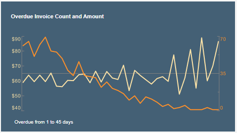
We will first consider the following chart, which shows the overdue invoice count and amount in dollars. The Chart is important because it shows an interesting divergence in the number of late invoices and the corresponding amounts. While there are fewer overdue invoices at longer overdue intervals, the average value of those long-overdue orders tends to be higher.
The following steps outline the process of creating this chart:
This is a very simple chart to create with InetSoft. To do this, first add a new Chart component into the dashboard using Visual Composer.
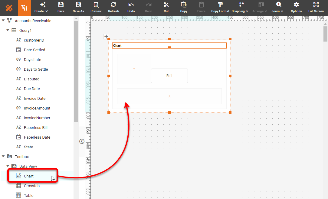
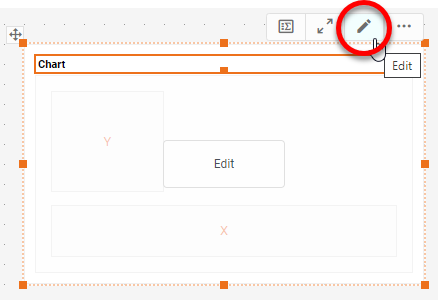
Press the Edit button on the Chart to open the Chart Editor.
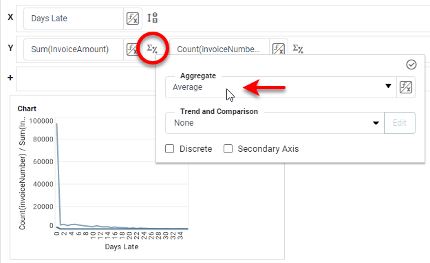
In the Chart Editor, place the desired dimension ('Days Late') and the two measures
('InvoiceNumber' and 'InvoiceAmount') on the appropriate axes.
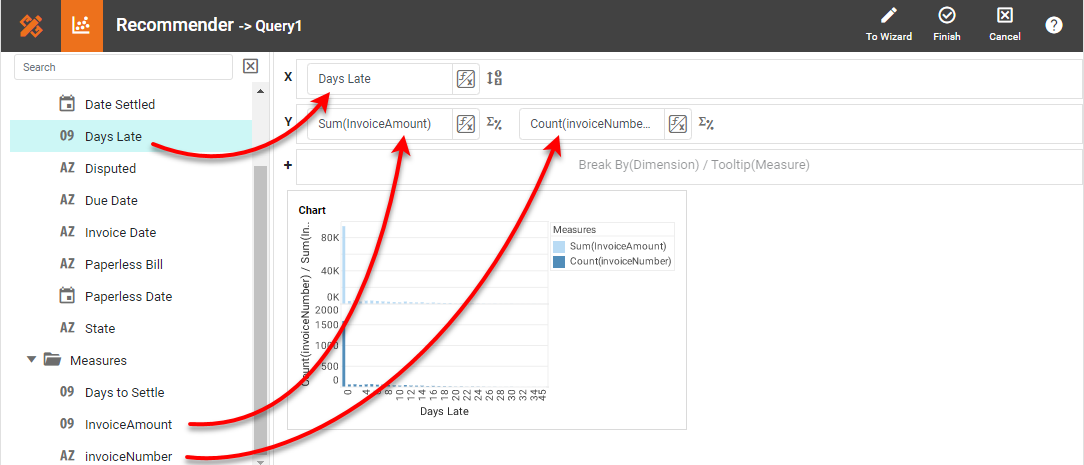
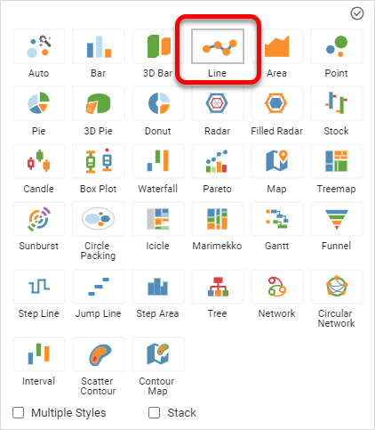
Choose a Line Chart style and switch to Single Axis to overlay the two
measures.
Set the Aggregate method to Average for the 'InvoiceAmount' measure.
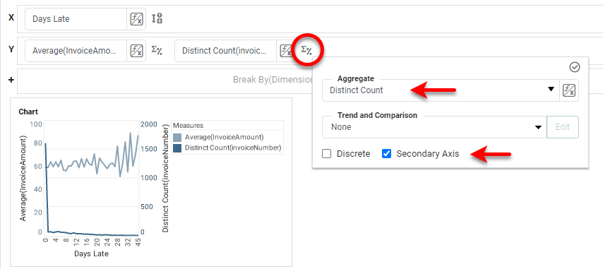
Set the Aggregate method for 'InvoiceNumber' to Distinct Count, and enable
the
Secondary Axis option. This allows the second measure to be plotted on the right axis of the chart.
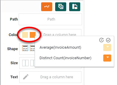
Assign the desired colors to the two measures.
Press Finish to exit the Chart Editor. Right-click the Chart legend and select
Hide
Legend. Hide all of the axis titles and the X-axis labels in the same way. Delete the Chart title if
desired.
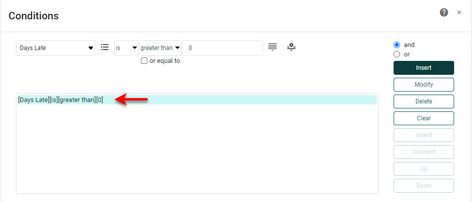
Note that the Chart contains an artifact for number of orders where the X axis is zero,
since
most orders were not delayed at all. To eliminate this point, right click the Chart, and select
Conditions. Then apply a filter condition to include orders only where Days Late > 0.
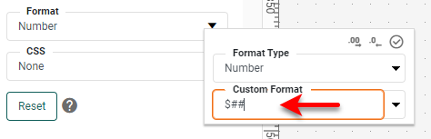
Apply a format to the left side axis labels. To do this, right click the labels and select
Format. Enter the following Custom number format: $##.
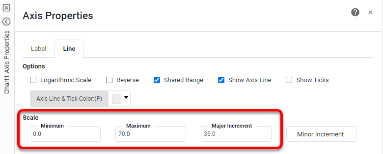
Finally, right-click on the secondary (right-side) axis labels, and select Axis
Properties. Then enter the maximum, minimum, and increment values shown below:
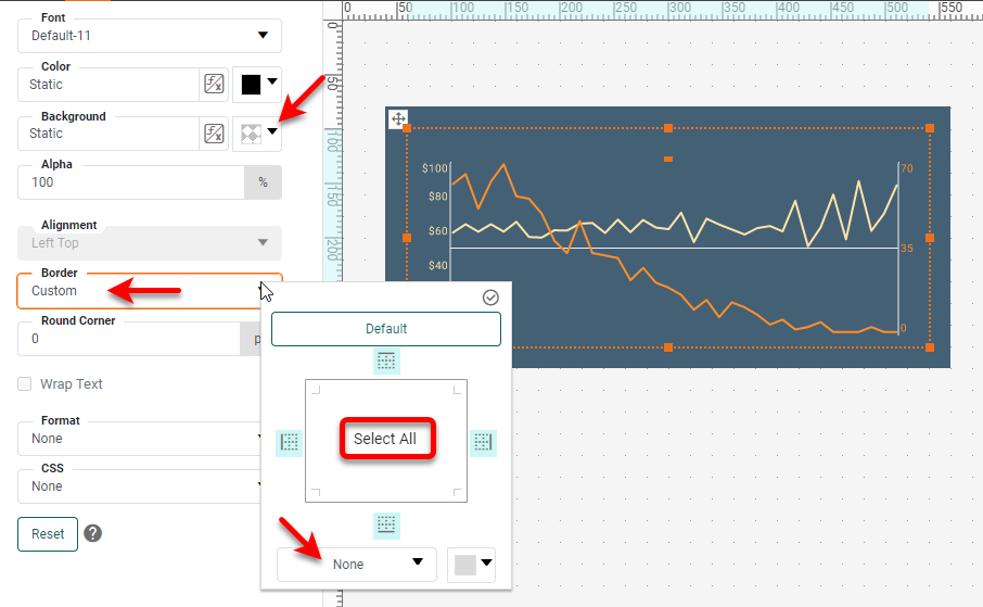
To make the Chart exactly match the example, set a transparent Background for the
Chart, set the Border to None, and place a gray Rectangle component behind the chart. The Chart is
now complete.
Add Interactive Filters to Dashboard
Below the Chart in the example dashboard there are three filters called Range Sliders.
These
enable the user to restrict the range of Invoice Date, Due Date, and Amount. These types of filters are
essential to making a dashboard dynamic and flexible because they enable the user to focus on the
particular
data they need to see. The interactivity provided by filters, as well as by other interactive elements, is
a
very large part of the InetSoft exploratory dashboard experience.
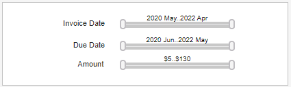
To add Range Sliders like these to a dashboard, you can simply drag a Date-type or
Numerical-type field onto the dashboard canvas in Visual Composer. Alternatively, you can first drag a new
Range Slider component into the dashboard, and then drag the desired field onto the blank Range Slider.
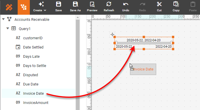
Repeat to add the additional Range Sliders. To format the dates on the Range Sliders,
select a
Range Slider and use the Format tab on the left side to assign a desired date format.
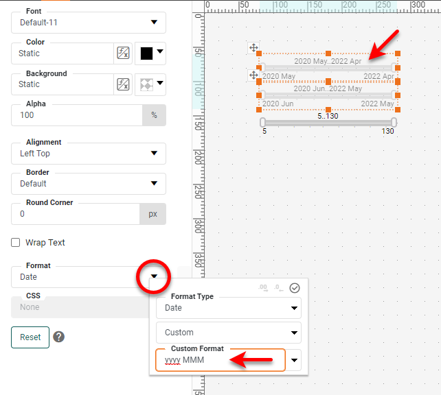
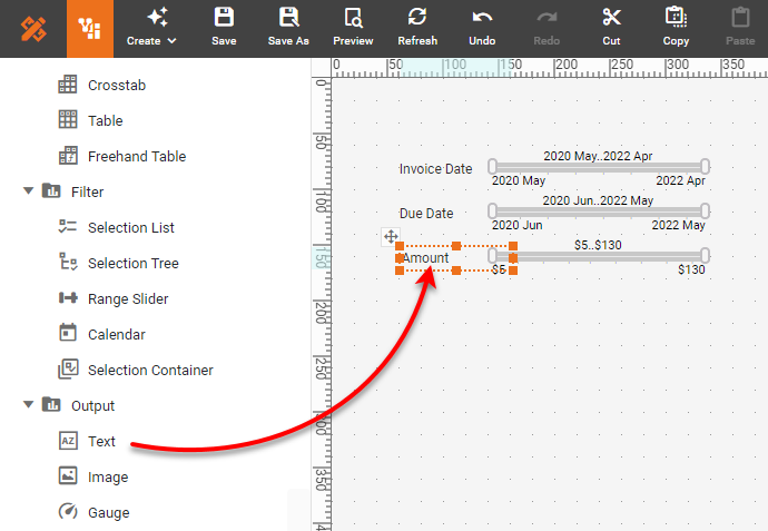
Use the same approach to add a "$" format to the third Range Slider. Then drag some Text
components into the dashboard and enter the appropriate labeling.
r
The filters are now operational, and will automatically filter the data on the Chart and
any other data view components in the dashboard.
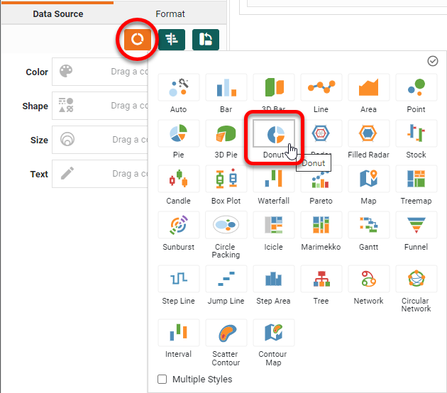
Add a Gauge Chart to Finance Dashboard
A Gauge displays a single measure, such as the disputed invoice share in our example.
InetSoft has two ways to create a Gauge such as this, either by using the dedicated Gauge component or using
the Donut chart style of the Chart component.
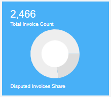
Let's see how to do this using the Donut chart. First add a new chart to the dashboard.
Open
the Chart Editor (see earlier for instructions on how to do this). Change the Chart Style to a
Donut.
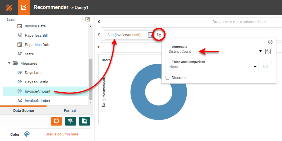
Drag the 'InvoiceAmount' to the Y region, and set the Aggregate to
Distinct
Count.
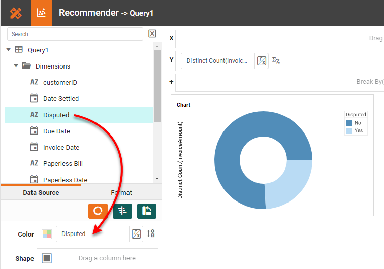
Drag the 'Disputed' field to the Color region to break out the invoices according
to
disputed status.
Hide the legend, the axis title, and the Chart title, and press Finish to complete
the
Gauge Chart. To add a digital display of the total invoice count such as in the example dashboard, drag a
Text
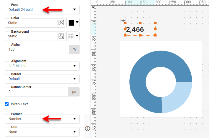
component into the dashboard. Then drag the 'InvoiceNumber' field on top of the Text component.
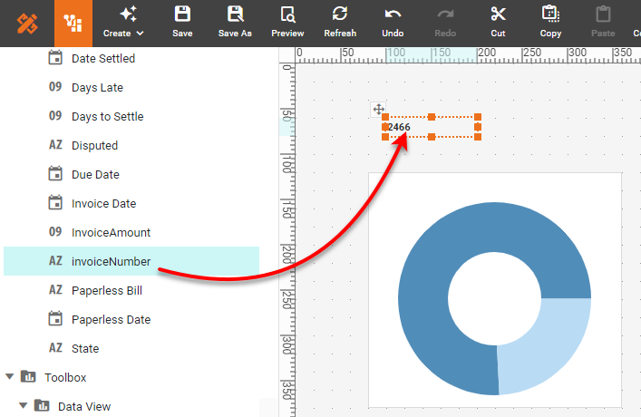
Use the Format panel to set the Format and Font.
You can position the Text and the Gauge as you want, add any explanatory text, and set the
background colors as desired.
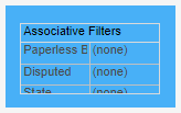
When you want to conserve space on a dashboard, you can combine filters into a Selection
Container, such as the Associative Filters on the example dashboard. This combines filters for 'Paperless
Bill', 'Disputed', and State' into a single unit, utilizing expanding lists to save dashboard real estate.
To create something like this, first add a Selection Container into the dashboard. Then
drag
the fields that you want to filter into the Selection Container.
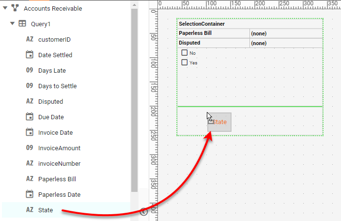
Resize the Selection Container as desired, and double-click the title to enter a new
title.
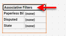
If desired, place a colored Rectangle component behind the Container, and use the
Format panel to set a transparent background for the Container. Adjust any other colors or borders
as
desired using the Format panel.
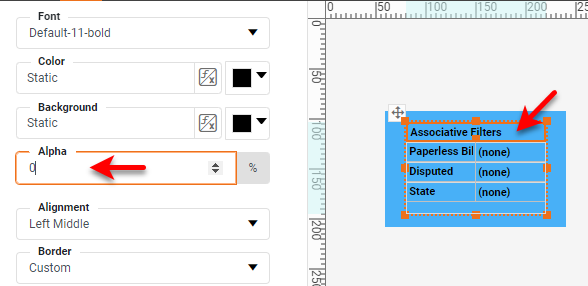
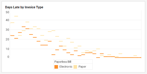
The example dashboard features a 'Days Late by Invoice Type' Chart. This is a less dense
variation of a bar chart that may be easier to read in some cases.
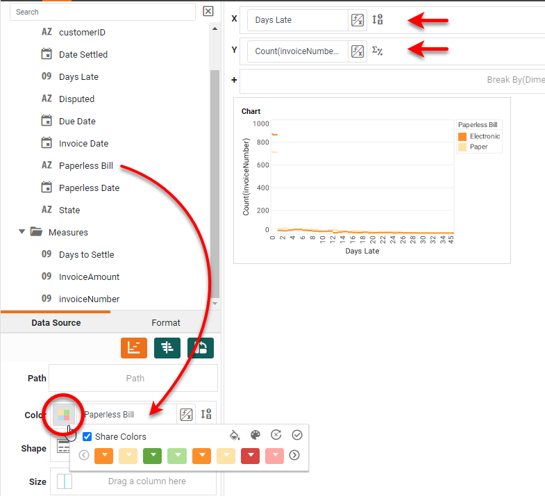
It is very easy to create this kind of Chart. First add a new Chart as before, and open
the
Chart Editor. Drag the 'Days Late' field to the X region and drag 'InvoiceNumber' to the Y
region. Drag 'Paperless Bill' field to the Color region. Press the Select Chart Style
button,
and choose the Jump Line style. Set the colors of the two paperless options as desired by pressing
the
Edit Color button.
r
This Chart obviously suffers from the same "Days Late = 0" problem that we saw
in
the first Chart, so, as we did earlier, set a Condition on the Chart so that Days Late >
0.
Then enter a Chart title, hide the X-axis, X-title, and Y-title, and drag the legend to the bottom of the
Chart.
r
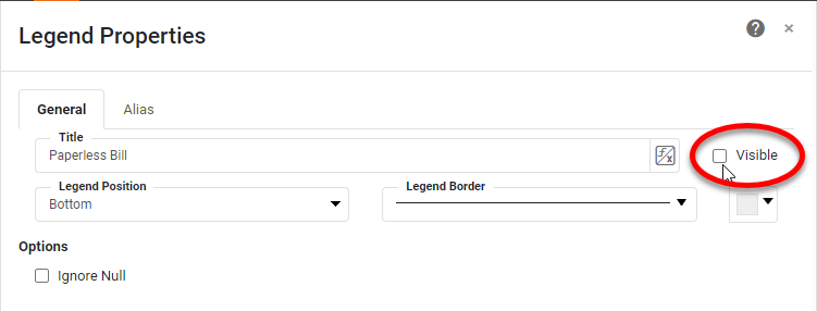
To hide the legend title, right-click on the legend, and select Legend Properties.
Disable the Visible property for the legend title.
r
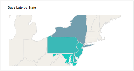
The example dashboard features a 'Days Late by State' Chart. Map charts are an
increasingly
popular method of displaying data that has some geographical connection, both because a map immediately
gives
spatial meaning to the data, and because users have become extremely accustomed to seeing data mapped on
Google Maps and other similar services. If data can be mapped, then users will expect to see a map.
r
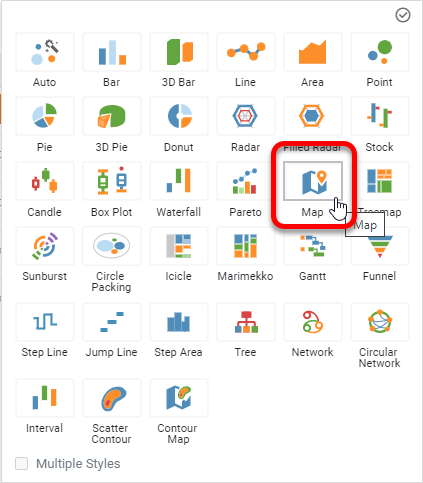
This is a very easy Chart to create because InetSoft provides a built-in Map Chart style.
InetSoft maps support both MapBox and Google Map backgrounds, but this particular map uses the default
background. To create it, first add a Chart to the dashboard and open the Chart Editor. Set the Chart
Style to Map:
r
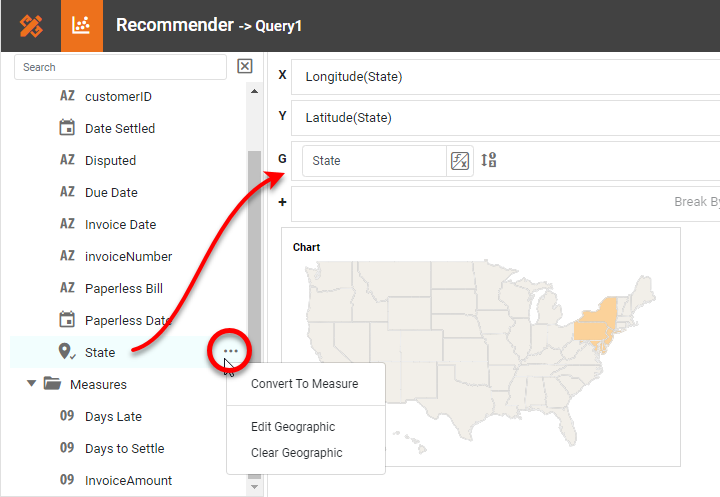
Mark the 'State' field as a Geographic field, and drag it to the G region in
the
Editor.
r
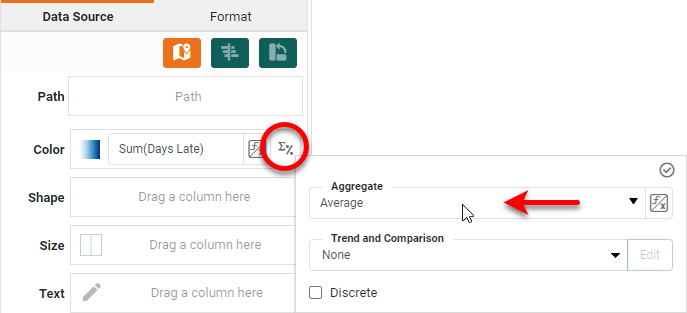
Drag the 'Days Late' field to the Color region, and set the Aggregate to
Average.
r
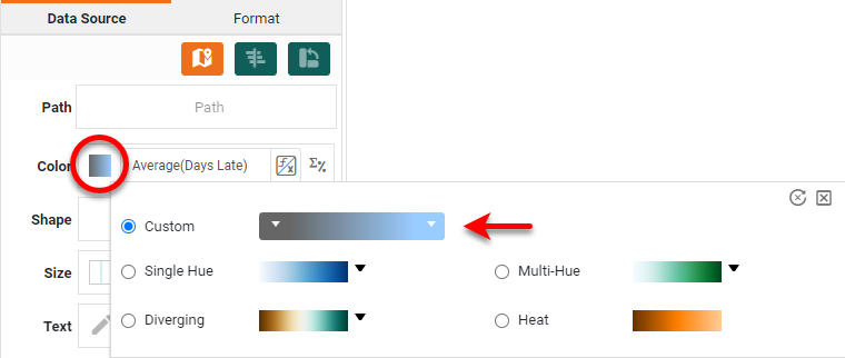
Change the color scale to use the desired start and end colors:
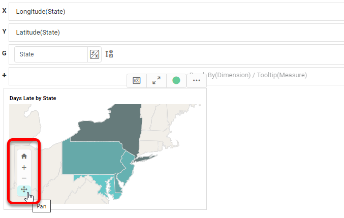
Hide the legend, and edit the Chart title as desired. Use the Pan and Zoom tools to
arrange
the initial map view. You can use these tools outside of the Chart Editor also.
This completes the Map Chart. Users will be able to pan and zoom the chart to achieve the
view they desire.
Add Custom Tooltips to Charts
An interesting feature of the sample dashboard is that most of the Charts feature
custom tooltips. For example, the Map Chart displays a tooltip such as that below:
To create a custom tooltip such as this, right-click the Chart and select
Properties.
In the Chart Properties dialog box, press the Customize button next to the Tooltip option.
Then
select Custom and enter the following custom tooltip: "{1} bills are paid {0} days late on
average". The numbers indicate the places where the relevant values are to be inserted based on where
the
user is pointing on the map.
r
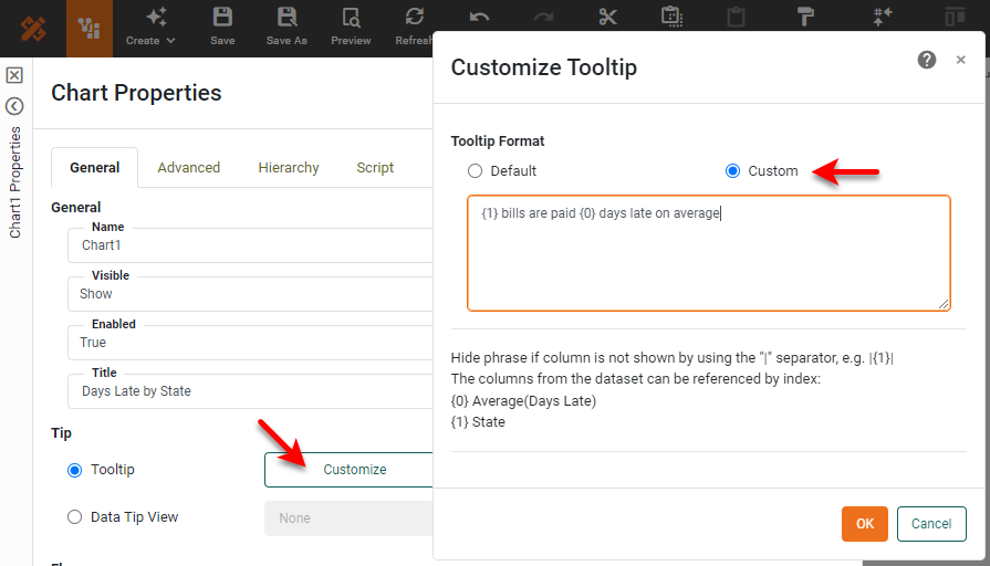
Press OK and close the dialog box to add the custom tooltip.
Summary
This article has illustrated a few of the techniques used to create a dynamic financial dashboard. InetSoft makes it quick and easy to display KPIs and key data series using Gauges and Charts, and facilitates exploration and interaction by providing a wide variety of filtering capabilities. For advanced finance needs, InetSoft also provides a complete finance scripting library including a variety of fiscal calendar conversions, interest computations, and many other tools to assist the design of financial dashboards.
We will help you get started
Contact us