How to Create a Churn Dashboard
What is a Customer Churn Dashboard?
A customer churn dashboard is a visual representation of key metrics and data related to
customer churn within a business. Customer churn refers to the rate at which customers stop using a product or
service and switch to a competitor or discontinue their usage altogether. The churn dashboard provides a
snapshot of customer churn patterns, trends, and insights, allowing businesses to monitor and analyze their
customer retention efforts.
The dashboard typically includes various visualizations and charts that summarize important
churn-related information. Here are some common elements you might find in a customer churn dashboard:
- Churn Rate: This metric shows the percentage of customers who have churned within a
specific period. It helps track the overall churn trend.
- Churn Cohorts: Cohort analysis categorizes customers based on their signup or acquisition
dates. By analyzing churn rates within different cohorts, businesses can identify patterns and understand if
certain customer segments are more prone to churn.
- Customer Segmentation: The dashboard may present churn data segmented by different
customer attributes such as demographics, geography, or purchase history. It helps identify high-risk
customer segments and tailor retention strategies accordingly.
- Churn Reasons: This section provides insights into why customers churn. It may include a
breakdown of churn reasons, such as price, product dissatisfaction, poor customer service, or competition.
Understanding the reasons behind churn helps businesses address specific pain points.
- Customer Lifetime Value (CLV): CLV represents the predicted revenue a customer generates
over their lifetime as a customer. Monitoring CLV alongside churn allows businesses to assess the financial
impact of customer attrition.
- Retention Initiatives: The dashboard may include information about ongoing retention
initiatives and their effectiveness. It helps evaluate the impact of various strategies and interventions
aimed at reducing churn.
- Predictive Analytics: Advanced churn dashboards may leverage predictive analytics to
forecast future churn rates based on historical data and customer behavior patterns. This enables proactive
churn prevention and intervention.
By using a customer churn dashboard, businesses can gain valuable insights into their customer
base, make data-driven decisions, and implement targeted strategies to improve customer retention and reduce
churn rates.
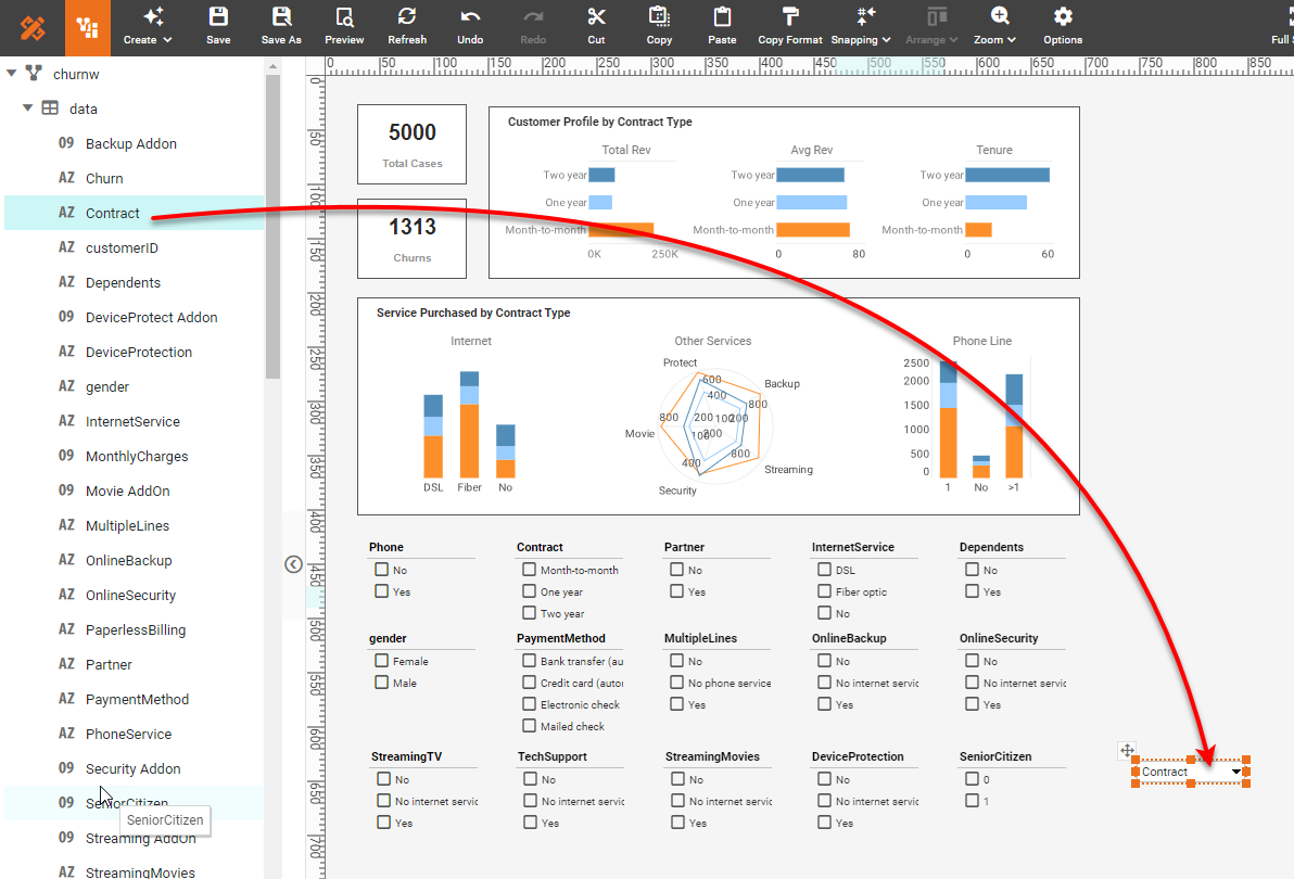
Create a Churn Dashboard
For the example churn dashboard found on the InetSoft Gallery, we
will consider the creation of some of the main elements:
- Text KPIs ('Total Cases', 'Churns, 'Priority')
- Charts: Bar, Radar, Pie, Scatter
- Filters: Selection Lists and Range Sliders
- Forms: ComboBox Menu
The following sections will illustrate the steps required to design this primary
functionality.
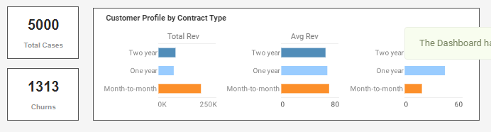
Add KPIs
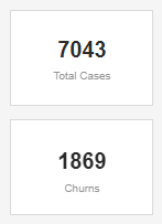
First consider the following KPIs.
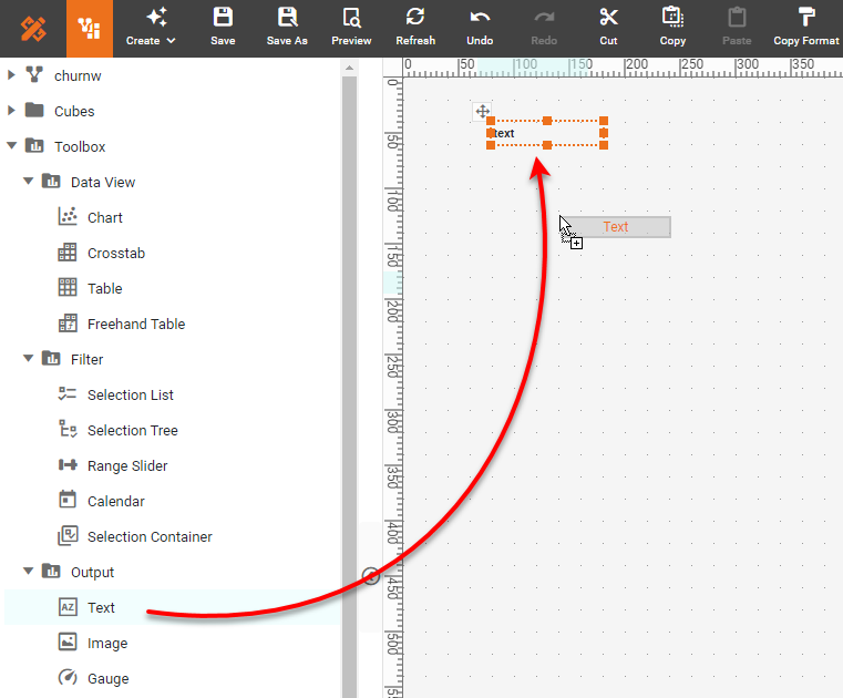
To create these KPIs, first drag a Text component from the Toolbox panel into the
dashboard using Visual Composer.
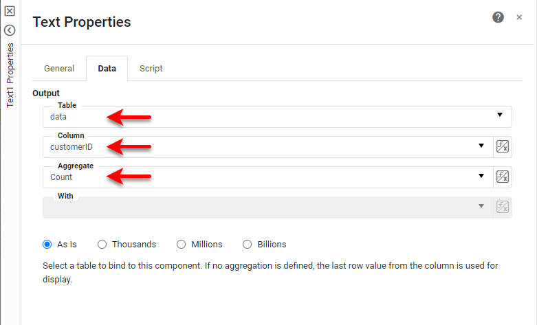
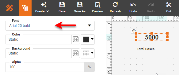
Right-click the Text component and select Properties from the context menu. In the Text
Properties dialog box, select the Data tab. Choose data as the 'Table', customerID as
'Column', and Count as 'Aggregate'. Press OK.
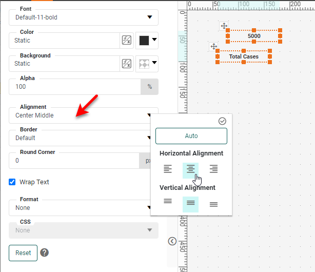
Drag in another Text component, and enter the text "Total Cases". Select both Text
components by dragging across them, and then select the Format tab in the bottom left panel. Set
Center Middle as 'Alignment' for both.
Now select just the top Text component, and choose a large bold font from the Format
panel.
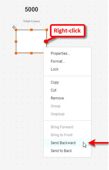
For the "Total Cases" text, set a small gray font. Drag a Rectangle component from
the Toolbox onto the dashboard. Use the Format panel to set a white 'Background' color. Then
right-click the Rectangle and select Send to Back (or Send Backward as many times as required).
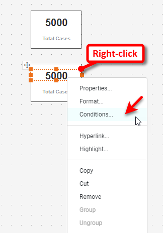
Drag the Rectangle behind the Text elements to provide a background. Then select all three
components by dragging across them. Copy and paste them (you can Ctrl-drag the group to do this, or use
the 'Copy' and 'Paste' menu commands) below the first group. Right-click the Text component in the second
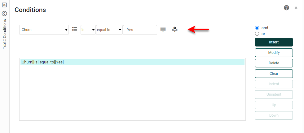
group, and select Conditions.
Add the following condition and press OK.
Change the Text label above the KPI from "Total Cases" to "Churns."
Add Bar Charts
We will now add the three bar charts below.
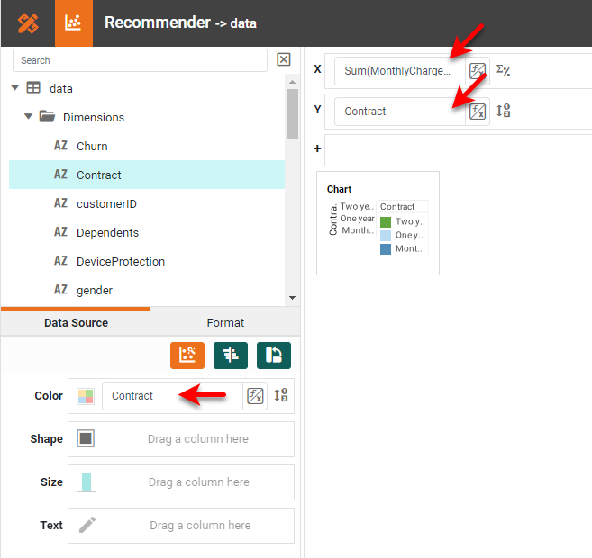
Drag a Chart component from the Toolbox into the dashboard. Use the resize handles on
the Chart to size the Chart to occupy a small square region. Press the Edit button to open the Chart
Editor. Drag the 'MonthlyCharges' field from the Measures folder of the 'data' data block to the
X region. (All the fields for these Charts can be found in the 'data' data block.) Drag the
'Contract'
field from the Dimensions folder to both the Y and Color regions.
Right-click on the legend and select Hide Legend. Right-click on the Y-axis and
X-axis
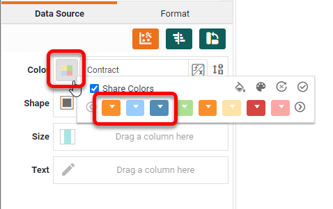
titles, and select Hide Title for each. Press the Edit Color button, and set the colors shown
below.
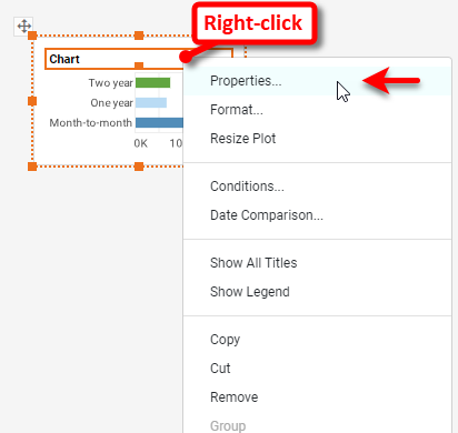
Press Finish to close the Editor. Right-click on the Chart and select
Properties.
Under the General tab of the 'Chart Properties' dialog box, turn off the
Visible
property next to 'Title'. Under the Line tab, set the 'X Grid' line to NONE. Press OK.
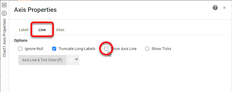
Right-click on the Y-axis and select Axis Properties. Under the Line tab, disable Show Axis
Line.
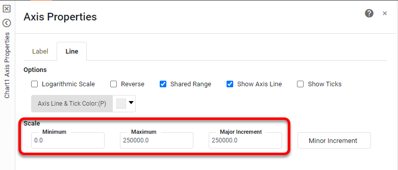
Right-click the X-axis and select Axis Properties. Under the Line tab, set the
Scale options as shown below:
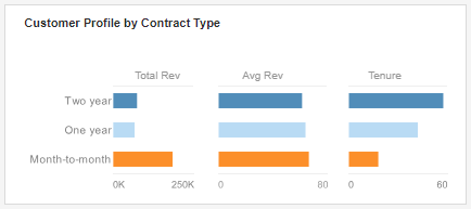
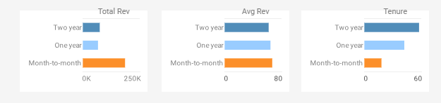
Add a Text element above the Chart that says "Total Rev". Chang the font size and
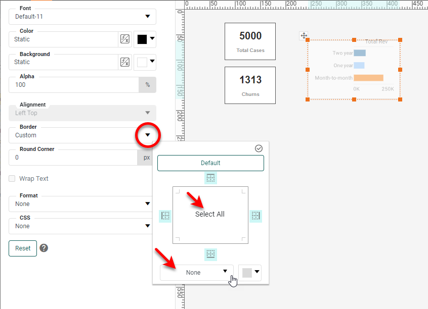
color for the labels as desired. Use the Format panel to remove the border from the Chart component.
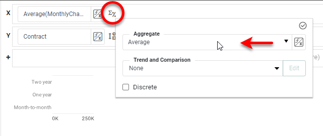
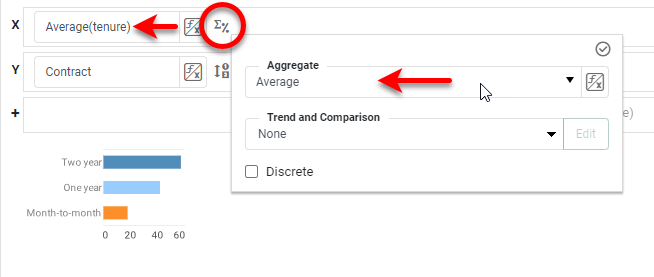
Make two copies of the Chart. Open the Chart Editor for the first copy. Press the Change
Measure button and change the 'Aggregate' for the X-axis to Average.
Right-click the X-axis and select Axis Properties from the menu. Under the
Line
tab, set the following limits, and press OK. Exit the Chart Editor.
Change the label above the Chart to "Avg Rev".
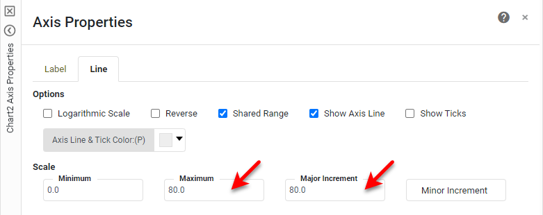
For the second copy, open the Chart Editor, and set the X measure to 'tenure' and the
'Aggregate' to Average.
Use the 'Axis Properties' dialog box to set the axis Maximum and Major
Increment
to 60, and change the label above the chart to "Tenure".
Drag a white Rectangle from the Toolbox and place it behind the three charts
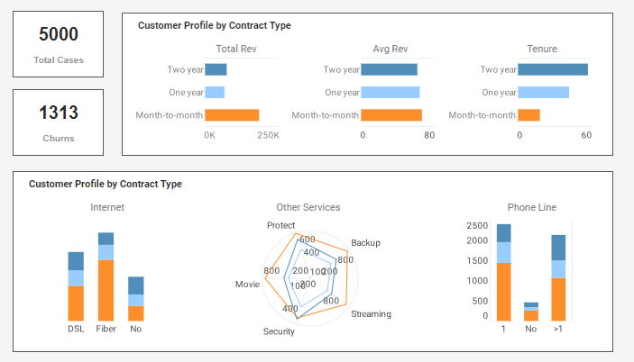
(right-click, Send to Back), and add a group label "Customer Profile by Contract Type".
Create another group of Charts by selecting, copying, and pasting the entire block of three
charts you just created. For the first and third charts, make the following changes using the Chart Editor.
- For the first Chart, place the 'InternetService' field in the X region, and the
'CustomerID' field in the Y region. NOTE: Before placing 'CustomerID', right-click the 'CustomerID'
field and select Convert to Measure from the context menu. The 'Aggregate' should be set to
Count by default. Hide the Y-axis, and use the Line tab of the 'Axis Properties' dialog box
to
hide the lines for the X-axis (turn off Show Axis Line). Use the Label tab to set horizontal
orientation for the labels, and use the Alias tab to change the "Fiber optic" label to
"Fiber". Change the label above the Chart to "Internet".
- For the third Chart, place the 'MultipleLines' field in the X region, and the
'CustomerID' field in the Y region. NOTE: Before placing 'CustomerID', right-click the 'CustomerID'
field and select Convert to Measure from the context menu. The 'Aggregate' should be set to
Count by default. Hide the Y-axis, and use the Line tab of the Axis Properties dialog
box to hide the lines for the X-axis (turn off Show Axis Line). Use the Label tab to set
horizontal orientation for the labels, and use the Alias tab to change the "Yes" label to
">1", the "No" label to "1", and the "No phone service" label
to
"No". Change the label above the Chart to "Phone Line".
For the middle Chart, make the following changes in the Chart Editor: Press the Select
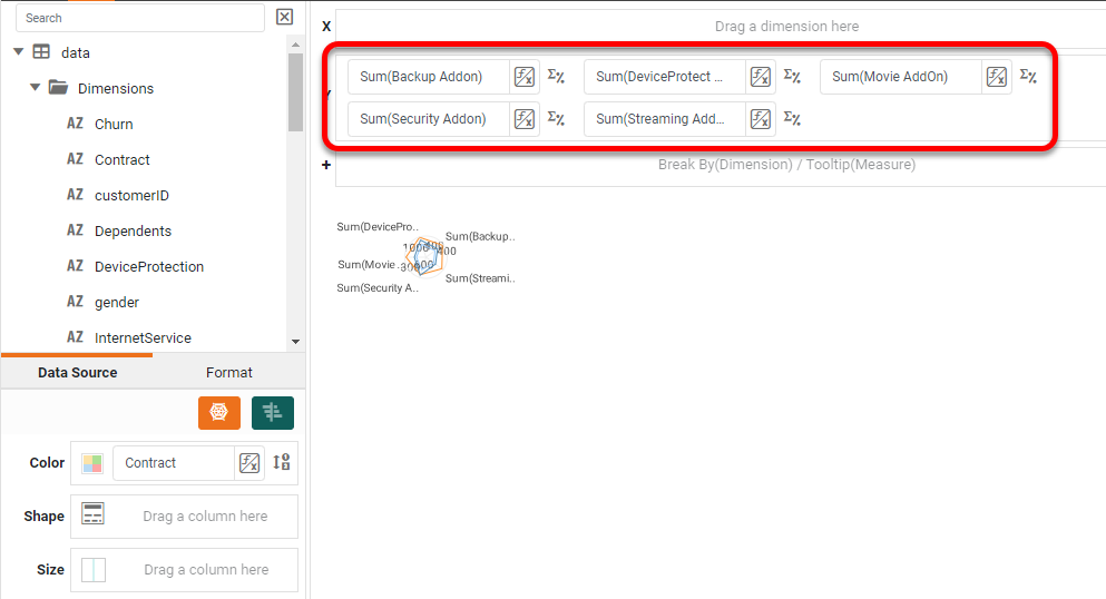
Chart Style button, and choose Radar. Remove the fields from the X and Y regions.
Add the following fields to the Y region: 'Backup Addon', 'DeviceProtect Addon', 'Movie Addon',
'Security Addon', 'Streaming Addon'.
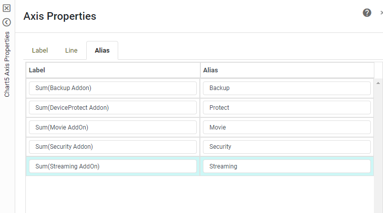
Right-click one of the axis labels and select Axis Properties. Use the Alias
tab
to set the following labels. The press OK, and exit the Chart Editor.
Set the label above the Chart to "Other Services".
Replace the "Customer Profile" label with the label "Service Purchased by
Contract Type".
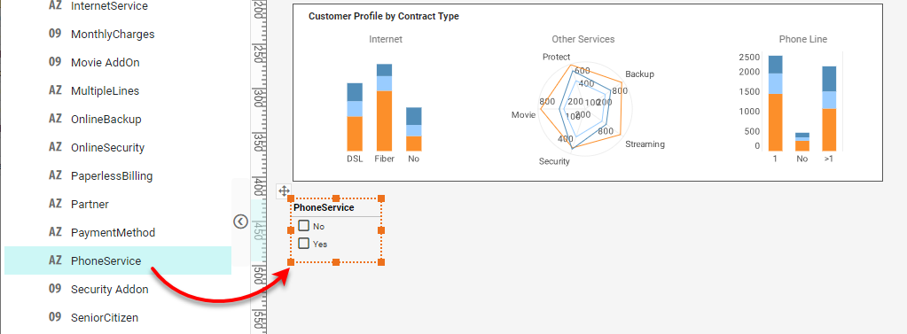
Below this set of KPIs and Charts, we will add a group of filters. Drag the 'PhoneService'
field from the data source into the dashboard. This creates a new Selection List. Change the title to simply
"Phone".
Repeat the above to add Selection Lists for the following fields: 'Contract', 'Partner',
'InternetService', 'Dependents', 'gender', 'PaymentMethod','MultipleLines', 'OnlineBackup',
'OnlineSecurity',
'StreamingTV', 'TechSupport', 'StreamingMovies', 'DeviceProtection'.
We also want to add 'SeniorCitizen', but if you drag this field into the dashboard, it will
create a Range Slider rather than a Selection List. So, in this case, drag a blank Selection List from the
Toolbox into the dashboard, and then drag the 'SeniorCitizen' field into the blank Selection List.
You
can format the Selection Lists as desired by using the settings on the Format tab. For this example,
though, we will leave them as-is.
Add a Menu
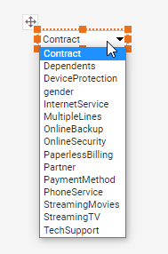
a Pie Chart that you will add in the next section. Drag a ComboBox from the Toolbox panel into
the dashboard. Into this ComboBox, drag the following fields: 'Contract', 'Dependents', 'DeviceProtection',
'gender', 'InternetService', 'MultipleLines', 'OnlineBackup', 'OnlineSecurity', 'PaperlessBilling',
'Partner', 'PaymentMethod', 'PhoneService', 'StreamingMovies', 'StreamingTV', TechSupport'.
The menu should now display the following options: Right-click the ComboBox and select
Properties. Change the 'Name' of the component to
"ViewBy", and press OK. (The 'Name' allows you to refer to the Form element as a variable
or
parameter, as you will do in the next section.) Add a Text label "View By" to the left of the
ComboBox.
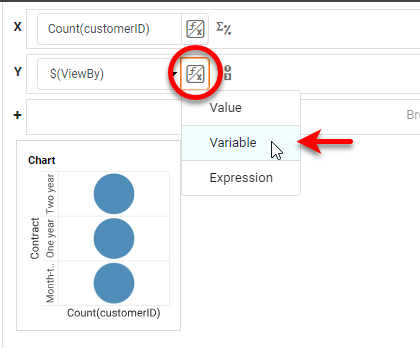
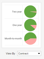
Drag a new Chart into the dashboard above the ComboBox, and open the Chart Editor. Press the
Select Chart Style button and choose Pie. In the data source, right click the 'customerID'
field, and select Convert To Measure. Then drag the 'customerID' field from the Measures
folder
to the X region of the Chart. Drag any field from the Dimensions folder to the Y region
of the Chart, and then press the Value Type button and select Variable. Choose the
ViewBy
component as the variable. This will allow the ViewBy ComboBox to set the dimension on the Y-axis of the
chart.
Drag the 'Churn' field to the Color region. Hide the legend and all the labeling
except
for the Y-axis labels. (To do this, right-click the various elements, and select the Hide option from
the menu.) Hide the Chart Title by turning off the Visible property for the 'Title' in the Chart
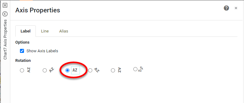
Properties dialog box. Right-click one of the Y-axis labels and select Axis Properties. Set a
horizontal orientation for the labels, and press OK.
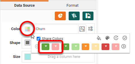
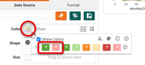
Press the Edit Color button, and set the first two colors as shown below:
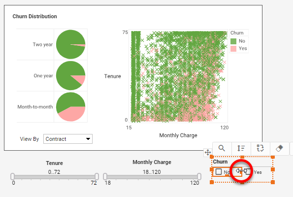
The Pie Chart is complete, and can be controlled by the ComboBox below:
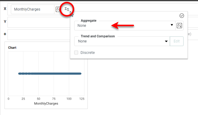
Drag a new Chart from the Toolbox into the dashboard next to the Pie Chart. Open the
Chart Editor. Press the Select Chart Style button and select Point. From the Measures
folder, drag the 'MonthlyCharges' field to the X region. Press the Edit Measure button, and
choose None as the 'Aggregate'.
Drag the 'tenure' field to the Y region, and drag 'Churn' to the Color region.
Press the Edit Color button and choose the same colors as you did for the Pie Chart.
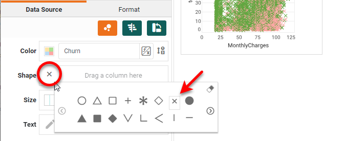
Press the Edit Shape button, and select the 'X' shape.
Right-click each axis title, and select Title Properties. Change the names to
"Tenure" and "Monthly Charges". Set the "Tenure" title to display
horizontally.
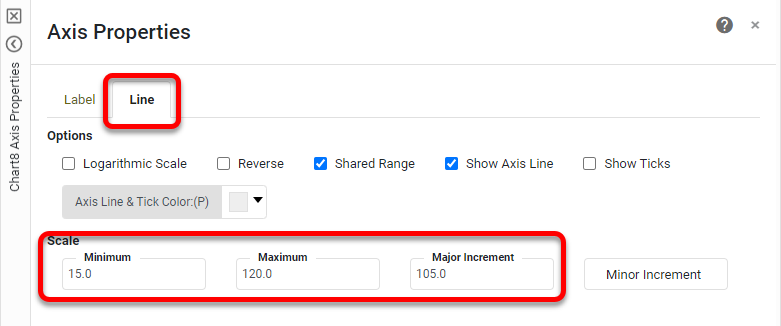
Right-click the X-axis and select Axis Properties. Set the following limits under the Line
tab.
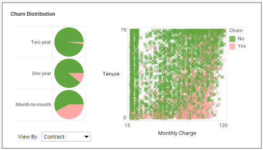
Add a Rectangle background for the Pie and Scatter Charts (as you did earlier), and add a
label that says "Churn Distribution". Set the borders of both Charts to None (as you did earlier).
Make any desired adjustments to fonts and colors using the Format panel.
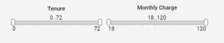
Add Range Sliders below these charts. To do this, drag the 'tenure' and 'MonthyCharges'
fields
into the dashboard. This creates a Range Slider for each. Add Text elements above to provide labels, as
shown
below.
Drag the 'Churn' field into the dashboard to provide one more Selection List next to the
Range
Sliders. Click on one of the cells and drag the handle to place the Yes/No choices side-by-side.
Finally, add a Bar Chart that displays "importances" determined by machine
learning.
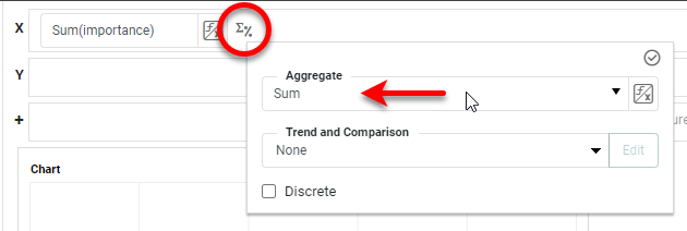
Drag a new Chart component above the Pie and Scatter Charts, and open the Chart Editor. For this Chart, use
the 'importances' data block as the data source. Right-click on the 'importance' field and select Convert
To Measure. Then drag it from the Measures folder to the X region. Press the Edit
Measure button and set the 'Aggregate' property to Sum.
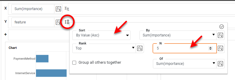
Drag the 'feature' field to the Y region. Press the Edit Dimension button and set the
sorting and ranking as shown below:
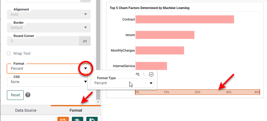
Finally, press the Edit Color button and choose a pink color for the bars. Click the
X-axis, and use the Format panel to assign a Percent format.
Change the Chart title to "Top 5 Churn Factors Determined by Machine Learning,"
hide
the X-axis labels and title, hide the Y-axis title, and hide the axis lines (using the Chart Properties
dialog
box).
The churn analytics dashboard is complete. Use the Format panel to adjust any fonts
and
styling to suit your needs.