How to Create a Customer Service Dashboard
By Kevin Siew, VP of Product Strategy, InetSoft
This document will explain how to create a customer service dashboard, such as the one shown
here, using dashboard creation software from InetSoft. A working version of this dashboard can be found in the
InetSoft
Gallery. This dashboard
primarily consists of a single chart and a KPI, along with some filter components. Below, we will examine how
you can create these different components.

What is a Customer Service Dashboard?
A customer service dashboard is a visual representation of key metrics and performance indicators related to customer service operations. It provides a consolidated view of important data and metrics, allowing customer service managers and teams to monitor and analyze the performance of their customer service activities. The dashboard typically displays real-time or near-real-time data from various sources, such as customer support tickets, call center interactions, live chat sessions, social media mentions, and customer satisfaction surveys. It can be customized to present specific metrics that are relevant to a particular organization's customer service goals and objectives. Some common elements you might find in a customer service dashboard include:- Ticket and case metrics: This includes the number of open tickets, average response time, resolution time, backlog, and other metrics related to the status and handling of customer support cases.
- Customer satisfaction metrics: These metrics may include customer satisfaction scores, Net Promoter Score (NPS), and feedback ratings gathered from post-interaction surveys or feedback channels.
- Call center metrics: If a call center is involved, the dashboard may include metrics like average call duration, call abandonment rate, call volume, and service level agreements (SLAs).
- Response and resolution metrics: These metrics indicate the speed and effectiveness of customer service responses, such as first response time, average handling time, and first contact resolution rate.
- Channel-specific metrics: For organizations that offer customer support through multiple channels (e.g., phone, email, live chat, social media), the dashboard may provide metrics specific to each channel, such as response time for emails or average chat duration for live chat interactions.
- Team and agent performance: The dashboard can display individual or team-level metrics to evaluate the performance of customer service agents, including metrics like ticket volume, customer satisfaction scores, and productivity metrics.
Create a Customer Service Dashboard
For the example dashboard found in the InetSoft Gallery, first consider
the
chart, which displays the success rate over time for the teams or team members selected in the Tree at
right,
and a breakdown selected by the 'Plot by' menu below. This is a straightforward configuration to create.
The
following sections will illustrate the steps required to design the main functionality.
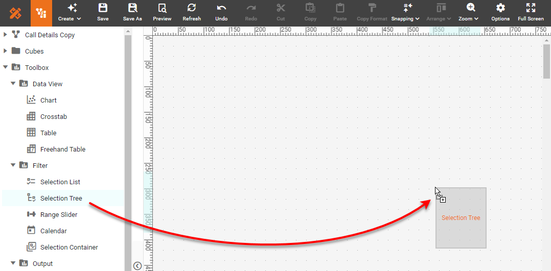
Add a Hierarchical Filter
First add a new Selection Tree component into the dashboard using Visual Composer.
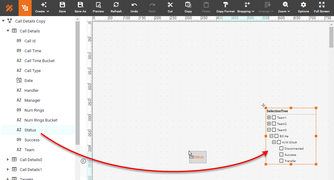
Drag the following fields from the Data Worksheet data block onto the Selection Tree,
one
at a
time: 'Team', 'Handler, 'Call Type', and 'Status'.
Press the "..." button in the Selection Tree toolbar and select 'Properties' to open
the
Selection Tree Properties dialog box. Select the Data tab. In the Measure field, select
'Call
Id' and in the Aggregate field select 'Count'. Enable the Text and Bar options.
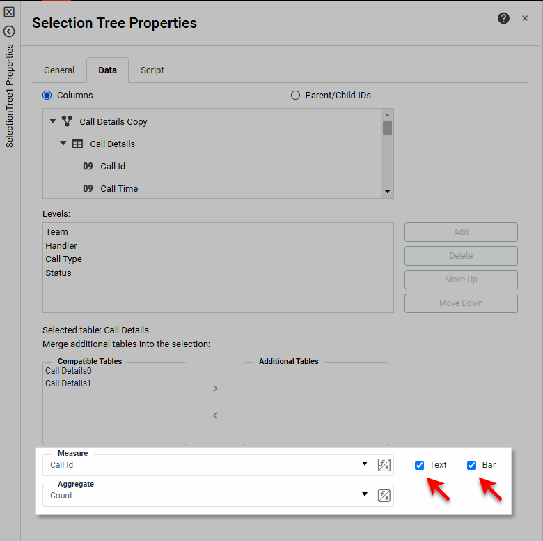
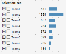
Under the General tab, change the name of the Selection Tree to 'TeamSelector'. The
Selection Tree now appears as shown below.
Add a Menu
Add a ComboBox component to the left of the Selection List. Drag the following
fields
onto the ComboBox: 'Date', 'Call Time Bucket', 'Status', and 'Num Rings Bucket'.
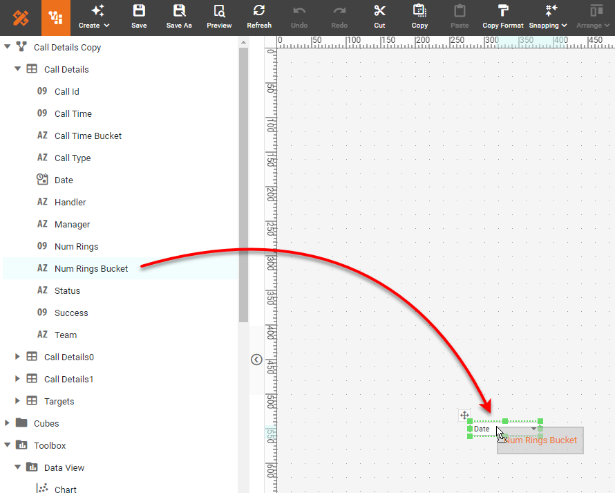
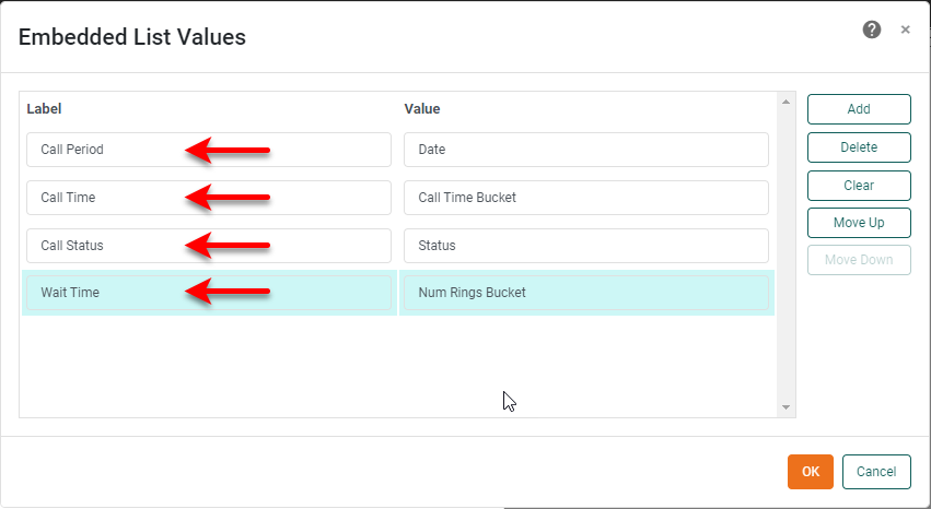
Right-click the ComboBox and select 'Properties'. Change the 'Name' to
XAxisField,and press the 'Edit' button next to the 'Embedded' option. In the 'Embedded List Values'
dialog box, set
the labels shown below, and press OK.
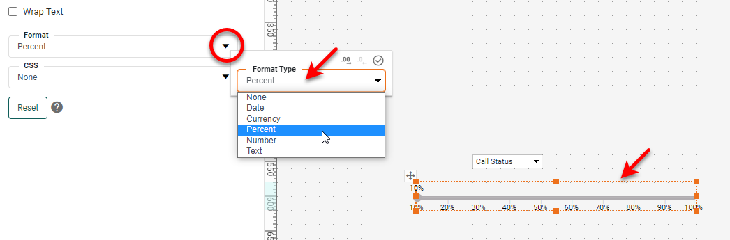
Drag a Slider component from the Toolbox to the dashboard. Right-click
the Slider and select 'Properties'. Under the General tab, name the slider ThresholdCB, set
the 'Minimum' to 0.1, 'Maximum' to 1, and 'Increment' to 0.1, and press OK. Then click the Slider,
select the Format tab, and assign a 'Percent' format to the Slider.
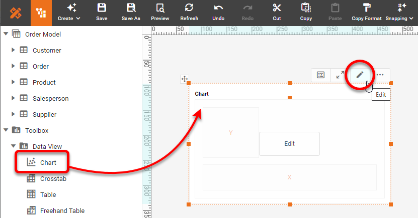
Add a Dynamic Chart
A Dynamic Chart is one that automatically updates based on the frequency you specify.
Drag
a
Chart component into the Dashboard. Press the Edit button on the Chart to open the Chart
Editor.
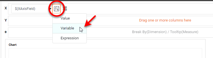
In the Chart Editor, place any dimension field on the X axis. Press the
Value
Type button, and select Variable. From the menu, choose 'XAxisField'.
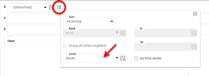
Press the 'Edit Dimension' button and select 'Month' as the Level setting.
Enable
the
'As time series' option.
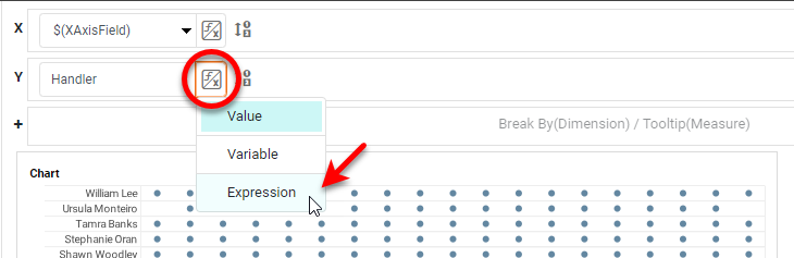
Add any dimension to the Y axis. (Note: You must add a dimension and not a
measure.)
Press the Value Type button, and select Expression.
In the Formula Editor, enter the formula TeamSelector.drillMember. You can
enter this formula easily by clicking the drillMember property under the TeamSelector component in the
left panel.
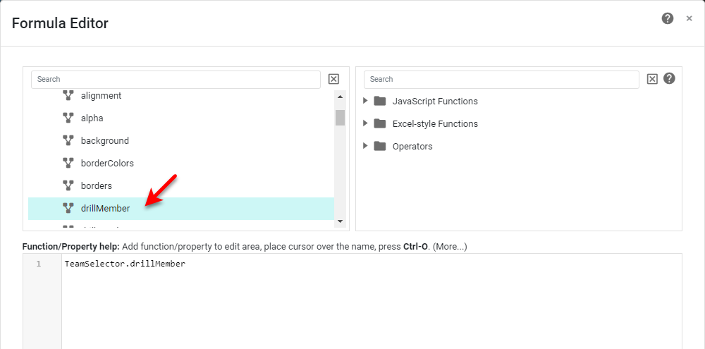
The drillMember property returns the field one level below the current
selection in the Selection Tree. This allows the chart to display the values within the selected
groups in the
Selection Tree.
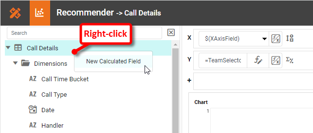
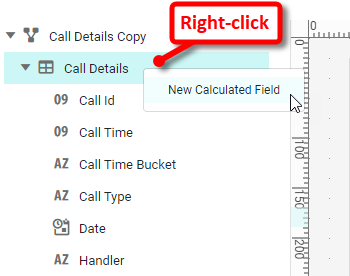
Define a new field: Right-click on the data block in the left panel, and select New
Calculated Field.
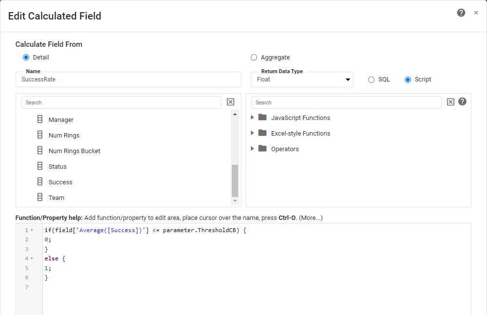
Name the field SuccessRate with 'Return Data Type' of 'Float', and use the
expression
shown below:
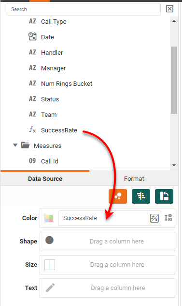
Drag the new 'SuccessRate' field to the Color region.
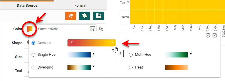
Press the Edit Color button and choose a desired color spectrum.
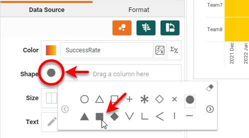
Press the Edit Shape button and choose a filled square.
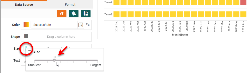
Press Edit Size and enlarge the points as shown below to complete the chart.
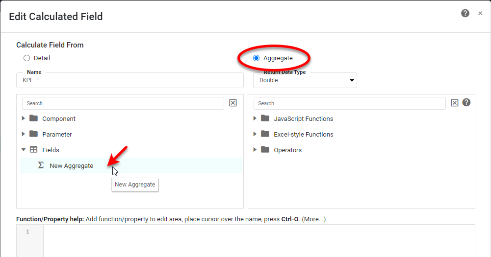
Add a Large Display KPI
Drag a Text component into the dashboard.
Create a new calculated field: Right-click on the data block, and select New
Calculated
Field from the menu.
In the Formula Editor, enter KPI as the 'Name', select the Aggregate option,
and
press
the New Aggregate button.
Create the following two aggregates: Sum(Success) and Count(Success).
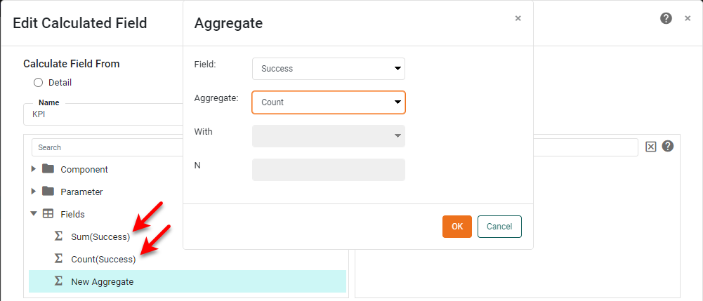
Then click on the new aggregates to add them into the following expression, and press
OK.
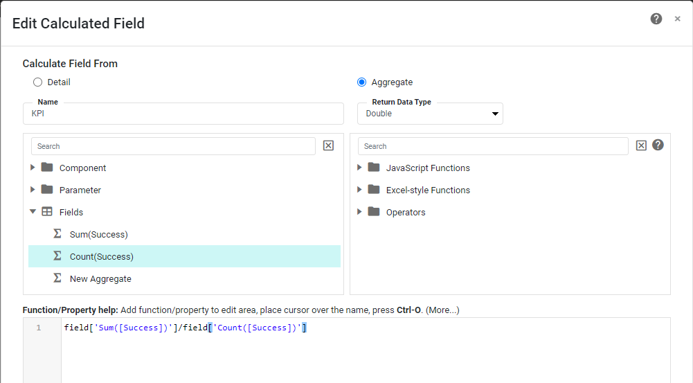
This expression represents the fraction of successful calls. Drag the newly created
aggregate
onto the Text component in the dashboard.
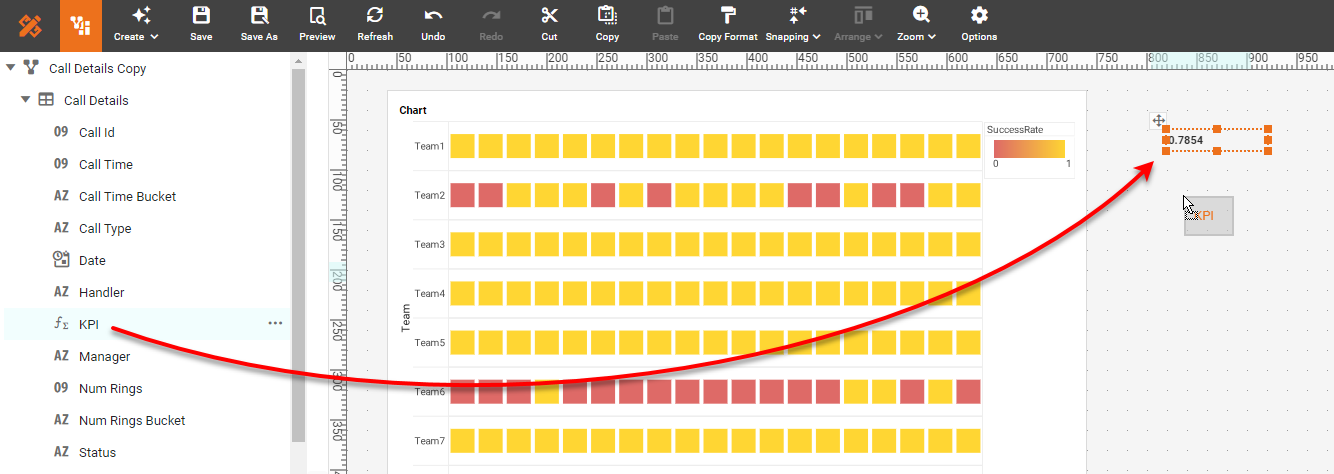
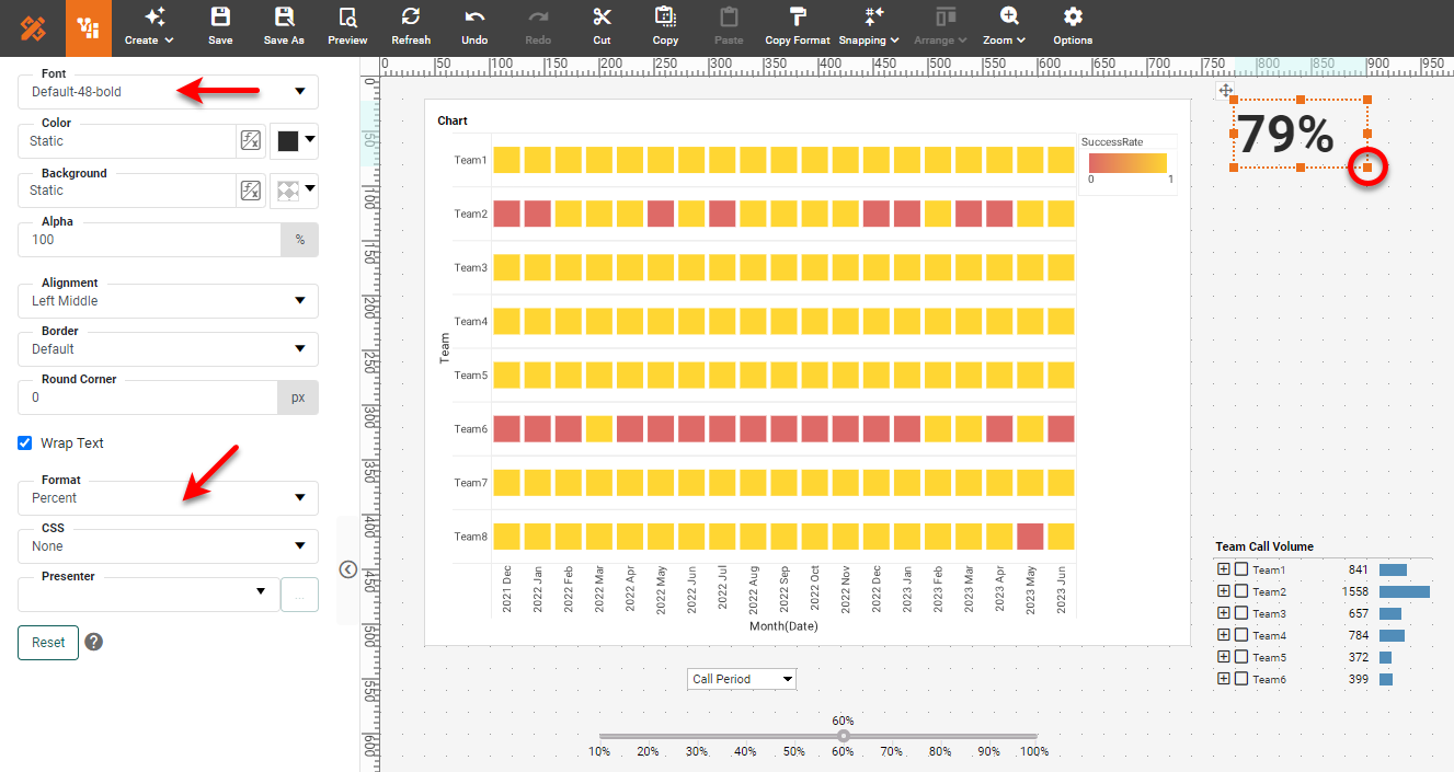
Use the Format panel to enlarge the font and apply a Percent format.
Resize
the
Text component to fit the contents.
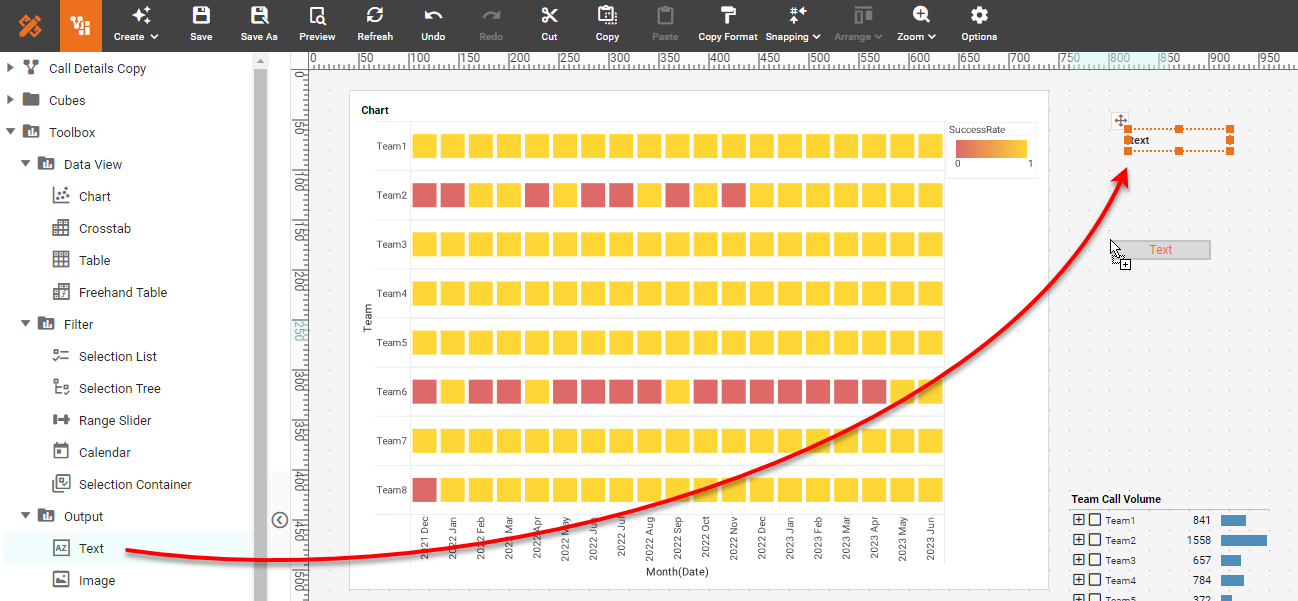
The major functionality of the dashboard is now in place. You can improve the aesthetics of the dashboard by adding filled rectangles as backgrounds, adding labels and images, changing fonts, and moving the legend below the chart to match the example in the InetSoft Gallery.
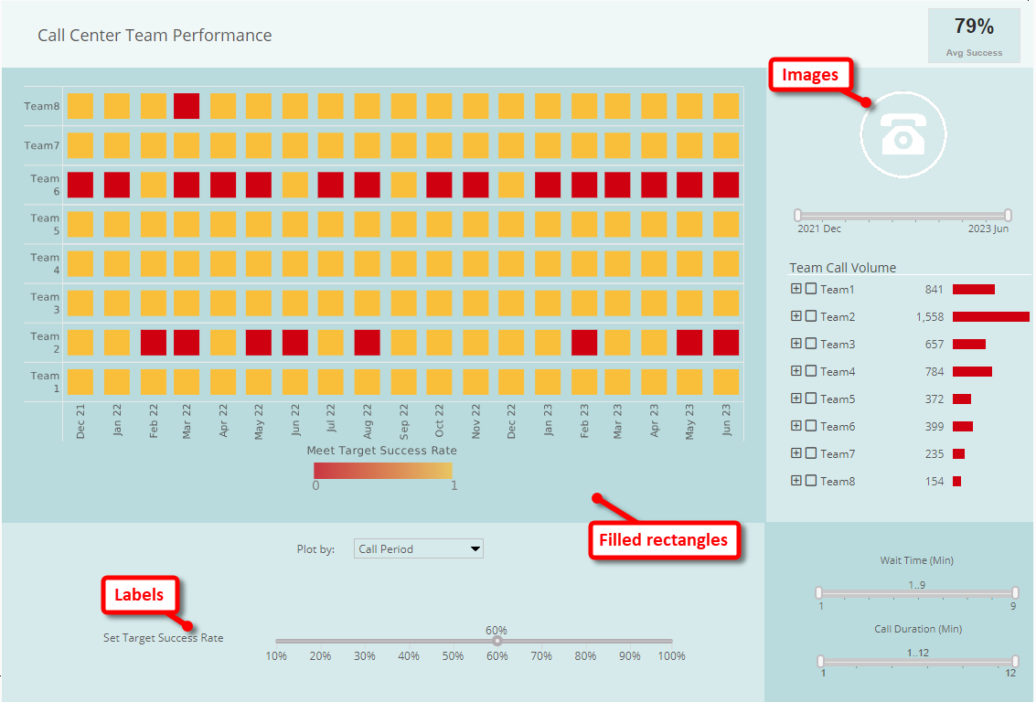
The only additional components to add to the dashboard are the Range Sliders for date,
wait
time (Num Rings), and call duration (Call Time). You can easily add these filters by simply dragging
the
desired date or numerical fields onto the dashboard, and then adding appropriate labels.