How to Create Candlestick Charts
This page discusses the uses of Candlestick charts, and explains how you can create them in both Google Sheets and InetSoft. This page also provides access to a free online tool for creating Candlestick charts and complete functioning business intelligence dashboards.
Contents Definition of a Candlestick Chart Why Use a Candlestick Chart? How to Make a Candlestick Chart How to Create a Candlestick Chart in Google Sheets Tool to Make Candlestick Charts Online for Free
Definition of a Candlestick Chart
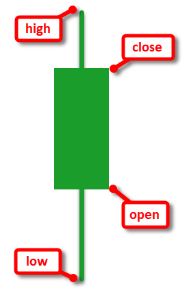
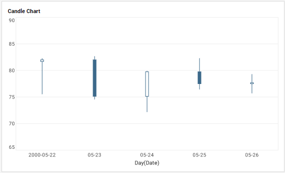
A "Candlestick" or "Candle" chart is a financial chart that displays the high, low, open, and close prices of a security for a specific period. It is often used to visualize stock prices over time. Each candle is composed of a body (or box) and an upper tail and lower tail (or wick). The bottom of the lower wick represents the low value for the security over the specified period. The top of the upper wick represents the high value for the security over the specified period. The top and bottom of the candle "body" represent the opening and closing prices of the security over the specified period. Candles for which the open exceeds the close are typically shown filled. Candles for which the close exceeds the open are typically shown empty. In some cases, color is also used to distinguish these cases (green vs. red, typically). A Candle Chart typically has many candles which represent the movement of a security over some period of time, such a few days, weeks, or years. Each candle can represent a single day's trading activity, or can reflect a longer period of time such as a week or a month. In all cases, the values displayed by the candle (low, high, open, close) are based on the period that the candle describes. A chart with multiple candles may look like that below.
Why Use a Candlestick Chart?
- They are easy to read and interpret: Candlestick charts are visually appealing and provide a lot of information at a glance.
- They can highlight trend reversals: Candlestick patterns, such as the "hammer," "inverted hammer," "doji," "double-bottom," and "double-top" can signal that a trend may be reversing.
- They can show the sentiment of the market: A candlestick chart can help traders understand whether buyers or sellers are in control of the market at a given time.
- They can be used with other technical indicators: Candlestick charts can be used in conjunction with other technical indicators, such as moving averages and oscillators, to confirm trading signals.
- They are widely used: Candlestick charts are widely used by traders and investors, so they are easy to find and access.
How to Make a Candlestick Chart in InetSoft
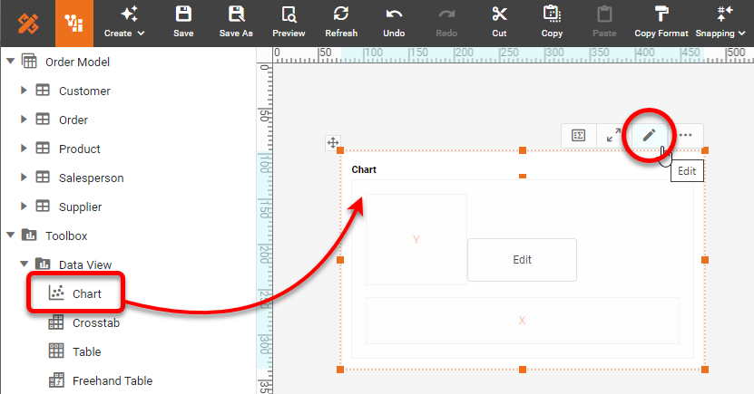
To create a Candle Chart in InetSoft, drag a Chart component from the Toolbox panel into a dashboard in Visual Composer, and then press the Edit button to open the Chart Editor.
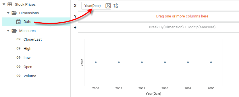
Drag a date field from the Data Source panel to the 'X' region.
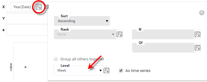
Press the Edit Dimension button next to the date field, and choose the desired date resolution (e.g., 'Week' or 'Day') from the 'Level' menu. Then press the 'Apply' button.
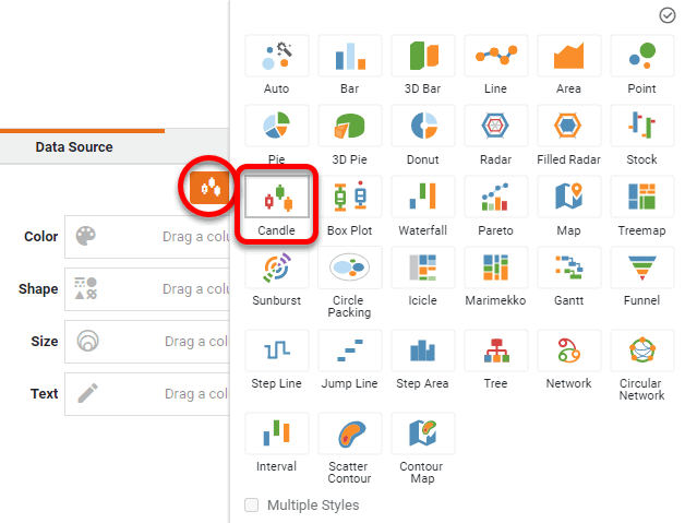
Press the Select Chart Style button, and select the Candle style. Press the 'Apply' button.
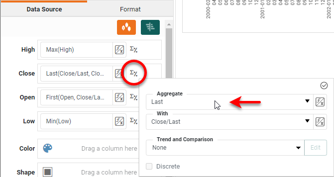
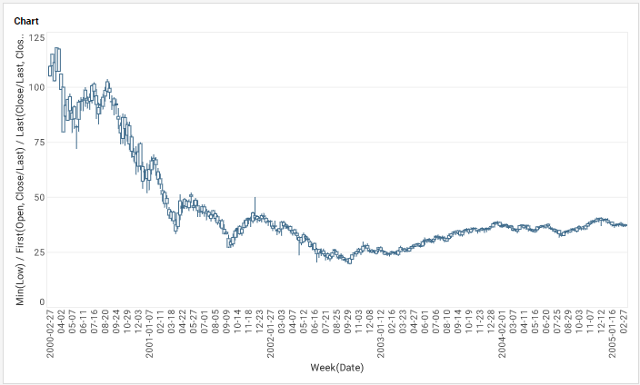
The Chart Editor now provides binding regions for 'High', 'Close', 'Open', and 'Low'. Drag the high, close, open, and low measures from the data source to the appropriate regions, as shown below.
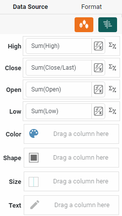
Press the Edit Measure button next to each measure field, and choose Max for 'High', Min for 'Low', First for 'Open', and Last for 'Close'.
Press the 'Finish' button to close the Editor.
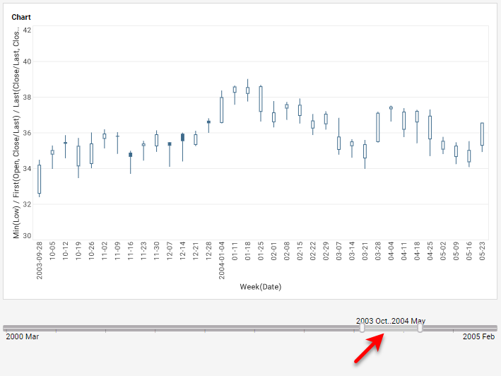
To observe the structure of the chart more closely, use the 'Zoom Chart' button to view a more limited date range, or add Date filters to the dashboard, as show below.
How to Create a Candlestick Chart in Google Sheets
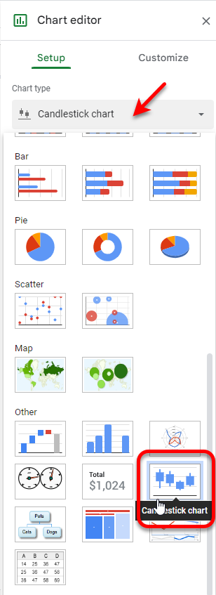
Select the data that you want to include on the chart, and then press Insert > Chart. Select Candlestick chart as the chart type.
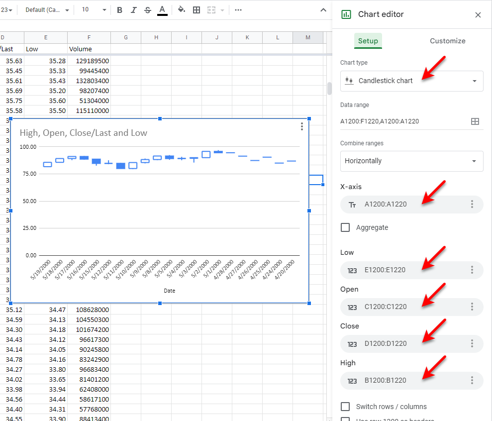
Size the chart as desired and use the Setup tab to assign the correct columns to the Chart Editor's X-axis, Low, Open, Close, and High properties.
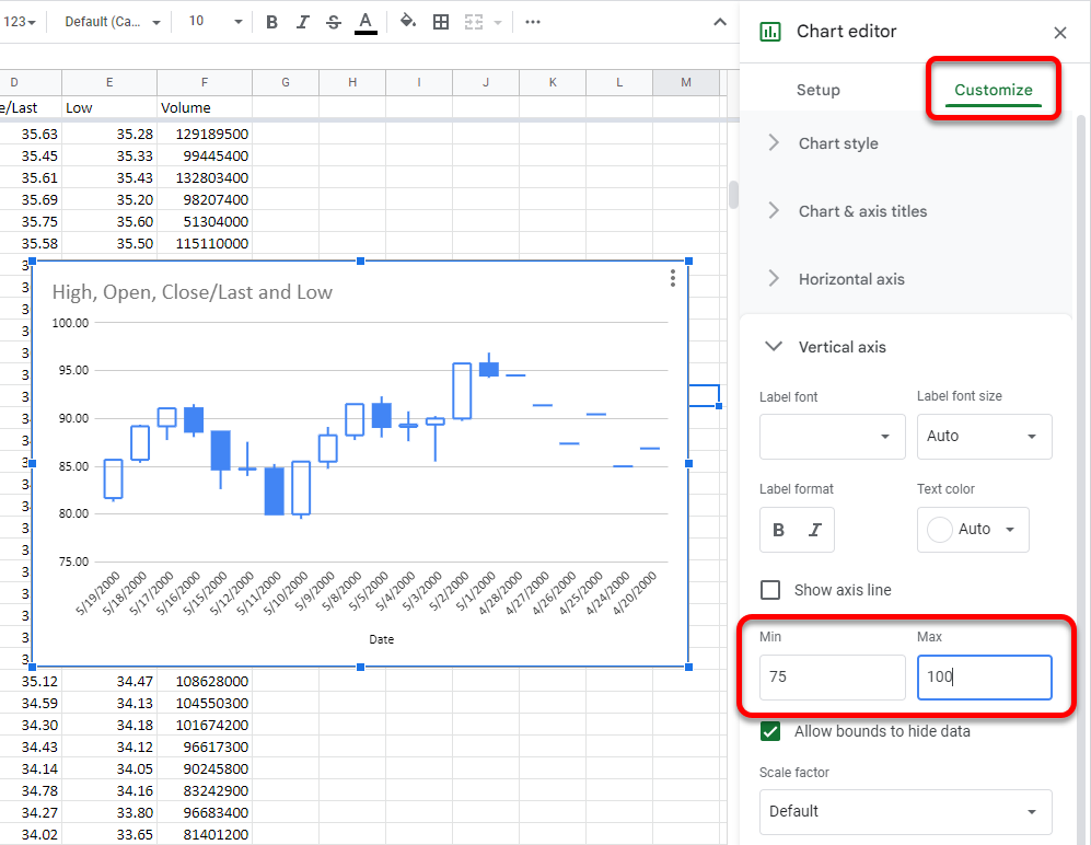
Make any other desired adjustments under the Customize tab. For example, you may want to adjust the chart vertical axis to better fit the data, as shown below:
Tool to Make Candlestick Charts Online for Free
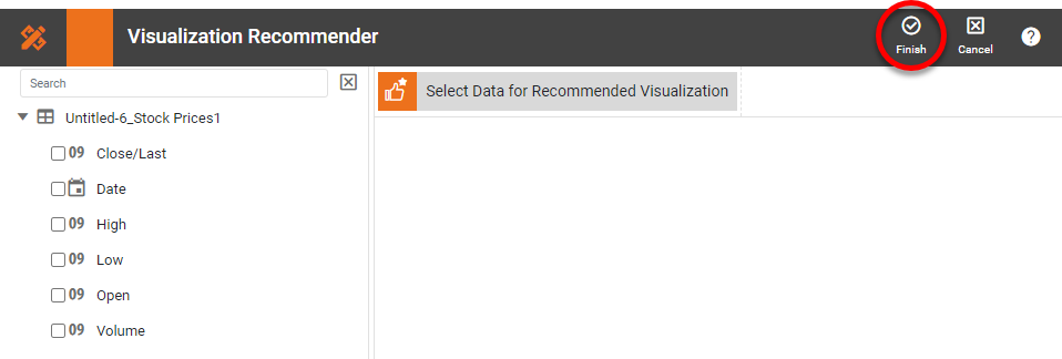
To easily and quickly create Candlestick Charts online for free, create a Free Individual Account on the InetSoft website. You will then be able to upload a text data set, as shown below:

Once you have done that, you will be able to proceed to the Visualization Recommender, which will get you started creating a dashboard. To start with a Candle chart, though, you can skip the Recommender by pressing the Finish button at the top bar of the Recommender.