How to Create a Manufacturing Dashboard
This training page will explain how to create a manufacturing dashboard such as the one below using dashboard creation software from InetSoft. A working version of this dashboard can be found in the InetSoft Gallery. This dashboard is primarily composed of charts. Below, we will examine some of these charts, discuss their value for manufacturing and see how easy they are to create with InetSoft's solution.
Contents
Using Dashboards for Manufacturing
Using a Radar Chart to Compare Multiple Product Measures
Create a Radar Chart
Using Multidimensional Charting to Compare Revenue with Labor Cost
Create a Shape Chart
Summary

Using Dashboards for Manufacturing
Dashboards are a powerful tool for manufacturing reporting because they provide a real-time, visual representation of critical performance metrics that are important to decision-making. Dashboards allow manufacturers to quickly and easily monitor their operations, identify trends, and make data-driven decisions to optimize their production processes.
Dashboards provide a real-time view of key performance indicators (KPIs) and metrics, allowing manufacturers to quickly and easily identify any issues that need attention. They enable manufacturers to quickly analyze data and make informed decisions based on the insights they gain. This can help reduce the time it takes to respond to issues, leading to increased efficiency and productivity.
Dashboards can also be shared with team members, stakeholders, and even customers, fostering collaboration and transparency across the organization. They allow manufacturers to track their performance over time, enabling them to identify trends and patterns that can inform their decision-making. Dashboards can be customized to meet the specific needs of the manufacturer, allowing them to focus on the metrics that matter most to their operations.
Dashboards provide manufacturers with a powerful tool for monitoring and optimizing their production processes, enabling them to make data-driven decisions that can improve efficiency, reduce costs, and increase profitability.
Using a Radar Chart to Compare Multiple Product Measures
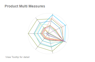
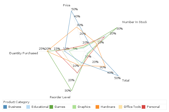
A radar chart, also known as a spider chart or star chart, is a type of chart used to display multivariate data in the form of a two-dimensional chart of three or more quantitative variables represented on axes starting from the same point. The data is plotted in the form of a polygon, with each vertex of the polygon representing one of the variables. This chart is often used to compare the values of multiple variables for a single data point.
The design of the chart can vary depending on whether there are multiple dimensions and measures (most typical, like above) or just a single dimension and measure, in which case the axes may represent the dimension values instead of the multiple measures.
There are several benefits to using a radar chart:
- Comparing multiple variables: A radar chart allows you to compare the values of multiple variables for a single data point, or to compare multiple data points across multiple variables. This makes it easy to identify patterns or trends in the data.
- Handling large number of variables: The chart is particularly useful when the data has a large number of variables, as it allows the viewer to see how all the variables are related to each other in a single, easy-to-read chart.
- Highlighting data distribution: The polygon shape of a radar chart can help to highlight the distribution of variables in a dataset, making it easy to see where most of the data points fall in relation to each other, and particularly to identify which points are outliers.
- Easy to understand: It is easy to understand for people with minimal technical knowledge.
- Showing patterns and trends: It is a very effective tool for showing patterns and trends in data, which can be useful in fields such as marketing, social sciences, and engineering.
Using a radar chart to display various product measure such as the number of labor hours required to produce each type of product can be useful for several reasons:
Cost analysis: By comparing the labor hours required to produce different products, manufacturers can gain insights into the relative costs of producing each product. This information can help them determine which products are most profitable and which ones may need to be re-evaluated in terms of their production processes.
Efficiency analysis: Analyzing the labor hours required for different products can also help manufacturers identify areas where their production processes may be inefficient. For example, if one product requires significantly more labor hours than another similar product, it may indicate that there are opportunities to streamline the production process for that product.
Production planning: By understanding the labor requirements for different products, manufacturers can better plan their production schedules and allocate resources more effectively. This can help ensure that they are able to meet production deadlines and minimize downtime.
Workforce planning: Comparing the labor hours required for different products can also help manufacturers make informed decisions about their workforce needs. For example, if one product requires significantly more labor than others, it may indicate that additional workers are needed to maintain production levels.
Overall, comparing the number of labor hours required to produce each type of product can help manufacturers gain insights into their production processes, identify areas for improvement, and make informed decisions about their resource allocation and workforce planning.
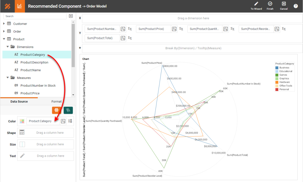
Create a Radar Chart
To create a radar chart in InetSoft, drag a Chart component from the Toolbox panel into a dashboard in Visual Composer, and then press the Edit button to open the Chart Editor.
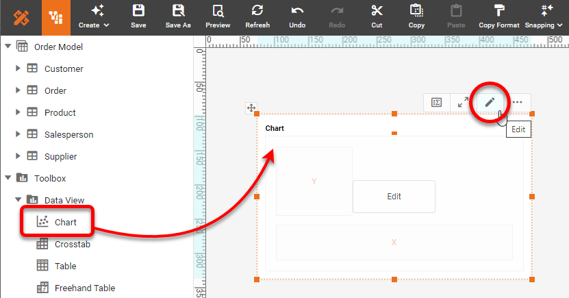
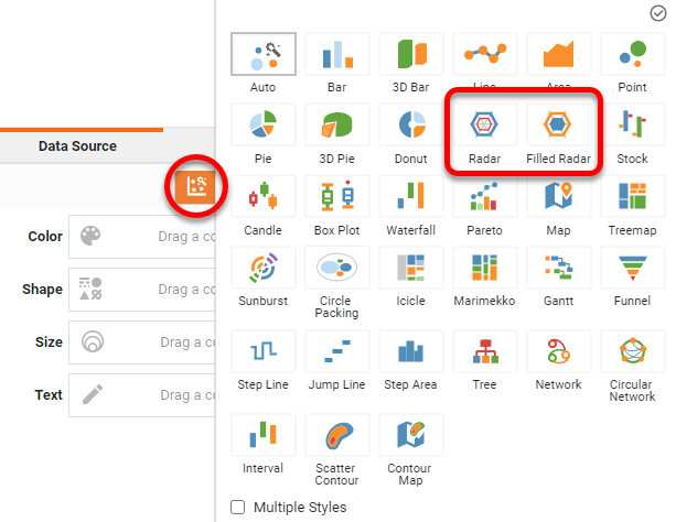
Press the 'Select Chart Style' button. Choose the 'Radar' or 'Filled Radar' style and press 'Apply'.
Determine whether your data contains a single measure or multiple measures. If you have multiple measures and want each measure to be represented by an axis, follow these steps: From the 'Measures' folder of the Data Source panel, drag two or more measures (typically, three or more) to the 'Y' region. This places the selected fields onto the chart as measures.
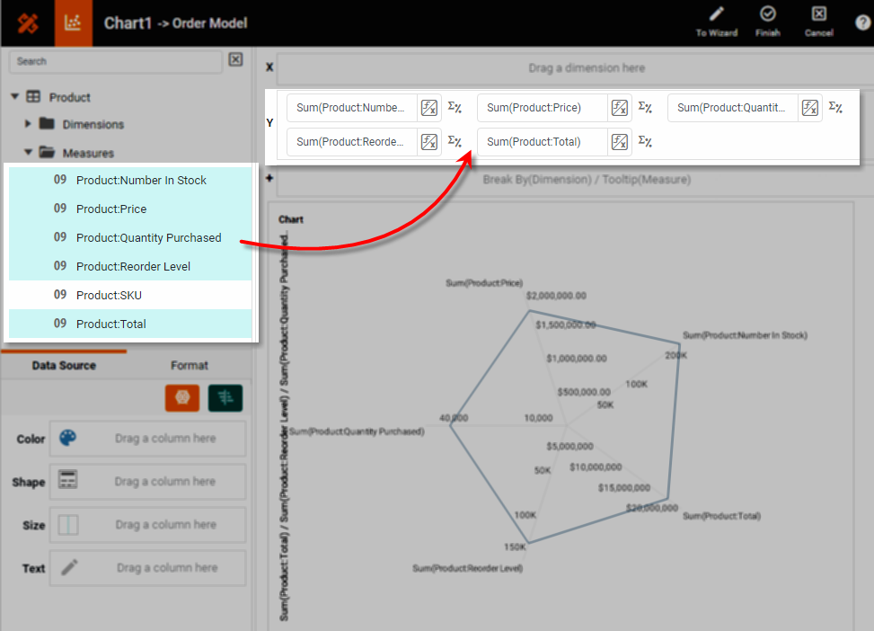
To break-out the data set into groups using color, shape, size, or text labeling, drag a dimension from the Data Source panel to the 'Color', 'Shape', 'Size', or 'Text' region.
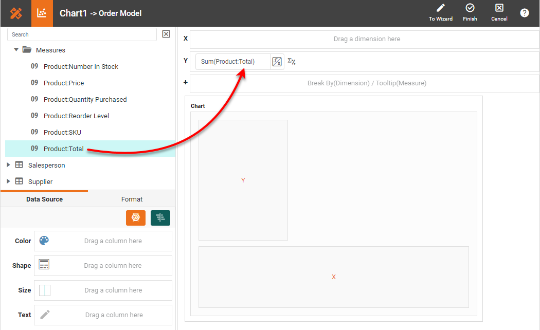
If you have a single measure, and want the values of a dimension to be represented by the axes, follow these steps: From the Data Source panel, drag a single measure to the 'Y' region.
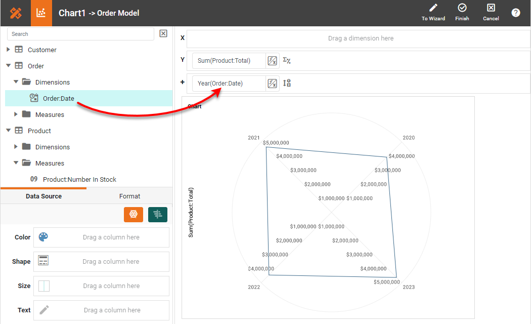
Drag the dimension whose values will define the axes to the 'Break By' field.
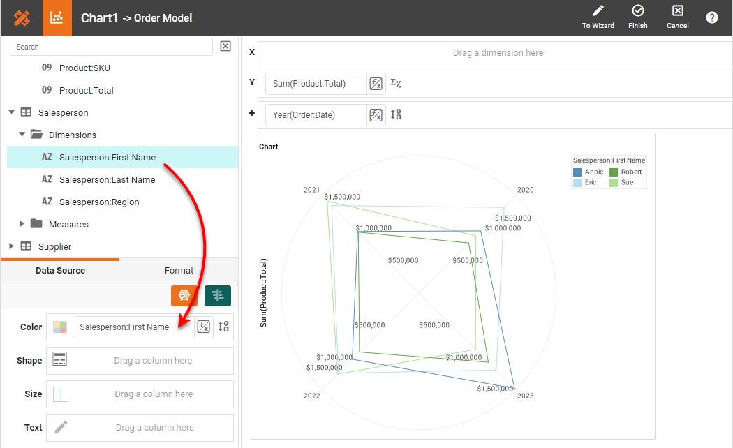
To break-out the data set into further groups using color, shape, size, or text labeling, drag a dimension from the Data Source panel to the 'Color', 'Shape', 'Size', or 'Text' region.
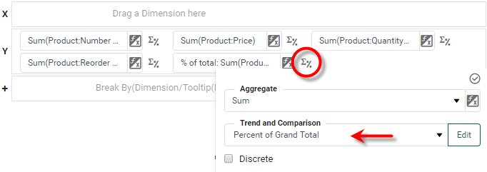
For a date dimension, press the 'Edit Dimension' button next to the field name in the Chart Editor, and set the 'Level' to the desired date grouping. Then press the 'Apply' button. Press the 'Edit Measure' button next to each measure, and select the desired 'Aggregate' and 'Trend and Comparison' method for the measure. For radar charts, it is sometimes desirable to set the 'Trend and Comparison' property to 'Percent of Grant Total' or 'Percent of Subtotal' so that all values are represented on the same scale.
To break-out the data set into further groups using color, shape, size, or text labeling, drag a dimension from the Data Source panel to the 'Color', 'Shape', 'Size', or 'Text' region.
If desired, use the 'Axis Properties' dialog box to provide aliases for the labels, and drag the legend to a desired position. Press 'Finish' to close the Editor.
Using Multidimensional Charting to Compare Revenue with Labor Cost
Multidimensional charting, also known as multivariate or multi-axis charting, is a type of data visualization that enables the representation of multiple variables on a single chart. It allows for the simultaneous display of data across two or more dimensions or variables, providing a more comprehensive view of complex datasets.
There are several types of multidimensional charts, including scatter plots, bubble charts, heat maps, and tree maps. Each chart type is useful for analyzing different types of data and identifying different patterns.
Multidimensional charting is useful for data analysis because it allows for the exploration of complex data relationships that may not be easily visible in traditional two-dimensional charts. By representing data across multiple dimensions, it is possible to identify correlations and trends that might otherwise go unnoticed.
Multidimensional charting can also help identify outliers or anomalies in data, as well as highlight areas where data may be missing or incomplete. Additionally, it can help identify patterns and relationships between variables that may be useful in predicting future outcomes or informing business decisions.
Overall, multidimensional charting is a powerful tool for data analysis because it allows for the representation of complex data in a way that is both visual and intuitive, making it easier to identify patterns, trends, and relationships across multiple dimensions.
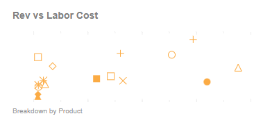
This multidimensional chart uses different shapes to visualize the relationship between labor hours and revenue for each product. This can be valuable for several reasons:
Cost analysis: By comparing the labor hours required to produce each product with the revenue generated by each product, manufacturers can gain insights into the relative costs of producing each product. This information can help them determine which products are most profitable and which ones may need to be re-evaluated in terms of their production processes.
Efficiency analysis: Analyzing the relationship between labor hours and revenue can also help manufacturers identify areas where their production processes may be inefficient. For example, if a product requires a lot of labor hours but generates little revenue, it may indicate that there are opportunities to streamline the production process for that product.
Product portfolio analysis: Visualizing the relationship between labor hours and revenue can also help manufacturers make informed decisions about their product portfolio. By identifying products that require a lot of labor but generate little revenue, manufacturers can make strategic decisions about whether to continue producing those products or discontinue them.
Resource allocation: By understanding the relationship between labor hours and revenue for each product, manufacturers can better allocate their resources and make informed decisions about their workforce needs. For example, if a product requires a lot of labor hours but generates little revenue, it may indicate that additional workers are needed to maintain production levels or that the production process needs to be re-evaluated.
Overall, using a shape chart to visualizing the relationship between labor hours and revenue for each product can help manufacturers gain insights into their production processes, identify areas for improvement, make informed decisions about their product portfolio and resource allocation, and ultimately improve their profitability.
Create a Shape Chart
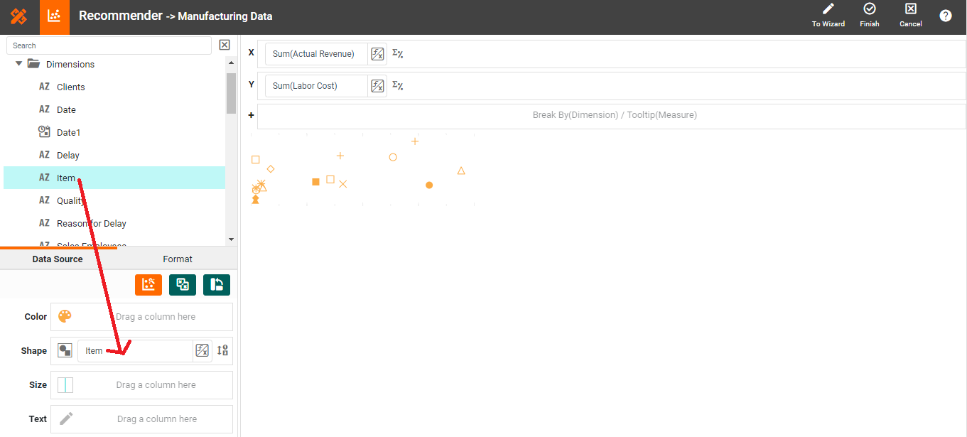
To visualize product type as different shapes, start with an existing dot plot and drag the product dimension from the data source to the 'Color', 'Shape', 'Size', or 'Text' region.
Summary
This page has gone over a few of the techniques used to create a dynamic and powerful manufacturing dashboard. You saw how to create shape and radar charts, and how to use them to analyze the most important aspects of manufacturing. InetSoft makes it quick and easy to display data in a wide variety of different styles for exploration and interaction. InetSoft additionally provides many other features to facilitate the creation of professional dashboards, such as embedding, hyperlinks, drill-downs, positioning and sizing aids, device-adaptive layout, advanced scripting, and much more. InetSoft is a complete solution for modern, powerful, and effective dashboards. provide a real-time view. If you are a developer interested in building your own real-time data platform that ingests data at scale, learn how to use Tinybird, Tremor, and Next.js to provide a real-time view for your application.