How to Create a Marketing Lead Dashboard
This training page will explain how to create a marketing lead dashboard such as the one below using dashboard creation software from InetSoft. A working version of this dashboard can be found on the InetSoft Gallery. This dashboard is primarily composed of charts. Below, we will examine some of these charts, discuss their value for marketing lead tracking and see how easy they are to create with InetSoft's solution..
Contents
Using Dashboards for Marketing Leads
The Importance of Tracking Lead Source
Using Highlights
Using a Highlight to Track Percent Change in Lead Volume
Add Conditional Format
Sparkline Charts
Tracking Leads by Source and State
Create Sparkline Chart
Summary

Using Dashboards for Marketing Leads
Data analysis and dashboards are critical tools for marketers to make informed decisions, optimize their strategies, and measure their performance. They can help marketers identify trends and patterns in customer behavior, market trends, and campaign performance. By analyzing data, marketers can make informed decisions about what products or services to offer, what messaging resonates with their target audience, and how to optimize their marketing campaigns. Dashboards provide real-time, visual representations of key performance metrics, such as website traffic, conversion rates, and customer engagement. By monitoring these metrics, marketers can quickly identify areas for improvement and adjust their strategies accordingly.
Data analysis can provide valuable insights into customer behavior, preferences, and demographics. By understanding their customers better, marketers can create more personalized and targeted campaigns that resonate with their audience. By analyzing the effectiveness of different marketing channels and campaigns, marketers can optimize their marketing spend and allocate resources more effectively. This can help them to reduce costs, increase ROI, and achieve their marketing goals more efficiently.
Data analysis can help marketers stay ahead of the competition by identifying emerging trends and market opportunities. By staying on top of these trends, marketers can adjust their strategies to capitalize on new opportunities and stay relevant in an ever-changing market. Overall, data analysis and dashboards are essential tools for marketers to make informed decisions, measure their performance, and stay ahead of the competition.
The Importance of Tracking Lead Source
Monitoring and analyzing new lead generations and their sources is crucial for businesses to understand which marketing channels and tactics are most effective in generating new leads. By monitoring and analyzing new lead generations, businesses can identify which marketing channels are most effective in generating new leads. This information can be used to optimize marketing efforts and allocate resources more effectively.
By tracking the sources of new leads and their conversion rates, businesses can evaluate the return on investment (ROI) of different marketing campaigns and channels. This can help businesses determine where to invest their marketing budget to generate the highest ROI. By analyzing the sources of new leads, businesses can identify areas for improvement in their marketing strategies. For example, if a particular marketing channel is not generating many leads, it may be necessary to adjust the messaging or tactics used in that channel to improve its effectiveness.
By tracking new leads and their sources, businesses can gain insights into the characteristics and behaviors of their target audience. This information can be used to develop more effective lead nurturing strategies and campaigns that resonate with potential customers. By monitoring and analyzing new lead generations, businesses can stay on top of industry trends and changes in customer behavior. This information can be used to adjust marketing strategies and stay competitive in a rapidly evolving market.
In summary, monitoring and analyzing new lead generations and their sources is essential for businesses to optimize marketing efforts, evaluate ROI, identify areas for improvement, improve lead nurturing, and stay competitive.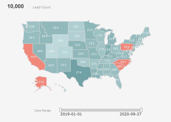
A highlighted threshold color on a dashboard is a visual indicator that is used to highlight data points that have exceeded or fallen below a predefined threshold value. Typically, threshold colors are used to draw attention to specific data points that require immediate action or attention.
Threshold colors are often displayed on charts or graphs on a dashboard, with different colors representing different levels of performance. For example, green may be used to indicate that a data point is performing well and has met or exceeded the target threshold, while yellow may be used to indicate that a data point is approaching the threshold and requires attention. Red may be used to indicate that a data point has fallen below the threshold and requires immediate action.
Threshold colors can be set manually or automatically, depending on the software used to create the dashboard. They are useful because they allow users to quickly identify areas of concern or opportunity without having to manually scan through large amounts of data. Overall, threshold colors are an effective way to highlight important information on a dashboard and help users make informed decisions based on the data presented.
Using a Highlight to Track Percent Change in Lead Volume
Tracking the percent change in lead count helps businesses measure their growth over time. By comparing the current lead count to the previous period, businesses can determine if they are growing or if they need to adjust their marketing strategies to attract more leads. Tracking the percent change in lead count helps businesses identify trends in their lead generation efforts. For example, if lead count is consistently increasing or decreasing over time, it could indicate a shift in customer behavior or a change in the effectiveness of marketing tactics.
By tracking the percent change in lead count, businesses can evaluate the effectiveness of their marketing campaigns. If lead count increases after a specific campaign, it indicates that the campaign was successful in attracting new leads. By tracking the percent change in lead count, businesses can optimize their marketing efforts to attract more leads. If lead count is not increasing, it may be necessary to adjust the messaging, targeting, or tactics used in marketing campaigns to improve their effectiveness.
Tracking the percent change in lead count helps businesses set realistic goals for lead generation efforts. By setting targets for lead count growth, businesses can work towards achieving specific objectives and track their progress over time. Tracking the percent change in lead count is important for businesses to measure growth, identify trends, evaluate marketing campaigns, optimize marketing efforts, and set goals.
Add Conditional Formatting
You can add a highlight to track percent change in lead volume by applying conditional formatting (highlighting) to chart elements, so that the element formatting changes based on the data bound to the element. These conditional formats are called highlights. They are very useful for calling attention to an element when its associated data meets (or fails to meet) some specified condition.
To apply a highlight to a table column, image, text element, chart, or crosstab, follow these steps:
Right-click the element you wish to highlight. (For a Table, right-click a data cell in column to which you want the highlight to be applied. For a Chart, right-click on a plot element or an axis label.) (NOTE: You can also access menu options from the 'More' button button in the mini-toolbar.)
Select 'Highlight' from the right-click context menu. This opens the 'Highlight' panel.

Press the 'Add' button. This opens the 'Name' dialog box.
Enter a name for this highlight, and press 'OK' to close the dialog box.
Repeat the previous steps to enter any additional highlights, and then follow the steps below for each individual highlight.
Select the highlight in the list that you want to edit.
In the 'Attributes' panel, select the highlight format. The formatting is applied when the data meets the highlight condition (specified below):
Click the 'Foreground' color chip to set the text color.
Click the 'Background' color chip to set the fill color.
Click the 'Font' menu to make the desired font selections.
Cell-based highlights take precedence over row-based highlights.
For a Table, select 'Apply to Row' if you wish to apply the specified formatting to the entire table row. Otherwise, the formatting applies only to the selected table column.
Press the 'Edit' button below the 'Conditions' box. This opens the 'Conditions' dialog box.

Follow the steps below to specify the condition expression for this highlight:
Select the operand and type of comparison from the menus at the top of the dialog box, e.g., "[Company][is not][one of]"
For table highlights, the operand is one of the table column names. For text and image highlights, the operand is called 'value', which is the aggregate value associated with the element, as configured in the Data tab of the element's 'Properties' dialog box.
For table highlighting, select 'Value', 'Field', 'Expression', 'Session Data', or 'Variable' from the 'Change Value Type' button .
If you select the 'Field' option, in the adjoining menu, choose the table column for comparison. (The two columns will be compared row by row, and the specified highlight will be applied to every row where the condition holds true.)
If you select the 'Value' option, either enter the comparison value into the provided text field, or press the 'Browse Data' button to choose the comparison value from a list.
If you select the 'Variable' option, select one of the Form components listed in the menu to provide the value at runtime. (See End-User Property Control for further details.)
If you select the 'Expression' option, press the 'JS'/'SQL' button to select JavaScript or SQL syntax, and then press the 'Edit Expression' button . This opens the Script Editor where you can enter your expression. (See End-User Property Control for details on using expressions.)
When you have fully specified the condition, press 'Append'.
To create a compound condition, repeat the steps above, using the 'and' and 'or' operators to composite the conditions. Read more about how to modify a condition.
Press 'OK' to exit the 'Conditions' dialog box and return to the 'Highlight' dialog box.
Repeat the above steps to add additional highlights.
Press 'OK' to close the 'Highlight' panel.
When you add a highlight to a table column or crosstab, the highlight condition is tested individually for each cell. When the condition is satisfied, the corresponding highlight format is applied to the cell or row (if 'Apply to Row' is selected).
You can use multiple highlights in combination to produce composite formats. For example, if you specify a red-foreground highlight for the condition "Discount is greater than 0," and you also specify a bold font highlight for the condition "State is equal to NJ," values which meet both conditions will appear highlighted in red and bold.
A sparkline is a small line chart, usually with axes or coordinates removed. The point of styling a line chart this way is to present the general shape of the data's variation over time, in a simple and highly condensed fashion. Sparklines are small enough to be embedded among text, or are often grouped with several other sparklines in a line or grid.
Unlike a typical chart, which often intends to show the maximum amount of information, sparklines are created to be succinct, and memorable in some measurement. Common candidates for sparklines are temperature or stock market price.
Sparklines are a useful alternative to single line charts with multiple lines plotted. When multiple lines are plotted on a single line chart, overlapping lines can cause confusion. Conversely, the multiple lines can be in such different ranges can cause some of the lines to lose their sense of scale. This is often the case for tracking multiple distinct metrics on the same chart. This can be partially remedied with multiple axes, but that can only accommodate two different ranges, and can also be confusing. But Sparkline charts overcome these limitations by giving each metric its own scale.
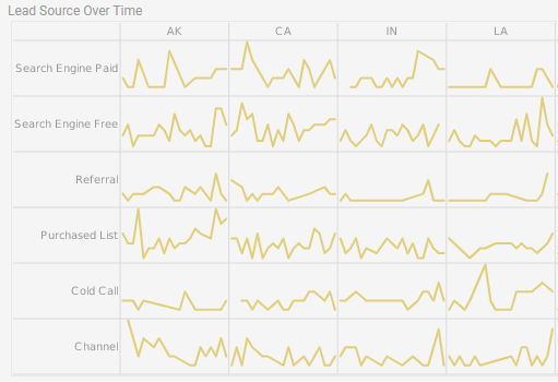
Tracking Leads by Source and State
This Sparkline example from InetSoft's Marketing Lead Dashboard displays how a grid of Sparkline Charts can convey information that a single chart with multiple lines cannot. Each individual Sparkline depicts the change from month to month of marketing leads form a particular lead source in a particular space. In a single chart, all of the lines would be a meaningless jumble.
While line charts could be larger and placed on a tabbed interface, or have the additional dimensions relegated to filter components, this would result in the visual comparison of trends in different lead sources and states being lost. With this grid of Sparklines, a marketing manager has an at a glance view of how lead trends compare from state to state and source to source.
When one state or source has an upswing or downturn of new leads, the manager can immediately see if other states or sources had a similar pattern, indicating whether or not the the cause of the change is related to something regional, something related to the strength or weakness of a particular lead source, or just a general trend in the market. If the manager wanted to drilldown into an individual sparkline, he could take advantage of InetSoft's tooltip views by hovering the mouse over the individual data points on the sparkline, to see exactly how many new leads were added in a particular month, from a particular source, in a particular state.
Create Sparkline Chart
To create a Sparkline chart, follow the basic steps below.
Prepare Your Data
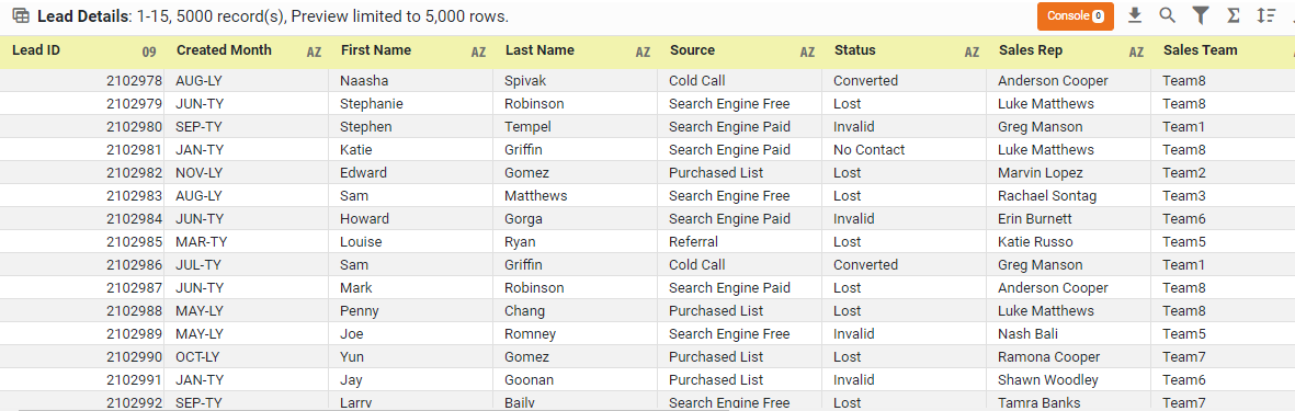
The data source for the chart (data block, query, or data model) should represent dimensions and measures as independent columns or fields, including a date column, as shown below. See Prepare Your Data for information on how to manipulate your data, if it is not currently in this form. (Note: A properly designed data model will already have the correct structure.)
Open a Chart for Editing
If necessary, create a new Dashboard. For information on how to create a new Dashboard, see Create a New Dashboard.
From the Toolbox panel, drag a Chart component into the Dashboard.

Resize the Chart as desired by dragging the handles.
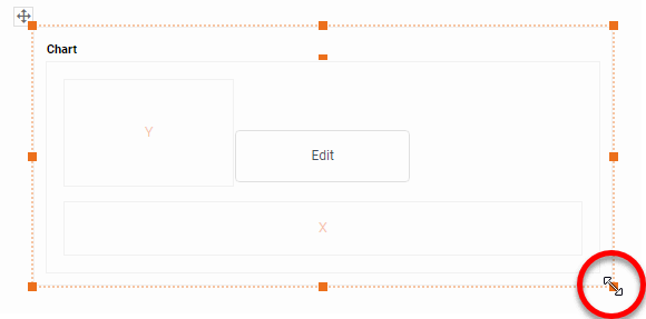
Press the 'Edit button in the center of the Chart or press the Edit' button in the top-right corner.

This opens the Visualization Recommender. Bypass the Recommender by pressing the 'Full Editor' button at the top right to open the Chart Editor.

Then follow the steps below to add data to the chart:
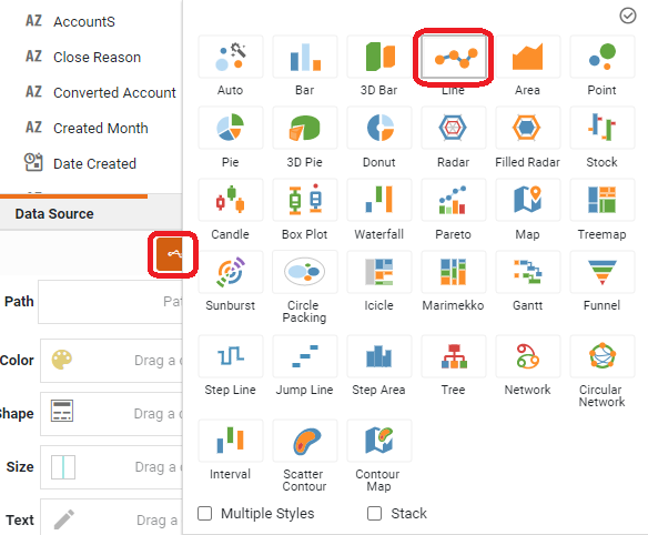
Press the 'Select Chart Style' button . Choose the 'Line' style.
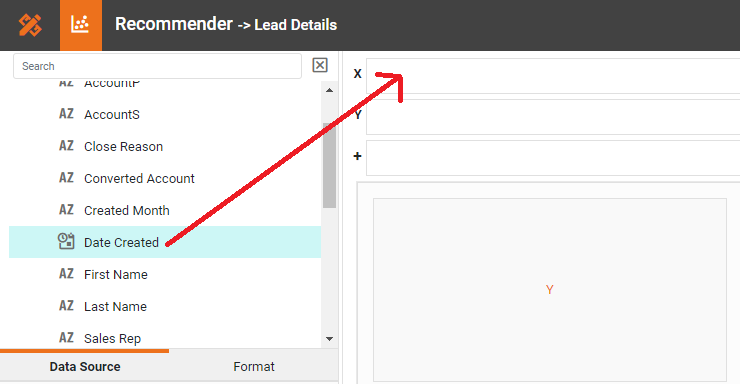
From the 'Dimensions' folder of the Data Source panel, drag a date dimension to the 'X' or 'Y' region.
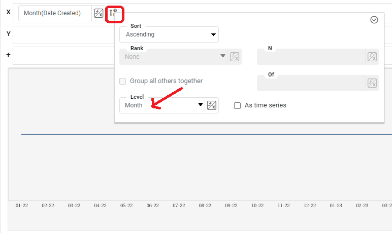
Press the 'Edit Dimension' button next to the field name in the Chart Editor, and set the 'Level' to the desired date grouping. Then press the 'Apply' button
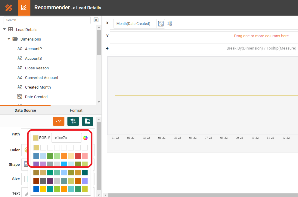
If you have a preference for the color of the Sparkline(s), select one in the 'Color' region.
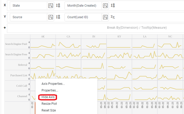
Sparklines are often used in a grid of charts, such as that below, where different charts represent different values of a particular dimension (here 'Source' and 'State').
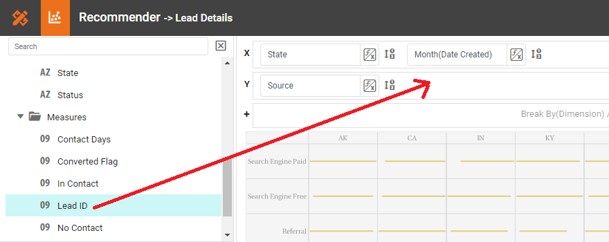
To create a grid of charts, simply add dimensions into the 'X' and 'Y' regions to create the desired arrangement. For example, to break out the 'State' dimension on the X-axis and the 'Source' dimension on the Y-axis, place these fields as shown below in the Chart Editor.
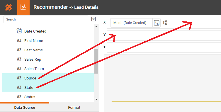
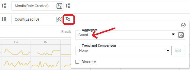
From the 'Measures' folder of the Data Source panel, drag a measure to the 'X' or 'Y' region. This places the selected field onto the chart as a measure.
Press the 'Edit Measure' button next to the measure, and select the desired aggregation method for the measure.
Hide the axes on the individual Sparkline charts by right clicking on each axis and selecting "Hide Axis" on the menu that appears.
Summary
This page has gone over a few of the techniques used to create a dynamic and powerful Marketing Dashboard. You saw how to create sparklines and threshold highlights, and how to use them to analyze the most important aspects of lead sources. InetSoft makes it quick and easy to display data in a wide variety of different styles for exploration and interaction. InetSoft additionally provides many other features to facilitate the creation of professional dashboards, such as embedding, hyperlinks, drill-downs, positioning and sizing aids, device-adaptive layout, advanced scripting, and much more. InetSoft is a complete solution for modern, powerful, and effective dashboards.