How to Create a Sales Dashboard
This document will explain how to create a sales dashboard such as the one below using dashboard creation software from InetSoft. A working version of this dashboard can be found on the InetSoft Gallery. This dashboard is primarily composed of a large number of charts. Below, we will examine some of these charts, and see how easy they are to create.
Contents
Create a Sales Summary Chart
Add a Revenue KPI
Add a Gauge Chart
Add a Scatter Chart
Create a Derived Field
Add a Multi-Style Chart
Create a Data Tip
Summary

Create a Sales Summary Chart
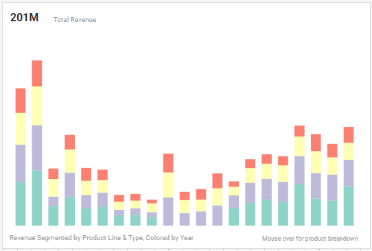
First consider the following chart, which shows summed revenue broken out by product line and type, with year represented by color. The chart in the sample dashboard uses a minimalist aesthetic by hiding all labels, but we will keep the labeling for clarity. The Chart provides a basic overview of which products are producing revenue and is therefore a key chart for assessing sales performance.
Following is a step-by-step guide to creating this chart:
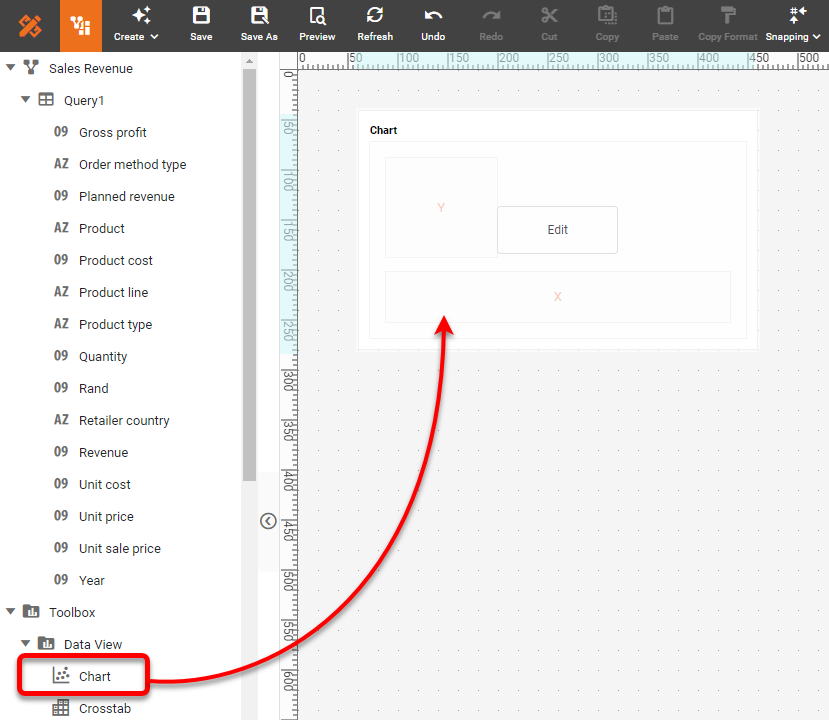
This is a very simple chart to create with InetSoft. To do this, first add a new Chart component into the dashboard using Visual Composer.
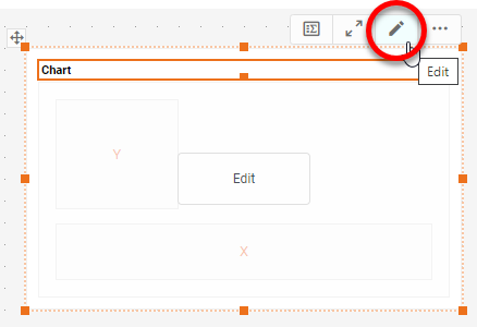
Press the Edit button on the Chart to open the Chart Editor.
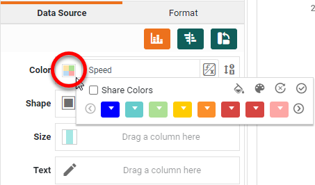
In the Chart Editor, place the desired dimension fields ('Product line', 'Product type', and 'Year') and the measure ('Revenue') in the appropriate regions: X, Y, and Color.
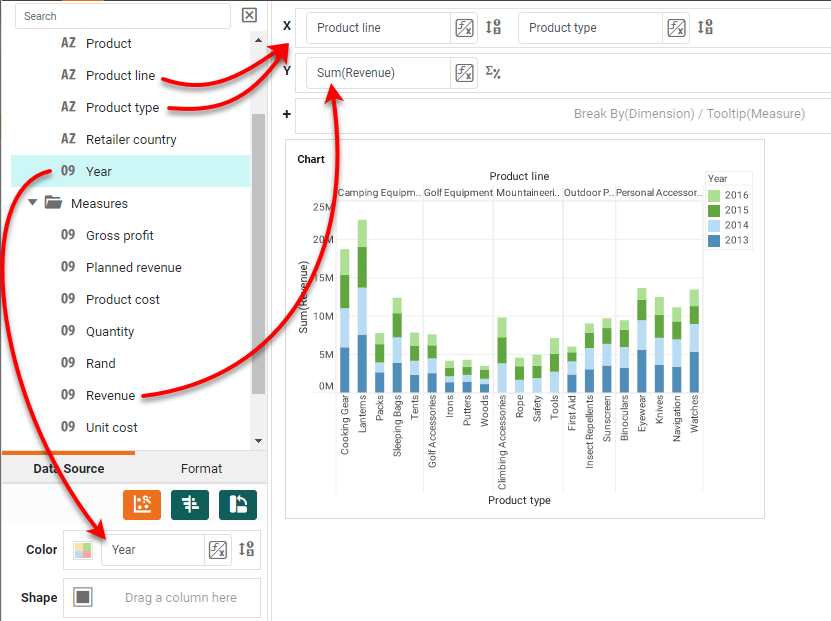
To change the colors to match the example, press the Edit Color button and choose the desired color sequence for the years.
Press Finish to exit the Editor. If you wish to hide the axis labeling, as in the sample dashboard, you can right-click on an axis and select Hide Axis from the menu. You can do the same for the axis titles, if desired, but for our walkthrough here we will leave all the labeling in place.
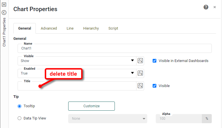
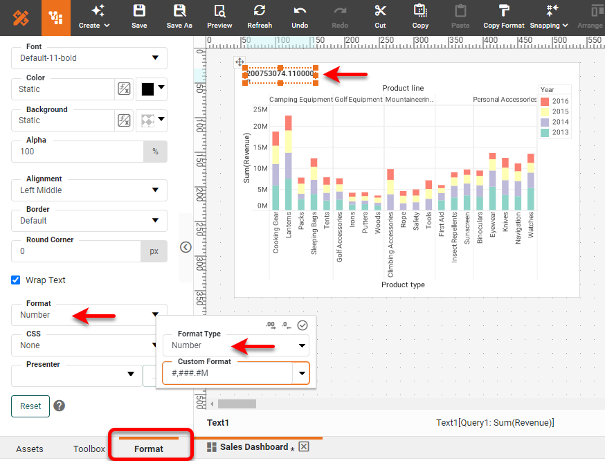
However, let's replace the Chart title with a text KPI giving the overall summed revenue. To hide the Chart title, right-click on the chart and select Properties from the menu. In the Chart Properties dialog box, delete the text in the Title field, but leave the Visible option enabled so the space for title can be used by the KPI we will add shortly. Press OK.
Add a Revenue KPI
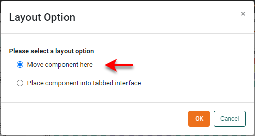
To add a revenue KPI (Key Performance Indicator) onto the chart, drag a Text element from the Toolbox onto the Chart in the desired location. When prompted, select 'Move component here'.
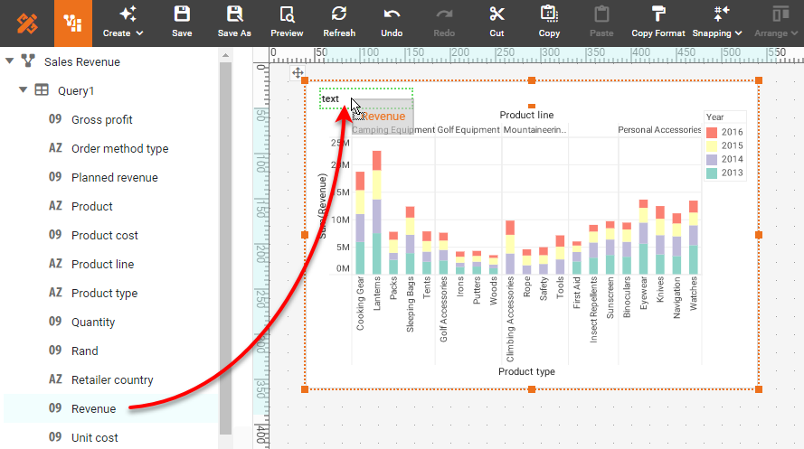
Drag the 'Revenue' field from the data source onto the Text component. The Text component now displays the summed revenue, but the formatting is inappropriate.
To change the formatting, select the Text component, and then press the Format tab in the left panel. Change Format to a custom Number format with display by millions (M), "#,###.#M".
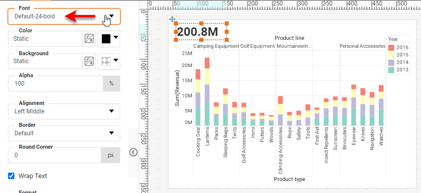
Change the text size as desired to present the KPI in a visible manner:
Add a Gauge Chart to Sales Dashboard
A Gauge displays a single measure, such as the disputed invoice share in our example. InetSoft has two ways to create a Gauge such as this, either by using the dedicated Gauge component or using the Donut chart style of the Chart component.
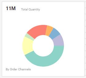
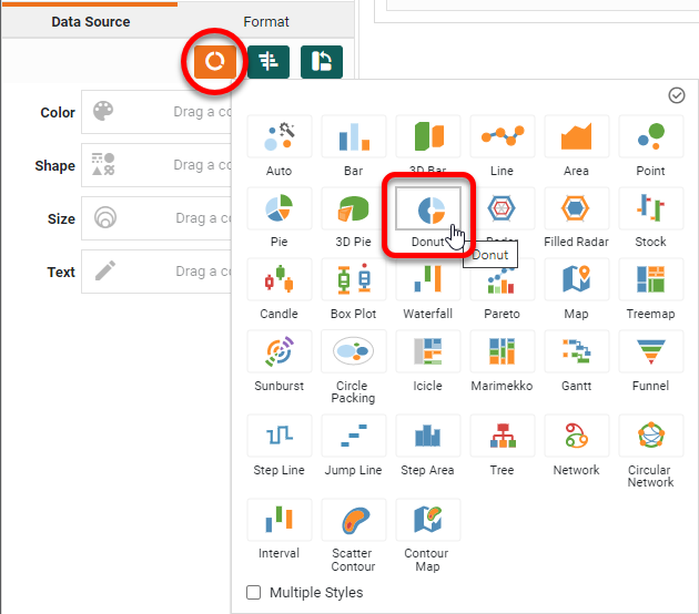
Let's see how to do this using the Donut chart. First add a new chart to the dashboard. Open the Chart Editor (see earlier for instructions on how to do this). Change the Chart Style to Donut.
Drag the 'Quantity' to the Y region, and the 'Order method type' field to the Color region to break out the data by order type.
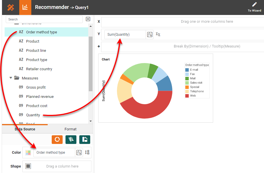
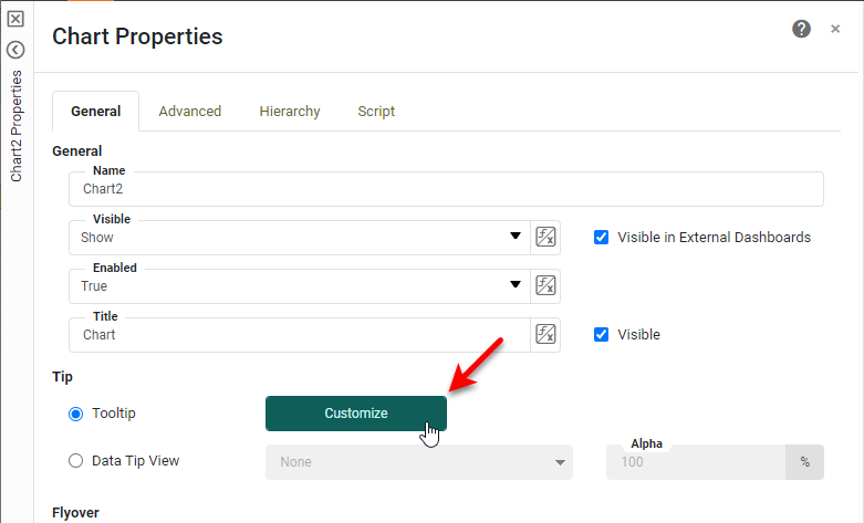
If you want the Chart to match the example dashboard, hide the legend, the axis title, and the Chart title, and change the chart colors as illustrated for the previous chart. Press Finish to complete the Gauge Chart. You can also add a KPI showing summed quantity by dragging a Text component into the dashboard as we did for the previous Chart. Then drag the 'Quantity' field on top of the Text component, as set the formatting as desired. The Gauge Chart in the sample dashboard also has a custom tooltip.
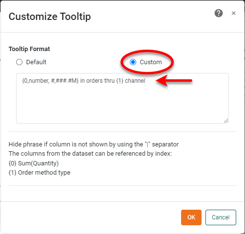
To make a custom tooltip, right-click the Chart and select Properties from the menu. Press the Customize button next to Tooltip.
Select the Custom option and enter the following tooltip text: "{0,number,#,###.#M} in orders thru {1} channel." The numbers in curly braces are used to insert actual data values, and the "number" parameter is used to apply formatting to the quantity value (millions representation). Press OK.
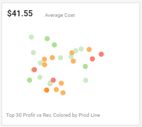
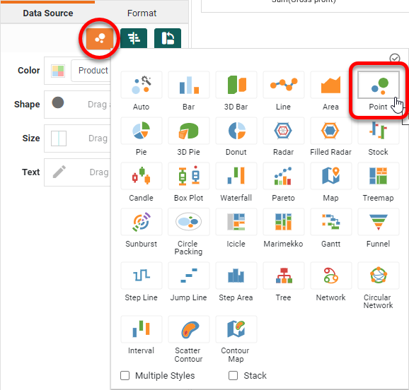
Add a Scatter Chart
The example dashboard features a Scatter Chart like the one below, displaying cost vs. profit, broken out by product line.
It is very easy to create this kind of Chart. First add a new Chart as before, and open the Chart Editor. Select a Point type chart.
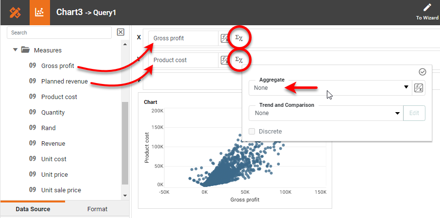
Drag the 'Gross profit' field to the X region and drag 'Product cost' to the Y region. Press the Edit Measure button for both measures, and set Aggregate to 'None'. (We want the scatter plot to show the raw data.)
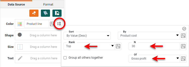
Drag the 'Product line' field to the Color region. To display the top 30 products by gross profit, press the Edit Dimension button next to the 'Product line' field, and set the Rank property as shown below:
Use the Size region to change the size of the points, and hide the legend and any labels as desired.
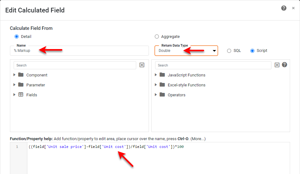
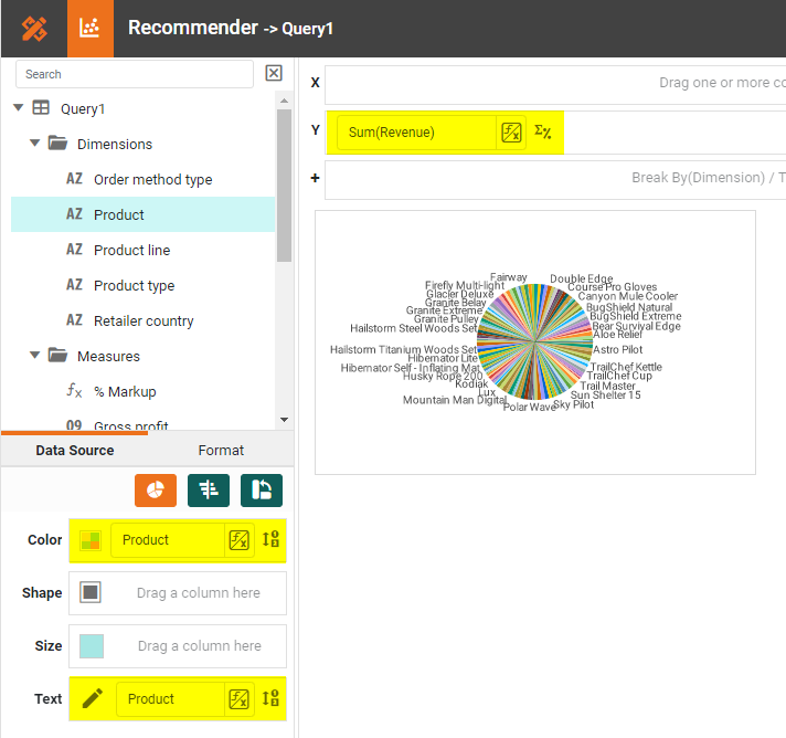
Create a Derived Field
In the sample dashboard, a field called '% Markup' is created by using a Calculated Field. This is easy to do. Right-click on the data source in the left panel, and select New Calculated Field from the menu. Provide a Name ('% Markup') and Return Data Type ('Double'), and enter the formula show below. Then press OK.
((field['Unit sale price']-field['Unit cost'])/field['Unit cost'])*100
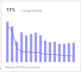
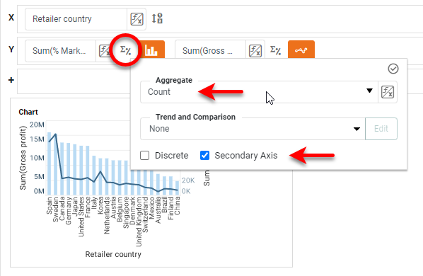
Add a Multi Style Chart
The example dashboard features an example of a chart with multiple styles, with 'Gross profit' as a Line chart and 'Markup' as a bar chart, broken out by country.
To create this chart, first add a Chart to the dashboard and open the Chart Editor. Drag 'Retailer Country' to the X region, and drag 'Gross profit' and '% Markup' (the Calculated Field created in the previous section) to the Y region.
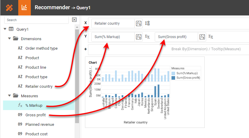
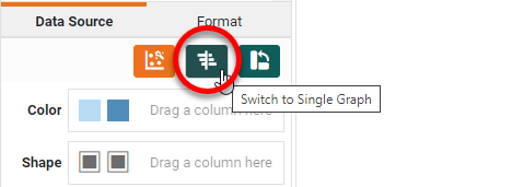
Press the Switch to Single Graph button to put both measures on the same axis.
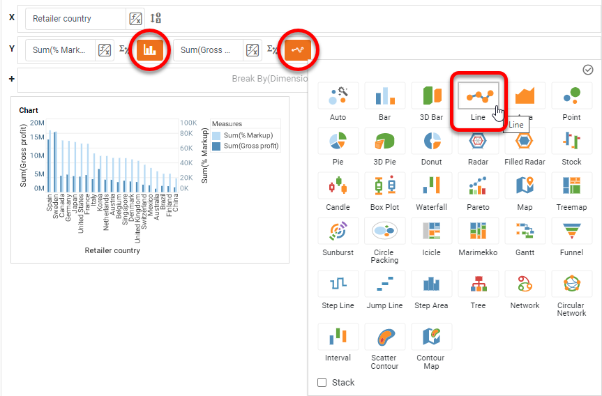
Press the Select Chart Style button and enable Multiple Styles at the bottom of the panel. Then press Apply.
Set a Bar style for the '% Markup' field and a Line style for 'Gross Profit'.
Press the Edit Measure button and change the Aggregate method for the '% Markup' field to Count, and enable Secondary Axis.
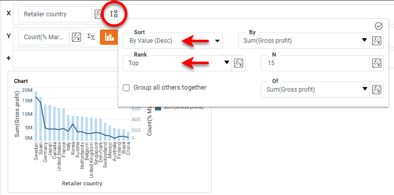
Press the Edit Dimension button next to 'Retailer Country', set the Sort to By Value (Desc) by 'Sum(Gross Profit)', and set the Rank to Top 15 by 'Gross Profit', as shown below:

To change the colors, choose the desired measure from the menu above the Color region, and then set the desired color. Then repeat for the other measure.
As with the previous charts, hide the legend and axis labeling if you want the chart to match the example dashboard in uncluttered appearance.
Create a Data Tip for Total Revenue Chart
Finally, let's see how you can replace a tooltip with another Data View component. In the example dashboard, when you mouse over the Revenue Chart at the top left, a Pie Chart pops up instead of the tooltip. This is called a Data Tip.
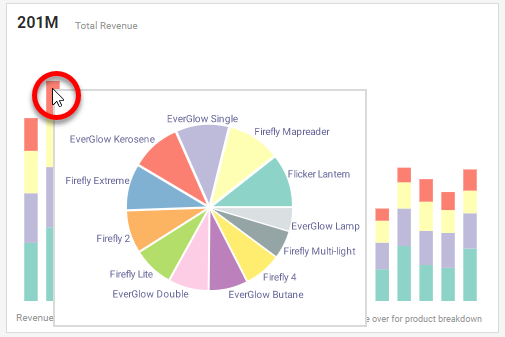
Follow these steps to create the Data Tip: Add a new Chart to the dashboard and set the Chart Style to Pie. Place the 'Revenue' field on the Y axis, and place the 'Product' field in the Color and Text regions. Hide the legend, axis label, and Chart title. Press Finish. (Don't worry if the chart looks crowded, because when it is used as a Data Tip it will be automatically filtered based on where the user points the mouse.)
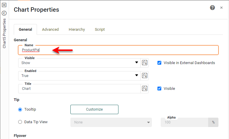
Right-click this new Pie Chart, and select Properties. Change the Name to "ProductPie", and press OK.
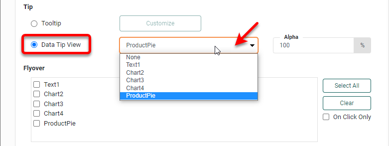
Now right-click the top Total Revenue Chart, and select Properties from the menu. In the Tip section of the General tab, select Data Tip View, and choose the "ProductPie" chart from the list. Press OK. This will use the "ProductPie" chart in place of the normal tooltip, and will also hide the "ProductPie" chart on the dashboard at runtime. (It will now ONLY appear as a Data Tip.)
Summary
This document has illustrated a few of the techniques used to create a dynamic and powerful Sales Dashboard. You saw how to create charts with multiple dimensions, multiple measures, and multiple styles. You added a text KPI, Gauge Chart, and Scatter Chart, and learned how to format data and text. You also saw how to create Ranking Filters, Calculated Fields, Custom Tooltips, and Data Tips to facilitate interactivity. It should be clear that InetSoft makes it quick and easy to display charts and KPIs in a wide variety of different modalities for exploration and interaction. InetSoft additionally provides many other features to facilitate the creation of professional dashboards, such as embedding, hyperlinks, drill-downs, positioning and sizing aids, device-adaptive layout, advanced scripting, and much more. InetSoft provides a complete solution for modern, powerful, and effective dashboards.