How to Create a Supply Chain Dashboard
This training page will explain how to create a supply chain dashboard such as the one below using dashboard creation software from InetSoft. A working version of this dashboard can be found on the InetSoft Gallery. This dashboard is primarily composed of charts. Below, we will examine some of these charts, discuss their value for supply chain tracking and see how easy they are to create with InetSoft's solution..
Contents
Using Dashboards for Supply Chain
Using Maps to Track Shipping Cost by Country
Create a Map
Using a Trellis Chart to Compare Stocked vs. Made-to-Order
Create a Trellis Chart
Summary

As visual representations of data dashboards provide quick and easy access to important information. In the context of supply chain and shipping, dashboards can provide real-time visibility into the supply chain and shipping operations, allowing stakeholders to quickly identify and address any issues that may arise.
With access to up-to-date and accurate information, decision-makers can make informed decisions that can help optimize the supply chain and shipping processes. Dashboards can also help facilitate collaboration and communication among different teams and departments involved in the supply chain and shipping processes.
The right dashboards can help identify bottlenecks and inefficiencies in the supply chain and shipping processes, allowing stakeholders to take corrective actions and improve overall efficiency. And by providing real-time visibility into the supply chain and shipping processes, dashboards can help improve customer service by providing customers with accurate and timely information about their orders.
Dashboards can help improve supply chain and shipping operations by providing stakeholders with timely and accurate information, facilitating collaboration, and enabling informed decision-making.
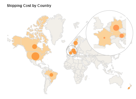
By tracking shipping costs by country, businesses can identify the factors that are driving the costs, such as taxes, duties, or transportation costs. This can help businesses optimize their shipping strategies and find ways to reduce costs. Tracking shipping costs by country can also help businesses compare prices and identify opportunities to save money. For example, a business may find that it is more cost-effective to ship to a certain country from a different origin location.
By understanding the shipping costs associated with different countries, businesses can better estimate the profitability of international sales. This can help businesses make informed decisions about which countries to target and which products to offer. Tracking shipping costs by country can also help businesses manage risk by identifying countries where shipping costs are high or where there are regulatory or logistical challenges that could impact the shipping process. Tracking shipping costs by country can provide valuable insights for businesses engaged in international shipping, helping them optimize their shipping strategies, reduce costs, and improve profitability.
To display data on a map by region (state, city, zip code, etc.), follow the steps below::
Prepare Your Data
The data source for the chart (data block, query, or data model) should represent dimensions and measures as independent columns or fields, including a date column, as shown below. See Prepare Your Data for information on how to manipulate your data, if it is not currently in this form. (Note: A properly designed data model will already have the correct structure.)
Open a Chart for Editing
If necessary, create a new Dashboard. For information on how to create a new Dashboard, see Create a New Dashboard.
From the Toolbox panel, drag a Chart component into the Dashboard.

Resize the Chart as desired by dragging the handles.
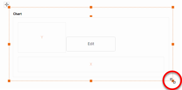
Press the 'Edit button in the center of the Chart or press the Edit' button in the top-right corner.

This opens the Visualization Recommender. Bypass the Recommender by pressing the 'Full Editor' button at the top right to open the Chart Editor.

Then follow the steps below to add data to the chart:
Press the 'Select Chart Style' button , and choose the 'Map' chart type. Press the 'Apply' button (or double-click the 'Map' icon).

The Chart Editor now provides a 'Geographic field.
Mark the dimensions you want to use on the map as geographical fields using the steps below.
Right-click the field in the tree or press the 'Actions' button , and select 'Set Geographic' from the context menu. This places a location icon next to the field name.

If the field is shown with a mapped location icon , this means the field has been already been mapped to a geographical level. If the field is shown with an unmapped location icon , this means you may need to set the geographical level for the field or resolve location names.
To set the geographical level, right-click the field name or press the 'Actions' button , and select 'Edit Geographic' from the context menu. This opens the 'Edit Geographic' dialog box.

In the 'Edit Geographic' dialog box, select the desired region from the 'Map' menu: Asia, Canada, Europe, Mexico, U.S., or World. The map that you select for a geographic field applies to all other geographical fields.
From the 'Layer' menu, select the geographical layer that corresponds to the data in the selected field.
This specifies the layer of the geographical database against which field values should be matched (e.g., city names should be matched against the city layer, etc.). The options available in the 'Layer' menu depend on the previously selected 'Map' option.
From the 'Mapping' menu, select the desired map database.
The Chart Editor attempts to resolve values in the selected geographic field against the corresponding layer in the map database. If the field was shown with an unmapped location icon , this means you may need to resolve location names. To do this, press the 'Edit' button next to the "Mapping' menu. This opens the 'Geographic Mapping' dialog box, which allows you to manually match place names. Make any required matches and press 'OK'.

To remove the geographical status of a field, right click the field or press the 'Actions' button , and select 'Clear Geographic' from the context menu.
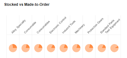
A trellis chart of pie charts of each product category's stocked vs made to order ratio can be useful to a supply chain manager in several ways. By examining the stocked vs made to order ratio for each product category, the supply chain manager can identify which categories have a higher proportion of made to order items. This information can help the manager understand which categories require a more flexible inventory management strategy.
By using a trellis chart of pie charts, the supply chain manager can quickly compare the stocked vs made to order ratio for each product category side by side. This can help the manager identify which categories are performing well and which may require further analysis. A trellis chart of pie charts can also be useful for highlighting opportunities for cost savings. For example, if a product category has a high proportion of made to order items, the supply chain manager may consider consolidating orders or increasing production volume to achieve cost savings. By providing a clear and visually appealing way to display data, a trellis chart of pie charts can help support decision-making. The supply chain manager can use this chart to inform decisions around inventory management, production planning, and cost optimization.
To create a Trellis chart in pie chart style like the example described above, follow the basic steps below.
Prepare Your Data
The data source for the chart (data block, query, or data model) should represent dimensions and measures as independent columns or fields, including a date column, as shown below. See Prepare Your Data for information on how to manipulate your data, if it is not currently in this form. (Note: A properly designed data model will already have the correct structure.)
Open a Chart for Editing
If necessary, create a new Dashboard. For information on how to create a new Dashboard, see Create a New Dashboard.
From the Toolbox panel, drag a Chart component into the Dashboard.
Resize the Chart as desired by dragging the handles.
Press the 'Edit button in the center of the Chart or press the Edit' button in the top-right corner.
This opens the Visualization Recommender. Bypass the Recommender by pressing the 'Full Editor' button at the top right to open the Chart Editor.
In the Chart Editor, drag a measure field from the Data Source panel to the 'Y' region.

In the Chart Editor, drag a dimension field from the Data Source panel to the 'Color' region.

Press the 'Edit Color' button to choose the colors. See Group Data by Dimension for more information about the color panel.

Press the 'Select Chart Style button, and choose your desired style. In this example, we will be selecting 'Pie" . This converts the chart into a pie-chart representation.

If you would like the pie slices labelled with text, then drag the same dimension that used in the 'Color' region to the 'Text' region as well.
Optional: Remove the legend if desired. To do this, right-click on the legend, and select 'Hide Legend' from the context menu.

Optional: To place a small gap between the pie slices, right-click the plot area and select 'Properties' from the context menu.

In the Advanced tab of the 'Chart Properties' panel, select Explode Pie' and press 'OK'.

The first pie chart is now complete

To turn the one chart into a Trellis chart, simply add dimensions into the 'X' and 'Y' regions to create the desired arrangement.

Summary
This page has gone over a few of the techniques used to create a dynamic and powerful supply chain dashboard. You saw how to create map and trellis charts, and how to use them to analyze the most important aspects of supply chains. InetSoft makes it quick and easy to display data in a wide variety of different styles for exploration and interaction. InetSoft additionally provides many other features to facilitate the creation of professional dashboards, such as embedding, hyperlinks, drill-downs, positioning and sizing aids, device-adaptive layout, advanced scripting, and much more. InetSoft is a complete solution for modern, powerful, and effective dashboards.