Circle Packing Charts - Definition, Example, and How to Make Them
This page will discuss the uses of Circle Packing Charts, show you how to create them in InetSoft, and provide access to a free online tool for creating Circle Packing Charts as well as complete functioning business intelligence dashboards.
Contents
Definition of Circle Packing Chart
An Example of a Circle Packing Chart
How to Make a Circle Packing Chart
Tool to Make Circle Packing Charts Online for Free

A Circle Packing chart, also known as a Circular Treemap, is a visualization that displays hierarchically organized data as a set of nested circles. Each circle represents a level in the data hierarchy, with sub-levels represented as smaller circles inside of the larger circles.
This allows the end-user to easily see the relationships between different dimensions and the proportion of each subcategory within its parent category. One of the main advantages of using a Circle Packing chart is that it effectively conveys hierarchical relationships between data points.
The size of each circle is usually determined by a measure, such as a quantity or percentage. The position of each circle is determined by its relationship to other circles in the chart.
Circle Packing charts are useful for visualizing data in fields such as finance, marketing, and social science. They could be used to show the distribution of wealth among different countries, the market share of different companies, or the relationship between different social groups.
An Example of a Circle Packing Chart
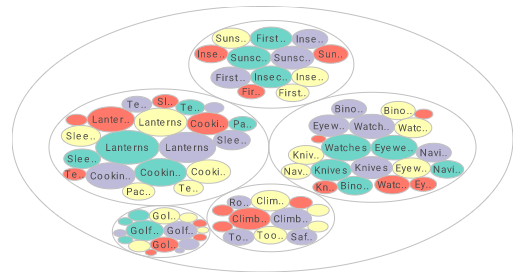
This chart, which will be featured in the how to instructions below, is an example of how how Circle Packing charts use series of circles within circles to represent dimension hierarchies, with size used to represent a measure.
In this example, sales are divided by state, city, and company name. Circles representing individual cities are nested within larger circles representing the states that those cities are in.
The circles representing cities contain smaller circles representing the individual companies within each city.
Each level of circle is sized according to the total sales revenue for its respective state, city or company. The city circles are colored according to the state that they're in, making the separation by state more clear to the viewer.

The sizing of the nested circles give a multilevel sense of proportion that would not be conveyed with other charts. The proportion of sales by state, city, and company not only conveyed simultaneously; the proportion of each company's contribution to each cities contribution, and each cities contribution to each states contribution, are conveyed to the viewer with one quick glance of the chart.
How to Make a Circle Packing Chart in InetSoft
To create a Circle Packing chart, follow the basic steps below.
Prepare Your Data
The data source for the chart (data block, query, or data model) should represent dimensions and measures as independent columns or fields, including a date column, as shown below. See Prepare Your Data for information on how to manipulate your data, if it is not currently in this form. (Note: A properly designed data model will already have the correct structure.)
Open a Chart for Editing
If necessary, create a new Dashboard. For information on how to create a new Dashboard, see Create a New Dashboard.
From the Toolbox panel, drag a Chart component into the Dashboard.

Resize the Chart as desired by dragging the handles.
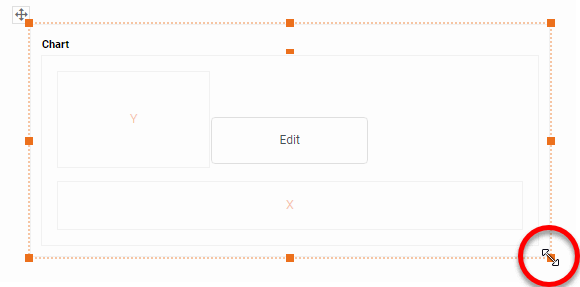
Press the 'Edit button in the center of the Chart or press the Edit' button in the top-right corner.

This opens the Visualization Recommender. Bypass the Recommender by pressing the 'Full Editor' button at the top right to open the Chart Editor.

To create a circle packing chart, place the desired hierarchical dimensions in the 'T' region of the Chart Editor, and place the desired measure in the 'Size' region of the Chart Editor. Use the 'Color' region to distinguish particular dimension values by color. NOTE: To create a grid of charts, place dimensions into the 'X' and/or 'Y' regions as well. (See Trellis Chart (Grid) for more information.)
Walkthrough
This example illustrates how to create a circle packing that displays total broken down by state, city, and product name.
Create a new Dashboard based on the 'Sales Explore' Data Worksheet. The 'Sales Explore' Data Worksheet can be found in the 'Examples' folder under 'Data Worksheet'. For information on how to create a new Dashboard, see Create a New Dashboard.
Drag a Chart component from the Toolbox tree to the Dashboard, and press the 'Edit' button at the top-right corner of the Chart to open the Visualization Recommender. Press the 'Full Editor' button at the top right to open the Chart Editor. (For more details on creating a chart, see Basic Charting Steps.)
In the Chart Editor, press the 'Select Chart Style' button and choose the 'Circle Packing' option. Press the 'Apply' button.

Drag the 'State', 'City', and 'Name' fields from the Data Source panel to the 'T' region. (NOTE: These fields can be found in the 'Sales Explore' Data Worksheet.)
Drag the 'Total' measure from the Data Source panel to the 'Size' region.
Drag the 'State' dimension from the Data Source panel to the 'Color' region.

Optional: Press the 'Edit Color' button next to the 'State' dimension, and choose the desired colors to represent the state values. Press the 'Close' button.
Optional: You can add additional dimensions to the Chart if desired. See Trellis Chart (Grid) for information about adding multiple dimensions to a chart axis.
Press the 'Finish' button to close the Editor.
Resize the chart as desired.
Hover the mouse over the chart to see a tooltip providing full information about each group. You can proceed to edit the titles, legend, etc. See Basic Charting Steps and Chart Properties for more information. See Format Data for information on how to format text on a Chart.
Tool to Make Circle Packing Charts Online for Free
To easily and quickly create Circle Packing Charts online for free, create a Free Individual Account on the InetSoft website. You will then be able to upload a spreadsheet data set.

Once you have done that, you will be able to proceed past the Visualization Recommender, which can usually get you started creating a dashboard. Since the Recommender does not allow you to create a Circle Packing Chart, press the Full Editor button.
Then proceed to build the Chart as described in the previous section.