Contour Charts - Definition, Example, and How to Make Them
This page will discuss the different kinds of Contour Charts, show you how to create them in InetSoft, and provide access to a free online tool for creating Contour Charts as well as complete functioning business intelligence dashboards.
Contents
Definition and Types of Contour Charts
An Example of a Contour Chart
How to Make a Contour Chart
Tool to Make Contour Charts Online for Free

A Contour Chart, or Scatter Plot, displays contours that correspond to the density of the plotted points. The points themselves are not displayed. Contour Charts are an intuitive method of displaying two dimensional point data., and can display data trends and correlations between any two dimensions. This form of charting makes outliers easy to identify, since regions with a higher density of points are grouped visually.
Contour charts can also provide a means for comparing different data sets plotted on the same axes. These properties make Contour Charts a great addition to InetSoft's extensive library of chart types
Contour Map Chart
This chart type combines a Map Chart with a Scatter Contour Chart to display density data either based on regional information (country, state, city, etc.) or based on latitude and longitude.
This is effective in cases where a simple map chart would have too many data points, resulting in a confusing jumble. Instead, the use of contours to show the densitiy of points on the map gives a clear picture of areas of higher and lower activity.
Examples of Contour Charts
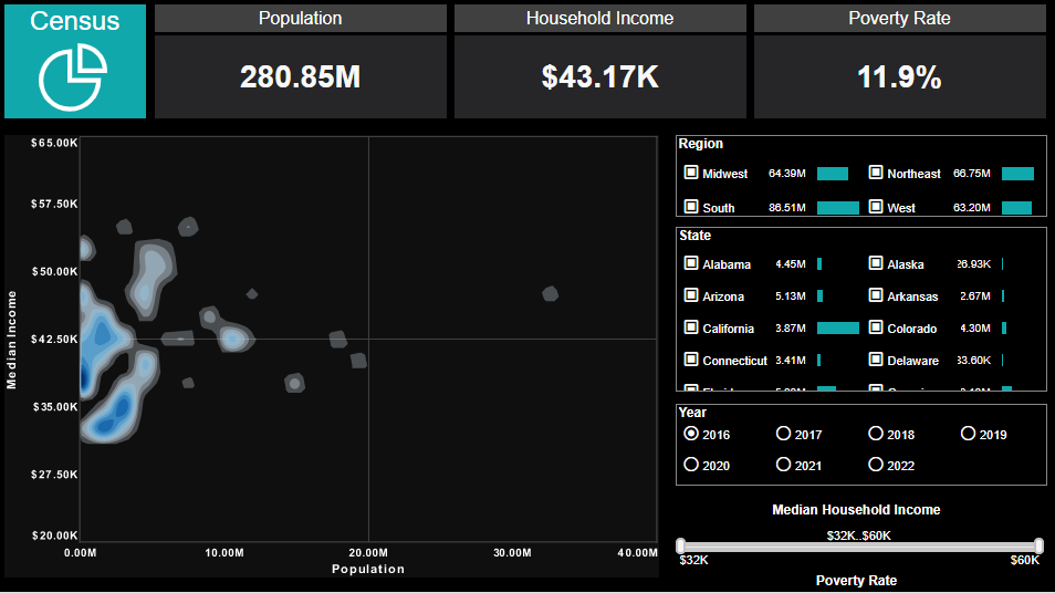
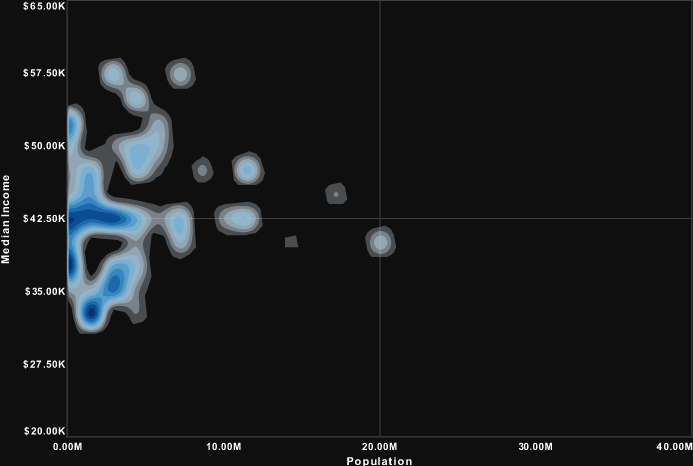
This contour chart, taken from a modified version of InetSoft's Census Dashboard, uses a Contour Scatter Plot to explore the relationship between states population and their median income, with state population plotted on the x axis and state median income on the y axis. In the original version of the chart, each of the fifty states was plotted with a circle data point, causing quite a jumble.
Using a contour plot provides a clearer overall picture of the relationship between median income and population. From simply glancing at the chart, we see that states tend to cluster around the one to two million population range, with median incomes of around thirty to forty five thousand.
Example of a Contour Map Chart
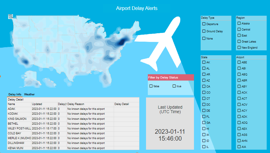
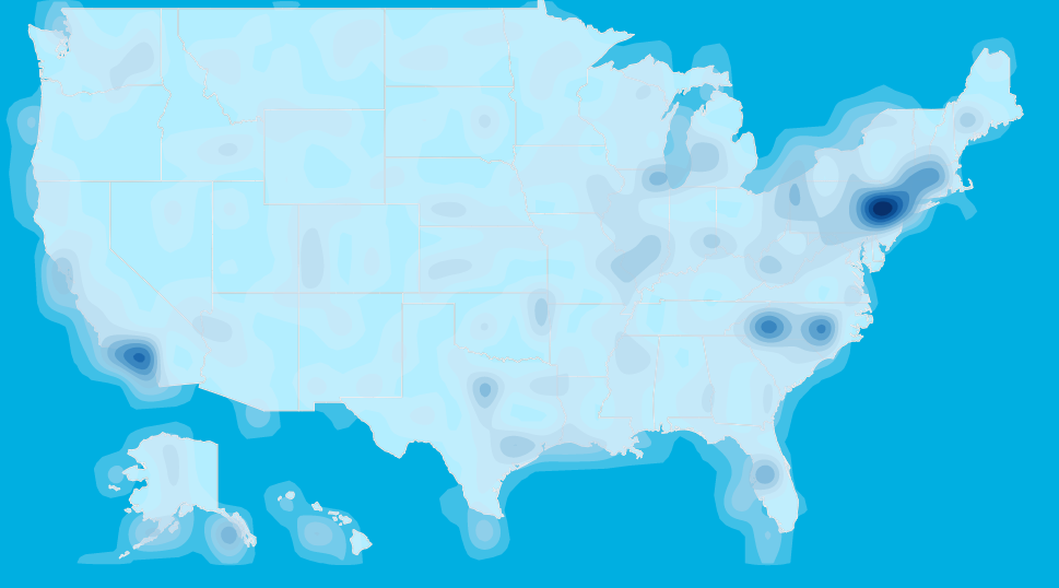
This contour map chart example, taken from a modified version of InetSoft's Airport Delays Dashboard, uses scatter contour to display airports with flight delays in the United States.
Once again, instead of a jumble of individual data points, we get a clear overall impression of the concentration of flight delays in various regions. A simple glance at the chart shows a concentration of delayed flights in the Northeast.
To create a Contour chart, follow the basic steps below.
Prepare Your Data
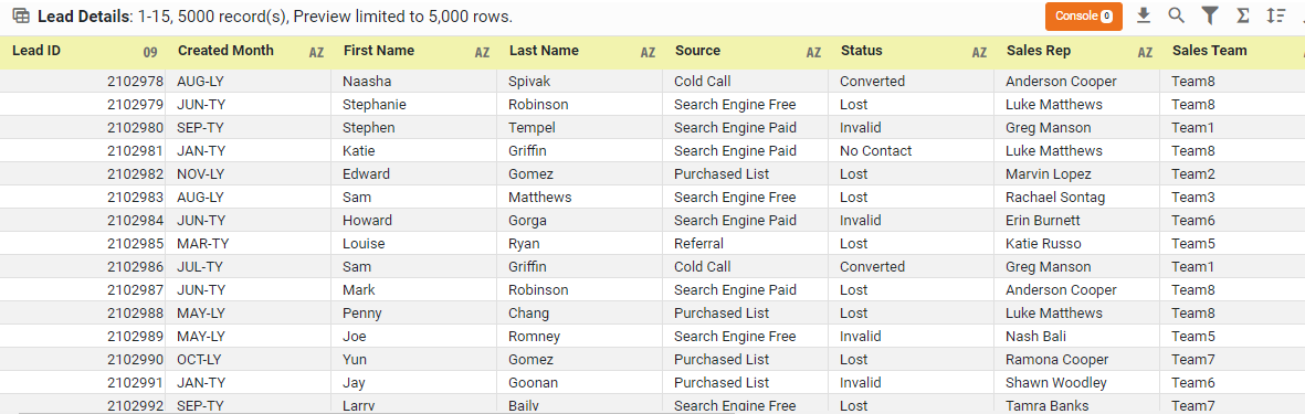
The data source for the chart (data block, query, or data model) should represent dimensions and measures as independent columns or fields, including a date column, as shown below. See Prepare Your Data for information on how to manipulate your data, if it is not currently in this form. (Note: A properly designed data model will already have the correct structure.)
Open a Chart for Editing
If necessary, create a new Dashboard. For information on how to create a new Dashboard, see Create a New Dashboard.
From the Toolbox panel, drag a Chart component into the Dashboard.

Resize the Chart as desired by dragging the handles.
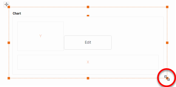
Press the 'Edit button in the center of the Chart or press the Edit' button in the top-right corner.

This opens the Visualization Recommender. Bypass the Recommender by pressing the 'Full Editor' button at the top right to open the Chart Editor.

Then follow the steps below to add data to the chart:
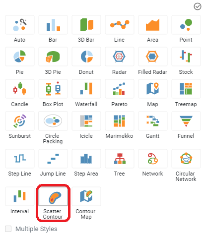
Press the 'Select Chart Style' button . Choose the 'Scatter Contour' style. Press the 'Apply' button
From the 'Measures' folder of the Data Source panel, drag a measure to the 'X' or 'Y' region.

Press the 'Edit Measure' button next to the measure, and select the desired aggregation method for the measure. NOTE: For Scatter Contour, you may not want aggregation. In this case, select 'None' as the aggregation method.

From the 'Measures' folder of the Data Source panel, drag a second measure to the 'X' or 'Y' region.

Press the 'Edit Measure' button next to the second measure, and select the desired aggregation method for the measure. Press the 'Apply' button.

This creates the desired scatter contour chart.

Optional Drag a dimension to the 'Text' area to display labels on the Chart. Note that if 'None' is selected as the aggregation method, duplicate labels may be displayed.

Optional Press the 'Edit Color' button to select an alternate color scheme. Note that for Scatter Contour chart you cannot bind a data field to the 'Color' region.

Optional: You can add additional dimensions to the Chart if desired. See Trellis Chart (Grid) for information about adding multiple dimensions to a chart axis.
Optional: To weight the data points according to a specified measure, drag a measure representing the weights to the 'Size' region. A larger weight assigns greater density to the point.
To change how the contours are focused on the data points (without weighting), press the 'Edit Size' button, and choose a fixed size value. NOTE: You can make additional adjustments to the appearance of the contours from the 'Chart Properties' dialog box. See below.

Press the 'Finish' button to close the Editor.
Optional: To change the characteristics of the contours, press the 'More' button in the Chart toolbar, and select 'Properties'. In the 'Chart Properties' dialog box, adjust the following settings under 'Density Contour' in the Advanced tab.
- 'Levels': Specifies the number of contours used to represent each region. A larger number produces a smoother transition of colors.
- 'Bandwidth': Specifies the area over which to calculate density. A larger number produces contours that span larger areas.
- 'Edge Alpha': Specifies the transparency of the contour edge. The transparency of the contour center is determined by the Chart 'Alpha' property. A higher value makes the edges more visible.
You can proceed to edit the titles, legend, etc. See Basic Charting Steps and Chart Properties for more information. See Format Data for information on how to format text on a Chart.
See previous section for instructions on how to configure your data and open a chart for editing.
Press the 'Select Chart Style' button, and choose the 'Contour Map' chart type. Press the 'Apply' button (or double-click the 'Map' icon).

The Chart Editor now provides a 'Geographic field.
Optional: If you want to use a web map background (Mapbox map or Google Map, depending on what your administrator has configured), follow the steps below:
Right-click the Chart and select 'Properties'. This opens the 'Chart Properties' dialog box.

Under the Advanced tab, enable 'Use Web Map as Background' and press 'OK'. (If this option is not available, ask your administrator to enable the Web Map feature.)

Optional: If your geographical field represents areas on the Chart (e.g., states) rather than points (e.g., cities), adjust the 'Alpha' setting to less than 100% so that the filled regions do not obscure the underlying map background.
Press 'OK' to exit the 'Chart Properties' dialog box.
Mark the dimensions you want to use on the map as geographical fields.
Right-click the field in the tree or press the 'Actions' button , and select 'Set Geographic' from the context menu. This places a location icon next to the field name.

If the field is shown with a mapped location icon , this means the field has been already been mapped to a geographical level. If the field is shown with an unmapped location icon , this means you may need to set the geographical level for the field or resolve location names.
To set the geographical level, right-click the field name and select 'Edit Geographic' from the context menu. This opens the 'Edit Geographic' dialog box.

In the 'Edit Geographic' dialog box, select the desired region from the 'Map' menu: Asia, Canada, Europe, Mexico, U.S., or World.
From the 'Layer' menu, select the geographical layer that corresponds to the data in the selected field.
This specifies the layer of the geographical database against which field values should be matched (e.g., city names should be matched against the city layer, etc.). The options available in the 'Layer' menu depend on the previously selected 'Map' option.
From the 'Mapping' menu, select the desired map database.
The Chart Editor attempts to resolve values in the selected geographic field against the corresponding layer in the map database. If the field was shown with an unmapped location icon , this means you may need to resolve location names. To do this, press the 'Edit' button next to the 'Mapping' menu. This opens the 'Geographic Mapping' dialog box, which allows you to manually match place names. Make any required matches and press 'OK'.

To remove the geographical status of a field, right click the field or press the 'Actions' button , and select 'Clear Geographic' from the context menu.
From the Data Source panel in the Chart Editor, drag a geographic dimension onto the 'Geographic' field in the Chart Editor.

The chart updates to display the locations contained in the geographic field.
Repeat the previous step to bind additional 'Geographic' levels. For example, you can bind 'City' and 'State' fields.

Optional: To weight the data points according to a specified measure, drag a measure representing the weights to the 'Size' region. A larger weight assigns greater density to the point.

To change how the contours are focused on the data points (without weighting), press the 'Edit Size' button, and choose a fixed size value. NOTE: You can make additional adjustments to the appearance of the contours from the 'Chart Properties' dialog box. See below.
Press the 'Finish' button to close the Editor.
Optional To change the characteristics of the contours, press the 'More' button in the Chart toolbar, and select 'Properties'. In the 'Chart Properties' dialog box, adjust the following settings under 'Density Contour' in the Advanced tab.
- 'Levels': Specifies the number of contours used to represent each region. A larger number produces a smoother transition of colors.
- 'Bandwidth: Specifies the area over which to calculate density. A larger number produces contours that span larger areas.
- 'Edge Alpha': Specifies the transparency of the contour edge. The transparency of the contour center is determined by the Chart 'Alpha' property. A higher value makes the edges more visible.
Optional: Set the initial map view by pressing the 'Pan' button and dragging on the map to reposition, and by pressing the 'Zoom In' button or 'Zoom Out' button to zoom. Press the 'Clear' button to reset the view.

Tool to Make Contour Charts Online for Free
To easily and quickly create Contour Charts online for free, create a Free Individual Account on the InetSoft website. You will then be able to upload a spreadsheet data set.

Once you have done that, you will be able to proceed past the Visualization Recommender, which can usually get you started creating a dashboard. Since the Recommender does not suggest Contour or Contour Map as an option, press the Full Editor button.
Then proceed to build the Chart as described in the previous section.