Gantt Charts - Definition, When To Use, and How to Make Them
This page will discuss the uses of Gantt Charts, show you how to create them in InetSoft, and provide access to a free online tool for creating Gantt Charts as well as complete functioning business intelligence dashboards.

A Gantt chart is a variation of a bar chart utilized for displaying project schedules, including the dependent relationships between the various stages of a project. The projects or project segments are displayed as horizontal bars which vary in length based on their duration, often displayed in relation to the amount of time planned for that particular project or project segment.
Much like a horizontal version of a candlestick chart, in which the highest and lowest part of a bar displays a stock's highest and lowest price, a Gantt chart displays a project or task's start and end date/time with both ends of a bar representing the project/task.
The Gantt chart is most popular chart in project management analytics, providing extremely useful guidance in the proper allocation of resources, enabling teams to better meet their deadlines by visualizing not only start and end dates, but also milestones and dependent tasks. Gantt charts give project managers an at-a-glance view of project progress, immediately showing who is lagging and on what.
The identification of dependent tasks is crucial, as in any project there are tasks that can be completed simultaneously and tasks that cannot be started or finished until others are complete. Neglecting the consideration of dependent tasks can result in bottlenecks that end up unnecessarily delaying the entire project timeline.
A Gantt chart can be helpful in any industry where meeting project deadlines can be challenging, from the construction of roads and bridges, to the completion of state of the art software. Gantt charts come as a standard chart type in all InetSoft software solutions, no script required.
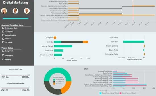
The InetSoft example of a Gantt chart above highlights how the use of a Gantt can complement a project management dashboard with more traditional bar charts. The dashboard's Gantt chart displays various marketing projects, with the titles of the projects listed on the right hand side, as is standard. A date timeline is displayed along the x axis, enabling project duration, both planned and actual, to be displayed horizontally. Using the colors grey and yellow to display the project's planned and actual times, respectively, enables project managers to immediately see which initiatives have proceeded on time and which have lagged.
How to Make a Gantt Chart in InetSoft
Configure your data: The data for a Gantt chart should be the start and end times for tasks, as well as any milestones, as shown below. See Prepare Your Data for information on how to manipulate your data, if it is not currently in this form.

To create a Gantt chart, follow the basic steps below:
Press the 'Select Chart Style' button . Choose the 'Gantt' style. Press the 'Apply' button.

If the date fields are listed under the 'Dimensions' folder in the Data Source panel, convert each date field to a measure. To do this, right-click each date dimension in the 'Dimensions' folder and select 'Convert to Measure'.

Drag the start date measure to the 'Start' region.

Drag the end date measure to the 'End' region.

Drag the milestone date measure to the 'Milestone' region.

From the Data Source panel, drag a desired dimension designating the different tasks to the 'Y' region.

Note that the order of the tasks may not be correct. To address this, proceed to the next step.
Press the 'Edit Dimension' button next to the dimension. (See Sort Data for more information about setting dimensions properties.) Select the 'Manual' option in the 'Sort' menu, and press the 'Edit' button to open the 'Manual Ordering' dialog box. To reorder an item in the 'Manual Ordering' dialog box, select the item and press the 'Up' or 'Down' buttons. Press 'OK' to close the dialog box.

To display the milestones using a different color, select the milestone field from the menu above the 'Color' region, press the 'Edit Color button', and choose the desired color.

Tool to Make Charts Online for Free
To easily and quickly create Gantt Charts online for free, create a Free Individual Account on the InetSoft website. You will then be able to upload a spreadsheet data set, as shown below:

Once you have done that, you will be able to proceed past the Visualization Recommender, which can usually get you started creating a dashboard. Since the Recommender does not offer the Gantt Chart as a suggestion, press the Full Editor button.
Then proceed to build the Chart as described in the previous section.