Heat Maps - Definition, Example, and How to Make Them
This page will discuss the uses of heat maps, show you how to create them in InetSoft, and provide access to a free online tool for creating heat maps as well as complete functioning business intelligence dashboards.
Contents
Definition of Heat Map
An Example of a Heat Map
How to Make a Heat Map
Tool to Make Heat Maps Online for Free

Definition of a Heat Map
A heat map is a visual representation of data that uses colors to indicate the relative values of the data points. A heat map displays a measure using a colored grid, where the value of the measure for a given combination of dimension values is used to determine the color of the grid at that location. Heat maps are often used to visualize data that has a spatial or geographical component, such as weather data, traffic patterns, or population density. In a heat map, each data point is represented by a colored square or rectangle, with the color indicating the intensity of the value being represented.
Typically, warmer colors such as red and orange indicate higher values, while cooler colors such as blue and green indicate lower values. Heat maps can be used to identify patterns and trends in large datasets and can be a powerful tool for data analysis and visualization. Heat maps provide an easy-to-understand visual representation of data that can be more intuitive and accessible than numerical tables or charts. They can help to gain insights from large datasets, particularly when there are many variables to consider. Heat maps make it easy to identify outliers or anomalies in a dataset, which may be missed when looking at the data in a different format. They allow for easy comparison of data across multiple variables or time periods, making it easier to spot trends and changes over time. Heat maps can be used to support decision-making processes, particularly in fields such as marketing, finance, and healthcare, where visualizing data can help to inform strategic decisions.
An Example of a Heat Map
This InetSoft heat map displays ozone levels by date. This can be a vital tool for understanding patterns and trends in air quality over time. By using warmer colors such as red and orange to represent high ozone levels and cooler colors such as yellow and green to represent low ozone levels, the heat map quickly highlights days when ozone levels are particularly high or low.
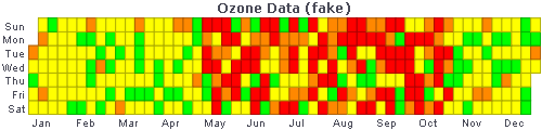
By displaying ozone levels by date, this heat map makes it easy to compare air quality on different days or over different time periods. This can be useful for understanding how air quality is changing over time, and for identifying seasonal or weather-related patterns in ozone levels. If the heat map was modified to be broken down by region or city, it could help to identify areas where ozone levels are consistently high. This could be useful for targeting efforts to reduce air pollution in these areas, and inform decision-making processes around issues such as public health, transportation, and environmental policy. Policymakers might use the data to develop strategies for reducing air pollution, or to inform public health warnings when ozone levels are particularly high.
How to Make a Heat Map in InetSoft
To display data on a heat map, follow the steps below::
Prepare Your Data
The data source for the chart (data block, query, or data model) should represent dimensions and measures as independent columns or fields, including a date column, as shown below. See Prepare Your Data for information on how to manipulate your data, if it is not currently in this form. (Note: A properly designed data model will already have the correct structure.)
In some cases (e.g., Pie Chart), you may want your data to provide just a single measure. In other cases (e.g., Line Chart), you may want the data to supply multiple measures. If the data does not provide the correct number of measures, you may be able to alter the number of measures to suit the needs of the chart by "pivoting" or "unpivoting" the data. See Convert Multiple Measures in Prepare Your Data for more information about this procedure.
To create a heat map, place the desired dimensions on the 'X' and 'Y' axes, and place the desired measure in the 'Color' region of the Chart Editor. Note: Do not place any measures on the 'X' and 'Y' axes, and do not place any fields in the 'Size' and 'Shape' regions of the Chart Editor.
This example illustrates how to create a heat map that displays Quantity Purchased broken down by month of year and product.
Create a new Dashboard based on the 'Sales Explore' Data Worksheet. For information on how to create a new Dashboard, see Create a New Dashboard.
From the Toolbox panel, drag a Chart component into the Dashboard.

Resize the Chart as desired by dragging the handles.
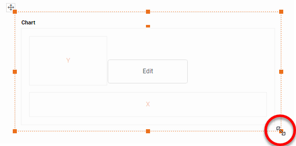
Press the 'Edit button in the center of the Chart or press the Edit' button in the top-right corner.

This opens the Visualization Recommender. Bypass the Recommender by pressing the 'Full Editor' button at the top right to open the Chart Editor.

In the Chart Editor, drag the 'Quantity Purchased' measure from the Data Source panel to the 'Color' region.
Drag the 'Name' dimension from the Data Source panel to the 'Y' region.
Drag the 'Date' dimension from the Data Source panel to the 'X' region.

Press the 'Edit Dimension' button next to the 'Date' field and set the 'Level' property to 'Month of Year'. Press the 'Apply' button

Optional: You can add additional dimensions to the Chart if desired. See Trellis Chart (Grid) for information about adding multiple dimensions to a chart axis.
Press the 'Edit Color' button next to the 'Quantity Purchased' measure, and choose the desired color spectrum to represent the aggregated values. (The built-in 'Heat' spectrum uses traditional shades of orange and brown, but you can use any other spectrum as well.)

Press the 'Close' button .
Press the 'Finish' button to close the Editor.
Resize the chart to show the desired number of products.
You can proceed to edit the titles, legend, etc. See Basic Charting Steps and Chart Properties for more information. See Format Data for information on how to format text on a Chart.
Tool to Make a Heat Map Online for Free
To easily and quickly create heat maps online for free, create a Free Individual Account on the InetSoft website. You will then be able to upload a spreadsheet data set.

Once you have done that, you will be able to proceed past the Visualization Recommender, which can usually get you started creating a dashboard. Since the Recommender does not allow you to create a heat map chart, press the Full Editor button.
Then proceed to build the map as described in the previous section.