Pareto Charts - Definition, When To Use, and How to Make Them
This page will discuss the uses of Pareto Charts, show you how to create them in InetSoft, and provide access to a free online tool for creating Pareto Charts as well as complete functioning business intelligence dashboards.

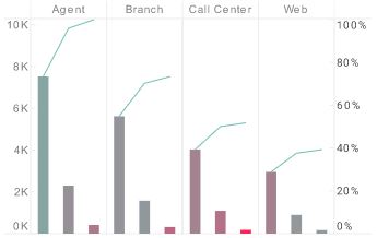
A Pareto chart is a dual axis chart which consists of a bar chart and a line chart. The bar chart aspect is fairly standard except it is always sorted so that the chart displays the highest amount, or tallest bar, on the left and the lowest amount on the right.
The line chart that is displayed over the bar chart displays the total proportion of the dataset represented by the bar below it combined with all larger bars to the left. Take a look at the Pareto chart above for a clear picture.
A Pareto chart conveys proportionality in more detail than a bar chart or pie chart, and is also more aesthetically pleasing than a waterfall chart. A Pareto chart is a great tool for helping users understand which factors influence outcomes the most. The theory behind it is known as the Pareto principle, which states that eighty percent of outcomes arise from twenty percent of causes. This principle is illustrated graphically with a Pareto chart.
Pareto analysis aids in decision making by separating out the input factors that have the greatest effect on outcomes. A Pareto chart typically involves data that covers cost, duration, or frequency, and a timeframe during which those data points occurred. Data frequency is represented on the left hand axis, with individual contributing factors represented with bars on the x axis. The percentage curve represented by the line is measured on the right hand side.
Pareto charts are usually used to identify key areas for improvement. For example, in manufacturing, a Pareto chart might be used to visualize the frequency of defects, and their cumulative impact.
An Example of a Pareto Chart
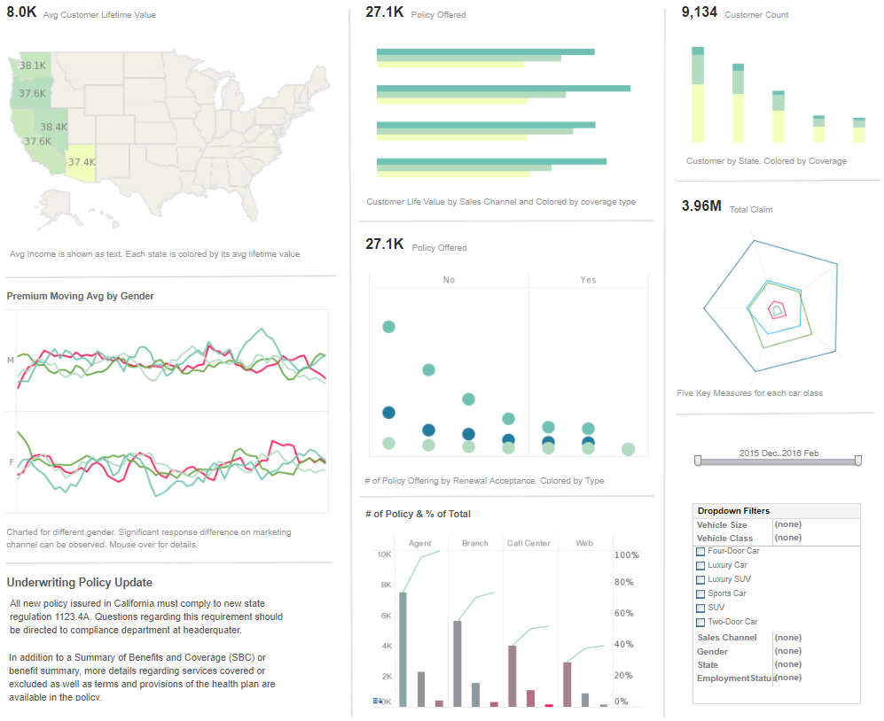
This insurance dashboard includes a Pareto chart that displays the proportion of each policy type relative to the total revenue. With the section of the chart for sales from agents, we can see the Pareto Principle in full effect, with almost eighty percent of agent sales being of personal auto policies, and sales for corporate and special auto policies consisting of the remaining twenty percent.
This is true of the auto policies sold by branches, call centers, and online as well. A manager using this chart would know to focus the attention of all sales staff on selling personal auto policies, in order to maximize revenue.
How to Make a Pareto Chart in InetSoft
To create a Pareto chart, follow the basic steps below.
Configure your data, and open a chart for editing.
Press the 'Select Chart Style' button. Choose the Pareto style. Press the 'Apply' button.

From the 'Dimensions' folder of the Data Source panel, drag a desired dimension to the 'X' or 'Y' region.

Optional: You can add additional dimensions to the Chart if desired. See Trellis Chart (Grid) for information about adding multiple dimensions to a chart axis. See Basic Charting Steps for information on how to add dimensions using color, shape, or size representation.
From the Measures' folder of the Data Source panel, drag a measure to the 'X' or 'Y' region. This places the selected field onto the chart as a measure.

Press the 'Edit Measure' button next to the measure, and select the desired aggregation method for the measure. Press the 'Apply' button.

Optional: You can add additional measures to the Chart if desired. See Multiple-Measure Chart for more information about adding multiple measures to a chart axis. See Basic Charting Steps for information on how to add measures using color, shape, or size representation.
Press the 'Finish' button to close the Editor.
You can proceed to edit the titles, legend, etc. See Basic Charting Steps and Chart Properties for more information. See Format Data for information on how to format text on a Chart.
Tool to Make Pareto Charts Online for Free
To easily and quickly create Pareto Charts online for free, create a Free Individual Account on the InetSoft website. You will then be able to upload a spreadsheet data set, as shown below:

Once you have done that, you will be able to proceed past the Visualization Recommender, which can usually get you started creating a dashboard. Since the Recommender does not offer the Pareto Chart as a suggestion, press the Full Editor button.
Then proceed to build the Chart as described in the previous section.