How to Create a Project Management Dashboard
This training page will explain how to create a project management dashboard such as the one below using dashboard creation software from InetSoft. A working version of this dashboard can be found on the InetSoft Gallery. This dashboard is primarily composed of charts. Below, we will examine some of these charts, and see how easy they are to create with InetSoft's solution..
Contents
Create a Gantt Chart
Add a Donut Chart
Create a Stacked Bar Chart
Add a Multiple Measures Chart
Add Custom Tooltips
Add Date Sliders
Add Selection Lists
Summary

Create a Gantt Chart
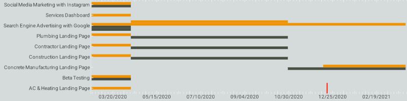
The dashboard's Gantt chart displays various marketing projects, with the titles of the projects listed on the right hand side, as is standard. A date timeline is displayed along the x axis, enabling project duration, both planned and actual, to be displayed horizontally. Using the colors grey and yellow to display the project's planned and actual times, respectively, enables project managers to immediately see which initiatives have proceeded on time and which have lagged.
To create a Gantt chart, follow the steps below:
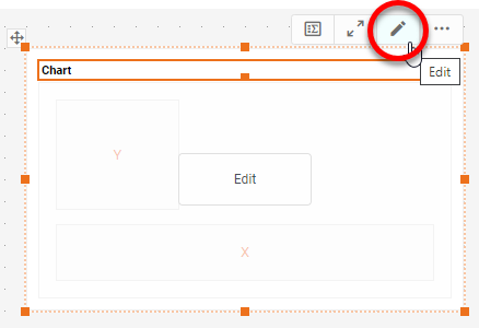
Press the Edit button on the Chart to open the Chart Editor.
Press the 'Select Chart Style' button . Choose the 'Gantt' style. Press the 'Apply' button.

Drag the start date measure to the 'Start' region.
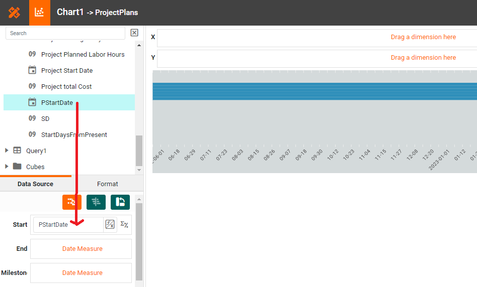
Drag the end date measure to the 'End' region.
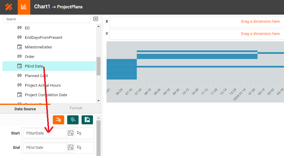
Drag the milestone date measure to the 'Milestone' region.
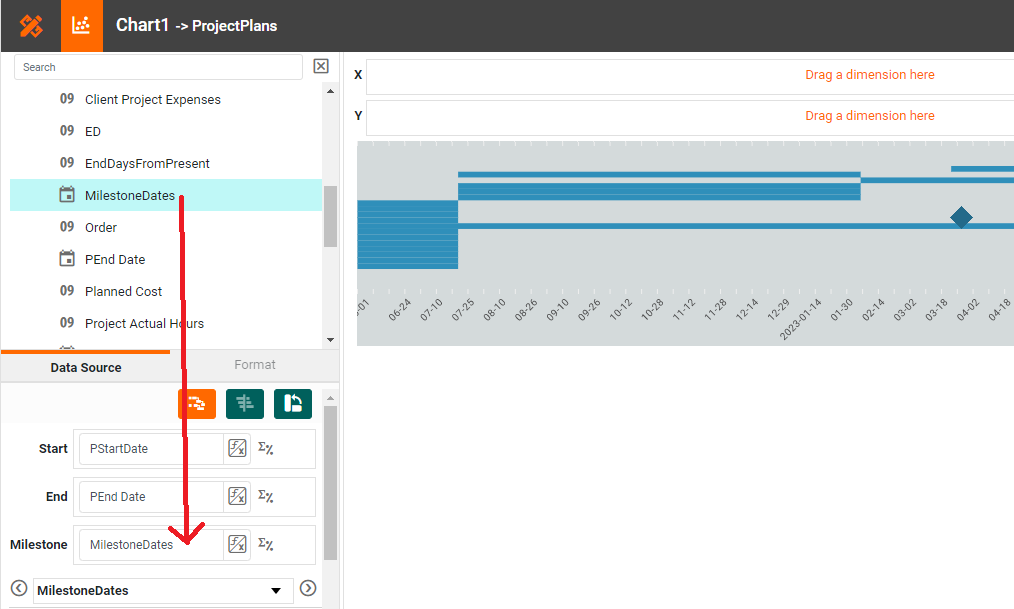
From the Data Source panel, drag the 'Description' dimension designating the different tasks to the 'Y' region.
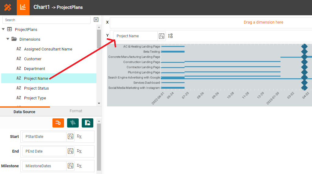
Note that the order of the tasks may not be correct. To address this, proceed to the next step.
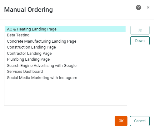
Press the 'Edit Dimension' button next to the dimension. (See Sort Data for more information about setting dimensions properties.) Select the 'Manual' option in the 'Sort' menu, and press the 'Edit' button to open the 'Manual Ordering' dialog box. To reorder an item in the 'Manual Ordering' dialog box, select the item and press the 'Up' or 'Down' buttons. Press 'OK' to close the dialog box.
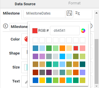
To display the milestones using a different color, select the milestone field from the menu above the 'Color' region, press the 'Edit Color button', and choose the desired color.
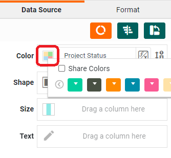
To add a color breakdown by project status, drag the 'ProjectPlan' field from the menu into the 'Color' region, press the 'Edit Color button', and choose the desired color.
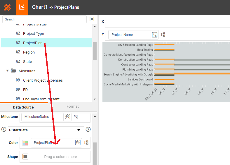
Select the colors to represent status using the same menu as when selecting the milestone style.
Add a Donut Chart
A donut chart is a Pie Chart with a hole in the center. To create a donut chart, follow the steps below.
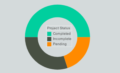
Open a Chart for editing. In the Chart Editor, drag the measure field 'Project IT' from the Data Source panel to the 'Y' region. In the Chart Editor, drag the dimension field 'Project Status' from the Data Source panel to the 'Color' region.
Press the 'Select Chart Style' button , and choose 'Donut'. This converts the chart into a donut-chart representation.

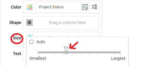
In the bottom-left panel, press the 'Edit Size' button, and choose the size of the donut hole.
Click on the 'Edit Color' button to select the colors for your guage.
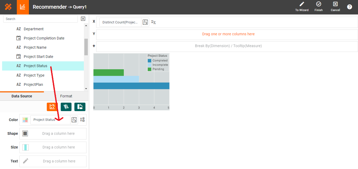
Create a Stacked Bar Chart
Create a Stacked Bar Chart by following these steps:
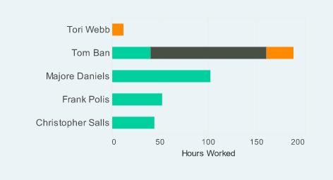
Open a Chart for editing. Press the 'Select Chart Style' button . Choose the 'Bar' style. Enable the Stack' option at the bottom of the panel. Press the 'Apply' button.
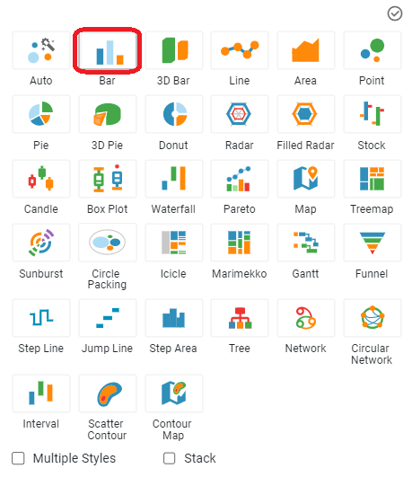
Note: 'Bar' is the default chart style when categorical dimensions are used.
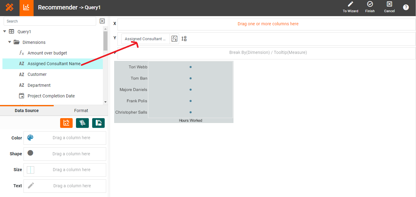
From the 'Dimensions' folder of the Data Source panel, drag athe Assigned Consultant Name dimension to the'Y' region.
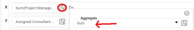
Drag the Assigned Consultant Labor Hours measure into the 'X' region. Press the 'Edit Measure' button next to the measure, and select the desired aggregation method for the measure.
To break-out the dataset into groups using color, drag project status from the data source into the 'Color' region.
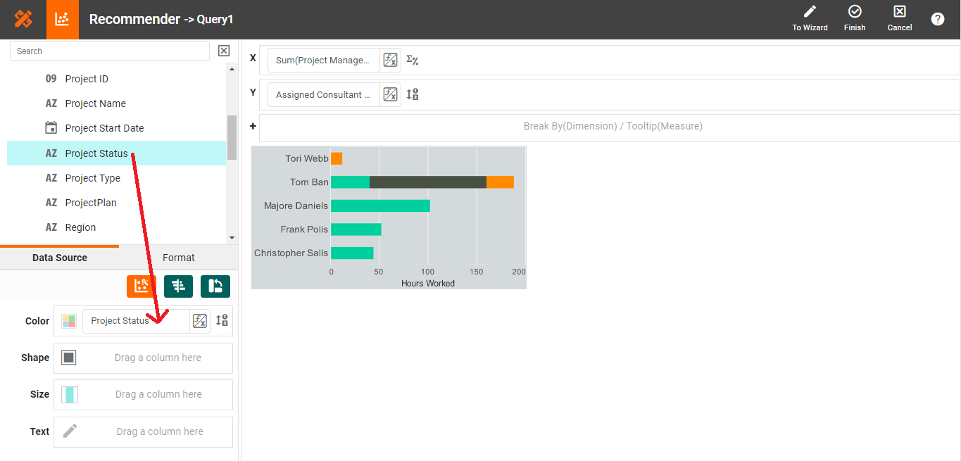
Press the 'Finish' button to close the Editor.
Add a Multiple Measures Chart
A multiple measures chart displays two or more measures on the same chart. This is useful for comparing related measures. Create a multiple measures chart by adding additional measure fields to the chart:
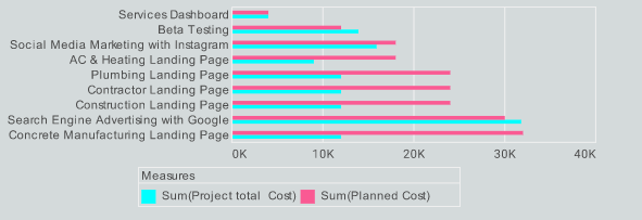
By default, when you add two or more measure fields on the X-axis, the selected data sets are plotted on adjacent sets of axes, as shown below:
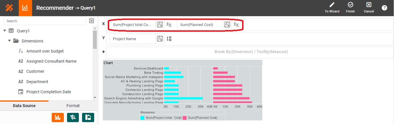
You want to display the measures on the same axis. To do this, press the 'Switch to Single Graph' button in the Chart Editor.
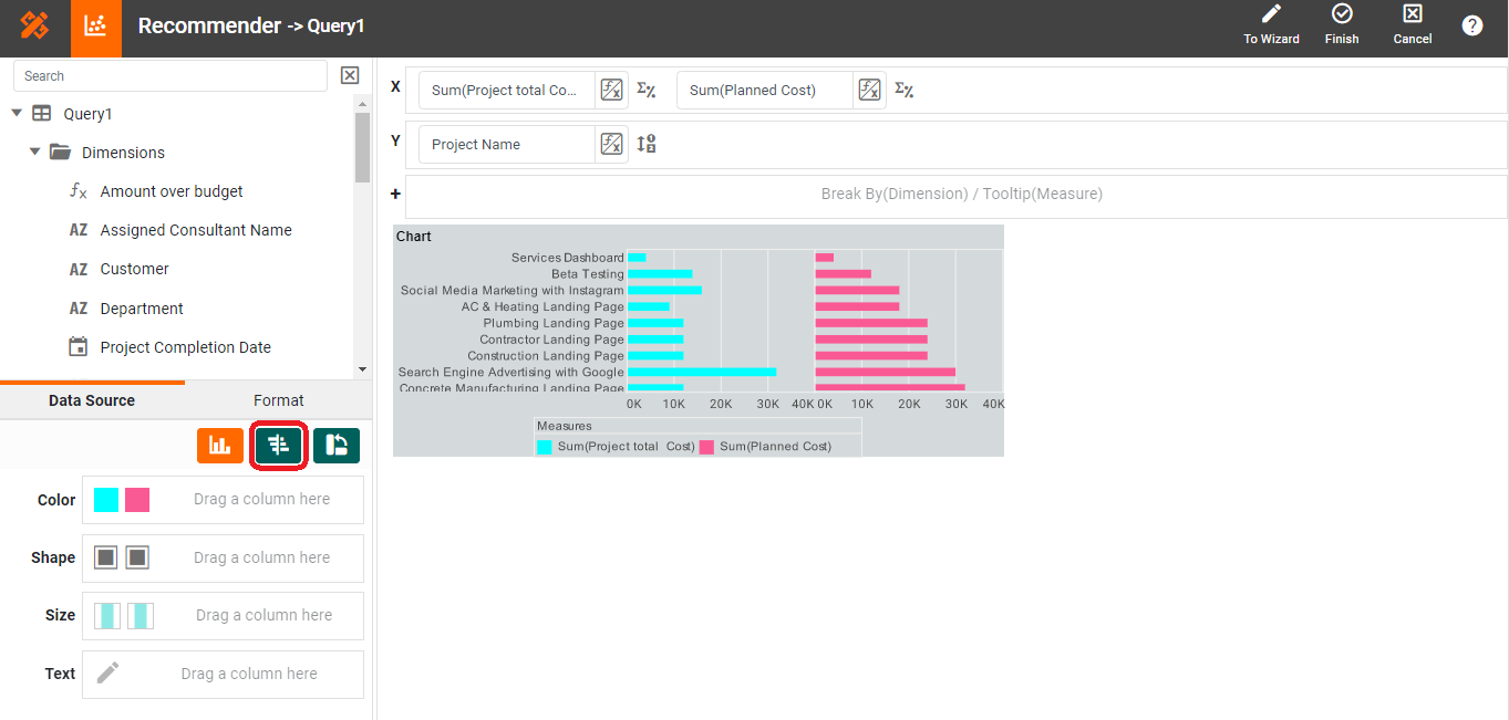
This fits both data sets on the same set of axes.
Add Custom Tooltips
Add custom tooltips by following steps below:
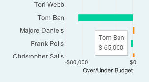
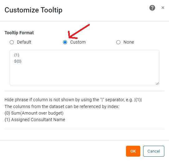
You can create a custom chart tooltip that incorporates data values in java.text.MessageFormat format. Right-click the Chart. Select 'Properties' from the context menu. (NOTE: You can also access menu options from the 'More' button button in the mini-toolbar.) This opens the 'Chart Properties' panel. Under the General tab, select the 'Tooltip' option, and click 'Custom'. This opens the 'Customize Tooltip' dialog box. You can insert a value into the tooltip by using either the index or the field name within curly braces, e.g., {1} or {Sum(Total)}. (You can mix indices and names within a single tooltip.) Select the 'Custom' option and enter the text shown in the image below:
Press 'OK' to close the 'Customize Tooltip' dialog box, and press 'OK' again to close the 'Chart Properties' dialog box. When you hover the mouse over the bars on the chart, you will now see the custom tooltip you specified.
In general, you should use field names rather than indices, because indices may not work correctly if another user makes ad hoc changes to the chart. To hide the tooltip entirely, select the 'None' option. Press 'OK' to close the 'Customize Tooltip' dialog box. Press ‘OK’ again to close the 'Chart Properties' panel. The tooltip that you specified is now used on the chart.
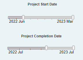
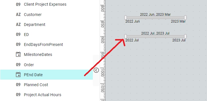
Adjust the selection range by dragging the slider end-handles. (You can also click on an end-handle and press the arrow keys on the keyboard.)
To quickly set the right side of the range to its maximum, double-click on the right end-handle. To quickly set the left side of the range to its minimum, double-click on the left end-handle. To quickly set the entire range to its full extent, double-click on the slider body.
and axis labeling if you want the chart to match the example dashboard in uncluttered appearance.
At the top of the Toolbox panel, expand the data block that contains the field you want to filter.
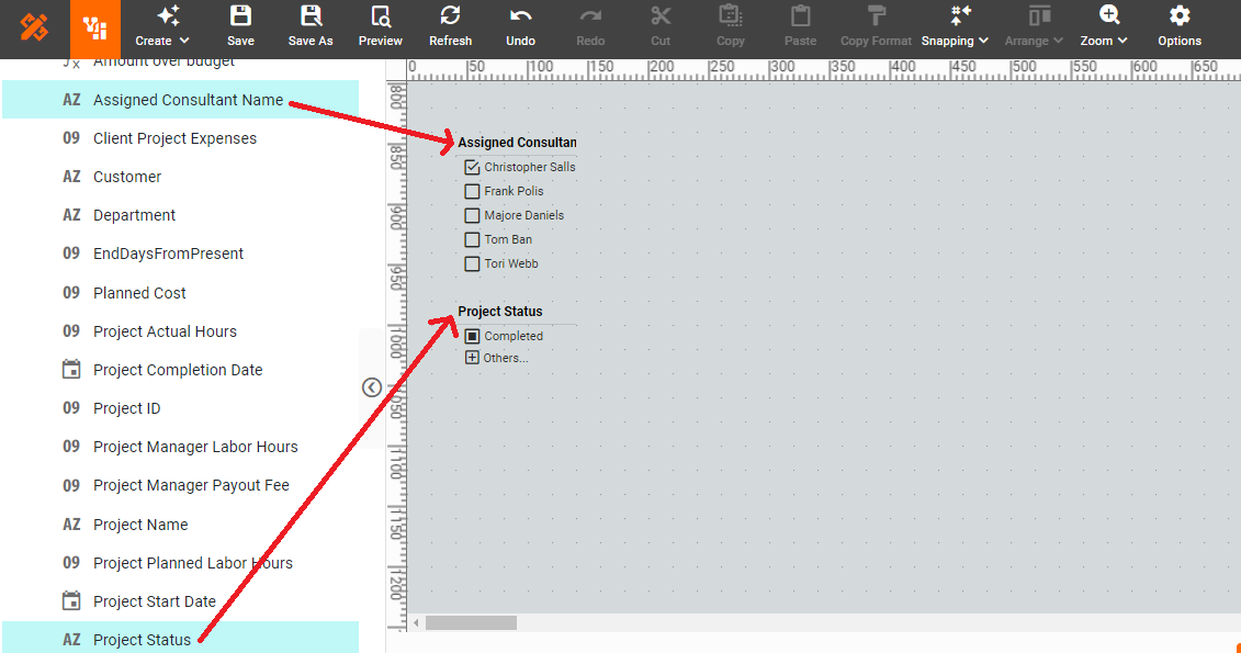
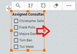
Resize the Selection Lists as desired.
Summary
This page has gone over a few of the techniques used to create a dynamic and powerful Project Management Dashboard. You saw how to create charts with multiple measures, and multiple styles. You added a Gantt chart, multiple measure chart, donut charts, and stacked bar charts. You also saw how to create Filters, and Custom Tooltips to facilitate interactivity. InetSoft makes it quick and easy to display data in a wide variety of different styles for exploration and interaction. InetSoft additionally provides many other features to facilitate the creation of professional dashboards, such as embedding, hyperlinks, drill-downs, positioning and sizing aids, device-adaptive layout, advanced scripting, and much more. InetSoft is a complete solution for modern, powerful, and effective dashboards.