Sparkline Charts - Definition, Example, and How to Make Them
What Is a Sparkline Chart?
A sparkline chart is a small, data‑dense line chart that shows a trend over time without axes, labels, or chart scaffolding. It is typically embedded inside text, tables, or dashboards to provide quick visual context next to a metric. Sparklines are ideal for showing direction, volatility, and general performance at a glance.
More About Sparklines
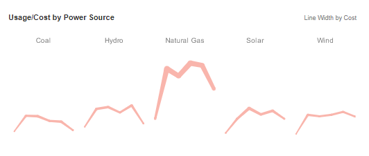
A sparkline is a small line chart, usually with axes or coordinates removed. The point of styling a line chart this way is to present the general shape of the data's variation over time in a simple and highly condensed fashion. Sparklines are small enough to be embedded among text, or are often grouped with several other sparklines in a line or grid.
Unlike a typical chart, which often intends to show the maximum amount of information, sparklines are created to be a succinct and memorable display of some measurement. Common candidates for sparklines are temperatures or stock market prices.
Sparklines are a useful alternative to single line charts with multiple lines plotted. When multiple lines are plotted on a single line chart, overlapping lines can sometimes cause confusion. Conversely, multiple lines can sometimes have such different magnitudes that sense of scale is difficult to convey on a single chart. This can be partially remedied with multiple axes, but that can only accommodate two different ranges, and can itself produce confusion. Sparkline charts overcome these limitations by giving each metric its own scale.
An Example of a Sparkline Chart
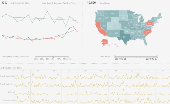
This Sparkline example from InetSoft's Marketing Lead Dashboard illustrates how a grid of Sparkline Charts can convey information that a single chart with multiple lines cannot. Each individual Sparkline depicts the change from month to month of marketing leads from a particular lead source in a particular space. In a single chart, the lines would create a meaningless jumble. While line charts with this data could be made larger and placed in a tabbed interface or have the additional dimensions relegated to filter components, this would result in loss of the ability to visually compare different lead sources and states. With the grid of Sparklines, a marketing manager has an at-a-glance view of how lead trends compare from state to state and source to source.
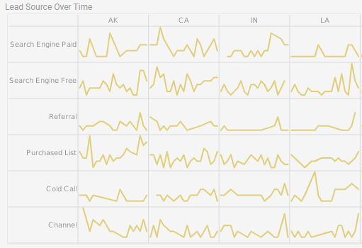
When one state or source has an upswing or downturn of new leads, the manager can immediately see if other states or sources had a similar pattern, indicating whether the cause of the change is related to something regional, to the strength or weakness of a particular lead source, or to the general trend in the market. If a manager wants to drill down into an individual sparkline, they could take advantage of InetSoft's built-in tooltips by hovering the mouse over the individual data points on the Sparkline to see exactly how many new leads were added in a particular month, from a particular source, in a particular state.
Other Sparkline Chart Examples
Below are common sparkline chart examples and how they are used to convey quick insights.
Revenue Trend Sparkline
Shows monthly or quarterly revenue direction. Useful for dashboards where a numeric revenue value is paired with a trend line.
Daily Visits Sparkline
Displays fluctuations in daily website or store visits. Helps identify spikes or dips without needing a full chart.
Stock Price Sparkline
A compact view of price movement over time. Common in financial dashboards and portfolio summaries.
Conversion Rate Sparkline
Shows how conversion performance changes across days or weeks. Useful for marketing and sales reporting.
Multi‑Sparkline Comparison Row
A row of sparklines comparing multiple categories such as product lines, regions, or departments to quickly spot which areas are trending up or down.

Sparkline Chart vs Other Charts
Sparklines differ from traditional charts because they emphasize simplicity and trend direction rather than precise values. The Bootstrap row/column layout below highlights the differences.
Common Mistakes When Using Sparkline Charts
Sparklines are powerful, but misusing them can lead to confusion or misleading interpretations.
- Using too many sparklines — Overuse makes dashboards harder to read.
- Using sparklines when exact values matter — They show trends, not specifics.
- Too few data points — Sparklines need enough data to show meaningful direction.
- No context labels — Without a number or title, the trend may be unclear.
- Inconsistent scales — Makes comparisons misleading.

How to Make a Sparkline Chart in InetSoft
To create a Sparkline chart, follow the basic steps below.
Prepare Your Data
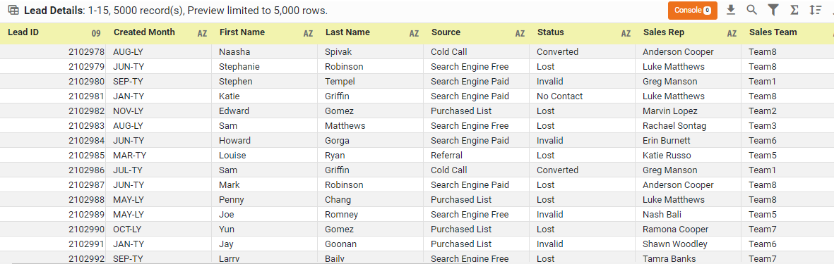
The data source for the chart (data block, query, or data model) should represent dimensions and measures as independent columns or fields, including a date column, as shown below. See Prepare Your Data for information on how to manipulate your data, if it is not currently in this form. (Note: A properly designed data model will already have the correct structure.)
Open a Chart for Editing
If necessary, create a new Dashboard. For information on how to create a new Dashboard, see Create a New Dashboard.
From the Toolbox panel, drag a Chart component into the Dashboard.

Resize the Chart as desired by dragging the handles.
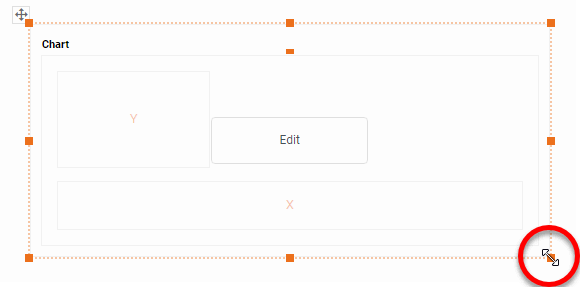
Press the Edit button in the center of the Chart or press the Edit button in the top-right corner.

This opens the Visualization Recommender. Bypass the Recommender by pressing the Full Editor button at the top right to open the Chart Editor.

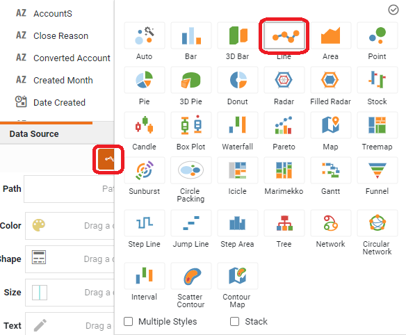
Press the Select Chart Style button. Choose the Line style.
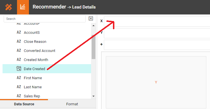
From the Dimensions folder of the Data Source panel, drag a date dimension to the 'X' or 'Y' region.
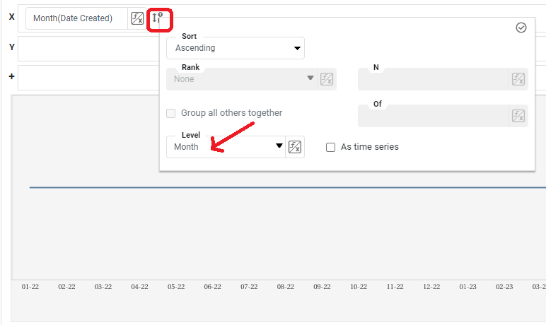
Press the Edit Dimension button next to the field name in the Chart Editor, and set the 'Level' to the desired date grouping. Then press the Apply button
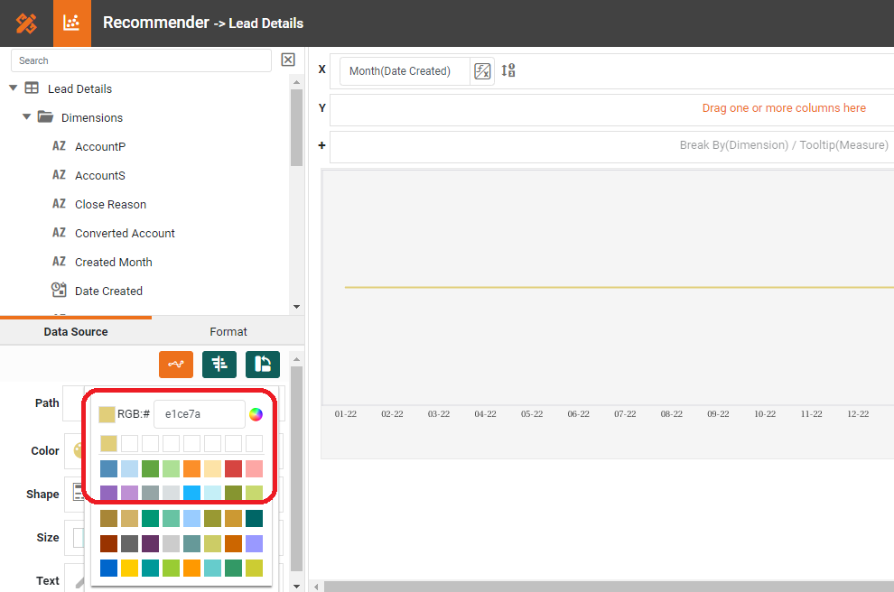
If you have a preference for the color of the Sparkline(s), select one in the Color region.
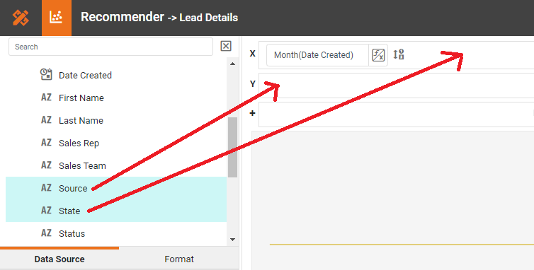
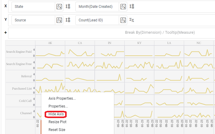
Sparklines are often used in a grid of charts, where different charts represent different values of a particular dimension (here 'Source' and 'State').
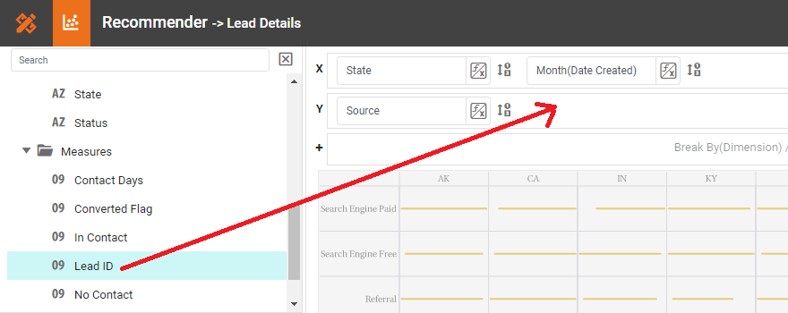
To create a grid of charts, simply add dimensions into the X and Y regions to create the desired arrangement. For example, to break out the 'State' dimension on the X-axis and the 'Source' dimension on the Y-axis, place these fields as shown below in the Chart Editor.
From the Measures folder of the Data Source panel, drag a measure to the X or Y region. This places the selected field onto the chart as a measure.
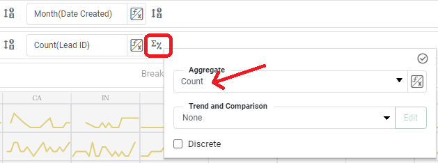
Press the Edit Measure button next to the measure, and select the desired aggregation method for the measure.
Hide the axes on the individual Sparkline charts by right clicking on each axis and selecting Hide Axis on the menu that appears.
Tool to Make Sparkline Charts Online for Free
To easily and quickly create Sparkline Charts online for free, create a Free Individual Account on the InetSoft website. You will then be able to upload a spreadsheet data set.
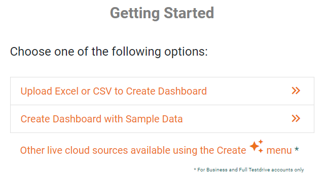
Once you have done that, you will be able to proceed past the Visualization Recommender, which can usually get you started creating a dashboard. Since the Recommender does not allow you to hide axes or drag an additional dimension onto the x axis, press the Full Editor button.
Then proceed to build the Chart as described in the previous section.

Sparkline Chart FAQs
What is a sparkline chart?
A sparkline chart is a small, minimalist line chart used to show a trend over time without axes or labels.
Why use a sparkline instead of a full chart?
Sparklines save space and provide quick trend context without overwhelming the layout.
Where are sparklines most commonly used?
Dashboards, KPI tables, financial reports, and inline metrics.
Can sparklines show multiple series?
Typically no — sparklines are designed for single‑series simplicity.
How much data should a sparkline include?
Enough points to show meaningful direction, usually 10–50 depending on the trend.
Do sparklines need labels?
No, but they should be paired with a number or title for context.