Sunburst Charts - Definition, Example, and How to Make Them
This page will discuss the uses of Sunburst Charts, show you how to create them in InetSoft, and provide access to a free online tool for creating Sunburst Charts as well as complete functioning business intelligence dashboards.
Contents
Definition of Sunburst Chart
An Example of a Sunburst Chart
How to Make a Sunburst Chart
Tool to Make Sunburst Charts Online for Free

Also known as a Radial Map, Multilevel Pie Chart, or Ring Chart, a Sunburst Chart is a chart used to visualize hierarchical data. While a pie chart has many uses, it can only display one set of categories at a time.
A Sunburst Chart integrates several dimensions into the traditional Pie Chart format, enabling several Pie Charts to be visualized as one.
A Sunburst Chart displays each level of a data hierarchy as a series of concentric rings, with each ring representing a level in the hierarchy. Each ring is proportionately segmented according to the dimension it displays. The ring segment's size gives an idea of its segment's proportion to the entire dataset.
The multiple ring layout of a Sunburst Chart creates a multilevel viewing experience of nested dataset dimensions. Each outer ring will further segment the segments of the inner circle, visualizing the proportion of very specific subcategories of the data. The rings and segments may be given distinct colors so as to enable their proportions to be seen more clearly.
An Example of a Sunburst Chart
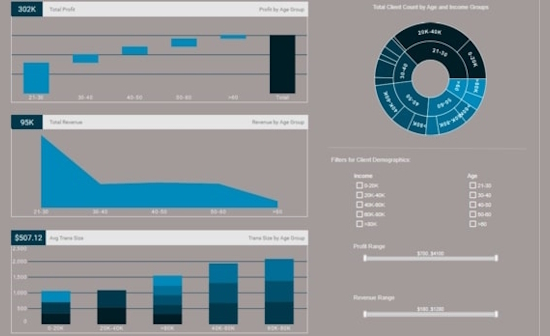
This chart displaying bank customer demographics shows how a Sunburst Chart can go beyond the utility of even several pie charts. Age demographics are visualized in the inner circle as the primary dimension, with each age segment being further divided by income bracket in the outer circle. This enables bank managers to see at a glance what income brackets of which ages form the largest customer segments.
Separate pie charts for income and age demographics would not convey this information, since neither of the segment types would be subdivided by the other. In order to see these sub-segments with traditional pie charts, the user would need to filter the data, thus losing the big picture overview where all segments and sub-segments can be compared. But with this Sunburst Chart, a marketing manager will immediately see that the bank's biggest customer segment is 21-30 year olds who make 20-40k a year, and will know to focus marketing and advertising efforts on retaining that demographic segment.

How to Make a Sunburst Chart in InetSoft
To create a Sunburst chart, follow the basic steps below.
Place the desired hierarchical dimensions in the 'T' region in the Chart Editor, and place the desired measure in the 'Size' region of the Chart Editor. Use the 'Color' region to distinguish particular dimension values by color. NOTE: To create a grid of charts, place dimensions into the 'X' and/or 'Y' regions as well. (See Trellis Chart (Grid) for more information.)
Prepare Your Data
The data source for the chart (data block, query, or data model) should represent dimensions and measures as independent columns or fields, as shown below. See Prepare Your Data for information on how to manipulate your data, if it is not currently in this form. (Note: A properly designed data model will already have the correct structure.)

In some cases (e.g., Pie Chart), you may want your data to provide just a single measure. In other cases (e.g., Line Chart), you may want the data to supply multiple measures. If the data does not provide the correct number of measures, you may be able to alter the number of measures to suit the needs of the chart by "pivoting" or "unpivoting" the data. See Convert Multiple Measures in Prepare Your Data for more information about this procedure.
Walkthrough Example
This example illustrates how to create a Sunburst chart that displays total broken down by state, city, and product name. The example uses the 'Sales Explore' Data Worksheet, which can be found in the 'Examples' folder under 'Data Worksheet'.
Create a new Dashboard based on the 'Sales Explore' Data Worksheet. For information on how to create a new Dashboard, see Create a New Dashboard.
Steps to Create the Sunburst Chart
Drag a Chart component from the Toolbox tree to the Dashboard, and press the 'Edit' button at the top-right corner of the Chart to open the Wizard. Press the 'Full Editor' button at the top right to open the Chart Editor. (For more details on creating a chart, see Basic Charting Steps.)
In the Chart Editor, press the 'Select Chart Style' button and choose the 'Sunburst' option. Press the Apply' button .

Drag the 'State', 'City', and 'Name' fields from the Data Source panel to the 'T' region. (NOTE: These fields can be found in the 'Sales Explore' Data Worksheet.)
Drag the 'Total' measure from the Data Source panel to the 'Size region.
Drag the 'State' dimension from the Data Source panel to the 'Color' region.

Optional: Press the Edit Color button next to the 'State dimension, and choose the desired colors to represent the state values. Press the 'Close' button.
Optional: You can add additional dimensions to the Chart if desired. See Trellis Chart (Grid) for information about adding multiple dimensions to a chart axis.
Press the 'Finish' button to close the Editor.
Resize the chart as desired.
Hover the mouse over the chart to see a tooltip providing full information about each group.
You can proceed to edit the titles, legend, etc. See Basic Charting Steps and Chart Properties for more information. See Format Data for information on how to format text on a Chart.
Tool to Make Sunburst Charts Online for Free
To easily and quickly create Sunburst Charts online for free, create a Free Individual Account on the InetSoft website. You will then be able to upload a spreadsheet data set.

Once you have done that, you will be able to proceed past the Visualization Recommender, which can usually get you started creating a dashboard. Since the Recommender does not offer the Sunburst Chart as a suggestion, press the Full Editor button.
Then proceed to build the Chart as described in the previous section.