Trellis Charts - Definition, Example, and How to Make Them
This article will discuss the uses of Trellis Charts, show you how to create them in InetSoft, and provide access to a free online tool for creating Trellis Charts as well as complete functioning business intelligence dashboards.
Contents
Definition of Trellis Chart
When to Use a Trellis Chart
Trellis Chart vs Alternatives
An Example of a Trellis Chart
More Trellis Chart Examples
How to Make a Trellis Chart
Common Mistakes When Using Trellis Charts
Frequently Asked Questions
Tool to Make Trellis Charts Online for Free
Definition of a Trellis Chart
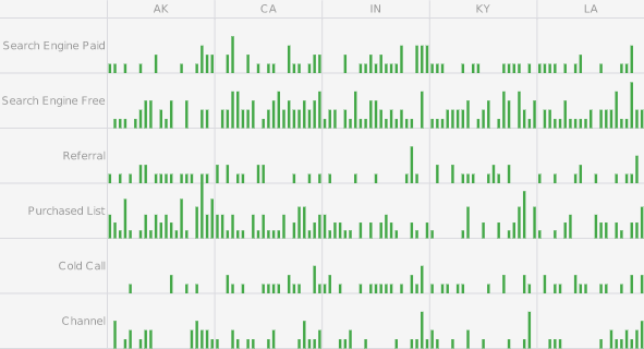
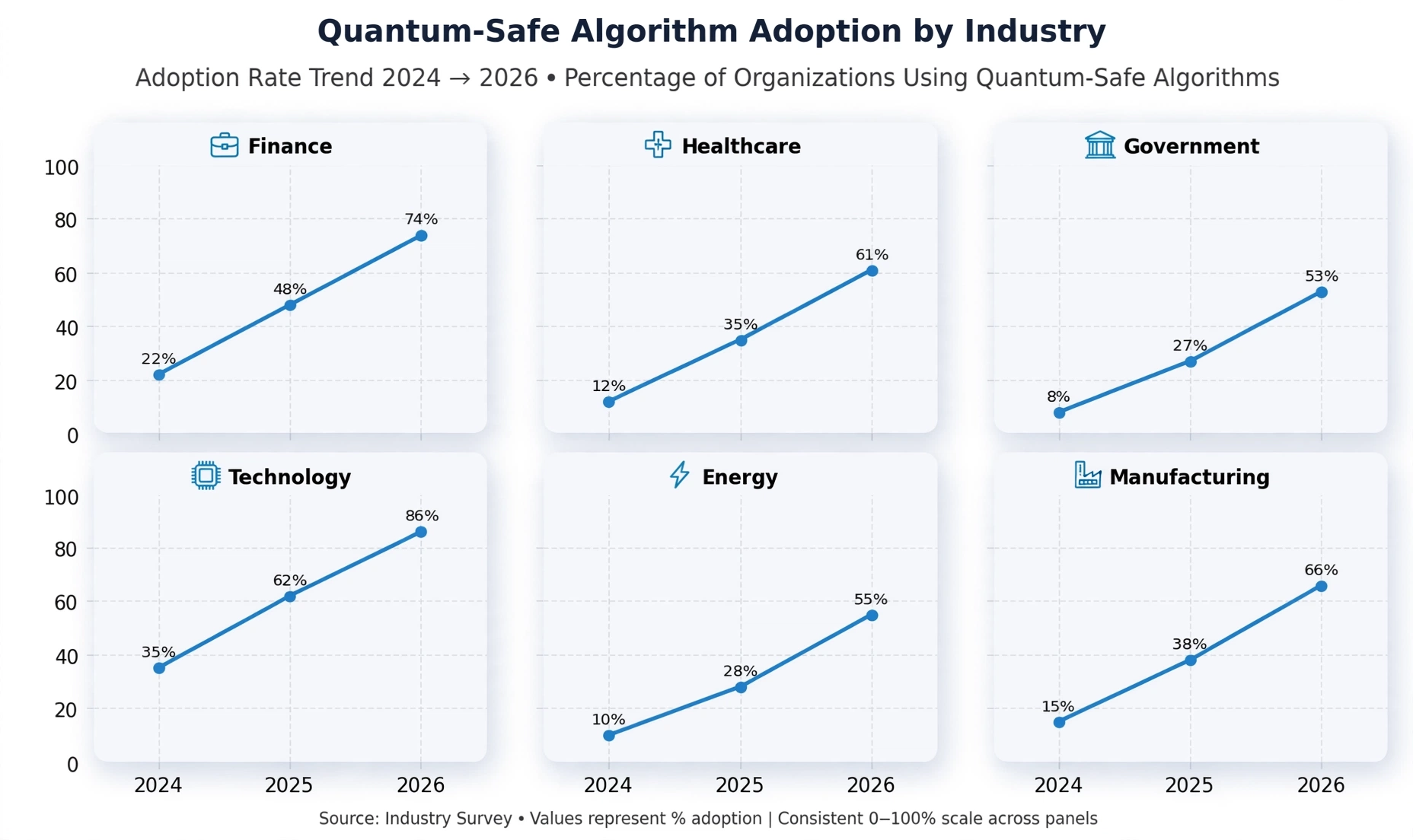
Trellis charts are a powerful data visualization technique that allows for the comparison of multiple subsets of data within a single visualization. Trellis charts are also known as small multiples, lattice charts, or panel charts, and they are widely used in modern analytics for clear multi-dimensional comparison. This technique is particularly useful when dealing with large or complex data sets, as it helps to break down the data into smaller, more manageable chunks.
The purpose of Trellis charts is to divide data into multiple small charts or "trellises", each of which represents a specific subcategory of the data. Each trellis can then be further divided into smaller subplots using traditional charting methods, which display different aspects of the data in a clear and intuitive format.
One of the main advantages of Trellis charts is that they allow for the comparison of many subsets of data in a single visualization. This can be particularly useful when dealing with data that has many different dimensions.. By breaking the data down into many small subsets, Trellis charts can help to identify patterns and trends that would be difficult to see in a single, larger chart.
Trellis charts can utilize a variety of different charting formats, including bar charts, line charts, and scatter plots. This versatility makes them a popular choice for data visualization professionals, as they can be used to effectively display a wide range of data types and formats.
When To Use A Trellis Chart
Trellis charts are ideal when you need to compare the same metric across multiple groups in a consistent, visually balanced way. They work best when each panel represents a category, region, product, device type, or time slice. Use a trellis chart when you want to highlight differences in trends, reveal anomalies, or show how patterns change across segments without losing clarity.
- Comparing time-series trends across regions
- Showing product performance across categories
- Visualizing device telemetry across models
- Highlighting anomalies across customer segments
- Displaying multi-group behavioral patterns
Trellis Chart Vs Alternatives
Trellis charts solve problems that other chart types struggle with. They avoid clutter, enforce consistent scaling, and make multi-group comparisons intuitive. Below is a comparison of trellis charts against common alternatives.
Vs Multi-Series Line Charts
Multi-series charts place all lines in one space, which can cause overlap and visual noise. Trellis charts separate each group into its own panel, making patterns easier to see.
Vs Small Multiples
Small multiples are conceptually similar, but trellis charts emphasize strict consistency in axes and layout, ensuring that comparisons are accurate and visually aligned.
Vs Facet Charts
Facet charts split data by dimension, but may vary scales automatically. Trellis charts maintain uniform scales across all panels, which is essential for fair comparison.
Vs Grid Heatmaps
Heatmaps show density or intensity but cannot display trends over time. Trellis charts preserve the underlying chart type, making them better for time-series or multi-metric analysis.
An Example of a Trellis Chart
This Trellis pie chart, taken from InetSoft's Mortality Causes Dashboard illustrates how having many small multiple charts can help the user notice broader patterns than looking at larger individual charts. The dashboard is built on a dataset of mortality causes by, age, sex, and racial demographics.
The x and y axis of this Trellis Chart are broken down by race and age, which each individual pie chart displaying the proportion of that race and age segment's most common causes of death. The potential for noticing similarities and differences between different demographic segments here is profound.
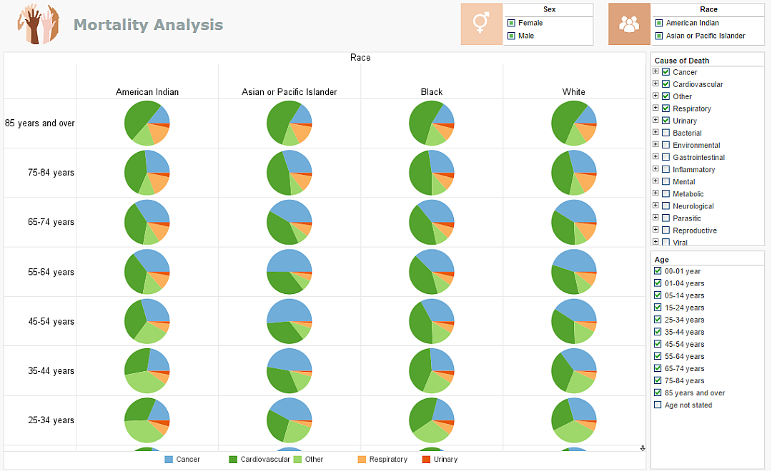
A full view of the dashboard yields a mortality breakdown of over forty different demographic segments in a single view. This, combined with the use of distinct common colors representing specific mortality causes across the individual pie charts enables a health researcher to notice similarities and differences in health and safety outcomes among these distinct segments of the population. With a quick glance, researchers can easily notice what ends the lives of people of different racial demographics, whether certain afflictions kill people of certain races sooner, and whether certain racial demographics seem better protected from certain mortality causes.
For health researchers, this can have applications in research for racial equity, create further questions as to the lifestyles and health decisions of different groups, and point towards investigations into possible genetic proclivities for different diseases in different racial groups. For healthcare providers, understanding an individuals proportionate risks of different ailments can help steer care, giving clues to guide diagnoses, helping to weigh the risks and benefits of different interventions, and also help provide individuals with lifestyle reccomendations best suited to their segments mortality risks.
More Trellis Chart Examples
Trellis charts can be applied to many real-world analytics scenarios. Below are examples with descriptions showing how they reveal insights that single charts often hide.
- Sales By Region Over Time: Each panel shows a region’s monthly sales trend, making it easy to compare seasonal patterns.
- Manufacturing Defects By Batch: Panels reveal which batches show spikes in defects and which remain stable.
- Website Traffic By Device Type: Each device type gets its own chart, highlighting usage differences between mobile, desktop, and tablet.
- Algorithm Adoption By Customer Segment: Panels show how different customer groups adopt new algorithms over time.
- Sensor Readings By Machine: Each machine’s telemetry is shown separately, making anomalies easy to spot.
How to Make a Trellis Chart in InetSoft
To create a Trellis chart in pie chart style like the example described above, follow the basic steps below.
Prepare Your Data
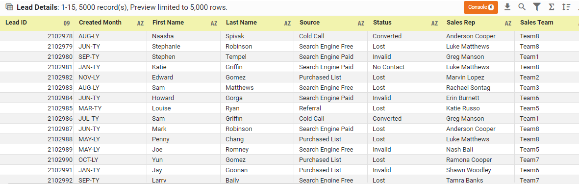
The data source for the chart (data block, query, or data model) should represent dimensions and measures as independent columns or fields, including a date column, as shown below. See Prepare Your Data for information on how to manipulate your data, if it is not currently in this form. (Note: A properly designed data model will already have the correct structure.)
Open a Chart for Editing
If necessary, create a new Dashboard. For information on how to create a new Dashboard, see Create a New Dashboard.
From the Toolbox panel, drag a Chart component into the Dashboard.

Resize the Chart as desired by dragging the handles.
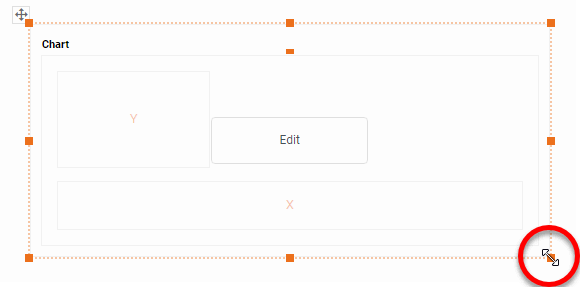
Press the 'Edit button in the center of the Chart or press the Edit' button in the top-right corner.

This opens the Visualization Recommender. Bypass the Recommender by pressing the 'Full Editor' button at the top right to open the Chart Editor.

In the Chart Editor, drag a measure field from the Data Source panel to the 'Y' region.

In the Chart Editor, drag a dimension field from the Data Source panel to the 'Color' region.

Press the 'Edit Color' button to choose the colors. See Group Data by Dimension for more information about the color panel.

Press the 'Select Chart Style button, and choose your desired style. In this example, we will be selecting 'Pie" . This converts the chart into a pie-chart representation.

If you would like the pie slices labelled with text, then drag the same dimension that used in the 'Color' region to the 'Text' region as well.
Optional: Remove the legend if desired. To do this, right-click on the legend, and select 'Hide Legend' from the context menu.

Optional: To place a small gap between the pie slices, right-click the plot area and select 'Properties' from the context menu.

In the Advanced tab of the 'Chart Properties' panel, select Explode Pie' and press 'OK'.

The first pie chart is now complete

To turn the one chart into a Trellis chart, simply add dimensions into the 'X' and 'Y' regions to create the desired arrangement.

The Trellis chart is now complete.
Common Mistakes When Using Trellis Charts
Trellis charts are powerful, but they can become confusing if not designed carefully. Avoid the following mistakes to ensure clarity and accuracy.
- Using inconsistent scales across panels
- Adding too many lines or bars inside each panel
- Splitting data into too many categories, creating an overwhelming grid
- Using different colors across panels, making comparison harder
- Failing to label axes clearly or consistently
Frequently Asked Questions
What Is A Trellis Chart?
A trellis chart is a grid of repeated charts that share the same axes and scale, allowing easy comparison across categories or segments.
Why Use A Trellis Chart?
Trellis charts make multi-group comparisons clear by separating each group into its own panel while keeping the visual structure consistent.
What Types Of Data Work Best In Trellis Charts?
Time-series data, category comparisons, device telemetry, customer segmentation, and multi-group behavioral patterns all work well in trellis charts.
How Do Trellis Charts Improve Comparison?
They enforce consistent axes and layout, making it easy to see differences in trends, peaks, dips, and anomalies across groups.
Are Trellis Charts Good For Time-Series Data?
Yes. Trellis charts are excellent for time-series because they show how trends differ across categories without overlapping lines.
How Do Trellis Charts Differ From Small Multiples?
Small multiples are similar, but trellis charts emphasize strict consistency in axes and scaling, ensuring accurate comparison.
Can Trellis Charts Be Interactive?
Yes. Trellis charts work well with filters, drill-downs, and dynamic highlighting in modern BI tools.
Tool to Make Trellis Charts Online for Free
To easily and quickly create Trellis Charts online for free, create a Free Individual Account on the InetSoft website. You will then be able to upload a spreadsheet data set.
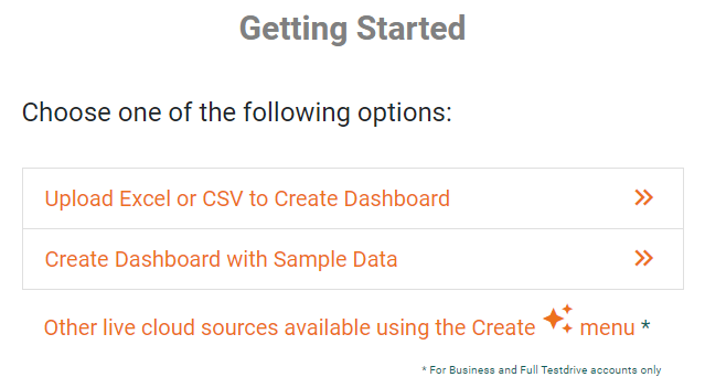
Once you have done that, you will be able to proceed past the Visualization Recommender, which can usually get you started creating a dashboard. Since the Recommender does not allow you to create a Trellis Chart, press the Full Editor button.
Then proceed to build the Chart as described in the previous section.