Waterfall Charts - Definition, When To Use, and How to Make Them
This page will discuss the uses of Waterfall Charts, show you how to create them in InetSoft, and provide access to a free online tool for creating Waterfall Charts as well as complete functioning business intelligence dashboards.

A waterfall chart is a variation of bar chart that displays the causes behind a net change in value between two points. Instead of simply showing a beginning value in one bar and an ending value in a second bar, a waterfall chart dis-aggregates all of those unique components that contributed to the net change, and displays them individually.
The waterfall chart is named from its shape. The first bar in a waterfall chart typically starts from a baseline of zero, and represents the initial quantity of the displayed measure. Then, there are a series of smaller floating bars, rising in a peak up to one final bar, which represents the ending quantity of the chosen measure, which, like the first bar, starts from the zero baseline of the x-axis.
The waterfall chart is one of the less common chart types, because it is particularly effective in specific use cases that show the positive and negative components of change. For this reason it is common in certain industries such as finance, HR, and insurance. A pie chart is traditionally the most common choice for displaying individual data points' proportionality to the whole. But a pie chart has limitations.
Once the pie contains over four or five dimensions, it can be overwhelming and disorienting, as the relative sizes of the pie's "slices" become difficult to discern. Also, it has been shown scientifically that viewers can discern minute differences in size more effectively when seeing bars on a bar chart then when viewing slices of a pie. But a bar chart lacks the clear display of proportion to the whole that a pie chart offers. So a bar chart is better for comparison and a pie chart is better for displaying proportion. Fortunately, in the use cases where the benefits of both are desired, a waterfall chart offers the best of both worlds.
An Example of a Waterfall Chart
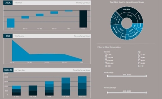
This waterfall chart from InetSoft's Financial Client Demographics dashboard shows how waterfall charts can be used to show marketers their most vital customer segments. At a glance, the user can see the the bank's largest segment of profit comes from the 21-30 age range, with the over 60 demographic contributing the least amount of profits.
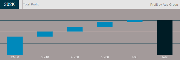
Having separate spaces, both horizontally and vertically, for each segments bar, enables the user to easily see how much each demographic contributes to the total 302k in profits, specified by the text KPI above the chart. Utilizing this chart, a manager would know to focus marketing and outreach efforts more on younger people, and to consider cutting back on such efforts to the elderly if funds are scarce.
How to Make a Waterfall Chart in InetSoft
To create a Waterfall chart, follow the basic steps below.
Configure your data, and open a chart for editing.
Press the 'Select Chart Style' button. Choose the Waterfall style. Press the 'Apply' button.

From the 'Dimensions' folder of the Data Source panel, drag a desired dimension to the 'X' or 'Y' region. To convert a measure to a dimension, right-click the measure in the Data Source panel and select 'Convert to Dimension'.

Optional: For a date dimension, press the 'Edit Dimension' button next to the field name in the Chart Editor, and set the 'Level' to the desired date grouping. Then press the 'Apply' button.

Optional: You can add additional dimensions to the Chart if desired. See Trellis Chart (Grid) for information about adding multiple dimensions to a chart axis. See Basic Charting Steps for information on how to add dimensions using color, shape, or size representation. To convert a dimension to a measure, right-click the dimension in the Data Source panel and select 'Convert to Measure'
From the 'Measures' folder of the Data Source panel, drag a measure to the 'X' or 'Y' region. This places the selected field onto the chart as a measure.

Press the 'Edit Measure' button next to the measure, and select the desired aggregation method for the measure.

Optional: In some cases, you may want to represent the aggregate value for each group as a change from the previous aggregate, in which case the total represents the overall change. To do this, select 'Change from Previous' in the 'Trend and Comparison' menu, and press the 'Apply' button.

Optional: You can add additional measures to the Chart if desired. See Multiple-Measure Chart for more information about adding multiple measures to a chart axis. See Basic Charting Steps for information on how to add measures using color, shape, or size representation.
Press the 'Finish' button to close the Editor.
Add a highlight to distinguish the negative "bricks" on the chart from the positive bricks. To do this, right-click the chart, and select the 'Highlight' option. (NOTE: You can also access menu options from the 'More' button button in the mini-toolbar.) From the Measures' folder of the Data Source panel, drag a measure to the 'X' or 'Y' region. This places the selected field onto the chart as a measure.

Create a highlight to format negative values. See Add Conditional Format for more information.

Press 'OK'.

You can proceed to edit the titles, legend, etc. See Basic Charting Steps and Chart Properties for more information. See Format Data for information on how to format text on a Chart.
Tool to Make Waterfall Charts Online for Free
To easily and quickly create Waterfall Charts online for free, create a Free Individual Account on the InetSoft website. You will then be able to upload a spreadsheet data set.

Once you have done that, you will be able to proceed past the Visualization Recommender, which can usually get you started creating a dashboard. Since the Recommender does not offer the Waterfall Chart as a suggestion, press the Full Editor button.
Then proceed to build the Chart as described in the previous section.