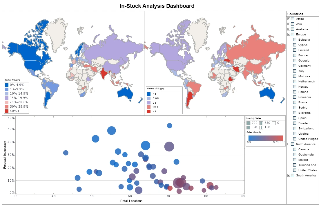
InetSoft Offers Business Intelligence Software for Creating OLAP Charts
InetSoft offers a BI software platform for dashboards, charts, visual analysis, and reporting to be used in conjunction with an OLAP server or any combination of open standards data sources.
OLAP is well established in traditional business intelligence. To ensure premium performance, it is supported in InetSoft software by a special OLAP data warehouse. InetSoft's OLAP Analyzer is an integrated OLAP front-end that allows business users to tap into this rich source of data. The key advantages are:
- The ability to leverage a data warehouse investment
- High performance
- The ability to mashup OLAP data with other sources
It's easy enough to be:
- Deployed in weeks, not months
- Learned by new-users with minimal training
is agile enough to:
- Adapt to changing data configuration and business needs
- Coordinate data research through visualization and maximum self-service
and robust enough to:
- Capture the attention of business executives
- Satisfy the demands of power users
- Scale up for organizations of all sizes
What Are OLAP BI Charts?
OLAP BI charts are data visualizations that are specifically designed to work with data from Online Analytical Processing (OLAP) systems. These charts are used in Business Intelligence (BI) platforms to help users explore multidimensional data interactively, enabling detailed analysis and rapid insights across various business metrics.
Understanding OLAP
OLAP is a category of data processing that enables users to analyze information from multiple perspectives using a multidimensional data model. It allows for operations like slicing, dicing, drilling down, rolling up, and pivoting through large volumes of data quickly and efficiently.
OLAP databases typically organize data into cubes, where each dimension (such as time, geography, or product category) can be examined at different levels of granularity. Measures, such as sales or revenue, are aggregated and can be calculated across these dimensions in real time.
How OLAP BI Charts Work
OLAP BI charts are tightly integrated with OLAP cubes, meaning they are built to handle hierarchical and aggregated data efficiently. These charts are dynamic, allowing users to:
- Drill down from yearly sales to monthly or daily figures
- Slice data by product line, region, or customer segment
- Compare metrics across different dimensions in a single view
- Filter data on the fly without re-querying the database
Types of OLAP BI Charts
OLAP-enabled BI tools can produce a variety of chart types, including:
- Pivot Tables: Tabular data views with drillable dimensions
- Stacked Bar and Column Charts: Great for comparing measures across categories
- Treemaps: Visualize hierarchical data using nested rectangles
- Line Charts with Hierarchy: Plot trends while allowing drill-down into time dimensions
- Heatmaps: Highlight performance variations across two dimensions
Benefits of OLAP BI Charts
- Real-time interaction: Users can navigate complex data instantly without waiting for reprocessing.
- Multidimensional insights: Enables rich cross-sectional analysis of KPIs and metrics.
- Performance optimized: OLAP engines are built for fast aggregation and filtering.
- Intuitive visual exploration: Business users can self-serve insights without needing SQL skills.
Use Cases
OLAP BI charts are commonly used in industries where multidimensional analysis is essential, including:
- Retail: Analyze sales by product, region, store, and time period
- Finance: Break down revenue, expenses, and profitability by department and fiscal period
- Manufacturing: Compare production output and quality metrics by plant and product line
- Healthcare: Explore patient metrics across locations, age groups, and treatment types

