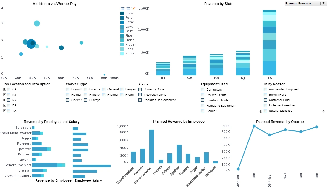
Psychology of Data Visualization
This is the continuation of the transcript of DM Radio’s program titled “What You See Is What You ‘Get’ – How Data Visualization Conveys Insight,”.
Eric Kavanagh: Okay folks back here at DM Radio and we have our good friend and colleague Dr. Robin Bloor calling in from Austin, Texas. Welcome back to the show.
Dr. Robin Bloor: It’s a pleasure to be here.
Eric Kavanagh: Sure. So what do you know about data visualization and maybe the psychology of data visualization?
Dr. Robin Bloor: Well, I think that's stuff that hasn’t been touched particularly strongly so far. I thought it would probably be a good idea to try. There’s one problem or one aspect of data visualization that leads to a problem and that is simple education.

With a given visualization, any individual ought to be able to deduce those things. It’s certainly the case that certain visualizations make a lot of things obvious. But the marketing world has been doing data visualization for a long time and normally they were attempting to deceive rather than to inform in terms of the stuff they presented.
So there are a lot of arrows that can be made intentionally or unintentionally. It's a fact for instance that 3D visualizations look much better than 2D visualizations. But if you go for bar charts and pie charts, it’s actually easier for the human brain to get information from 2D than 3D visualization.
Things like that are kind of interesting. I saw some really good stuff on one of the presentations which was animated based on visualization. It's really, really good but you can't come and stop it and drill down. The point is that various forms of data visualization have very specific context and they carry only a certain amount of information.
And, remember the other thing is that data visualization is now going to the point where, on the one hand, we’re using visualizations in order to better understand data; but, on the other hand, we have a lot of data visualization with poor communication.
And just because I understand a particular way of looking at data doesn't mean the guy that I send it to is going to understand that. I think there’s an awful lot of work to be done in for people to properly understand what data visualizations options are, what they mean, what you missed, what you get.
Tables are great but as soon as you have several million rows of tables it’s not so great. You pretty much have to visualize it to get any idea of the shape of the data unless you are going to do something simple, such as, find the outliers by sorting it. You are pretty much lost as soon as you are coming to really big samples of data.
Case Study: Enhancing Operational Efficiency and Customer Experience with InetSoft's Data Visualization Microservice—A Canadian Ferry Operator's Success Story
Operating a fleet of ferries in Canada, with its diverse geography and extensive coastlines, presents unique challenges. From managing schedules to optimizing fuel consumption and responding to fluctuating passenger demand, ensuring efficient operations and high customer satisfaction is no small feat. This case study examines how a Canadian ferry operator, Maple Coast Ferries (a fictional company), successfully leveraged InetSoft's data visualization microservice app to transform its operations and deliver a superior travel experience.
The Challenge Maple Coast Ferries operates across Canada's eastern and western coasts, providing critical transportation links for passengers and freight. Despite its pivotal role in connecting communities, the company faced several operational challenges:
-
Complex Scheduling: Coordinating dozens of vessels across multiple routes, weather conditions, and seasonal changes required meticulous planning. Inefficiencies often led to delays and customer dissatisfaction.
-
Demand Fluctuations: Passenger numbers varied widely depending on time of year, day of the week, and even special events. Poor forecasting resulted in underutilized vessels during off-peak times and overcrowding during peak periods.
-
Fuel Costs and Environmental Concerns: With rising fuel prices and increasing scrutiny of carbon emissions, Maple Coast Ferries needed to optimize fuel usage while maintaining service quality.
-
Data Silos: The company collected vast amounts of data from ticketing systems, vessel sensors, and customer feedback. However, this data resided in separate systems, limiting its usefulness.
-
Customer Experience: Poor communication of schedules, delays, and service changes often left passengers frustrated, impacting brand reputation.
The Solution To address these challenges, Maple Coast Ferries turned to InetSoft's data visualization microservice app. InetSoft's solution enabled the company to integrate disparate data sources, analyze operations in real time, and present actionable insights through intuitive visualizations.
Implementation The deployment of InetSoft's microservice app unfolded in three key phases:
-
Data Integration and Centralization InetSoft's platform enabled the integration of multiple data streams, including ticketing records, vessel telemetry, weather forecasts, and customer feedback. These data sources were centralized into a single dashboard, creating a comprehensive view of operations.
- Customizable Dashboards and Visualizations Using InetSoft's flexible tools, Maple Coast Ferries created
role-specific dashboards for key stakeholders:
-
Operations Managers monitored fleet performance and schedule adherence in real time.
-
Finance Teams tracked fuel consumption and operational costs.
-
Marketing Teams analyzed customer feedback and ticket sales trends.
-
- Predictive Analytics The microservice app's advanced analytics capabilities allowed the company to forecast passenger demand, identify potential delays, and optimize resource allocation. Predictive models were also employed to anticipate maintenance needs, reducing downtime.
Results The implementation of InetSoft's data visualization microservice delivered transformative results across several dimensions:
-
Operational Efficiency
-
Real-time monitoring of vessel performance and adherence to schedules reduced delays by 25%.
-
Demand forecasting enabled better allocation of vessels, cutting operating costs by 15% during off-peak seasons.
-
Environmental Impact
-
Optimized fuel consumption led to a 12% reduction in fuel costs and a corresponding decrease in greenhouse gas emissions.
-
Customer Satisfaction
-
Improved communication tools, integrated with the InetSoft platform, provided passengers with real-time updates on schedules and delays.
-
Surveys conducted post-implementation showed a 30% increase in customer satisfaction scores.
-
Decision-Making and Strategic Planning
-
Interactive dashboards empowered managers to make data-driven decisions quickly. The ability to simulate different operational scenarios proved invaluable during peak travel seasons.
-
Brand Reputation
-
Positive customer experiences and the company's commitment to sustainability boosted its reputation, as reflected in increased ridership and media coverage.
Key Features of InetSoft's Microservice That Made the Difference
-
Scalability: The app seamlessly handled large volumes of data, ensuring Maple Coast Ferries could scale its operations without performance bottlenecks.
-
Customization: Tailored visualizations allowed stakeholders to focus on the metrics most relevant to their roles.
-
Ease of Integration: InetSoft's microservice easily integrated with the ferry operator's existing IT infrastructure, minimizing downtime during implementation.
Lessons Learned
-
Data Integration is Key: Breaking down data silos was crucial for creating a unified view of operations and identifying opportunities for improvement.
-
User Training Ensures Success: Comprehensive training programs for employees ensured widespread adoption of the new tools.
-
Collaboration Across Departments: Effective communication and collaboration among operations, finance, and marketing teams amplified the benefits of the solution.
Future Directions Building on the success of InetSoft's data visualization microservice, Maple Coast Ferries plans to explore additional innovations:
-
AI-Driven Insights: Leveraging artificial intelligence to further refine demand forecasting and maintenance scheduling.
-
Enhanced Customer Engagement: Integrating augmented reality (AR) tools into the passenger experience, such as virtual tours of ferry destinations.
-
Sustainability Initiatives: Partnering with green energy providers to transition the fleet to hybrid or fully electric vessels.
