Radar Charts - the Definition, an Example, How to Create Them
This page discusses the uses of radar charts, and explains how you can create them in both Google Sheets and InetSoft. This page also provides access to a free online tool for creating radar charts and complete functioning business intelligence dashboards.
Contents
Definition of a Radar Chart
Why Use a Radar Chart?
How to Make a Radar Chart
How to Create a Radar Chart in Google Sheets
Tool to Make Radar Charts Online for Free

Definition of a Radar Chart
A radar chart, also known as a spider chart or star chart, is a type of chart used to display multivariate data in the form of a two-dimensional chart of three or more quantitative variables represented on axes starting from the same point. The data is plotted in the form of a polygon, with each vertex of the polygon representing one of the variables. This chart is often used to compare the values of multiple variables for a single data point.
The design of the chart can vary depending on whether there are multiple dimensions and measures (most typical, like above) or just a single dimension and measure, in which case the axes may represent the dimension values instead of the multiple measures.
Why Use a Radar Chart?
There are several benefits to using a radar chart:
- >Comparing multiple variables: A radar chart allows you to compare the values of multiple variables for a single data point, or to compare multiple data points across multiple variables. This makes it easy to identify patterns or trends in the data.
- >Handling large number of variables: The chart is particularly useful when the data has a large number of variables, as it allows the viewer to see how all the variables are related to each other in a single, easy-to-read chart.
- >Highlighting data distribution: The polygon shape of a radar chart can help to highlight the distribution of variables in a dataset, making it easy to see where most of the data points fall in relation to each other, and particularly to identify which points are outliers.
- >Easy to understand: It is easy to understand for people with minimal technical knowledge.
- >Showing patterns and trends: It is a very effective tool for showing patterns and trends in data, which can be useful in fields such as marketing, social sciences, and engineering.
How to Make a Radar Chart in InetSoft
To create a radar chart in InetSoft, drag a Chart component from the Toolbox panel into a dashboard in Visual Composer, and then press the Edit button to open the Chart Editor.
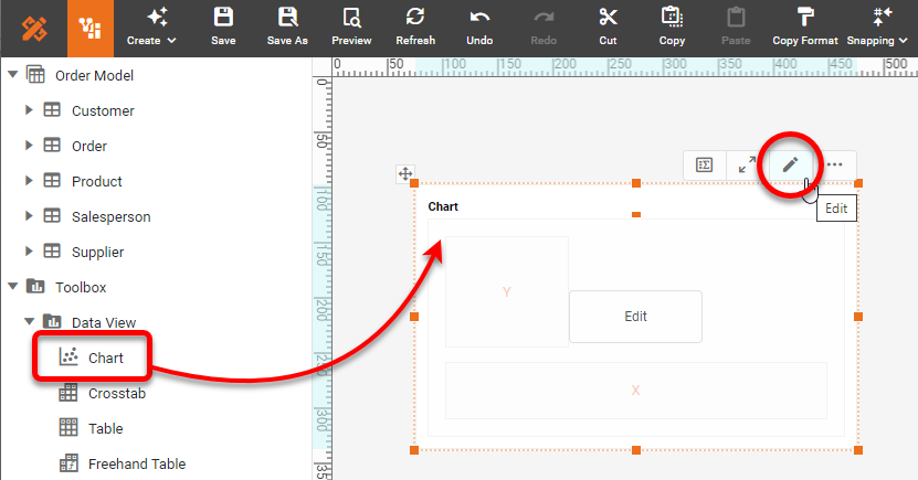
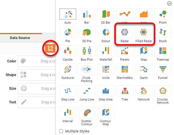
Press the 'Select Chart Style' button. Choose the Radar or Filled Radar style and press 'Apply'.
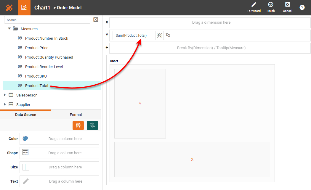
Determine whether your data contains a single measure or multiple measures. If you have multiple measures and want each measure to be represented by an axis, follow these steps: From the 'Measures' folder of the Data Source panel, drag two or more measures (typically, three or more) to the 'Y' region. This places the selected fields onto the chart as measures.
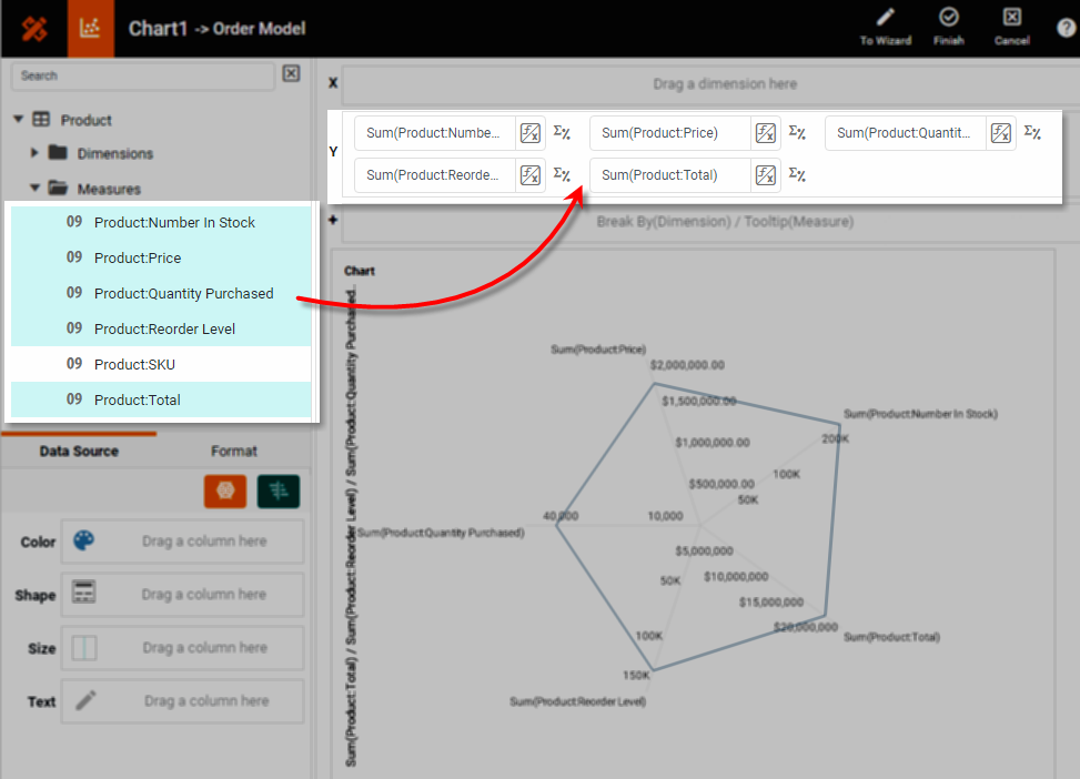
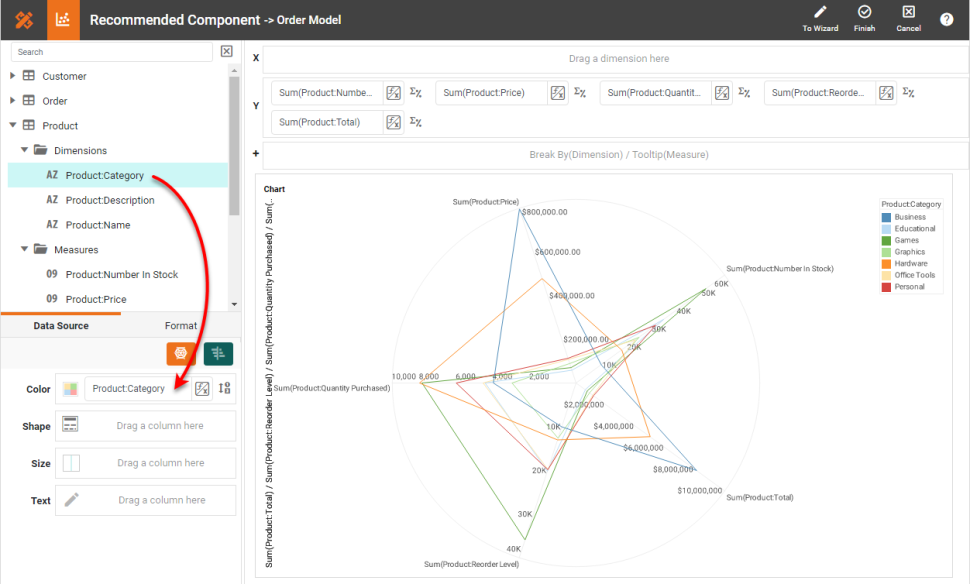
To break-out the data set into groups using color, shape, size, or text labeling, drag a dimension from the Data Source panel to the 'Color', 'Shape', 'Size', or 'Text' region.
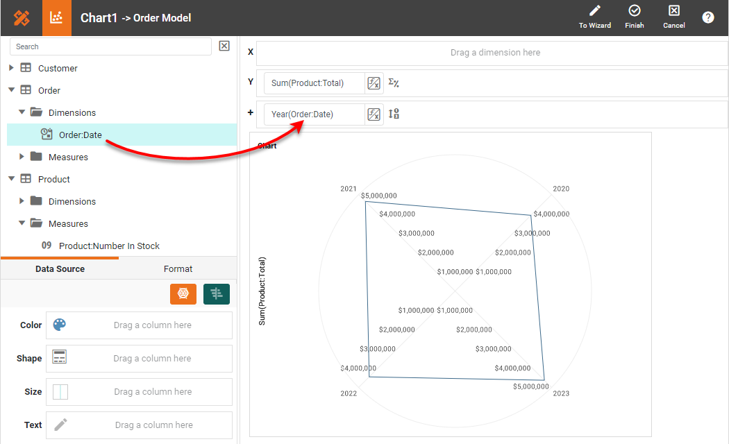
If you have a single measure, and want the values of a dimension to be represented by the axes, follow these steps: From the Data Source panel, drag a single measure to the 'Y' region.
Drag the dimension whose values will define the axes to the 'Break By' field.
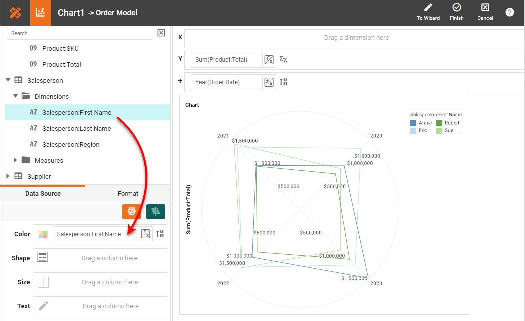
To break-out the data set into further groups using color, shape, size, or text labeling, drag a dimension from the Data Source panel to the 'Color', 'Shape', 'Size', or 'Text' region.
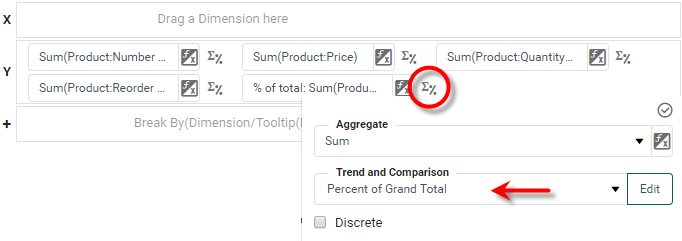
For a date dimension, press the Edit Dimension button next to the field name in the Chart Editor, and set the 'Level' to the desired date grouping. Then press the 'Apply' button. Press the Edit Measure button next to each measure, and select the desired 'Aggregate' and 'Trend and Comparison' method for the measure. For radar charts, it is sometimes desirable to set the 'Trend and Comparison' property to 'Percent of Grant Total' or 'Percent of Subtotal' so that all values are represented on the same scale.
To break-out the data set into further groups using color, shape, size, or text labeling, drag a dimension from the Data Source panel to the 'Color', 'Shape', 'Size', or 'Text' region.
If desired, use the 'Axis Properties' dialog box to provide aliases for the labels, and drag the legend to a desired position. Press 'Finish' to close the Editor.
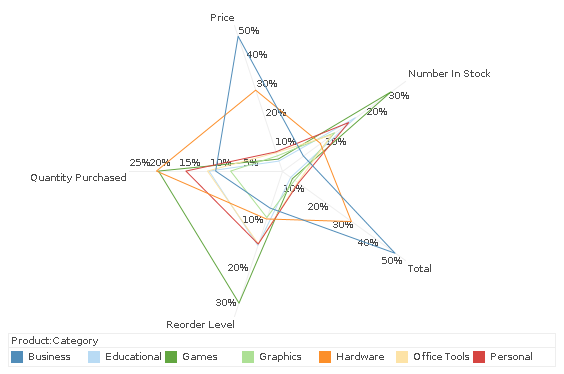
How to Create a Radar Chart in Google Sheets
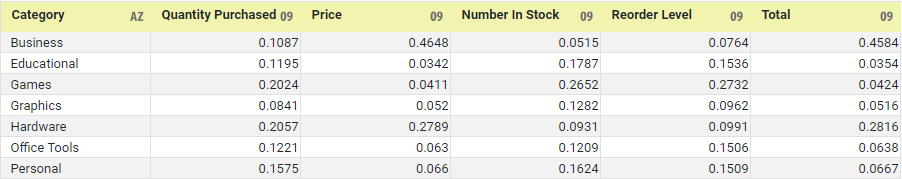
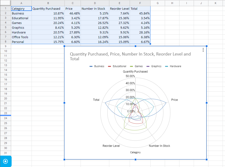
Creating a radar chart in Google Sheets is fairly simple, but also somewhat limited, as the data must be pre-aggregated, as shown below. (InetSoft does not require pre-aggregation.)
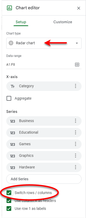
Select the data that you want to include on the chart, and then press Insert > Chart. Select Radar chart as the chart type. Enable Switch Rows/Columns.
This creates the desired radar chart, shown below.
Tool to Make Radar Charts Online for Free
To easily and quickly create Radar Charts online for free, create a Free Individual Account on the InetSoft website. You will then be able to upload a text data set, as shown below:

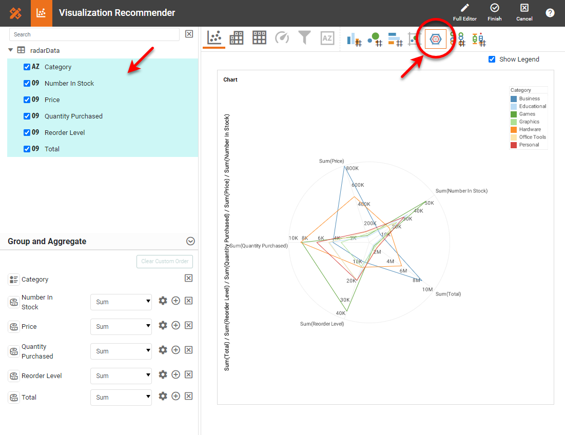
Once you have done that, you will be able to proceed to the Visualization Recommender, which will get you started creating a dashboard. To start with a radar chart, select the dimension and measures that you want to use, and choose the Radar option from the top bar of the Recommender.
After you press Finish to leave the Visualization Recommender, you can continue to modify the Chart or add other components using the Visual Composer shown earlier.