What Is the Best Dashboard Software for Real-Time Data Visualization?
How to see fast-changing data clearly, reliably, and in a way that supports quick decisions? Real-time dashboards are used in operations centers, IT monitoring, manufacturing, logistics, finance, marketing, and many other domains where seconds and minutes matter.
The “best” software is not just the one with the most attractive charts; it is the platform that can ingest live data, update visualizations smoothly, scale with demand, and remain usable for both technical and non-technical users.
This article explores what “best” means in the context of real-time data visualization, the features that define a strong real-time dashboard platform, and how several leading tools—such as InetSoft, Grafana, Power BI, Tableau, and Datadog—approach live data. Rather than naming a single winner, the focus is on the qualities that matter and how to match them to your environment.
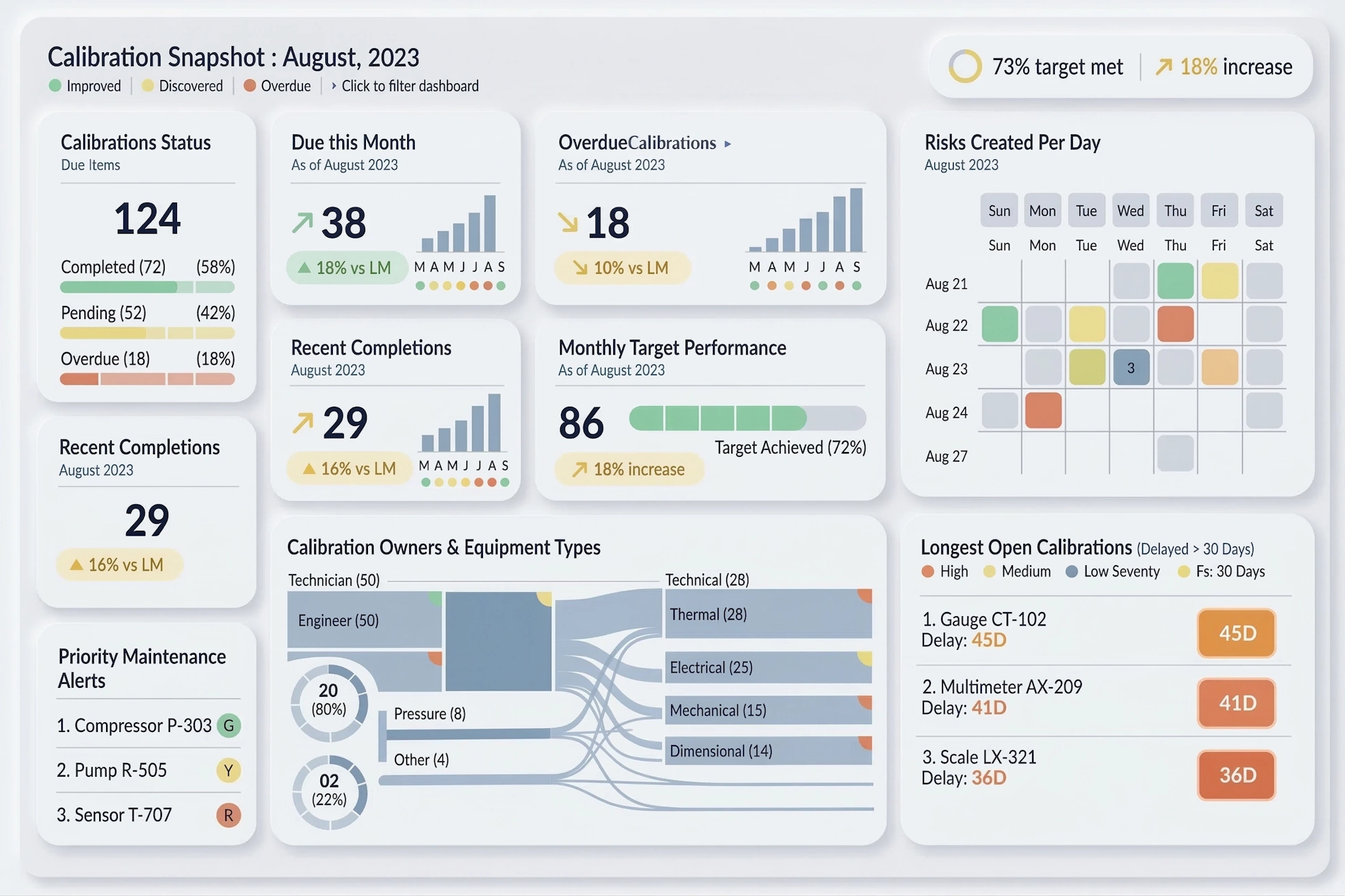

Defining Real-Time Data Visualization
Real-time data visualization refers to dashboards and visual displays that update frequently—often every few seconds or continuously—as new data arrives. This can involve streaming data from sensors, logs, metrics, transactions, or user activity. The goal is to provide a current view of what is happening right now, not just a historical report.
In practice, real-time dashboards:
- Refresh automatically without manual reloads.
- Display live metrics such as throughput, latency, error rates, or production counts.
- Highlight anomalies using thresholds, colors, and alerts.
- Allow interactive exploration even while data continues to update.
- Support multiple audiences from operators to managers and executives.
The best dashboard software for real-time visualization is the one that can deliver these capabilities reliably and at scale.
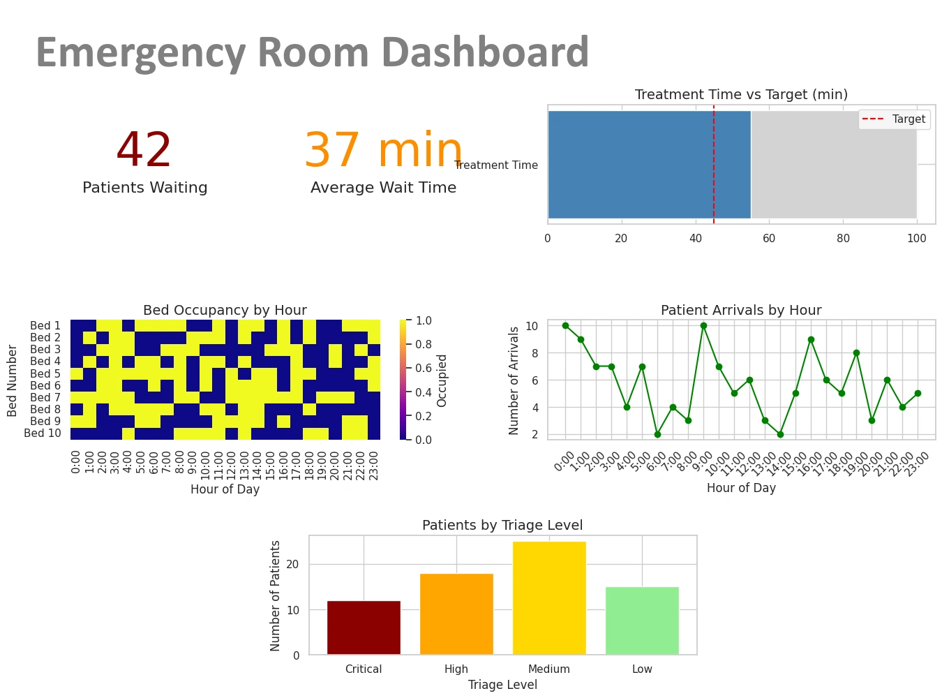
Why Real-Time Dashboards Matter
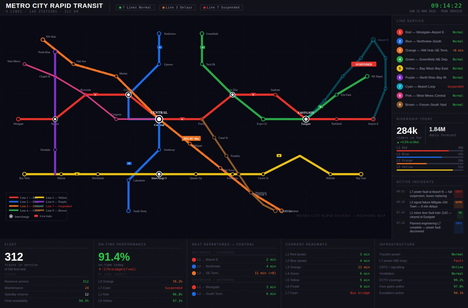
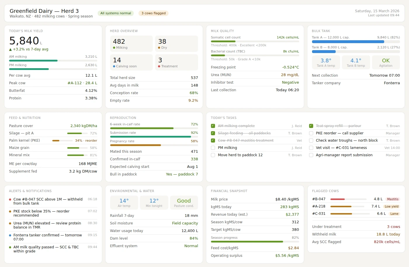
Real-time dashboards are critical in environments where delays can lead to lost revenue, degraded user experience, or safety risks. For example, an operations team monitoring website performance needs to see spikes in response time as they happen, not hours later. A manufacturing supervisor needs to know immediately when a production line slows down or stops. A logistics manager needs live visibility into shipments and routes.
Real-time dashboards matter because they:
- Enable faster response to incidents and anomalies.
- Support continuous optimization by showing the impact of changes immediately.
- Improve situational awareness across teams and departments.
- Provide transparency for stakeholders who need to understand current performance.
- Reduce reliance on manual reporting and ad hoc data pulls.
The best dashboard software is the one that makes these benefits accessible without requiring complex custom development.
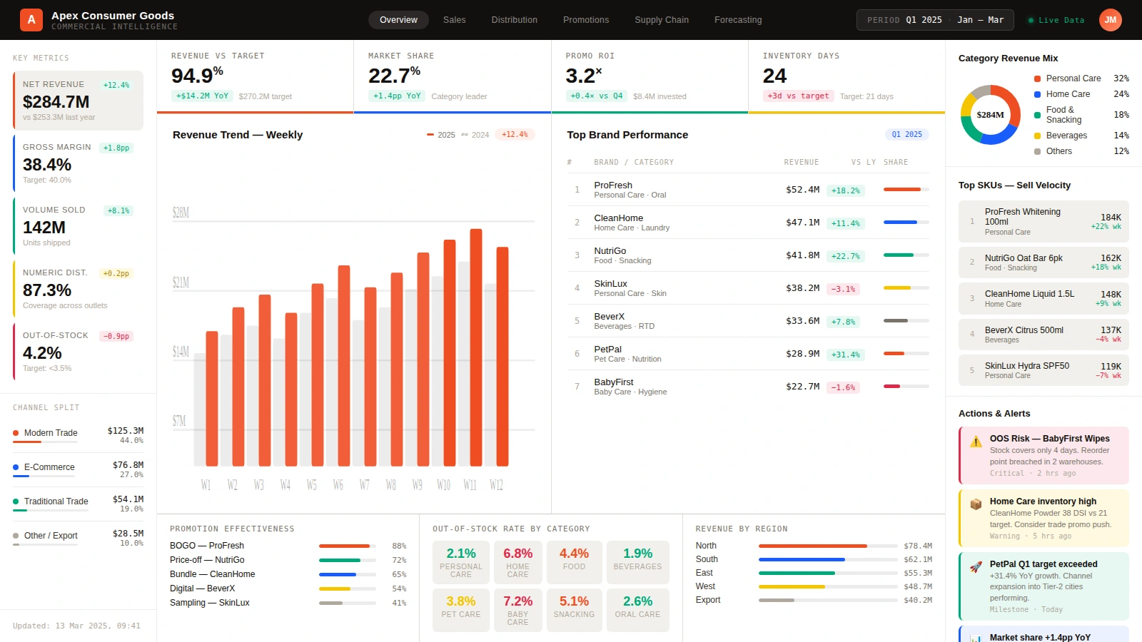
Core Features of the Best Real-Time Dashboard Software
To evaluate which dashboard software is best for real-time data visualization, it helps to break down the capabilities that matter most. Below are key features that distinguish strong real-time platforms from basic reporting tools.
1. Real-Time Data Ingestion and Streaming
The foundation of real-time visualization is the ability to ingest data continuously. This can involve streaming protocols, message queues, event hubs, or frequent polling of APIs and databases. The best platforms support multiple ingestion methods and can handle high-volume data without losing events or slowing down.
Common sources for real-time data include:
- Application logs and metrics from monitoring systems.
- IoT sensors in manufacturing, energy, or transportation.
- Transaction streams in finance, e-commerce, or retail.
- User activity data from web and mobile applications.
2. Configurable Refresh Rates
Not all dashboards need to update at the same frequency. The best software allows administrators and designers to configure refresh intervals per dashboard or per widget. Critical views might refresh every few seconds, while less urgent dashboards update every minute or longer. This flexibility helps balance performance and resource usage.
3. Efficient Rendering and Performance
Real-time dashboards must remain responsive even as data updates frequently. Efficient rendering, incremental updates, and optimized queries are essential. The best platforms are designed to handle continuous updates without freezing, flickering, or overwhelming the browser or client.
Performance considerations include:
- Server-side aggregation to reduce data volume sent to the client.
- Client-side rendering optimizations for smooth animations and transitions.
- Scalable architecture that can handle many concurrent users and dashboards.
4. Rich Visualization Library
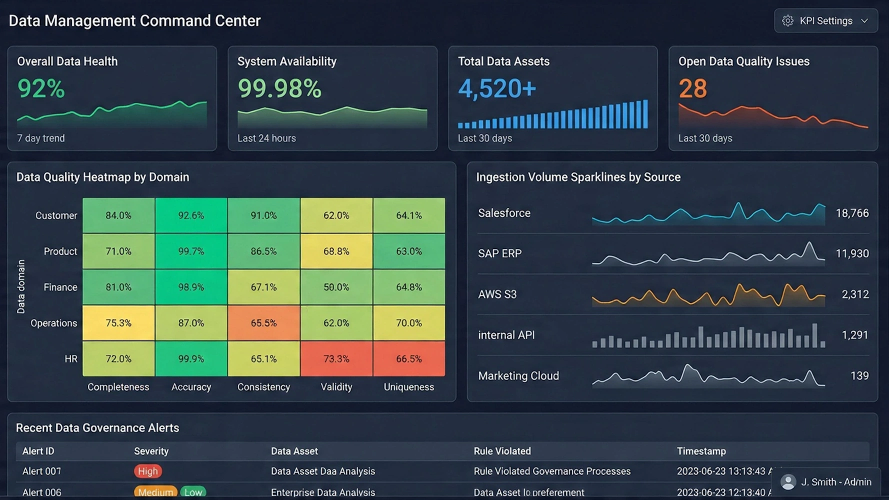
The best dashboard software offers a wide range of visual components tailored to real-time data. This includes line charts, area charts, bar charts, gauges, status tiles, heatmaps, and maps. Certain visualizations are particularly useful for live metrics:
- Time-series charts to show trends and spikes over recent intervals.
- Gauges and dials to represent current values against thresholds.
- Status tiles to indicate up/down states or alert conditions.
- Heatmaps to visualize intensity across regions, systems, or categories.
A rich visualization library allows designers to choose the most effective representation for each metric.
5. Interactivity and Exploration
Real-time dashboards are not just passive displays. Users need to filter, drill down, and pivot views while data continues to update. The best platforms support interactive controls such as time-range selectors, filters, search, and drill-through to detailed views.
Interactivity helps users move from high-level awareness to deeper understanding without leaving the dashboard.
6. Alerting and Threshold Visualization
While dedicated alerting systems often handle notifications, real-time dashboards should visualize thresholds and alert states directly. This can include color changes when metrics cross limits, icons or badges indicating active alerts, and summary panels showing counts of issues.
The best software makes it easy to see not just the numbers, but whether those numbers are within acceptable ranges.
7. Security, Governance, and Sharing
Real-time dashboards often display sensitive operational data. The best platforms support secure authentication, role-based access control, and governed sharing. Administrators can define who can view, edit, or publish dashboards, ensuring that access aligns with organizational policies.
Governance features help maintain trust in the dashboards and prevent unauthorized changes.
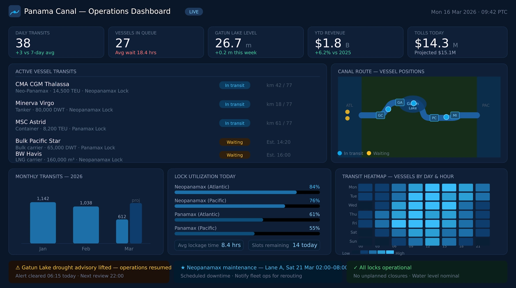
Leading Dashboard Platforms for Real-Time Visualization
Several dashboard and analytics platforms are widely used for real-time data visualization. Each has its own strengths, focus areas, and ideal use cases. Below is an overview of how some leading tools approach real-time dashboards.
InetSoft
InetSoft provides a unified analytics and dashboard platform that supports real-time data visualization across multiple sources. It offers configurable refresh rates, interactive dashboards, and strong data integration capabilities. InetSoft is well-suited for organizations that need both operational real-time views and deeper analytics, allowing teams to move from live metrics to historical analysis within the same environment.
InetSoft emphasizes multi-source connectivity, governed sharing, and interactive exploration, making it a strong choice for real-time dashboards that must also support broader reporting and analytics needs.
Grafana
Grafana is widely used for real-time monitoring and visualization, especially in IT and DevOps environments. It excels at time-series data and integrates with many metrics and logging systems. Grafana’s dashboards can update frequently and display complex visualizations of system performance, making it a popular choice for operations centers and engineering teams.
Its plugin ecosystem and support for multiple data sources make Grafana highly flexible, though it is often oriented toward technical users.
Power BI
Power BI supports real-time dashboards through streaming datasets and direct query connections. It integrates well with cloud services and can display live metrics from various sources. Power BI is often used in business environments where users need both real-time views and traditional reports, and its interface is designed to be accessible to non-technical users.
While powerful, some advanced real-time scenarios may require careful configuration of data flows and refresh settings.
Tableau
Tableau offers strong visualization capabilities and can connect to live data sources for near real-time dashboards. It is known for its interactive visual exploration and rich chart library. For truly high-frequency updates, additional configuration or infrastructure may be needed, but Tableau remains a popular choice for organizations that value visual clarity and interactive analysis.
Datadog
Datadog is a cloud-based monitoring and observability platform that provides real-time dashboards for metrics, logs, and traces. It is designed for live monitoring of applications, infrastructure, and services. Datadog’s dashboards update continuously and support alerting, making it ideal for operations teams that need immediate visibility into system health.
Evaluating Which Platform Is Best for Your Real-Time Needs
Determining the best dashboard software for real-time data visualization depends on your specific environment, data sources, team skills, and goals. A platform that is ideal for one organization may be less suitable for another. The key is to match capabilities to requirements.
When evaluating platforms, consider:
- What data sources you need to visualize and whether the platform supports them natively.
- How frequently dashboards must update and whether refresh rates are configurable.
- Who will use the dashboards and whether the interface is accessible to non-technical users.
- How important interactivity is for your use cases.
- What governance and security requirements you must meet.
- How the platform fits into your broader analytics strategy beyond real-time monitoring.
Running a proof-of-concept with real data and real users can reveal how well a platform meets your needs in practice.
From Real-Time Metrics to Insight
Real-time dashboards are most valuable when they are part of a broader analytics lifecycle. Live metrics show what is happening now, but teams also need to understand why it is happening and what to do about it. The best dashboard software supports both real-time views and historical analysis, allowing users to move from immediate awareness to deeper insight.
A typical lifecycle includes:
- Defining questions such as “Are we meeting performance targets right now?” or “Where are bottlenecks occurring?”
- Collecting real-time data from relevant systems.
- Visualizing metrics in dashboards that update continuously.
- Investigating anomalies using drill-downs and filters.
- Analyzing historical patterns to understand trends and recurring issues.
- Communicating findings through shared dashboards and reports.
Platforms that support this full lifecycle provide more value than tools that only display live numbers.
What Is the Best Choice?
When answering the question, “What is the best dashboard software for real-time data visualization?”, the most useful response is not a single product name but a description of the qualities that make a platform truly effective for real-time use.
The best dashboard software for real-time data visualization is the one that:
- Ingests data continuously from your key sources.
- Updates dashboards at appropriate intervals without performance issues.
- Provides rich, clear visualizations tailored to live metrics.
- Supports interactivity for exploration and investigation.
- Aligns with your security and governance needs.
- Fits into your broader analytics and reporting strategy.
InetSoft, Grafana, Power BI, Tableau, and Datadog are examples of platforms that can deliver strong real-time dashboards, each with its own focus. InetSoft emphasizes unified analytics and multi-source dashboards, Grafana excels at time-series monitoring, Power BI integrates with business environments and cloud services, Tableau offers interactive visual exploration, and Datadog provides deep observability for applications and infrastructure.
Ultimately, the best choice for your organization will be the platform that matches your data landscape, operational needs, and user expectations while making real-time visualization feel natural and reliable rather than fragile or complex.
Frequently Asked Questions
What makes a dashboard truly real-time?
A dashboard is truly real-time when it updates automatically as new data arrives, with refresh intervals measured in seconds or continuous streaming, and when users can rely on it to reflect current conditions without manual reloads.
Do I always need second-by-second updates?
Not necessarily. The appropriate refresh rate depends on your use case. Some dashboards need updates every few seconds, while others are effective with updates every minute or longer. The best software lets you configure refresh intervals.
Can non-technical users work with real-time dashboards?
Yes, if the platform provides a user-friendly interface and guided workflows. Many modern tools allow non-technical users to view and interact with real-time dashboards without needing to manage data pipelines or write code.
How important is interactivity in real-time dashboards?
Interactivity is important because it allows users to investigate anomalies, filter views, and drill down into details while data continues to update. This helps teams move from awareness to understanding and action.
Can real-time dashboards be used for long-term analysis?
Real-time dashboards are primarily focused on current conditions, but when combined with historical data storage and analytics, they can support long-term analysis by allowing users to compare current metrics with past trends.
How should I choose a platform for real-time visualization?
Consider your data sources, required refresh rates, user audience, governance needs, and how the platform fits into your overall analytics strategy. Testing with real data and users is often the best way to evaluate suitability.