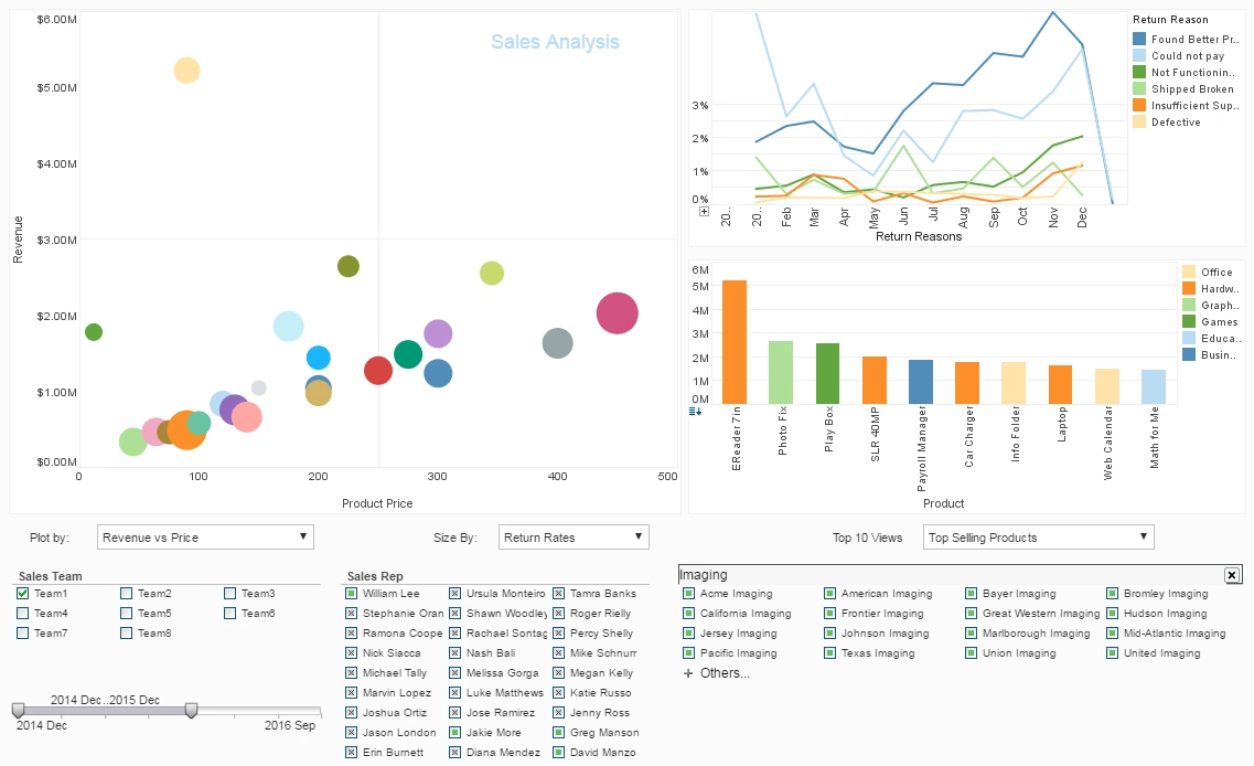
Sales Performance Dashboard Example
Are you searching for a way to analyze your sales pipeline?
As you can see in the example here, dashboards are powerful tools for doing just that. The sample dashboard provided tracks many sales-related key performance indicators in a highly visual and digestible manner.
This dashboard displays a large amount of information in a small space. It uses a large number of common KPIs to track the overall performance of sales.
Pharmacy Benefit Manager Uses InetSoft's Sales Dashboard Solution
StyleBI: Flexible, Component-Based Architecture
InetSoft’s StyleBI is a modular framework designed for scalable analytics delivery. For IT teams within PBMs, StyleBI offers open integration points through RESTful APIs and direct connectors to PostgreSQL, Oracle, and various cloud warehouses. The software’s UI components are written in JavaScript, making it ideal for embedding within PBM portals and CRM systems. Because it’s open source, developers can fully tailor chart behavior, interactivity, and even localization for different pharmacy networks.
Sales Performance Dashboard Overview
A PBM’s StyleBI sales performance dashboard is typically displayed on widescreen monitors (e.g., 1600x1024 pixels), designed for visual clarity and multitier navigation. At its core, the dashboard provides an interactive grid layout featuring six visualizations, updated in real-time with the latest transactional and engagement data.
Key Performance Indicators (KPIs) Tracked
- Formulary Adoption Rate: % of covered lives aligned with preferred drug lists
- Rebate Yield: Total rebates earned per therapeutic class
- Gross Margin by Payer Segment: Revenue minus drug acquisition costs across commercial, Medicare, and Medicaid payers
- Sales Cycle Duration: Average time from initial pitch to signed contract
- New Payer Acquisition: Number of net-new payer contracts closed monthly
- Call-to-Conversion Ratio: Effectiveness of outbound engagement
Visualizations Included
The dashboard uses advanced chart types to distill insights for the sales and executive leadership teams:
1. Bullet Chart: Rebate Yield by Therapeutic Class
This bullet chart measures expected vs. actual rebate values across top categories like cardiovascular, oncology, and diabetes drugs. Target thresholds are shaded (low, medium, optimal), while actual performance is marked with a vertical line—giving instant visibility into underperforming drug rebates.
2. Heatmap: Formulary Adoption Over Time
Mapped across months and payer segments, this heatmap reveals formulary adherence trends. Darker tones highlight strong adoption, while lighter regions flag lagging compliance. Filters allow slicing by region, pharmacy chain, or sales territory.
3. Radar Chart: Sales Rep Effectiveness
Displays individual metrics such as lead responsiveness, follow-up velocity, presentation rating, engagement index, and conversion % for each rep. This holistic view helps managers identify top performers and coach those below benchmark.
4. Stacked Bar Chart: Contracts Closed by Channel
Breaks down sales volume across direct-to-payer, broker network, and group purchasing organizations. Each bar is segmented by month to visualize seasonal variations and pipeline growth patterns.
5. Time Series Line Chart: Sales Cycle Duration Trend
Tracks the average days to closure over a 12-month span, with annotations for systemic delays (e.g., formulary committee holdups, compliance reviews). Useful for identifying process inefficiencies and automation opportunities.
6. TreeMap: Margin Distribution by Drug Category
This TreeMap groups drugs into categories and sizes each block by margin contribution. Hover pop-ups display SKU-level data, NDC codes, and acquisition sources—allowing granular investigation into low-margin offerings.
Reports Delivered to Stakeholders
In addition to dashboard visualizations, StyleBI enables automated report generation using its templating engine. Commonly delivered reports include:
- Weekly Sales Pulse: Snapshot of closed deals, formulary wins, and call logs
- Monthly Rebates Summary: Aggregated rebate earnings and variances vs projections
- Quarterly Payer Engagement Report: Conversion metrics, outreach ROI, and territory heatmaps
- Executive Performance Brief: High-level view for board review, exportable to PDF and Excel
Deployment and Security Considerations
StyleBI supports containerized deployment via Docker, enabling flexible orchestration with Kubernetes. Role-based access control (RBAC) ensures secure user segmentation, especially when dashboards are embedded in multi-tenant PBM platforms. With LDAP and OAuth integration, IT teams can enforce enterprise login policies and maintain audit logs for each dashboard interaction.
Customization & Extensibility
The open nature of StyleBI allows PBM IT departments to build reusable modules and share visualization templates across internal teams. JavaScript hooks enable real-time alerts, predictive scoring overlays, and even NLP-based search within dashboards. This extensibility is critical for PBMs adapting to changing drug formularies and compliance mandates.
