Sales Dashboards from InetSoft
Below are screenshots of StyleBI dashboards focused on sales analytics, pipeline management, and KPI tracking as presented on inetsoft.com. These visualizations showcase interactive charts, drag‑and‑drop design, and data mashup-driven insights tailored for sales teams and leaders.
1. Sales Performance Dashboard Example
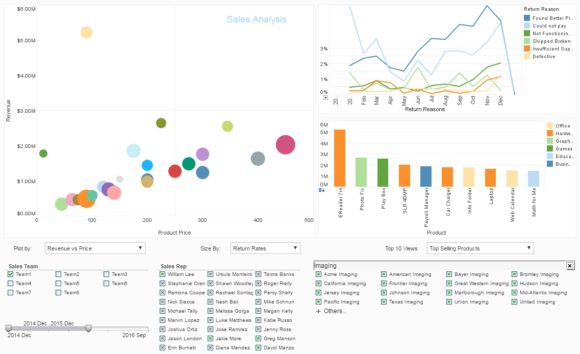
This dashboard combines bubble charts, bar graphs, and line charts to visualize revenue, price sensitivity, and return rates simultaneously. Interactive filters such as date sliders and team selectors enable dynamic exploration. Tooltip-enabled elements deliver aggregated data on hover for quick insight.
2. Sales KPI Dashboard View
A clean layout tracking key sales metrics like sales by product, close ratios, lead volume, and forecast variance. The interface uses gauge visuals and scorecards to compare current performance against goals. Perfect for executive or VP-level scorecards.
3. PipelineDeals Integration Dashboard
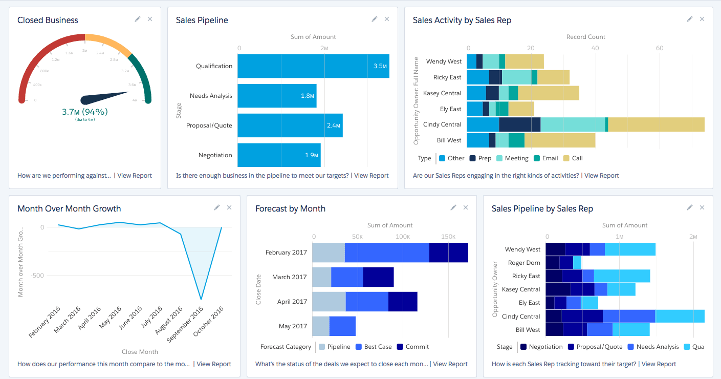
This templated dashboard integrates CRM-derived opportunity metrics with pipeline health indicators. It highlights stage durations, opportunity age, and rep-level activity with color-coded bars. Managers can easily identify stalled deals and top opportunities.
4. Sales Reporting & Analytics Overview
Features a mix of pie charts, column charts, maps, and time-series visuals showing sales by region, product line, and time period. The mashup-enabled canvas permits slicing by rep, region, or customer segment. Self-service design supports rapid ad-hoc reporting without IT help.