Treemap Charts - Definition, When To Use, and Examples

Definition of a Treemap Chart
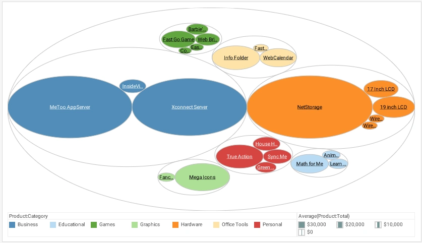
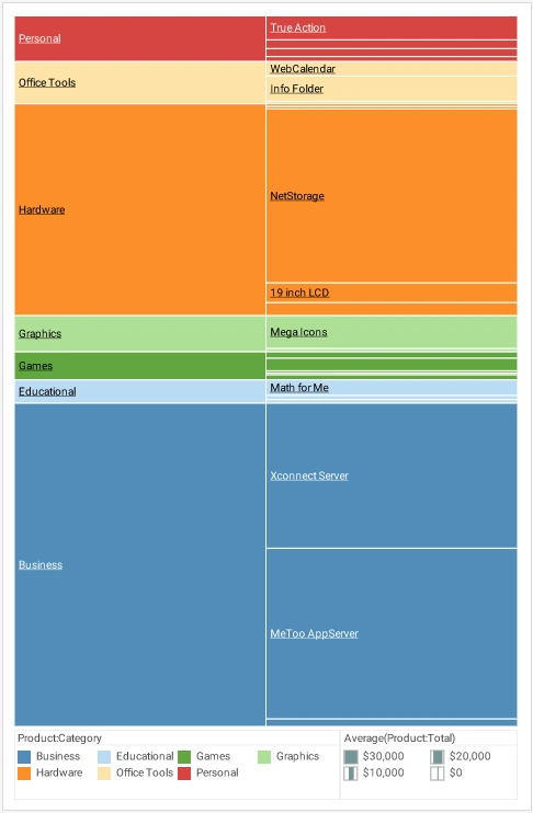
A Treemap Chart is a graphical display of hierarchical data in the form of nested rectangles, where each individual rectangle represents a subgroup whose aggregate is reflected by the area of the rectangle, and possibly also by its color. At each level of the hierarchy as well, the size of the parent rectangle formed by the assemblage of sub-rectangles represents the aggregate measure associated with that parent level of the hierarchy. For example, if a hierarchy is composed of products and product categories, and the measure is average total dollar amount, then a treemap might look like this, although the legend is typically omitted.
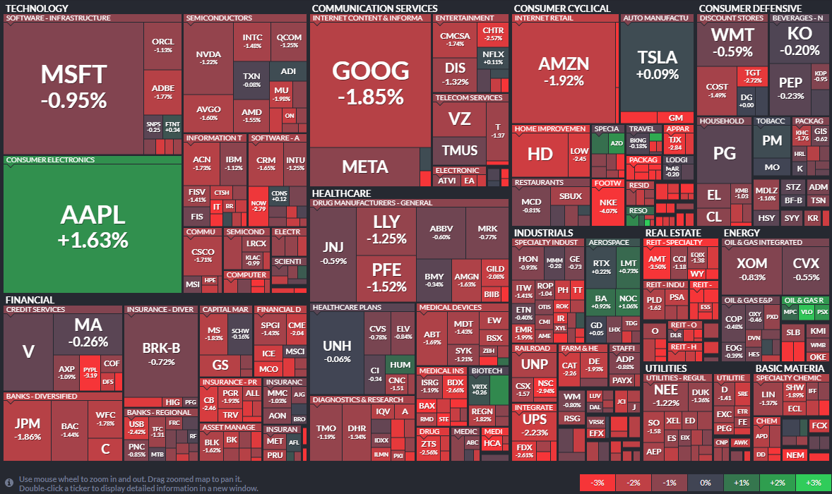
A common example of a treemap that is well suited to its data is the stock heat map generated by FinViz. The small rectangles are individual company ticker symbols, and the rectangular groups are the sectors (healthcare, real estate, etc.) comprised of these companies. In this instance, the color represents the individual stock's gain or loss, and the size of the rectangle represents the company's market cap.
Why Use a Treemap Chart?
The obvious benefit of the treemap chart is that is provides a very quick illustration of the "big picture", effectively highlighting areas that have the greatest importance in terms of power, value, or any other KPI. For example, in the FinViz chart above, it is immediately obvious which companies and sectors are losers or winners at the moment the chart is displayed. (For the FinViz application, the chart changes continuously throughout the trading day.) Although it is not easy to compare two companies that are spatially separated from each other in the chart, such comparisons are probably not necessary in this application. If such detailed comparisons were required, other chart types such as a Bar Chart might be better suited to the data.
A general disadvantage of treemaps, which can be seen in both examples above, is that less significant areas can be difficult to read or may not display labels at all, and zooming may be required to be able to resolve the text or details. Although this can be partially addressed by effective use of tooltips for interactive charts, a treemap is therefore not best choice for data that needs to be compared precisely or viewed in its entirety, but is more suitable for cases where an "at a glance" holistic impression conveys the desired information. For the FinViz chart above, what most users want to see is "How is the energy sector doing?" or the like. The exact details of whether a stock is down 1% or 1.5% are not important. The holistic nature of the viewer's needs makes the treemap the perfect way to present the market.
Variations of Treemap Charts with Examples
Treemap charts can appear in different styles, and can be adapted to suit the data they are presenting. There are also other chart types that can be used to present hierarchical data in a manner logically identical to a treemap.
Circle Packing Chart
The first of these is the Circle Packing Chart. Not as compact as the treemap, it nevertheless presents the same information. It may be useful when the treemap appears too dense.
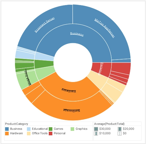
Sunburst Chart
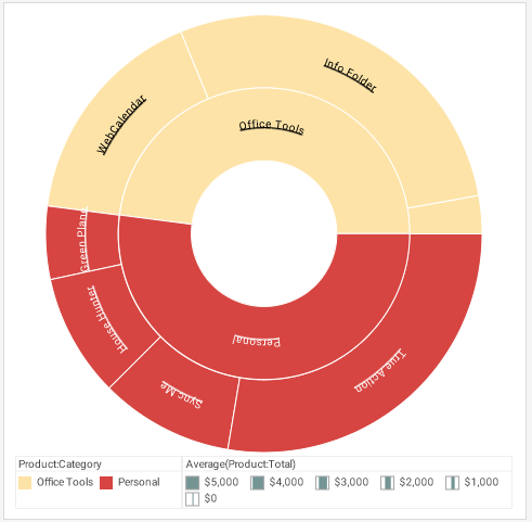
Another variation on the treemap concept is the Sunburst Chart. This also clearly suffers from the inability to display all text labels legibly, and requires zooming to reveal all of the data. Below, the same chart has been zoomed to reveal the details of the Personal and Office Tools categories.
Icicle Chart
Yet another variation is the Icicle Chart, which favors a one-dimensional orientation of the rectangular regions, and may be easier to read in some instances.
Treemap Charts in InetSoft Software
InetSoft's Style Intelligence and Style Scope products support Treemap Charts, Circle Packing Charts, Sunburst Charts, and Icicle Charts. These charts can be created easily in the Visual Composer, as described below.
InetSoft's software products are 100% web-based, and provide a full suite of business intelligence capabilities including interactive dashboards, ad hoc reporting, pixel-perfect report generation, and self-service data preparation. To try out these chart types for free online, see the instructions below.
How to Make a Treemap Chart in InetSoft
Creating a Treemap Chart with InetSoft software is extremely simple. The other chart types mentioned above (Circle Packing, Sunburst, and Icicle) are created in the same way.
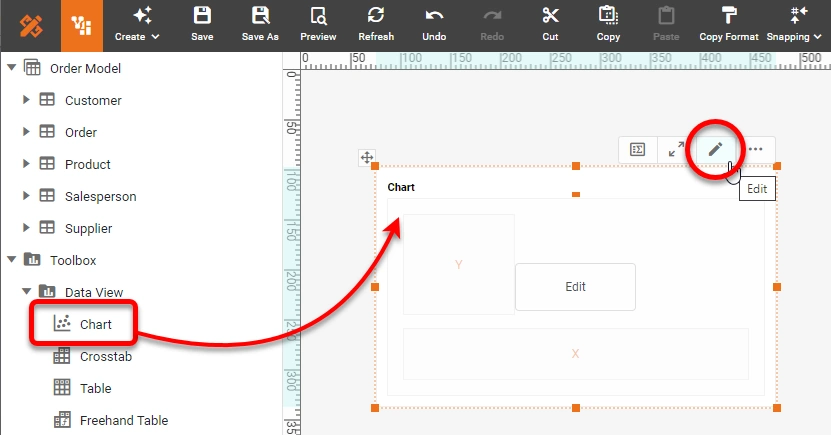
Drag a Chart component from the Toolbox panel into a dashboard in Visual Composer, and then press the Edit button to open the Chart Editor.
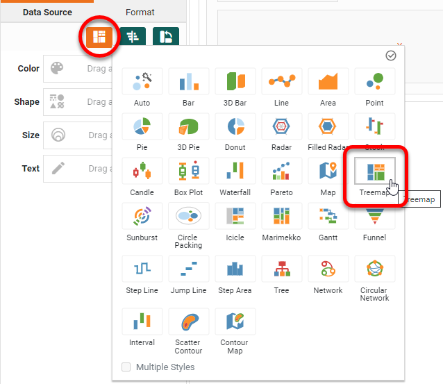
In the Chart Editor, set the Chart Style to Treemap.
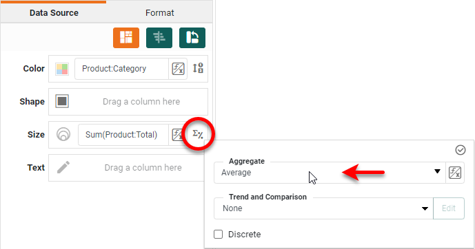
Drag the desired hierarchy dimensions to the T region in the Chart Editor. Drag a desired dimension to the Color region, and drag a measure to the Size region. (See highlights below.)
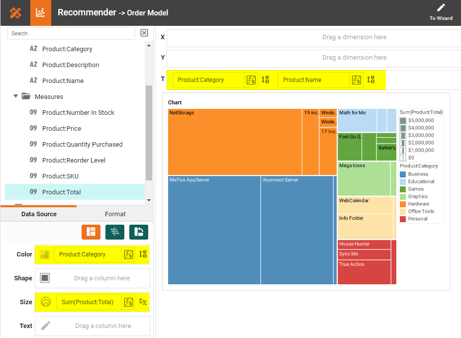
Press the Edit Measure button next to the measure and choose a desired Aggregate.
Press Finish to close the Chart Editor. The Treemap is complete.
How to Create a Treemap Chart in Google Sheets
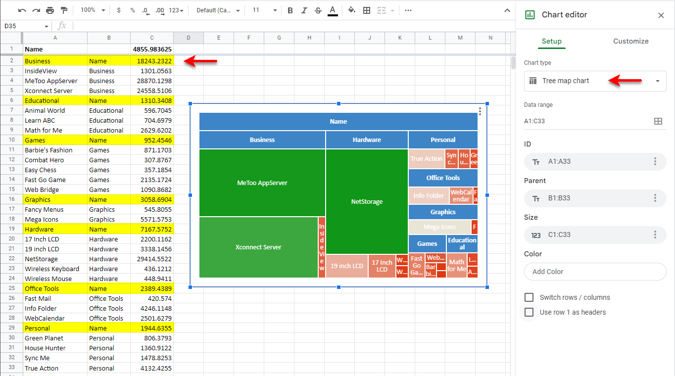
Creating a Treemap in Google Sheets is cumbersome, because all aggregates in the hierarchy must be pre-computed and arranged in an eccentric tabular form, with parent values in the same column as child values. Unlike InetSoft, in Google Sheets the treemap chart cannot be created from the raw data directly.
To create a Treemap Chart in Google Sheets, you must first aggregate the data as shown below, with parent values and aggregates shown highlighted. Then add a Chart from the Insert menu, and use the Chart Editor to choose the Tree map chart type. This creates the desired treemap.
Tool to Make Treemap Charts Online for Free
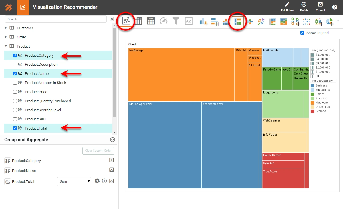
To easily and quickly create Treemap Charts online for free, create a Free Individual Account on the InetSoft website. You will then be able to upload a text data set, as shown below:

Once you have done that, you will be able to proceed to the Visualization Recommender, which will get you started creating a dashboard. To start with a Treemap Chart, select the hierarchical fields and measure that you want to use, and choose Treemap from the top bar of the Recommender.
After you press Finish to leave the Visualization Recommender, you can continue to modify the Chart or add other components using the Visual Composer shown earlier.