Understanding Operational Dashboards
Operational Dashboard Definition
An operational dashboard is a real‑time visual system that tracks ongoing business processes, highlights deviations from expected performance, and enables frontline teams to take immediate action. Unlike analytical dashboards, operational dashboards focus on live KPIs, alerts, and short‑interval control to keep daily operations running smoothly.
Operational dashboards exist to manage the day-to-day occurrences in a business. They are a particularly good tool when looking at metrics that change frequently and for being able to drill into details to understand root causes of what is happening.
As the name suggests, operational dashboards paint a picture of business operations. They concern themselves with the here-and-now rather than the later. Analytical dashboards concern themselves with the future.


Why Should You Consider an Operational Dashboard?
If you are interested in how well your KPIs are operating you may want to consider an operational dashboard.
Time sensitive matters, as well, are best analyzed on this way, due to their here-and-now approach. Who is going to be using this dashboard? The overall feel of the dashboard will be determined based on the end user.
Operational dashboards are very well suited to managers and standard business users who are concerned with the current state of a business, rather than executives who must concern themselves with the future.
What are you hoping to achieve by utilizing a dashboard? Use an operational dashboard to track current performance against goals and expose weaknesses to be addressed. See what is working for you and determine best practices.
Finally, an important thing to consider is where your business has its source data stored. Operational dashboards are typically more suited to improving the visibility of a singular system or application as opposed to that of multiple data sources.
Key Features of Effective Operational Dashboards
Real‑Time Data Refresh
Operational dashboards rely on continuous or near‑continuous data updates so teams can respond instantly to issues. This is essential for real‑time monitoring.
Alerts and Threshold Indicators
Visual cues such as color changes, warnings, and automated notifications help operators detect problems before they escalate.
Role‑Based Views
Dashboards should adapt to the needs of supervisors, operators, managers, and executives, ensuring each role sees the KPIs that matter most.
Drill‑Down and Detail Views
Users must be able to click into KPIs to understand root causes, making drill‑down analytics a core capability.
Multi‑Source Data Mashup
Operational dashboards often combine machine data, ERP metrics, IoT signals, and workflow systems into a unified real‑time view.
Operational vs Analytical Dashboards
How Are Operational Dashboards Different from Other Departmental Dashboards?
In the world of business intelligence and data visualization, dashboards serve as indispensable tools for summarizing performance, identifying issues, and driving decisions. While every department—whether sales, finance, marketing, HR, or IT—relies on dashboards, operational dashboards stand apart in their purpose, structure, and function. This article explores what makes operational dashboards unique, why they matter, and how they differ from other departmental dashboards in scope, design, and usage.
1. Real-Time Emphasis and Temporal Sensitivity
Operational dashboards typically emphasize real-time data or near-real-time refresh cycles. Because operations often involve logistics, manufacturing, service delivery, or resource management, real-time updates are crucial to making timely decisions. In contrast, dashboards in departments like finance or HR may rely more on weekly or monthly aggregated data, as those areas do not require minute-by-minute awareness.
For instance, a manufacturing plant might use an operational dashboard to monitor equipment uptime, inventory levels, or product defect rates. If downtime spikes or a production bottleneck emerges, immediate intervention is necessary. Finance teams, on the other hand, can afford to review their dashboards on a monthly cadence, as their KPIs are often based on closing periods or fiscal quarters.
2. Operational KPIs Are Often Process-Oriented
While departmental dashboards typically track strategic outcomes, operational dashboards focus on process-centric metrics. Key performance indicators (KPIs) in operations are directly tied to workflows, output, and efficiency. Examples include cycle time, lead time, throughput, utilization rate, defect rates, and on-time delivery percentage.
This contrasts with marketing dashboards, which may focus on customer engagement, conversion rates, or campaign ROI—metrics that reflect outcomes but not internal process steps. Operational dashboards are more concerned with how things are done and how efficiently they are executed, making them vital for process improvement and lean initiatives.

3. Multisource and Cross-Functional Integration
Operational dashboards often require integration across multiple systems and departments to provide a unified view. For example, a logistics dashboard might pull data from a warehouse management system (WMS), transportation management system (TMS), ERP, and external GPS tracking services.
In contrast, dashboards for HR or sales may depend on a more limited data set sourced from a single platform like an HRIS or CRM, respectively. The multisource nature of operational dashboards makes them technically more complex to develop and maintain but also more critical for providing a complete operational picture across organizational silos.
4. Focus on Immediate Action and Exception Management
Unlike other departments that use dashboards for historical analysis or strategic planning, operations teams use dashboards for real-time monitoring and incident response. A good operations dashboard acts as a control panel, highlighting variances, exceptions, or anomalies that require swift action.
These dashboards often include alert thresholds, visual indicators such as red/yellow/green signals, and drill-down capabilities to investigate issues quickly. For instance, if a service center sees an unusual spike in unresolved tickets or increased average resolution time, the dashboard should not only flag the problem but help isolate its cause. Sales or HR dashboards rarely carry this kind of urgency in their design.
5. Physical Asset and Human Resource Monitoring
Operations dashboards are unique in that they often monitor physical assets (machinery, vehicles, facilities) as well as human resource deployment. They help managers understand how well machines are functioning, how workforces are distributed, and where bottlenecks might be occurring in physical or digital workflows.
This stands in contrast with dashboards from departments like finance or IT, which are more abstract and number-driven. While IT dashboards may track infrastructure performance, they are not as tied to real-world physical processes as operations dashboards, which must account for constraints like equipment maintenance schedules, shift overlaps, and geographic distribution.
6. Visual Design Tailored for Fast Interpretation
Because operations teams may need to make quick decisions, the visual design of their dashboards is often optimized for instant interpretation. Metrics are displayed in large, legible formats; charts emphasize trends or thresholds; and layout prioritizes spatial awareness of the production floor, supply chain routes, or workload queues.
This contrasts with executive dashboards or HR dashboards that might emphasize clean, summarized visuals for presentation purposes. The operational dashboard is not about impressing stakeholders—it's about giving frontline managers the insights they need to keep the business running smoothly.
7. Alignment with Lean and Continuous Improvement
Operations dashboards are essential tools for driving lean management and Six Sigma methodologies. These frameworks emphasize waste reduction, quality control, and continuous improvement, all of which require detailed and consistent monitoring of process metrics.
As such, operational dashboards often include Pareto charts, root cause analysis tools, and time-based views that allow for the identification of trends and inefficiencies. Dashboards in other departments may not be so tightly linked to such structured methodologies, focusing more on performance summaries than process diagnostics.
8. Greater Customization and Localization
Operational environments can vary significantly—even within the same company—based on plant layout, team roles, or supply chain stages. Therefore, operations dashboards often need to be highly customizable and even localized to specific sites, teams, or shifts.
Compare this to a corporate finance dashboard that can likely serve all stakeholders equally across the enterprise. The operations dashboard must reflect the on-the-ground reality of specific processes, making it more granular and tailored than most other departmental dashboards.
9. Broader User Spectrum
Operations dashboards often serve a wider and more diverse group of users, including supervisors, machine operators, quality inspectors, logistics coordinators, and plant managers. These users may have different technical capabilities and data literacy levels.
As a result, operations dashboards must strike a careful balance between being highly functional and easy to use. Training and user interface simplicity are more crucial here than in departments where dashboards are typically used by analysts or managers with strong data backgrounds.
Industries That Rely on Operational Dashboards
- Manufacturing and production lines
- Energy and utilities
- Logistics and transportation
- Retail store operations
- Healthcare and hospital operations
- Hospitality and service industries
- Government and public safety
Operational Dashboard Examples
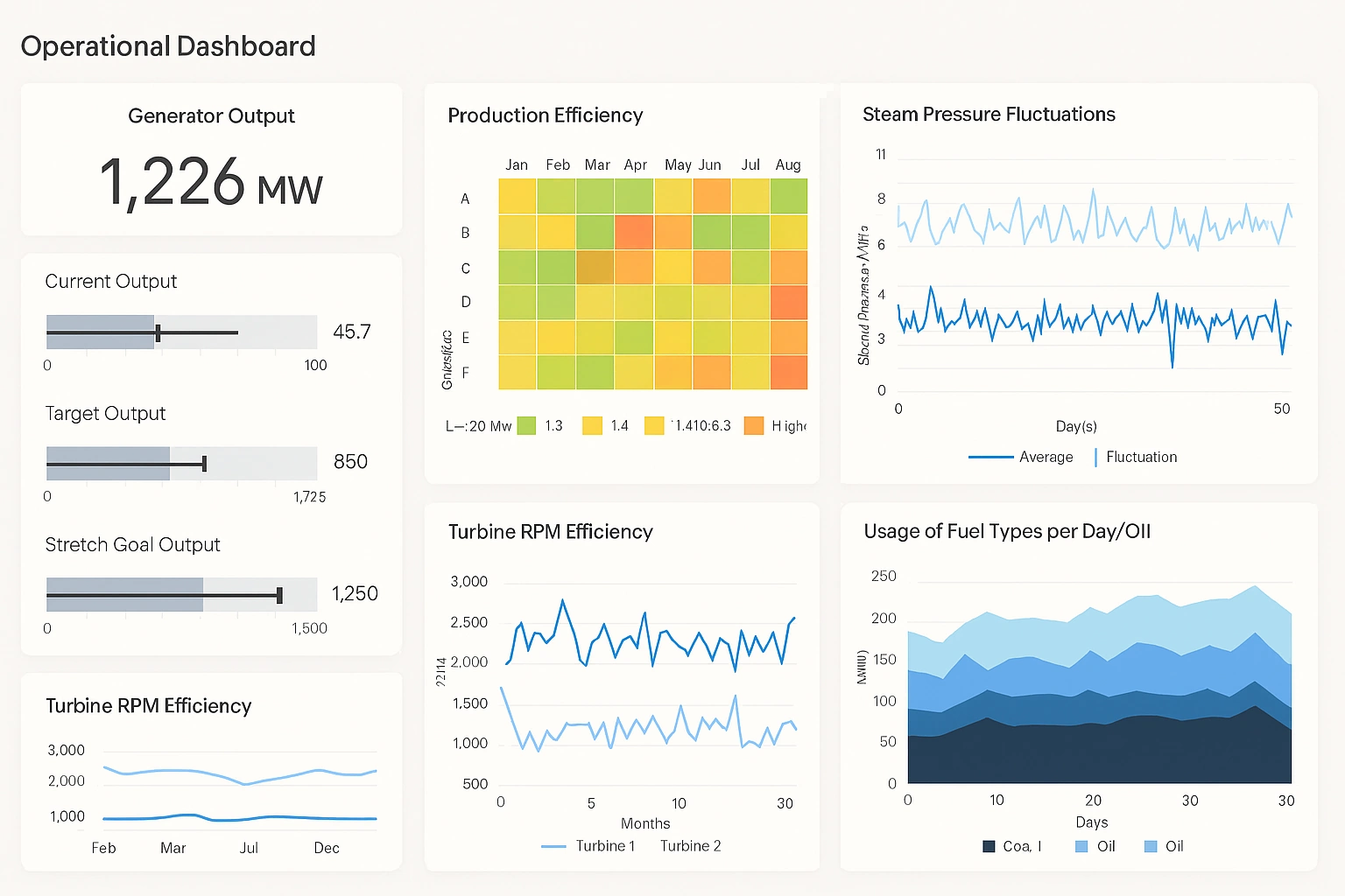
Production Line Operational Dashboard
Tracks throughput, downtime, cycle time, and bottlenecks across machines and shifts.
Call Center Operations Dashboard
Monitors queue length, agent availability, call resolution time, and SLA compliance.
Logistics & Fleet Dashboard
Shows vehicle locations, delivery status, route efficiency, and exceptions.
Warehouse Throughput Dashboard
Displays pick/pack rates, inventory movement, dock utilization, and backlog alerts.
Utility Grid Operations Dashboard
Monitors load distribution, outages, voltage anomalies, and maintenance alerts.
Hospital Operations Dashboard
Tracks bed availability, patient flow, staffing levels, and critical alerts.
Comparing Tools for Building Operational Dashboards
Operational dashboards have a very specific job: provide fast, trustworthy visibility into systems, pipelines, and processes that need to be monitored continuously. Unlike executive or analytical dashboards, operational views prioritize timeliness, clarity, alert context, and consistency over visual experimentation. MetricFire, Grafana, Kibana, Freeboard, and StyleBI all support dashboarding, but they approach operational use cases from very different angles.
MetricFire: Managed Metrics for Operational Visibility
MetricFire is best understood as a managed operational monitoring platform rather than a general dashboarding tool. It focuses heavily on time-series metrics, alerting, and reliability, which are core requirements for operations teams. Because MetricFire handles metric storage, scaling, and retention, teams can focus on instrumenting services and defining alerts instead of maintaining infrastructure.
For operational dashboards, MetricFire works well when uptime, latency, throughput, and error rates are the primary concerns. Dashboards tend to be standardized and metrics-driven, which supports consistency across environments. However, customization and cross-domain data mashup are limited compared to more flexible platforms, making it less suitable when operational data needs to be combined with business or application-layer context.
Grafana: Flexible Operational Dashboards Across Systems
Grafana is one of the most common choices for operations dashboards because it excels at visualizing metrics from many systems in one place. Infrastructure metrics, application performance, cloud services, and even business KPIs can coexist on the same dashboard. This flexibility is valuable for operations teams that need a single operational view spanning multiple technologies.
Grafana dashboards are highly interactive, support templating for environments and services, and integrate closely with alerting workflows. The tradeoff is that Grafana depends heavily on the quality and structure of underlying data sources. Without strong metric discipline, dashboards can become fragmented or inconsistent across teams, especially as organizations scale.
Kibana: Log-Centric Operational Investigation
Kibana approaches operations dashboards from a different direction, emphasizing logs, events, and indexed data rather than pure metrics. This makes it particularly useful for incident investigation, where understanding context, error messages, and sequences of events matters more than aggregate trends.
While Kibana supports time-series visualizations, it is not optimized for traditional operational metrics dashboards in the same way Grafana is. Dashboards often serve as entry points into deeper searches rather than continuous monitoring views. For operations teams heavily focused on log analysis, Kibana is extremely powerful, but it is less effective as a primary real-time operational dashboard.
Freeboard: Lightweight Status Displays
Freeboard occupies the simplest end of the operational dashboard spectrum. It is designed to display live values from APIs or data feeds with minimal setup and no backend complexity. This makes it useful for wall displays, kiosks, or small internal tools where a quick operational snapshot is needed.
However, Freeboard lacks core operational features such as alerting, historical analysis, and complex filtering. It is best viewed as a display layer rather than a monitoring solution. For serious operations environments, Freeboard typically complements other tools rather than replacing them.
StyleBI: Operational Dashboards with Broader Context
StyleBI approaches operations dashboards from a business intelligence perspective, emphasizing data integration, modeling, and reuse. This makes it well suited for operational scenarios where system metrics need to be combined with business or process data, such as order flow, SLA tracking, or customer-impact analysis.
Unlike pure monitoring tools, StyleBI allows operational metrics to be blended with relational data, APIs, and application databases without requiring a separate ETL stack. Dashboards can be standardized across teams while still supporting customization and embedding for different operational roles. This makes it particularly useful for operations dashboards that sit between engineering, support, and business teams.
Choosing the Right Tool for Operations
The right operations dashboard tool depends on what needs to be monitored and who needs to act on the data. MetricFire and Grafana excel when metrics and alerts are the primary focus. Kibana dominates when logs and event investigation drive operational workflows. Freeboard works for simple, real-time displays with minimal requirements. StyleBI fills a gap where operational monitoring intersects with business context, reporting, and embedded analytics.
Operations dashboards succeed when they reduce uncertainty and speed up decisions. Tools that align with data structure, team workflows, and long-term maintenance realities tend to outperform those chosen purely for visual appeal.
What is an operational dashboard?
An operational dashboard is a real-time monitoring tool that helps frontline teams track KPIs, detect issues, and take immediate action.

Frequently Asked Questions
What KPIs belong in an operational dashboard?
Common KPIs include throughput, cycle time, downtime, SLA compliance, backlog levels, and alert thresholds.
How do operational dashboards differ from analytical dashboards?
Operational dashboards focus on real-time action, while analytical dashboards focus on long-term trends and strategic decisions.
Which industries use operational dashboards?
Manufacturing, logistics, utilities, healthcare, retail, and service industries rely heavily on operational dashboards.
What makes an operational dashboard effective?
Real-time data, clear alerts, role-based views, drill-down capability, and multi-source mashup are essential.
Do operational dashboards require real-time data?
Yes. Without frequent refresh intervals, operational dashboards lose their value for frontline decision-making.
How long does it take to build an operational dashboard?
Timeline varies based on data complexity and requirements. Simple dashboards can be built in days, while enterprise-grade solutions with multiple data sources and custom logic may take weeks to months.
What's the difference between push and pull alerts in operational dashboards?
Push alerts automatically notify teams when thresholds are breached, while pull alerts require users to manually check the dashboard. Push alerts are preferred for critical operational issues requiring immediate response.
Can operational dashboards integrate with incident management systems?
Yes. Modern operational dashboards can integrate with incident management platforms like PagerDuty or OpsGenie, automatically triggering alerts and creating incidents when KPIs exceed critical thresholds.