Word Cloud Charts - Definition, When To Use, and Types
This document will discuss the uses of Word Cloud Charts, and how you can create them in Google Docs and InetSoft. It will also provide access to a free online tool for creating Word Clouds and complete functioning business intelligence dashboards.
Contents
Definition of a Word Cloud Chart
Why Use a Word Cloud Chart?
How to Make a Word Cloud Chart
How to Create a Word Cloud Chart in Google
Tool to Make Word Cloud Charts Online for Free

Definition of a Word Cloud Chart
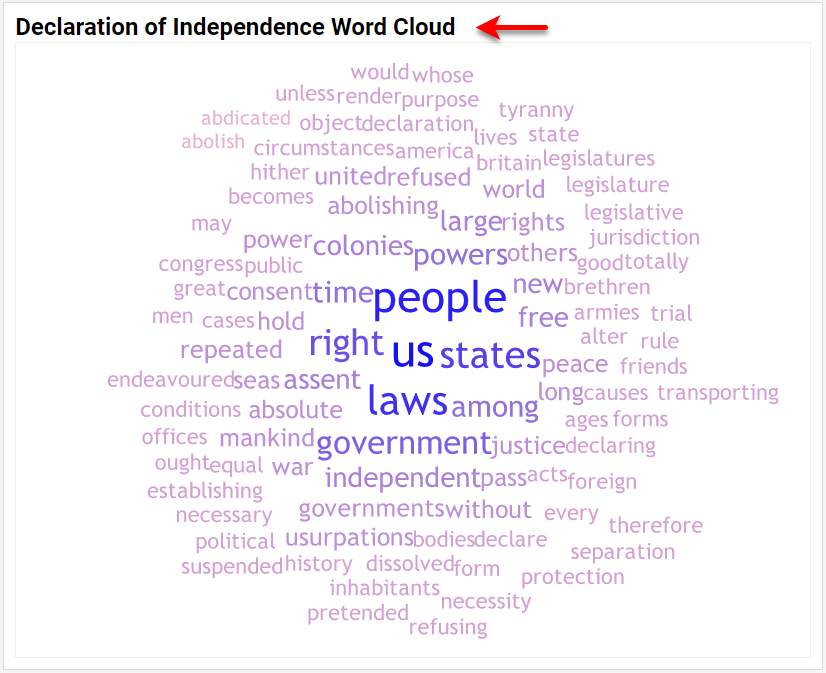
A Word Cloud or Tag Cloud Chart typically displays the relative frequency of terms in a document or other text source. The most common terms appear in the largest, most prominent font, while less common terms appear at progressively smaller font sizes. An example Word Cloud for the U.S. Declaration of Independence is shown above.
Why Use a Word Cloud Chart?
A Word Cloud is an attention-grabbing chart type that very rapidly conveys which terms have the greatest frequency in the document or text source, which are often among the most important terms. However, as a data analysis tool, the Word Cloud has severe limitations. Two particular shortcomings are that it is very difficult to accurately judge the relative value of a measure by using font sizes or font weights, and, secondly, that certain words are simply larger than others, not owing at all to their importance in the document.
For example, the term "independent" will generally appear larger than the term "law" even if the term "law" appears with equal or higher frequency in the document. Word Clouds should therefore be restricted to use only as a presentation aid, and not in any way as an analytical tool. Other chart types such as bar and point charts are far more effective for analysis purposes.
How to Make a Word Cloud Chart in InetSoft
Creating a Word Cloud with InetSoft software is extremely simple. A preliminary step is to transform a document or other word source into a table that contains the words and their relative frequencies, such as shown below.
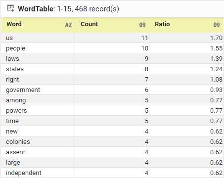
You can generate these word counts using InetSoft, or by using one of the free third-party tools for this purpose, but the only thing you really need is the 'Word' column that has the list of words in the document (either counted or uncounted). The InetSoft Word Cloud Chart can automatically compute the word frequencies at the time the chart is generated.
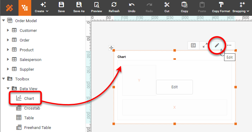
To create a Word Cloud Chart based on the data arrangement described above, drag a Chart component from the Toolbox panel into a Dashboard in Visual Composer, and then press the Edit button to open the Chart Editor.
Drag the 'Word' dimension to the Text region. Drag the desired measure (typically the 'Count' or 'Ratio') to the Size region. Press the Edit Measure button next to the measure in the Size region and choose 'None' as the Aggregate (if the words have already been counted). If the words have not been counted yet, then set 'Count' as the Aggregate.
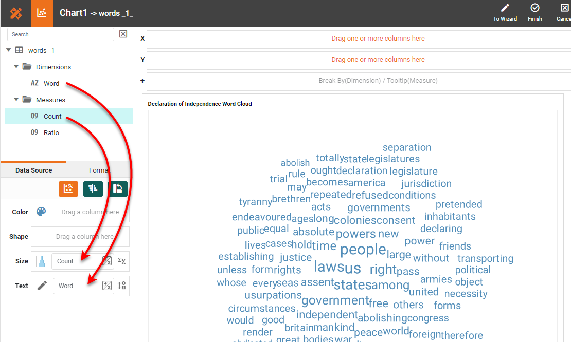
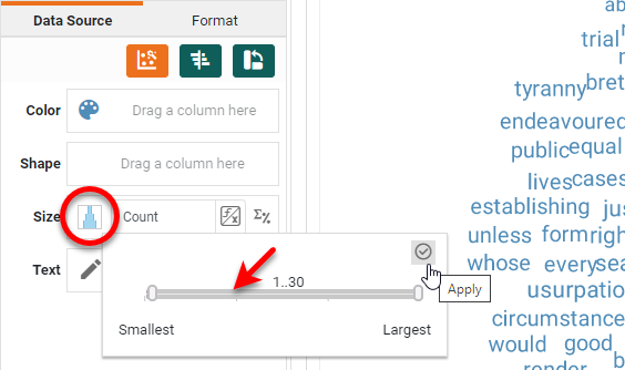
Press the Edit Size button and expand the range fully. Press Apply. You can always adjust this later on.
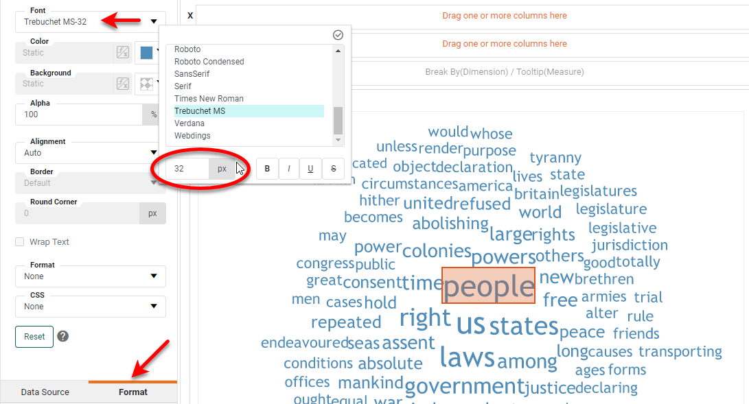
Select one of the words on the Chart and open the Format tab in the left panel. Adjust the size and font of the text as desired. The rest of the text will scale based on the size that you choose.
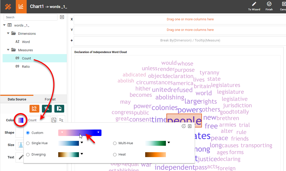
You can also use color to represent the word count, for example using stronger colors for higher counts and fainter colors for the lower counts. To do this, drag your measure (again) to the Color region, and press the Edit Color button to select the desired color spectrum.
Press Finish to close the Chart Editor. The Word Cloud is complete. You can choose to add a chart title if you wish, and format it as desired by using the left Format panel.
How to Create a Word Cloud Chart in Google
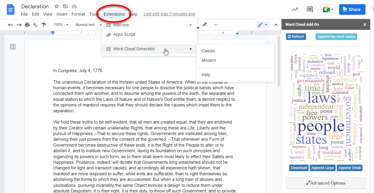
Google Sheets does not provide a Word Cloud chart type; however, there are several third-party Word Cloud generators available for Google Docs and Google Drive. These Word Clouds can generally be created with one or two clicks from within the document (an example is shown below), but the ability to customize these Word Clouds is often not available in the free version of the plugin.
The disadvantage of these tools is that they are not in any way integrated into a data analysis or data presentation package, meaning that it would effectively be impossible to automate the generation of these charts as part of a report or dashboard. These plugins are useful for getting a quick survey of a particular document, but would be ineffective in the context of production reporting.
Tool to Make Word Cloud Charts Online for Free
To easily and quickly create Word Cloud Charts online for free, create a Free Individual Account on the InetSoft website. You will then be able to upload a text data set, as shown below:

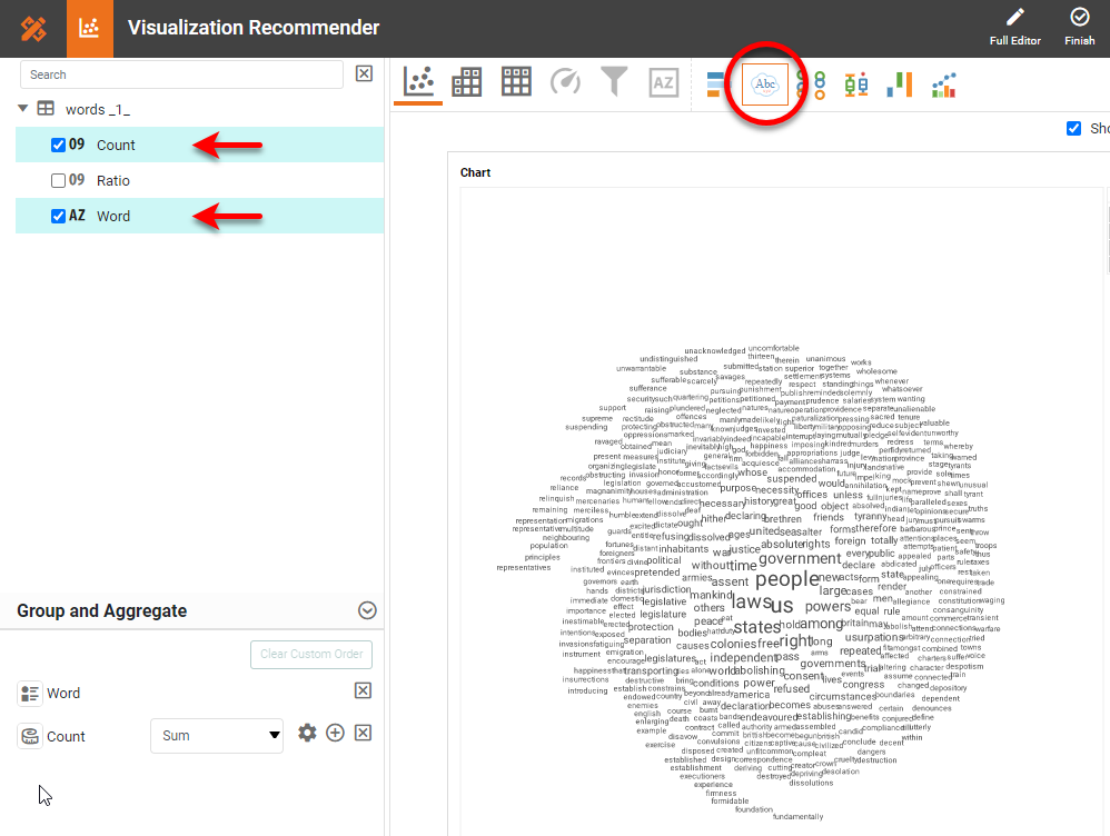
Once you have done that, you will be able to proceed to the Visualization Recommender, which will get you started creating a dashboard. To start with a Word Cloud Chart, select the 'Word' field and a measure (e.g., 'Count') that you want to use, and press the Word Cloud button in the top bar of the Recommender.
Then press the Full Editor button at the top right. Proceed to modify the Chart or add other components using the Visual Composer options shown earlier. For example, you can set a Rank filter (e.g., "top 100 words"), text formatting, color association, chart title, and so on, as described above.