InetSoft's Free Service for Cloud-based Visual Analysis
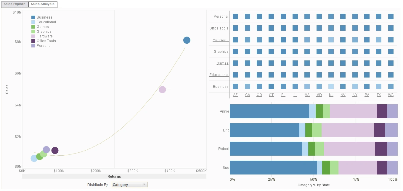
Click the Start Free button to use InetSoft's free app. It is an easy to use interactive data visualization service that requires no software installation. It is an edition of StyleBI that is designed for business users, perfect for an individual analyst or a departmental workgroup to share their analyses.
Upload a spreadsheet and use the web-based designer to create visualizations and analyses that can be accessed from any PC or Mac with a browser.
Compare Your Options
FREE
More Resources About Visual Analysis
-
Transform Raw Data Into Visual Insights
This article introduces InetSoft’s visual data exploration tools. It highlights interactive dashboards that simplify complex datasets. Users can drill down into charts for deeper understanding. The article emphasizes clarity and accessibility in visual analytics. It showcases how visualizations empower decision-makers across industries.
-
Interactive Exploration Of Business Information
InetSoft’s visual analytics solution enables dynamic data exploration. The article explains how users interact with dashboards to uncover trends. Drag-and-drop features allow customization without technical expertise. Visualizations provide clarity for executives and analysts alike. The piece underscores agility in business intelligence.
-
Identify Patterns And Relationships Quickly
This article focuses on visual analytics dashboards. It explains how organizations use charts and graphs to detect patterns. Dashboards highlight KPIs in real time. Visual tools simplify complex data for faster decisions. The piece emphasizes accessibility for non-technical users.
-
Communicate Information Through Clear Graphics
Data visualization dashboards transform raw numbers into meaningful visuals. The article explains how charts, maps, and graphs enhance communication. Dashboards provide clarity for stakeholders at all levels. Visualizations highlight trends and anomalies effectively. The piece underscores storytelling through data visuals.
-
Empower Users With Self-Service Exploration
This article introduces interactive visualization tools. Users can manipulate data directly within dashboards. The tools support ad hoc analysis without IT intervention. Visualizations adapt to user needs dynamically. The piece emphasizes flexibility and empowerment in analytics.
-
Monitor Metrics Using Intuitive Graphics
Visual KPI dashboards present performance indicators graphically. The article explains how managers track goals visually. Charts and gauges simplify complex metrics. Dashboards provide real-time monitoring for executives. The piece underscores clarity in KPI communication.
-
Simplify Complex Information With Graphics
This article highlights visual reporting tools. Reports are enhanced with charts and diagrams. The article explains how visuals improve comprehension. Dashboards integrate reporting with visualization seamlessly. The piece emphasizes efficiency in communication.
-
Discover Trends Through Graphical Exploration
Visual data mining tools help uncover hidden patterns. The article explains how graphs reveal correlations. Dashboards support predictive analytics visually. Users gain insights without statistical expertise. The piece underscores accessibility in advanced analytics.
-
Enhance Decision-Making With Graphical Dashboards
This article focuses on visual business intelligence. It explains how dashboards integrate multiple data sources. Visualizations provide clarity for executives and analysts. The piece highlights agility in adapting to new metrics. It underscores the role of visuals in BI success.
-
Combine Disparate Sources Into Unified Graphics
Visual data integration tools merge multiple datasets. The article explains how dashboards unify information. Charts and graphs present consolidated insights. Users gain a holistic view of operations. The piece emphasizes efficiency in data management.
-
Design Dashboards For Maximum Clarity
This article outlines best practices for visualization. It explains how to choose appropriate chart types. Dashboards should emphasize clarity and simplicity. Visual storytelling enhances stakeholder engagement. The piece underscores professional standards in visualization design.
-
Forecast Outcomes Using Graphical Models
Visual predictive analytics tools support forecasting. The article explains how charts illustrate future trends. Dashboards integrate predictive models visually. Users gain confidence in decision-making. The piece emphasizes accessibility of advanced analytics.
-
Ensure Compliance Through Transparent Graphics
Visual data governance dashboards track compliance metrics. The article explains how visuals highlight policy adherence. Charts provide clarity for auditors and managers. Dashboards simplify monitoring of governance standards. The piece underscores accountability through visualization.
-
Understand Buyer Behavior With Graphical Insights
Customer analytics dashboards present behavior visually. The article explains how charts highlight purchase patterns. Dashboards track engagement and retention metrics. Visualizations simplify complex customer data. The piece emphasizes strategic marketing through visuals.
-
Optimize Logistics Using Graphical Monitoring
Supply chain dashboards present KPIs visually. The article explains how managers track inventory and delivery. Charts highlight bottlenecks and inefficiencies. Dashboards provide transparency across logistics networks. The piece underscores efficiency gains through visualization.