BI Software Examples
Looking for BI software examples? Below are well-designed, intuitive to use, interactive and personalizable examples built with InetSoft's innovative BI application. Test drive Style Intelligence online for free today and interact with more examples.
Project Management
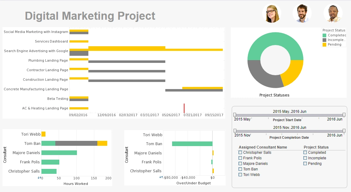
This project management office dashboard aids in the monitoring of various marketing initiatives and the start and end times of various project stages. This type of dashboard helps digital marketing agencies track the progress of their consultants on various initiatives. A Gantt chart tracks the start and end date of various projects, giving a visual representation of project durations. Gantt charts now comes as a standard option in InetSoft's visualization engine.
Utility Usage
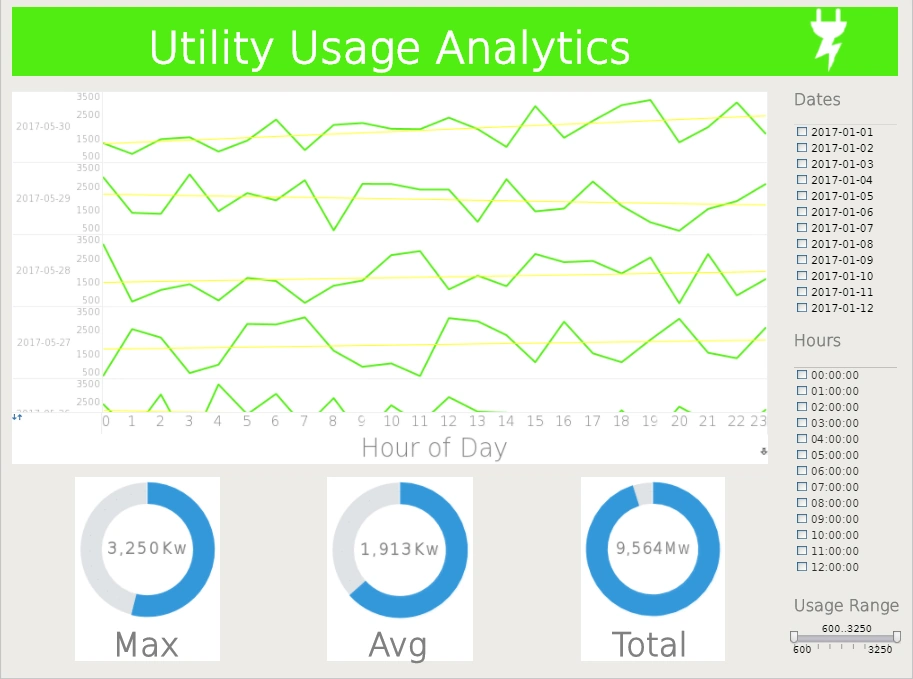
This utility usage example breaks down power usage by day and even hour. Three easy to read guages display maximum, average, and daily usage. An array of filters enables the user to drill down into households that are outliers in their usage.
What-If Scenarios
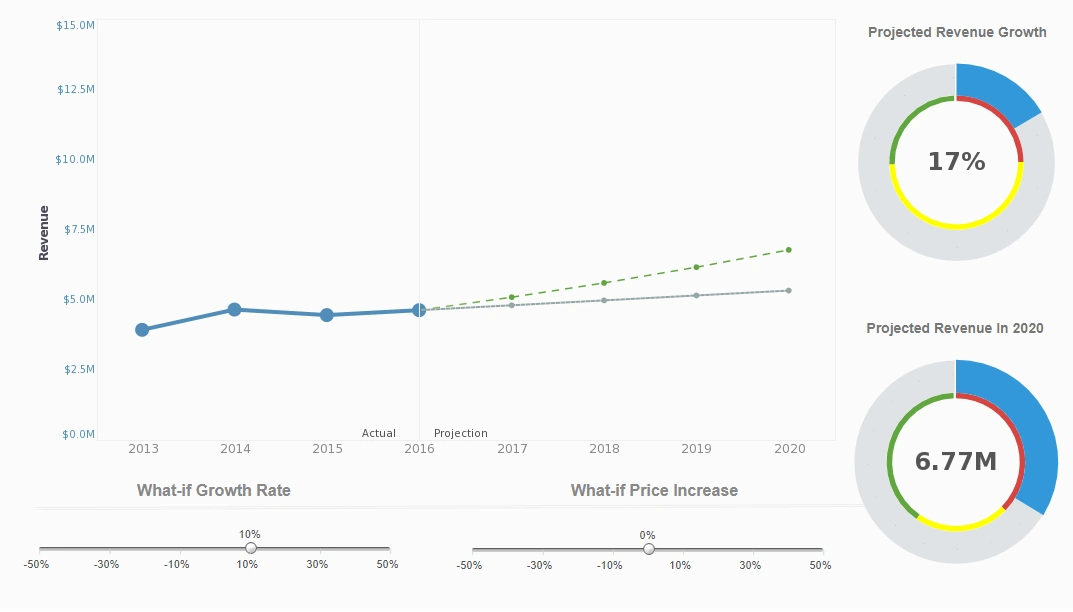
This what-if scenario predicts how revenue would be affected by changes in growth and prices. What-if analysis is the process of mathematically predicting how an organization will be affected given a predefined situation. This is typically done in spreadsheet programs, by modifying certain values in a dataset to see how those changes will influence outcome of the formulas in place. InetSoft's what-if analysis feature assists analysts in quantifying uncertainty in causal relationships and optimizing resource allocation while guiding decisions.
Supply Chain BI
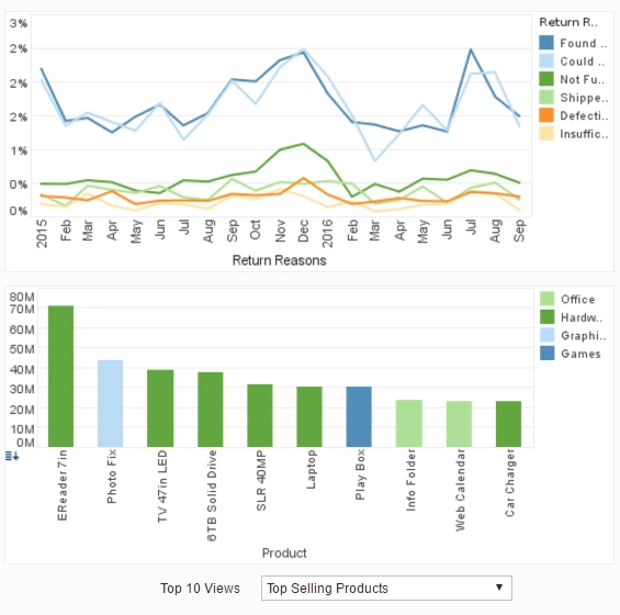
This supply chain BI dashboard tracks shipments on different types of product and also the reasons for returning products. A dropdown list enables the chart binding to be swapped out for various fields.
Utility Management
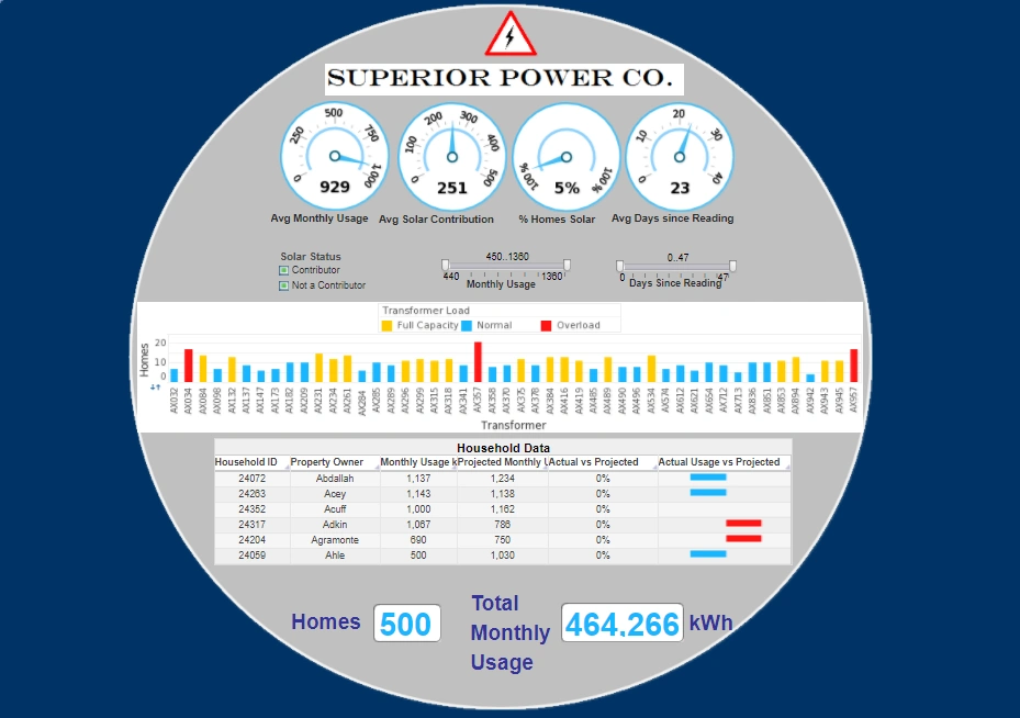
This utility management dashboard example gives power plant executives a broad overview of power consumption and equipment maintenance. In this screenshot, solar power is brushed, causing the proportion of power usage from solar to be highlighted in charts throughout the dashboard.Dials at the top cover the most important metrics, while a table at the bottom enables the viewer to drill down into individual household use.
Marketing BI Dashboard
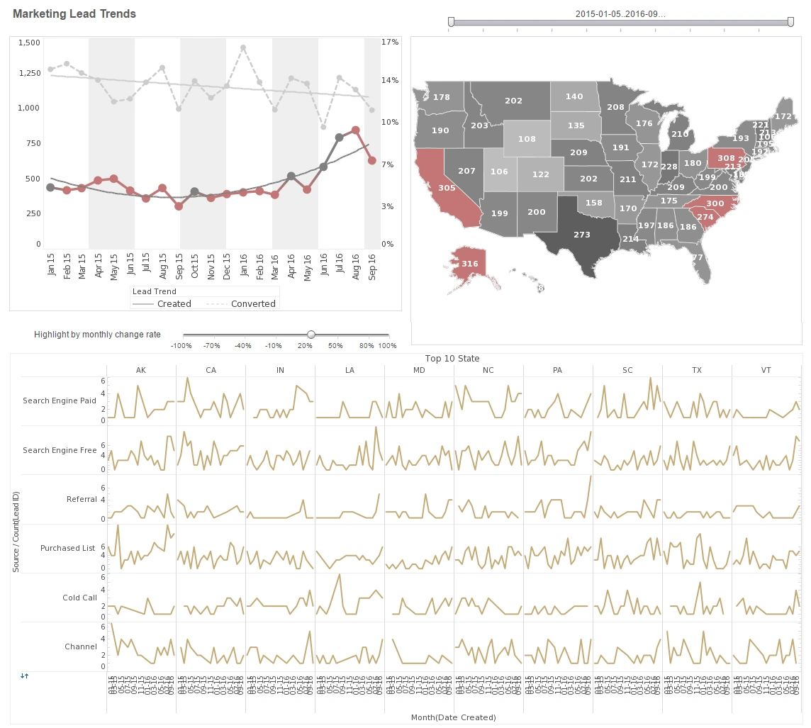
This marketing campaign analysis displays important aspects of the sales funnel, by displaying leads by source, state and date. Both top charts include a highlight feature based on monthly change rate, whose threshold can be adjusted using a slider which modifies the change rate that results in a chart highlight. The dashboard template gives an overall picture of new leads, their sources, and their conversion rates.
Team Performance
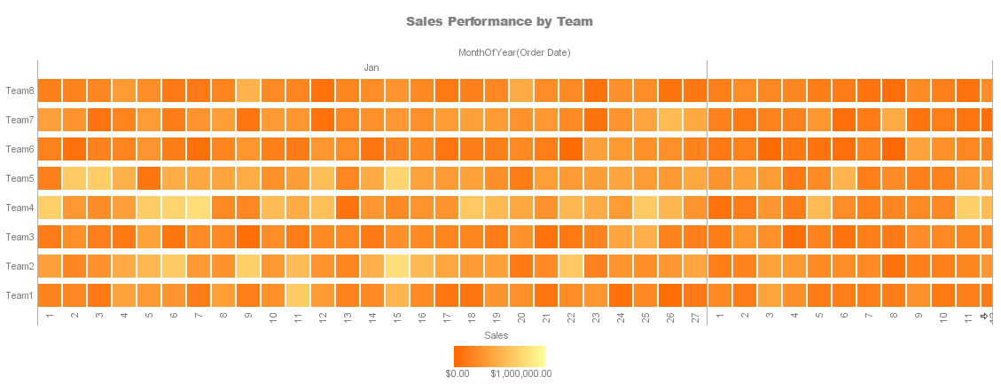
This heat map compares each sales team's performance for every month of the year. A heat map is a visual representation of data that uses colors to indicate the relative values of the data points. A heat map displays a measure using a colored grid, where the value of the measure for a given combination of dimension values is used to determine the color of the grid at that location. Heat maps are often used to visualize data that has a spatial or geographical component, such as weather data, traffic patterns, or population density. In a heat map, each data point is represented by a colored square or rectangle, with the color indicating the intensity of the value being represented.
Retail Management
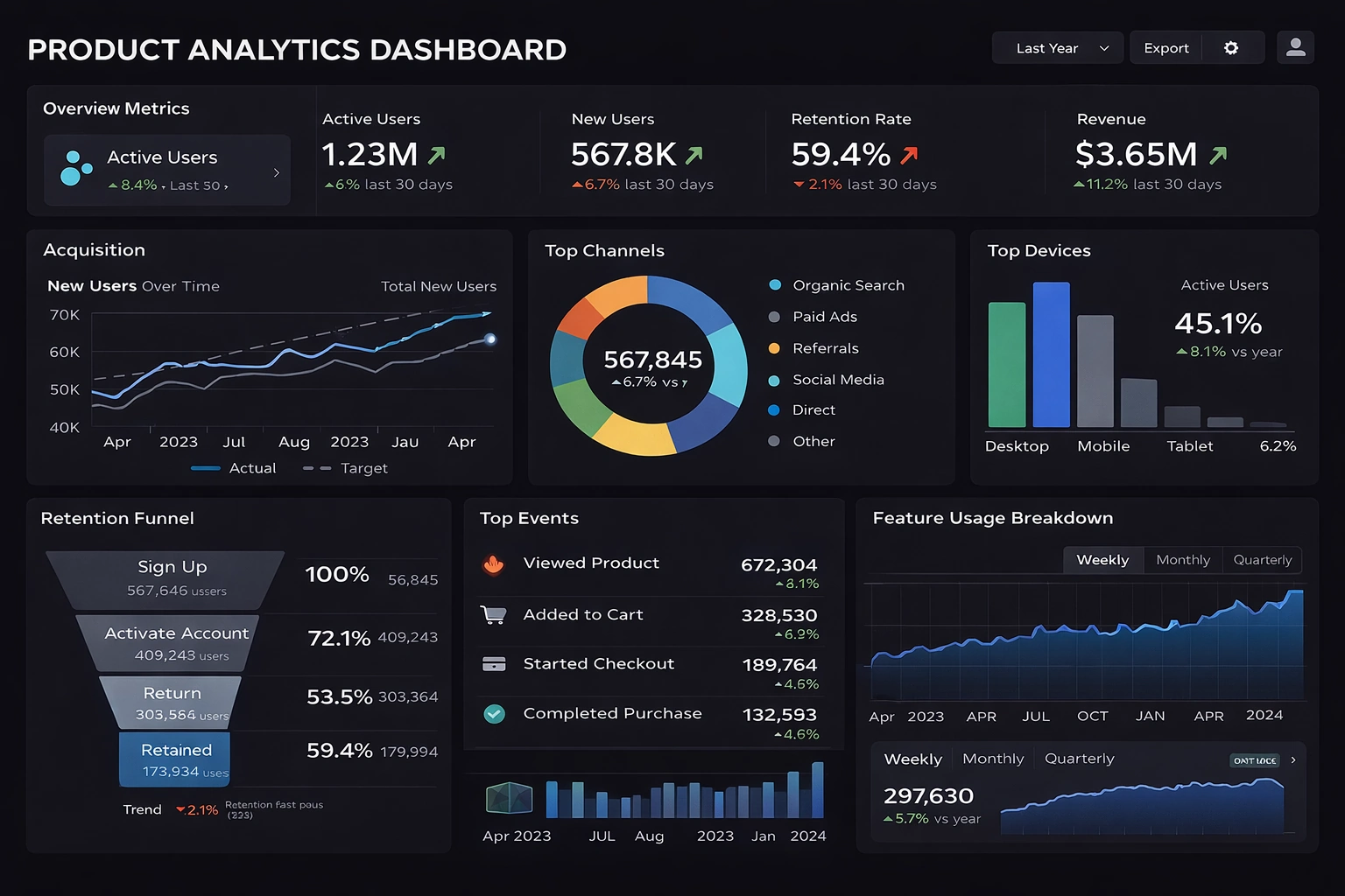
The Product Analytics Dashboard presents a comprehensive overview of key performance indicators in a sleek dark-themed interface, featuring prominent overview metrics such as active users, new users, retention rate, and revenue, each with trend indicators for the last 30 days. It includes dedicated sections for user acquisition with a line chart tracking new users over time against targets, a donut chart breaking down top channels like organic search and paid ads, and a bar chart for top devices showing mobile dominance among active users.
Channel Analytics
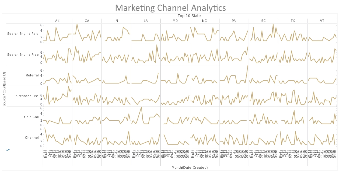
This Sparkline example from InetSoft's Marketing Lead Dashboard displays how a grid of Sparkline Charts can convey information that a single chart with multiple lines cannot. Each individual Sparkline depicts the change from month to month of marketing leads form a particular lead source in a particular space. In a single chart, all of the lines would be a meaningless jumble. When one state or source has an upswing or downturn of new leads, the manager can immediately see if other states or sources had a similar pattern, indicating whether or not the the cause of the change is related to something regional, something related to the strength or weakness of a particular lead source, or just a general trend in the market.