Six Examples of BI Dashboards
Since 1996, InetSoft's dashboard software StyleBI™ uses a visualization-driven approach to enable rapid deployment of business intelligence dashboards. They are business user-driven and offer strong analytic functions. Dashboard software has been established as a highly effective business intelligence tool. Our dashboards can be monitoring-oriented or analysis-oriented and are a foundation of performance management software.
StyleBI does not require a desktop based server. It is web based and compatible with popular internet search providers, it can work with or without flash plugins and is accessible on mobile devices. Take a look at the versatility of BI implementation with our dashboard software. Click on the dashboard images to get a better look:
Construction Drilldown by Worker Type
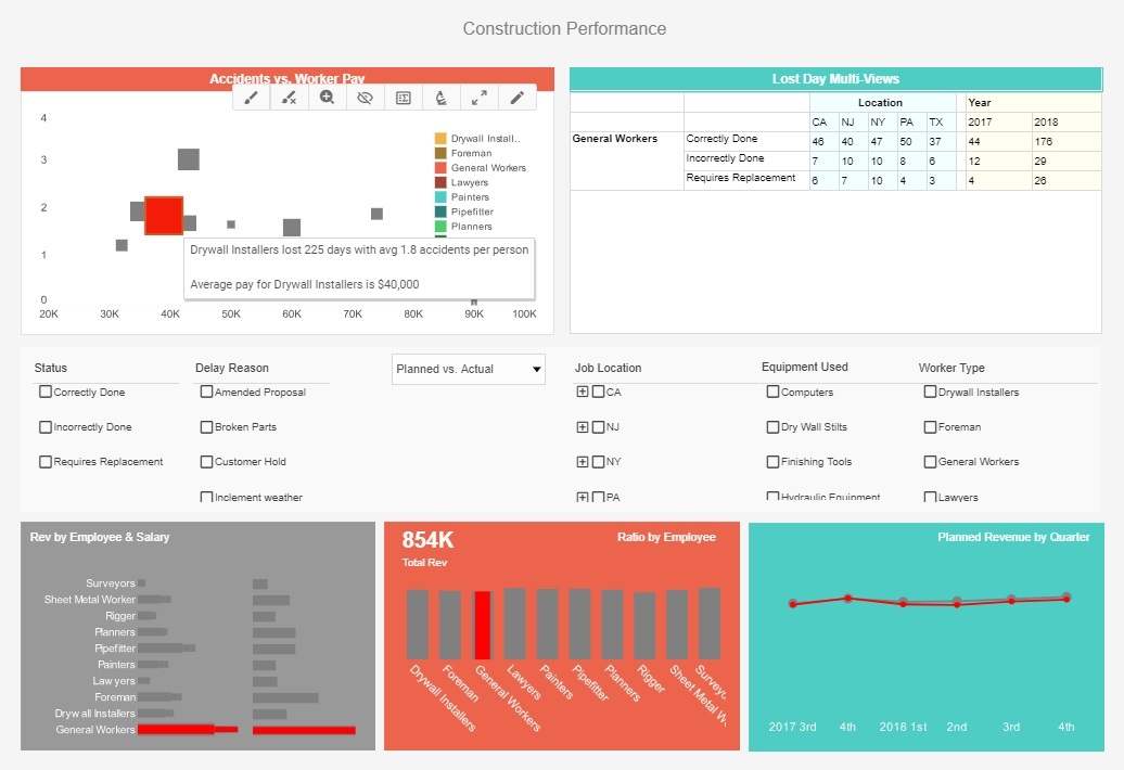
This drilled down construction dashboard gives property developers a variety of stats on project involving drywall installers, including costs, timeliness, and worker safety. Additional drilldown buttons on the Revenue by Quarter chart enables the user to pinpoint periods of high and low activity.
US Population Gender Analysis
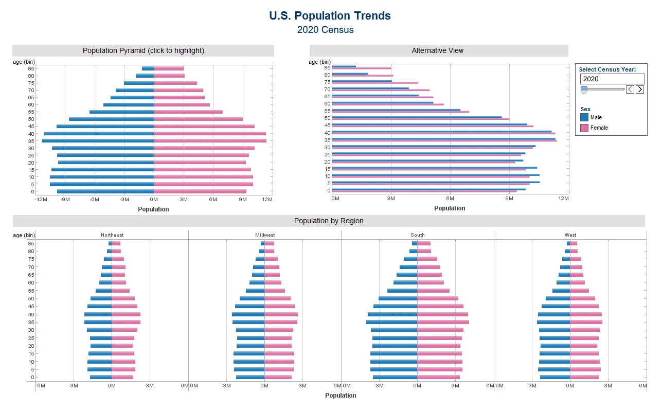
This visual exploration of United States census data demonstrates various population trends divided by gender, including population by region and age.
The use of color makes the different population metrics easier to compare.
Team Performance Dashboard
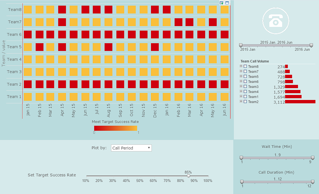
This team performance dashboard shows which teams are pulling their weight and which ones are lagging.
A red highlight provides easy comparison to goals that can be adjusted via slider as initiatives progress.
Patient Risk Assessment
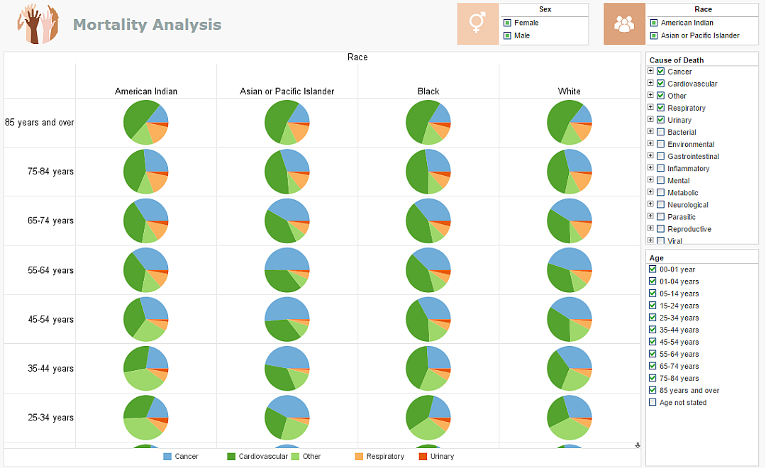
This patient risk assessment visualization details the most common causes of death for every demographic segment. Healthcare providers can use this visualization to supplement analysis of an individual's case history, weighing the patients symptoms against the most common mortality causes of their individual population segment, steering extended care.
Automobile Performance
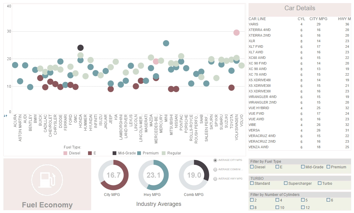
This dashboard presents fuel-economy metrics (MPG, CO2 emissions, and real-world consumption) across vehicle models and driving cycles. Interactive controls — radio buttons to switch efficiency measures, sliders for model year and speed profiles, and dropdowns to compare brands — let users explore trade-offs and quickly identify the most fuel-efficient options.
Airport Weather Delays Dashboard
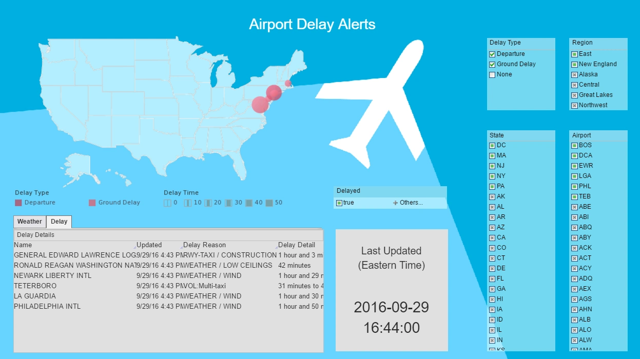
This airport weather delay visualization pulls in live flight and weather data in real-time. Interactive selection lists range all the way from general region to specific airport, allowing the user to view the data as granularity as they would like.
Sales Opportunity Pipeline
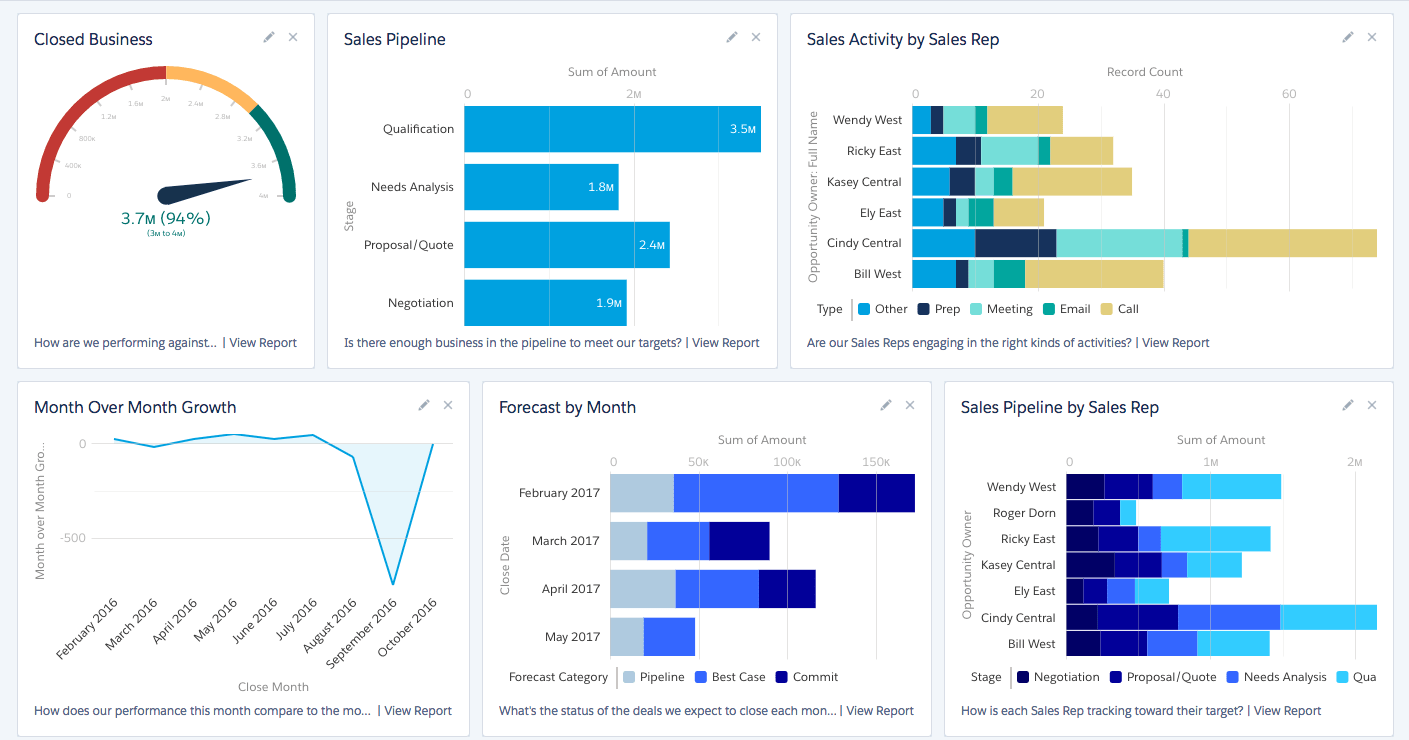
Track opportunities by stage, owner, and expected close date. This dashboard uses stacked bars, funnel views, and velocity metrics to help sales teams prioritize follow-ups and forecast revenue more accurately.
Supply Chain Analytics Dashboard
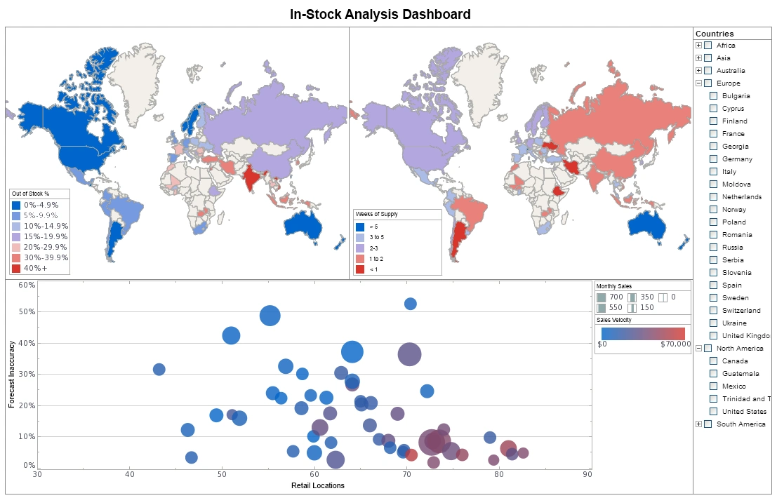
Monitor inventory levels, supplier lead times, and order fulfillment rates with interactive time-series charts and heatmaps. Use this dashboard to identify bottlenecks and optimize logistics across distribution networks.
Ambergris Harvesting Dashboard
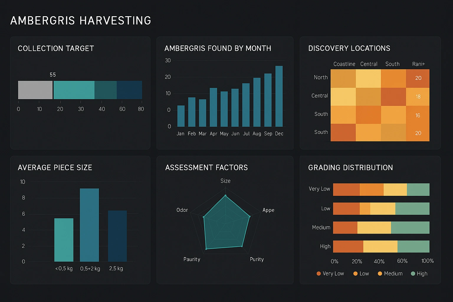
This dashboard visualizes ambergris collection metrics by region and season, showing harvest volume, vessel routes, crew hours, and quality grades. Interactive filters let users isolate time ranges, vessel types, and weather conditions to analyze yield drivers and compliance status. Map overlays and time-series charts reveal hotspots and seasonal patterns for operational planning and risk management.
Healthcare Patient Flow Dashboard
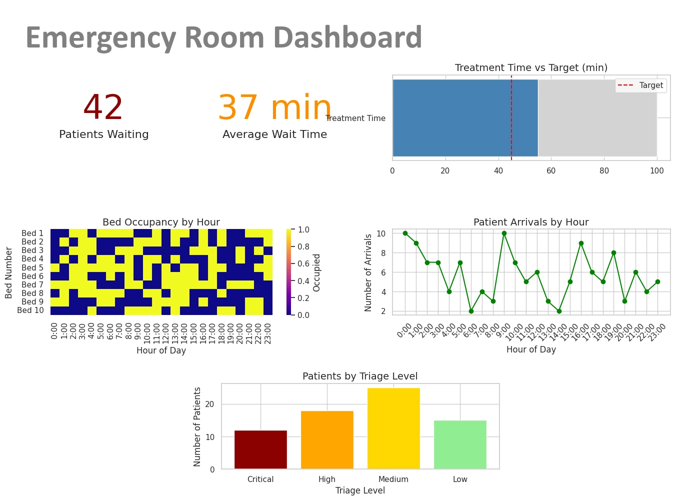
Visualize admissions, discharges, bed occupancy, and wait times. This dashboard helps care teams optimize throughput, reduce bottlenecks, and improve patient experience with actionable, time-based insights.
Global Network Performance Dashboard
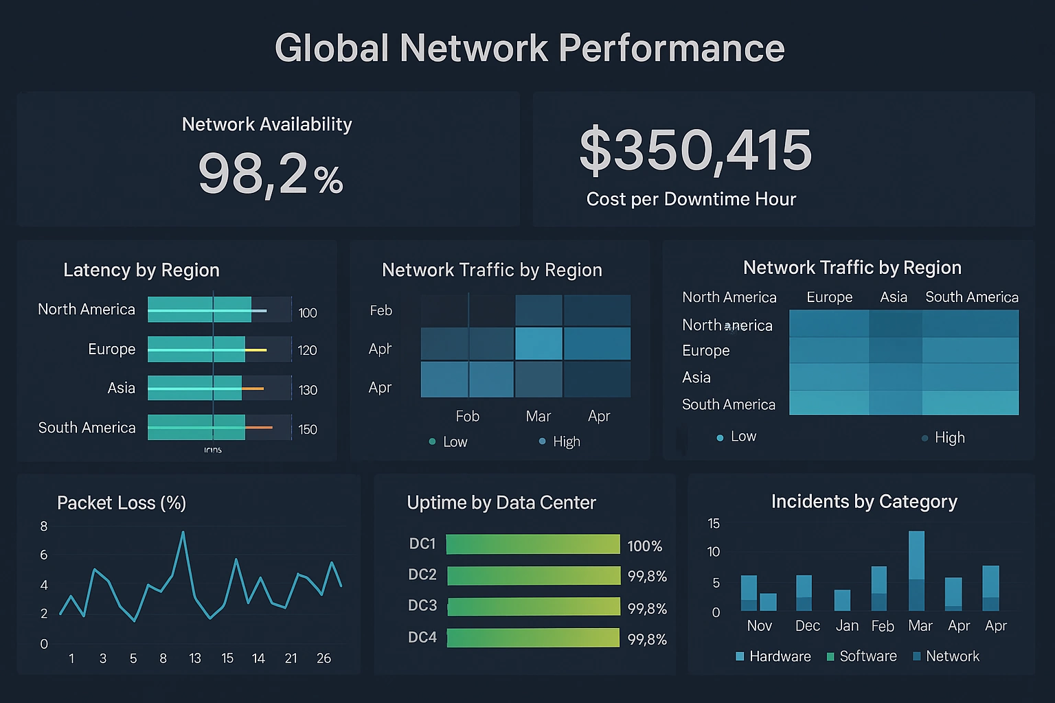
Monitor worldwide network health with latency maps, throughput trends, and outage heatmaps. Interactive filters let operators isolate regions, providers, and time windows to quickly identify and remediate performance issues.
Stripe Payment Dashboard
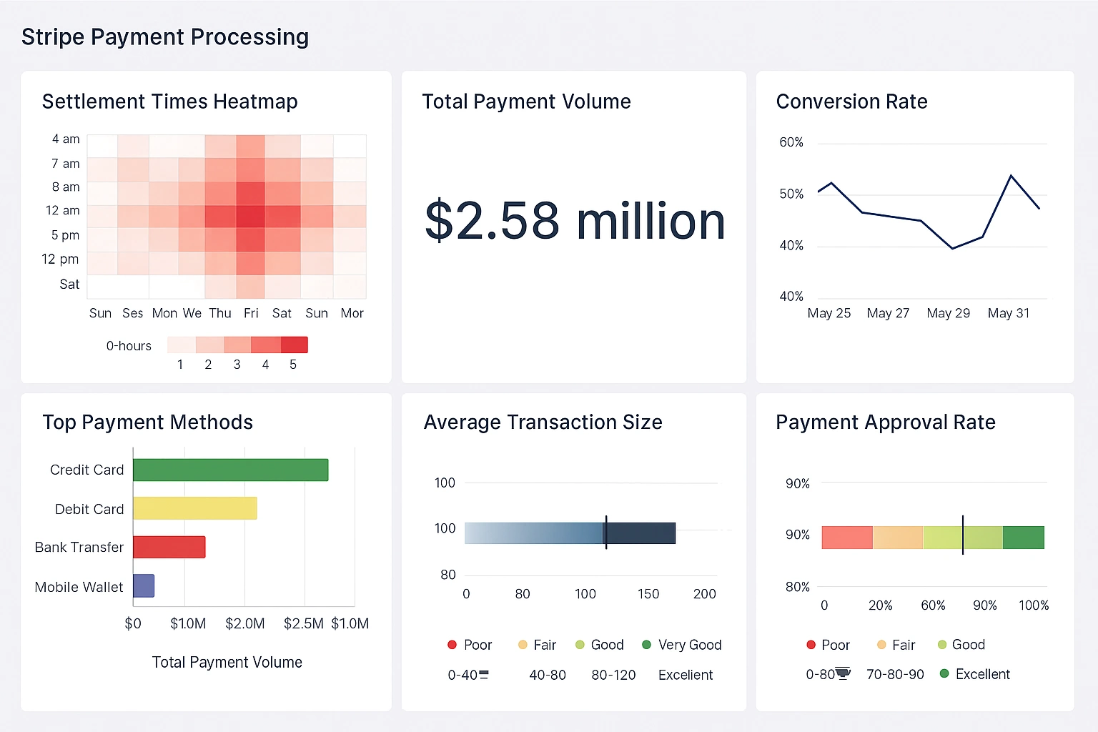
Track transactions, chargebacks, and revenue trends from Stripe in real time. Use dropdowns and date sliders to analyze payment volume by region, product, and payment method to spot anomalies and optimize conversion.
HR Attrition Dashboard
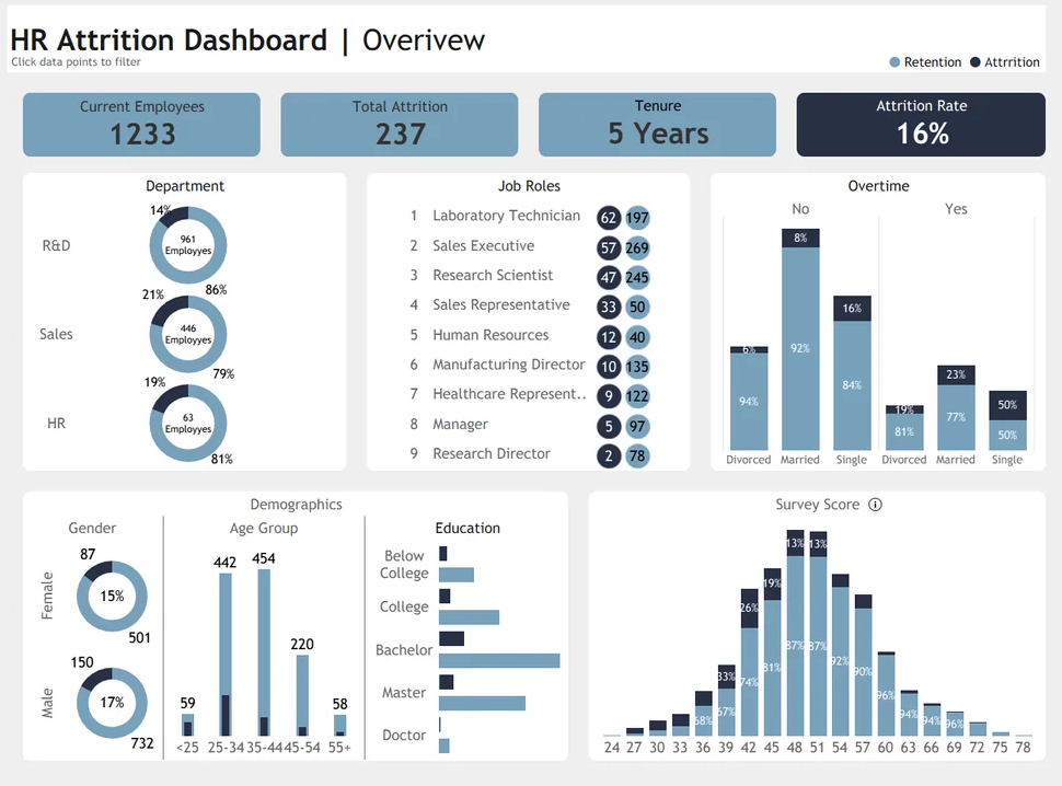
Analyze employee turnover, retention rates, and exit reasons by department with cohort analysis, survival curves, and interactive filters to identify drivers of attrition and evaluate retention strategies.
Spaceship Management Dashboard
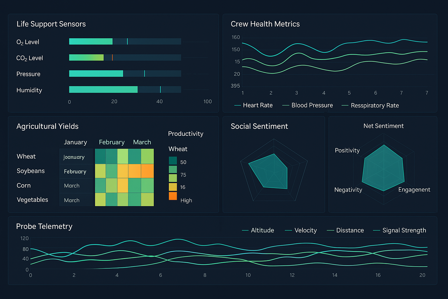
Monitor vessel systems, crew assignments, fuel reserves, and mission timelines with telemetry charts, map overlays, and interactive alerts to maintain mission readiness and respond to anomalies.
Private Duty Care Dashboard
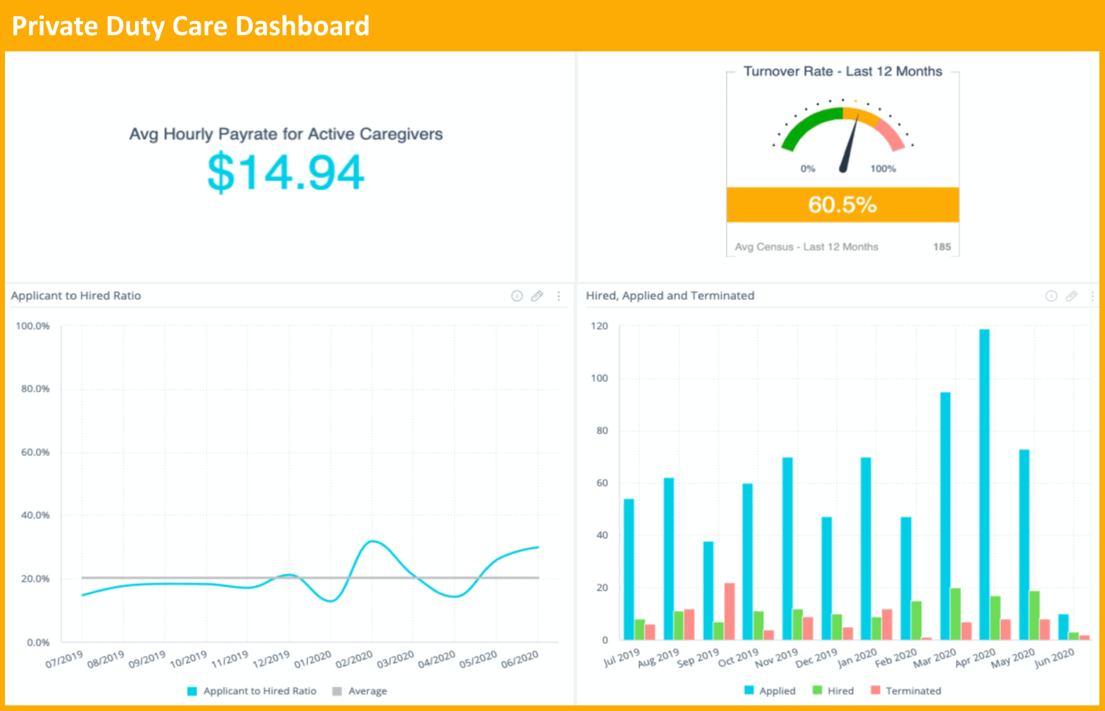
This Private Duty Care Dashboard consolidates scheduling, caregiver utilization, and patient visit quality into a single interactive view. Key performance tiles show visits completed, on-time rate, average visit duration, and billing status. A route map layer visualizes caregiver travel, enabling optimization of daily assignments and reduced drive time. Filters allow drilling by client, caregiver, neighborhood, or payor, while a timeline control highlights seasonal demand and overtime spikes. Visit-level drilldowns expose missed visits, reasons, and corrective actions, and a compliance panel surfaces documentation gaps for audits. Integrated KPI trend charts let managers compare cohorts over weeks or months to assess retention, caregiver performance, and client acuity impact. Forecasting widgets predict upcoming demand based on historical patterns and referrals, guiding hiring or float staffing. Alerts are configurable for overdue visits, excessive overtime, or unpaid invoices. With role-based access and anonymized PHI fields for analytics, supervisors gain operational control while maintaining privacy. This dashboard supports operational excellence: maximize caregiver productivity, improve patient experience, reduce travel costs, and tighten revenue capture through real-time, actionable insight.
Procurement Analyst Dashboard
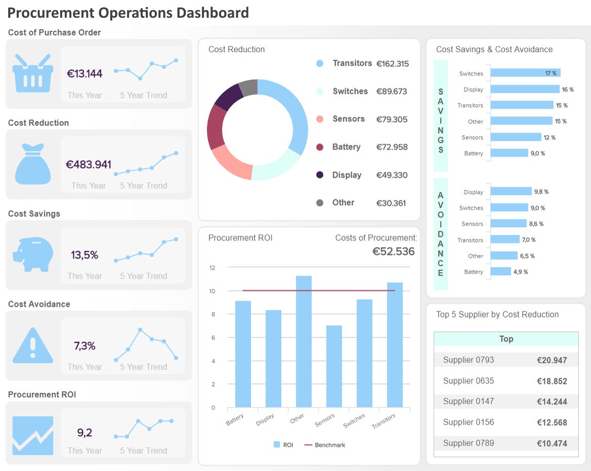
The Procurement Analyst Dashboard transforms spend, supplier, and sourcing data into high-value insights for cost control and supplier strategy. A central spend heatmap and category treemap reveal concentration of expenditure and opportunities for consolidation. Interactive supplier scorecards rate on-time delivery, quality defects, lead-time variability, and negotiated savings; click through to see contract terms, PO-to-invoice matching rates, and dispute history. Time-series charts enable seasonality and trend analysis for demand forecasting, while a lead-time slider and simulated purchase scenarios estimate stockout risk and safety-stock requirements. Savings waterfalls and sourcing opportunity lists let analysts prioritize renegotiations and alternate suppliers by potential impact. Drilldowns surface maverick spend and non-compliant purchases by department, along with automated alerts for expiring contracts and single-source dependencies. Visual invoice aging and payment-term optimization panels help finance teams accelerate capture of early-pay discounts and reduce working capital. This dashboard supports evidence-based procurement decisions, improves supplier performance, uncovers cost-savings, and mitigates supply risk through interactive exploration and scenario modeling.
Plant Management Dashboard
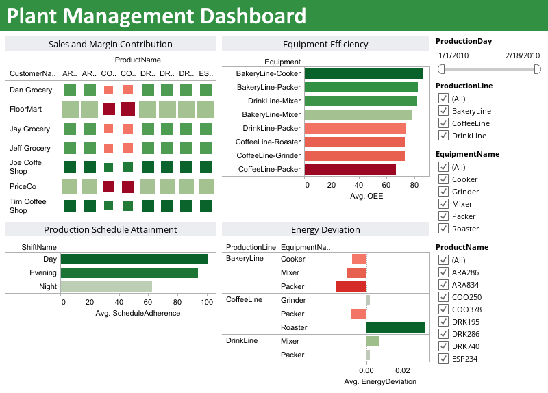
The Plant Management Dashboard focuses on production efficiency, quality, and asset health to drive continuous plant improvement. Core KPIs include OEE (availability, performance, quality), throughput, yield, and scrap rates, displayed alongside shift-based comparisons and operator performance. Real-time telemetry charts surface machine vibration, temperature, and cycle times; integrated SPC (statistical process control) charts highlight out-of-control conditions and root-cause candidates. A downtime analytics module categorizes stoppages by cause, duration, and frequency, enabling targeted maintenance or process changes. Work order and spare-parts dashboards link maintenance requests to inventory levels, exposing potential stock shortages that could extend MTTR. Energy consumption and material usage trackers reveal cost drivers per product line, and predictive maintenance models estimate remaining useful life for critical assets to prioritize interventions. Interactive filters allow focus by line, product SKU, or time window while drilldowns show event-level logs and corrective actions. This consolidated operational view empowers plant managers to improve uptime, reduce waste, optimize maintenance planning, and meet production targets with measurable, data-driven actions.
These additional dashboard examples showcase common enterprise scenarios where visual analytics drive faster decisions. A Sales Pipeline dashboard highlights opportunities by stage, owner, and expected revenue, enabling priority actions. The Manufacturing Production dashboard tracks throughput, yield, and downtime trends to reveal bottlenecks. The Retail POS dashboard surfaces real-time sales and inventory levels across locations to optimize promotions and replenishment. The Healthcare Patient Flow dashboard visualizes admissions, discharges, and bed occupancy to improve throughput and patient experience. Combined, these examples demonstrate how interactive charts, filters, and drilldowns transform raw data into operational insight for cross-functional teams and accelerate data-driven outcomes consistently.
