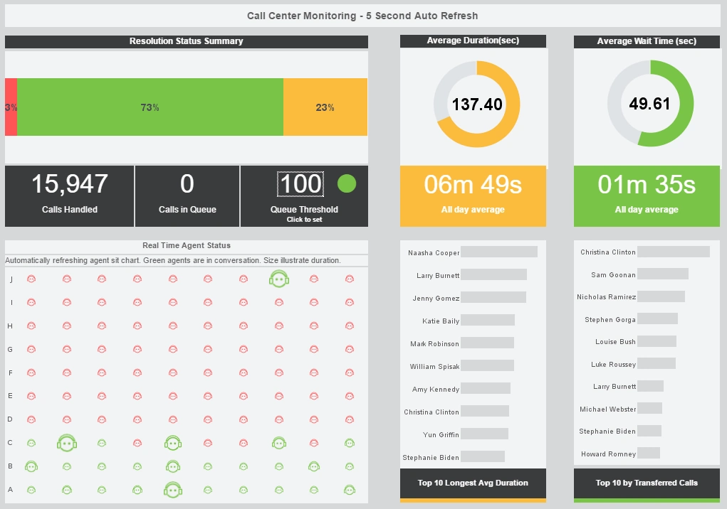
Power Usage Analysis Dashboard
The usage analysis dashboard here exemplifies the powerful tools and features of InetSoft's interactive web-based analytical dashboard. As a pioneer in business intelligence solutions, InetSoft paves the way for dashboard, reporting, and data mashup solutions for organizations across different industries.
By mashing up multiple data sets, users can create a visualization, like the chart below, to filter, sort, and analyze electric utility data. By having a very simple point and click system, users can focus on specific information to gather and satisfy specific needs or wants, enhancing business intelligence operations. Users are also equipped with a diverse set of features and tools, like the brushing tool, to filter by age, hours on web, gender, exclusivity, and. operating systems.
InetSoft's visualization software combines ease of use with detailed tools and features to help users in day-to-day decision making, as well as help them be constantly updated in achieving a longer-term goal.
Register for a personalized demo and pricing.


Capabilities of the InetSoft's Usage Analysis Dashboards:
- Monitor, explore, and analyze by filtering and sorting desired information
- Easy to use, modify, and create charts and visuals
- Leverage user-driven data mashup
- Upload and sift through multi-dimensional data to spot trends and aberrations
- Slice and dice data with simple point-and-click method
- Share visual analysis with others
Metrics Tracked on a BI Usage Dashboard and How to Interpret Them
A BI usage dashboard provides insight into how an enterprise business intelligence platform is being utilized. Unlike operational or financial dashboards, a BI usage dashboard focuses on monitoring the activity and engagement of users, the performance of reports and dashboards, and the overall adoption of analytics across the organization. Tracking these metrics helps IT leaders, analytics managers, and executives understand which parts of the platform are most valuable, identify areas for improvement, and drive increased adoption and effectiveness.
User Engagement Metrics
1. Active Users
Active users measure the number of individuals who log in and interact with the BI platform over a defined period, often daily, weekly, or monthly. This metric indicates how broadly the platform is being used. A high number of active users suggests strong adoption, while low numbers may indicate that the platform is underutilized or that training and awareness are lacking. To increase active users, organizations can provide role-specific dashboards, encourage self-service exploration, and promote success stories showing how insights drive decisions.

2. User Frequency
User frequency tracks how often individual users access the platform. It provides insight into habitual usage patterns and identifies users who may be engaging sporadically or infrequently. Frequent use typically correlates with higher value extraction from the platform. Encouraging frequent use can be achieved by embedding dashboards in daily workflows, sending automated alerts or summaries, and ensuring dashboards provide actionable information that users need regularly.
3. User Adoption by Role or Department
This metric breaks down platform engagement by organizational roles or departments. It helps identify areas where BI adoption is strong and where it is weak. For example, finance may have high adoption because of budget reporting needs, while operations may lag due to limited exposure or relevance. To improve adoption in underrepresented departments, targeted training, customized dashboards, and demonstrating relevant use cases can be effective strategies.
Report and Dashboard Metrics
4. Most Viewed Reports and Dashboards
Identifying the most accessed reports and dashboards shows which content is delivering value to users. High-view dashboards indicate popular or essential content, while rarely accessed dashboards may need redesign, retirement, or re-promotion. Encouraging use of underutilized but valuable dashboards can be accomplished through training, highlighting key insights in newsletters, or integrating dashboards into workflow tools.

5. Report Load Times
Report load time measures the performance of dashboards and reports in terms of response speed. Slow-loading dashboards can frustrate users and reduce engagement. Monitoring this metric allows IT teams to optimize queries, tune data models, or adjust data volumes. Faster load times generally increase usage, as users are more willing to explore content when response times are minimal.
6. Report Scheduling and Automation Usage
This metric tracks how often reports are scheduled for automated delivery versus ad-hoc viewing. High utilization of scheduling features indicates that users are embedding BI outputs into regular processes. Organizations can increase scheduled report usage by promoting automation features, aligning report delivery with workflow timing, and providing templates that reduce setup effort.
Data Interaction Metrics
7. Filter and Drill-Through Utilization
These metrics track the extent to which users interact with dashboards by applying filters, drilling into details, or pivoting data. High interactivity indicates that users are exploring data and deriving insights, whereas low interactivity may suggest static consumption or limited understanding of dashboard capabilities. Training, in-dashboard tips, and intuitive design can encourage more active interaction.

8. Data Export Activity
Data export metrics measure how frequently users extract data from the BI platform into spreadsheets or other tools. While some export activity indicates that users are leveraging BI for deeper analysis, excessive exporting can imply that dashboards are not meeting user needs. Improving dashboard design, providing better visualization options, or offering downloadable data in pre-configured formats can reduce unnecessary exports while keeping insights accessible.
System and Platform Metrics
9. Concurrent Sessions
Concurrent sessions indicate how many users are accessing the platform simultaneously. Monitoring this metric helps IT teams anticipate load requirements, scale infrastructure, and prevent performance degradation. Optimizing system resources and planning capacity based on concurrent usage patterns ensures that the platform remains responsive during peak periods.
10. Platform Errors and Failures
This metric tracks system errors, failed report executions, or data connection failures. High error rates can discourage users from trusting or relying on the platform. IT teams can reduce errors by monitoring logs, resolving data connectivity issues, and ensuring that dashboards are tested after updates. Minimizing errors is crucial to maintaining user confidence and ongoing engagement.
Adoption and Trend Metrics
11. New User Registrations
New user registration tracks how many users are added to the platform over time. It indicates interest and growth in adoption. Supporting new users through onboarding programs, tutorials, and introductory dashboards can improve retention and engagement among recently registered users.
12. User Retention Rate
Retention measures the percentage of users who continue to engage with the platform over time. Low retention may indicate that dashboards are not providing value or that users face usability challenges. Enhancing retention involves understanding why users disengage, redesigning low-value content, and offering regular support and communication about platform capabilities.

13. Feature Usage Metrics
This includes tracking which features — such as predictive analytics tools, AI-driven recommendations, or collaboration functions — are being used. Feature adoption helps gauge how effectively the platform’s full capabilities are being leveraged. Low feature usage can highlight areas for training or further development, while high usage identifies strengths to promote across the organization.
How to Affect BI Usage Metrics
Understanding the meaning of BI usage metrics is only part of the process; organizations must actively manage them to improve adoption, engagement, and overall value. Strategies to influence metrics include:
- Training and Onboarding: Structured training programs and onboarding help users understand dashboards, reports, and features. Highlighting relevant use cases accelerates adoption and increases interactivity.
- Role-Based Dashboards: Providing dashboards tailored to specific roles ensures that each user sees relevant data, increasing active usage and engagement.
- Performance Optimization: Reducing load times, minimizing errors, and maintaining responsive dashboards encourages repeated use and positive user experiences.
- Content Promotion: Regular communication about new dashboards, report templates, and analytic features can drive engagement and increase usage of underutilized content.
- Gamification and Incentives: Some organizations introduce recognition or rewards for frequent or innovative use of the BI platform to encourage active engagement.
- Feedback Loops: Capturing user feedback on dashboard usability, relevance, and performance helps refine content and improve retention.
- Embedding BI in Workflows: Integrating dashboards into daily operational processes ensures that BI becomes an essential part of decision-making, directly affecting usage frequency and interactivity metrics.