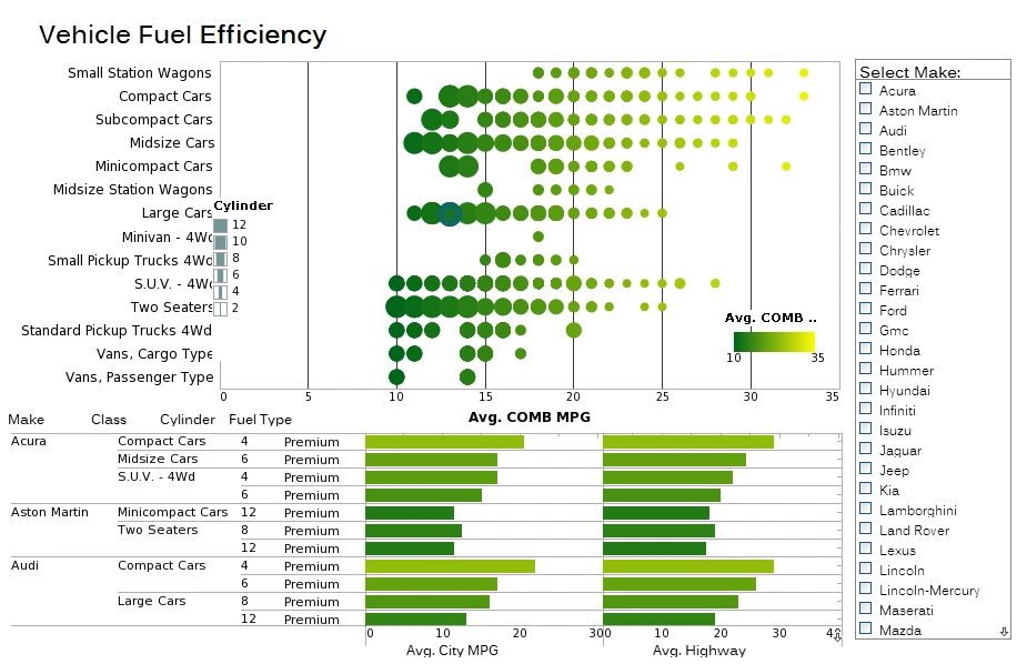
Visual Analysis Examples
Since 1996, InetSoft's visual analysis software StyleBI uses a reporting-driven approach to enable rapid deployment of analytical dashboards. Dashboard software has been established as a highly effective business intelligence tool. Our dashboards can be monitoring-oriented or reporting-oriented and are a foundation of performance management software.
StyleBI does not require a desktop based server. It is web based and compatible with popular internet search providers, and is accessible on mobile devices. Take a look at the versatility of BI implementation with our dashboard software. Click on the reporting images to get a better look.
Worker Safety Analysis
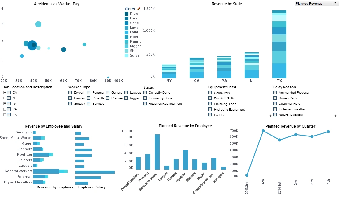
This worker safety analysis gives a high level view of construction accidents as well as basic revenue and payroll.
Accidents are broken down by company role as well as by state.
Visual Mortality Analysis
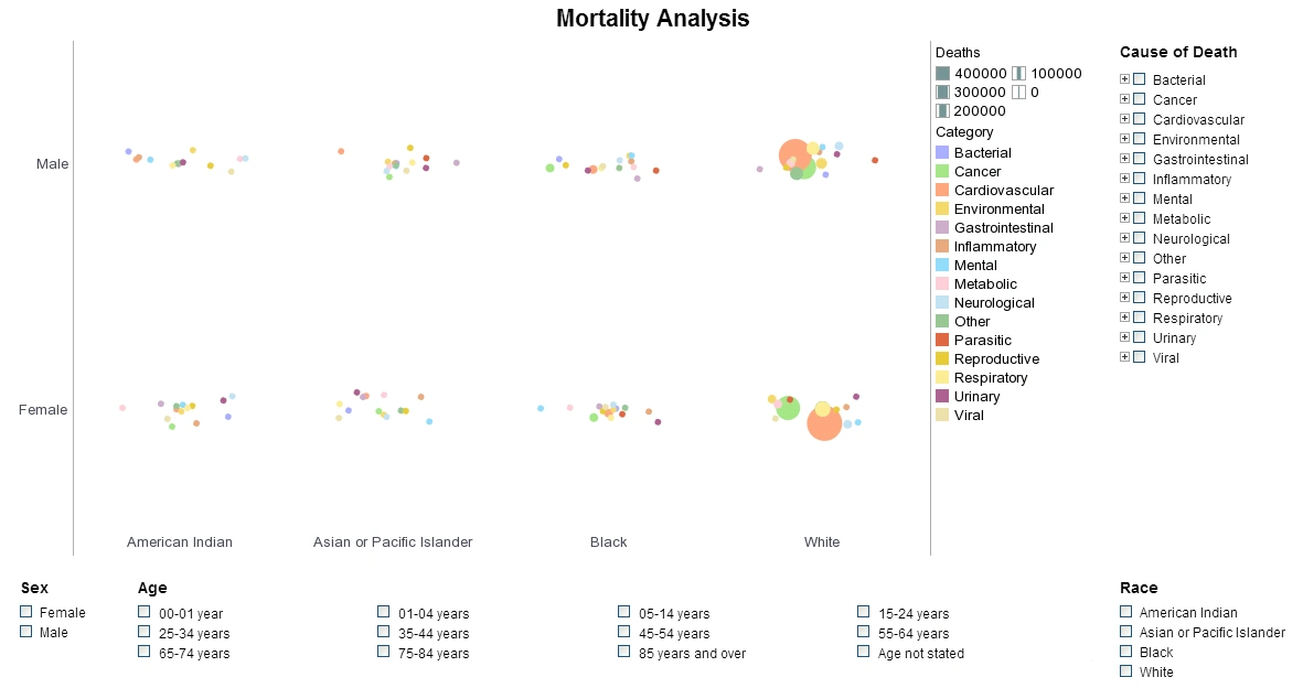
In this visual mortality analysis you can easily wring out a huge variety of statistics surrounding national mortality. The visuals can be displayed by age, race, gender or cause. You can filter out specific diseases within each Cause or zoom in for an intimate analysis within certain communities.
Easily spot the major causes or drill down to find the way certain causes affect demographics differently.
Racial Tolerance Analysis
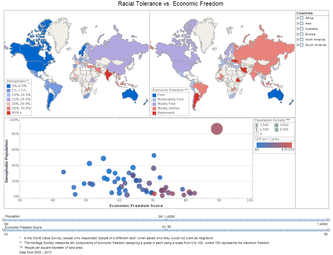
This racial tolerance analysis comparing tolerance with economic freedom combines the best of both world by using both map charts and a multidimensional bubble chart. The addition of color and sizing on the bubble charts results in a total of four measures displayed in a single chart, allowing complex sociological patterns to be explored.
Visual What-If Analysis Example
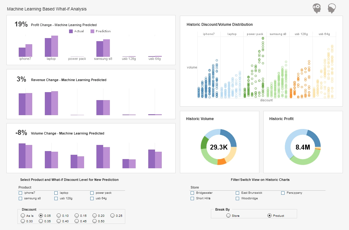
This visual what-if analysis example breaks down historic product volume and discount distributions and uses the data to predict changes in revenue and profit.
Large KPIs detailing historic profit and volume make the comparison with predictions easier.
Visual Customer Service Analysis
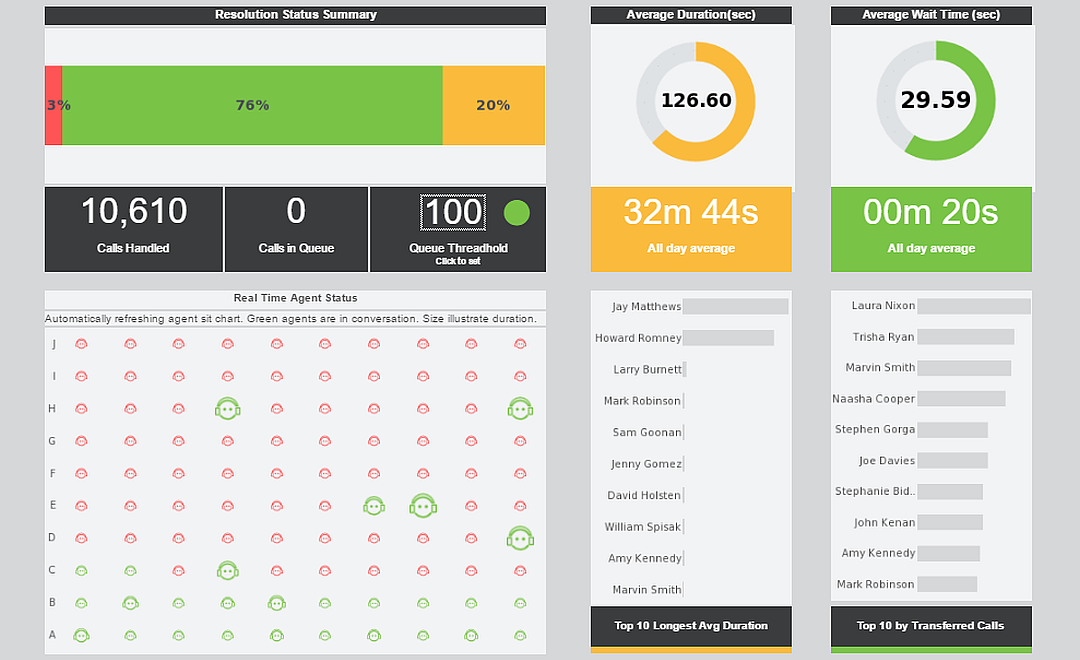
This visual customer service analysis lets customer service managers see who's handling the most calls and who might need some attention.
The analysis refreshes with live data ever 30 seconds, giving an overview of current calls in real time.
Visual Demographic Analysis

This visual analysis of United States census data demonstrates the flexibility offered by multidimensional charting.
In addition to population and median income on the x and y axes, region and property value are displayed using color and fill.
Ambergris Harvesting Dashboard
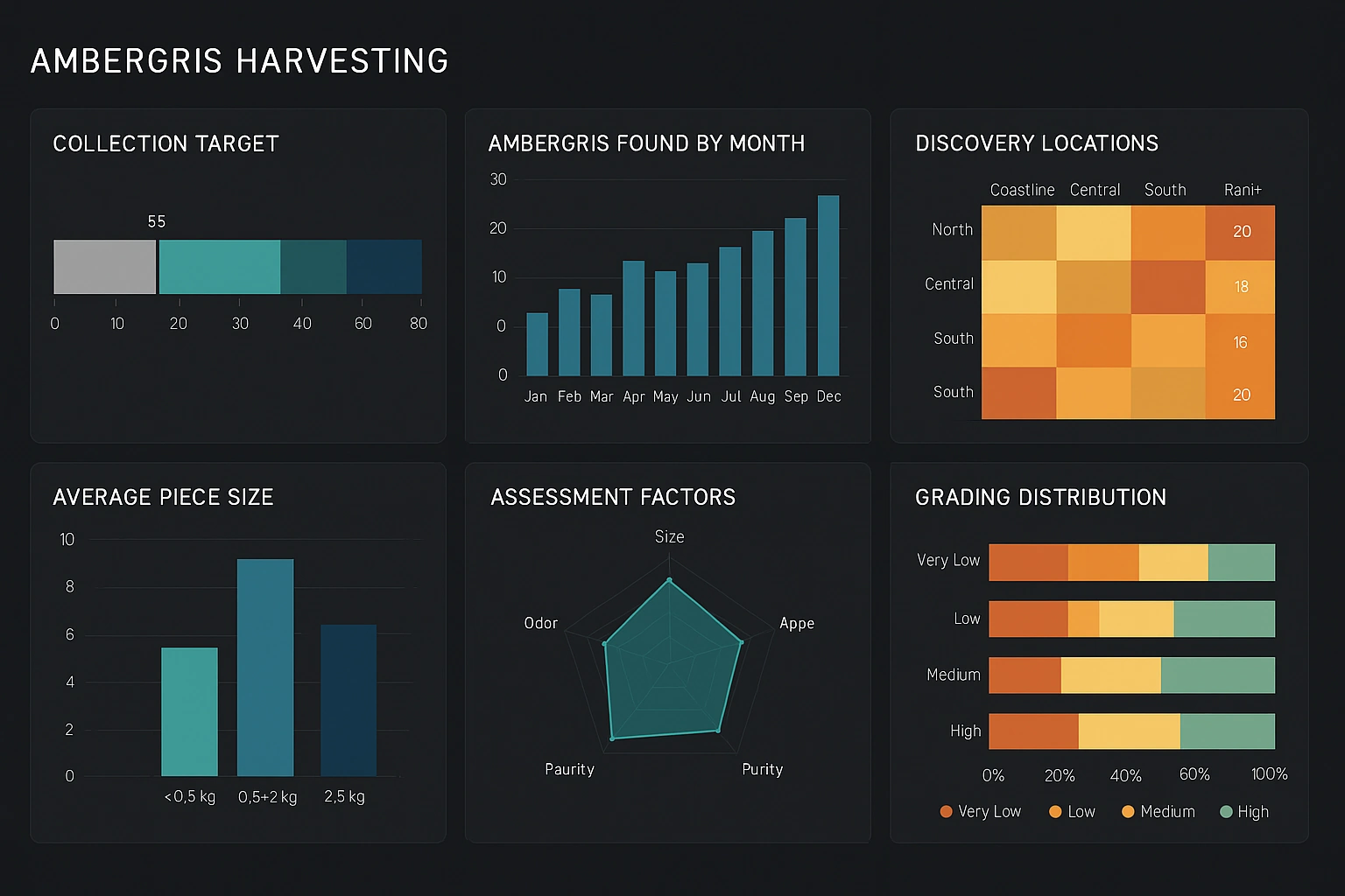
The Ambergris Harvesting Dashboard compiles operational, environmental, and quality metrics across collection zones and seasons to give managers a complete view of ambergris recovery activities. At the top, tiles show aggregate harvest volume, average quality grade, total vessel-hours, and compliance status. A geospatial map plots recent finds with time-enabled playback, color-coded by quality grade, and overlays wind and sea-state layers so teams can correlate environmental conditions with yield. Time-series panels display weekly and monthly harvest trends and compare actual returns to forecasts, revealing seasonal patterns and enabling staffing optimization. Route visualizations and vessel telemetry charts let supervisors inspect travel efficiency, idle time, and distance-per-collection, while a crew performance module tracks hours, certifications, and incident reports. A quality breakdown pane drills into chemical grade and market-value estimates by batch, including inspection flags and chain-of-custody links. Interactive filters permit slicing by region, vessel type, crew, and weather window; scenario tools simulate the impact of changing collection windows or reallocating vessels on weekly yield and operational costs. Compliance checks surface zones with regulatory constraints, and an alerts hub issues notifications for oversize finds, unusually low quality, or safety events. Together, these visualizations help balance sustainable collection practices, safety, and revenue — enabling data-driven scheduling, routing, and procurement decisions while keeping visibility into yield quality and regulatory adherence.
CIO Executive Dashboard
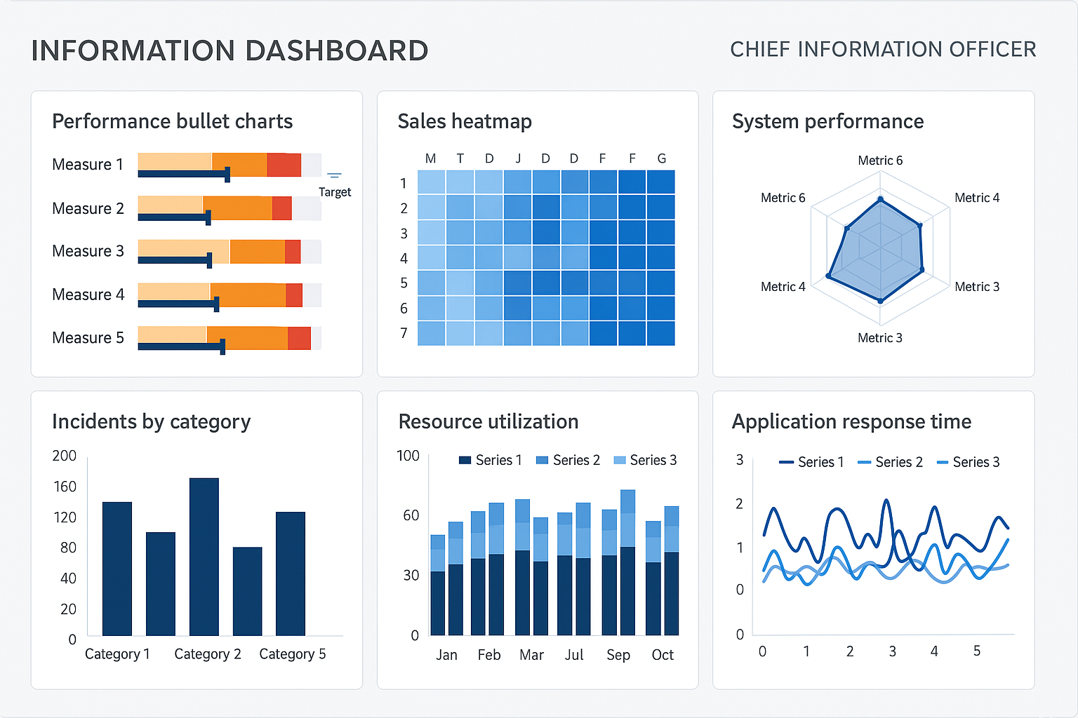
The CIO Executive Dashboard synthesizes IT health, project delivery, security posture, and cost performance into a single executive view designed for strategic decision-making. Prominent KPIs include service availability, mean time to resolution (MTTR), incident volume by priority, and capacity utilization across cloud and on-prem resources. A top-right portfolio panel summarizes active projects with schedule adherence, percent complete, and risk scores, enabling rapid triage of projects that need attention or reallocation. Security and compliance widgets display vulnerability trends, open critical findings, and patching cadence alongside recent threat alerts and compliance posture by regulatory domain. Financial visuals include burn rates, cloud spend over time, cost-per-service, and trending cost anomalies with drill-through to resource tags and teams responsible. Operational panels provide incident heatmaps by geography and service, capacity trend forecasts for CPU, memory, and network, and change-management success rates. Interactive controls let executives filter by business unit, region, or service tier and run what-if scenarios for capacity increases or cost optimization levers (e.g., instance sizing, reserved capacity). Integration charts show business-service dependency maps, making it easy to assess downstream impact of outages or planned maintenance. Together, these components support balanced decisions across reliability, security, and spend — enabling the CIO to align IT delivery with business priorities, reduce operational risk, and communicate outcomes to the board with clarity and evidence.
Emergency Room Throughput Dashboard
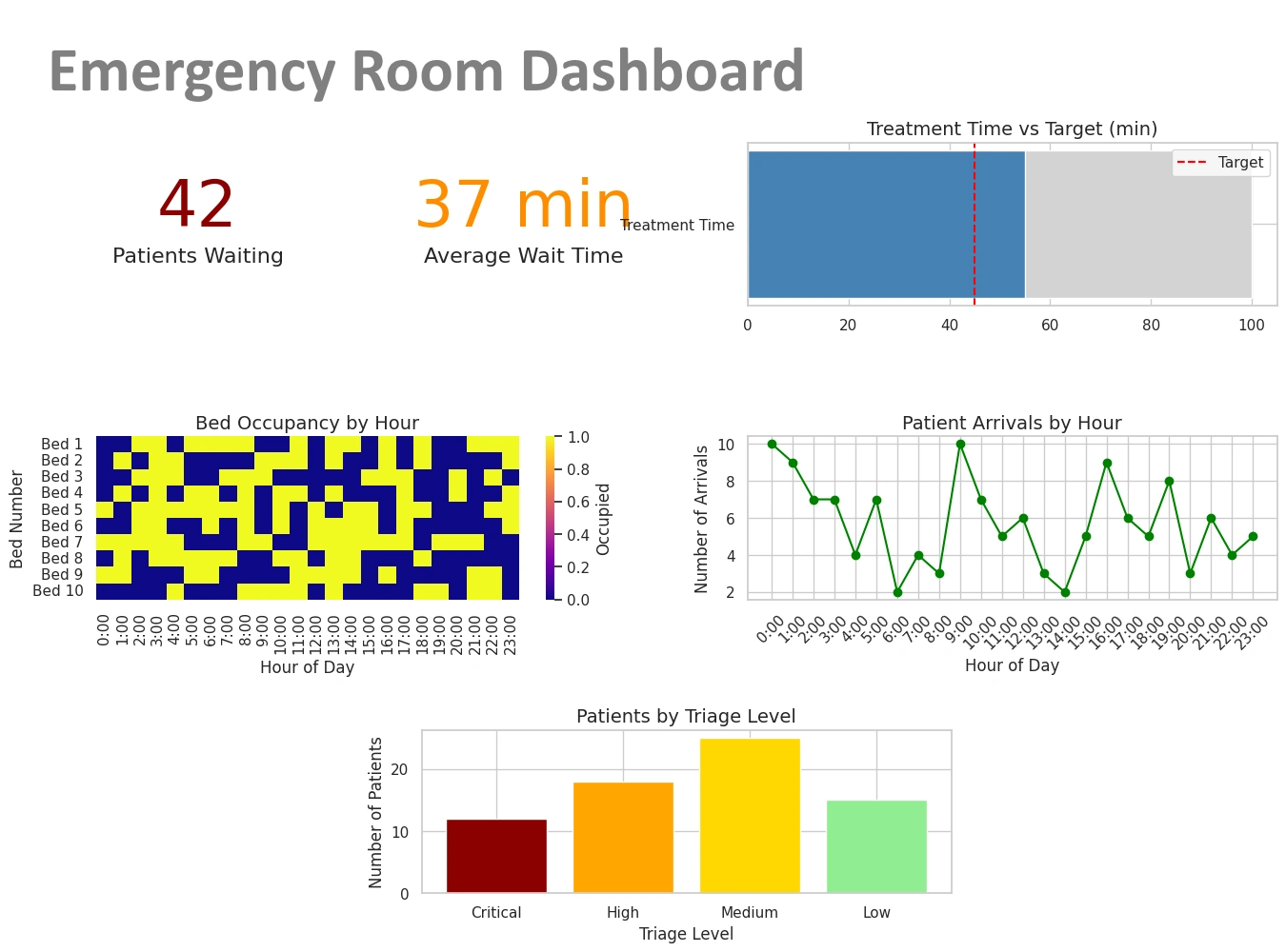
Emergency departments (EDs) are high-variability, high-stakes environments where throughput and resource allocation directly affect patient outcomes. This Emergency Room Throughput Dashboard focuses on operational KPIs that matter to ED directors, triage nurses, and hospital administrators: real-time waiting room counts, average door-to-provider times, left-without-being-seen (LWBS) rates, bed turnaround time, and staffing utilization. Time-series panels show arrival patterns by hour and day so managers can anticipate peaks, while heatmaps reveal bottlenecks by treatment area. A drill-through view correlates acuity levels with length-of-stay to prioritize high-impact process improvements. Resource overlays track bed occupancy, on-call coverage, and equipment availability; predictive trendlines estimate expected wait times for the next six hours based on recent arrivals and service rates. Interactive filters allow slicing by arrival mode (walk-in, ambulance), insurer, or presenting complaint, and leaderboards surface provider-specific throughput metrics to enable targeted coaching. Alerts and threshold widgets provide immediate visibility into diverted status or critical queue growth. Combined, these visualizations give clinical and operational leaders the situational awareness needed to shorten waits, reduce LWBS, and improve patient flow while preserving quality of care.
Insurance Coverage Analysis Dashboard
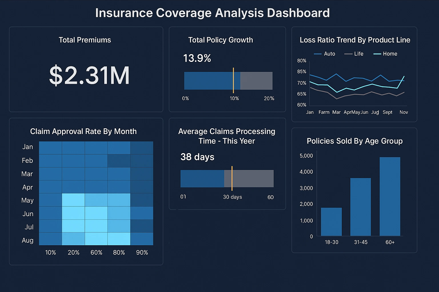
Payers and care managers need clarity on who is covered, under what plans, and where potential cost exposure exists; this Insurance Coverage Analysis Dashboard surfaces that clarity. The dashboard aggregates member counts by plan type, active versus lapsed coverage, and population risk scores to highlight coverage gaps and churn risk. Claims trend charts reveal top drivers of spend (by category and provider), while eligibility heatmaps show regional coverage density and areas with large uninsured populations. A cohort analysis feature enables exploration of coverage transitions across months and identifies members at risk of losing coverage due to eligibility or renewal issues. Provider network visualizations display utilization by in-network versus out-of-network, with drill-downs into authorization rates and denial reasons. Interactive what-if tools simulate the financial impact of coverage changes, policy modifications, or provider contract adjustments. Embedded KPI tiles show average cost-per-claim, percent of claims denied, and member retention, giving both actuarial and care teams the insight to reduce leakage, improve authorization workflows, and target outreach to at-risk members with tailored interventions.
