Back in April we released the 2010 Green Car Dashboard to mostly positive reviews. But every now and then, we received some eloquently worded, thought-provoking criticism:
—–Original Message—–
From: InetSoft Info [mailto:info@inetsoft.com]
Sent: Wednesday, June 02, 2010 8:29 AM
Subject: [NEEDS ATTENTION] InetSoft Contact Form Response
Importance: High
Email: baddesign@gmail.com
First Name: bad
Last Name: design
Phone: 8886664444
Your green car dashboard stinks
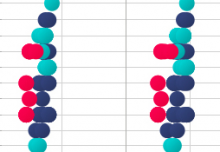
Several months ago while I was creating mockups for the green car dashboard, I experimented with more visually oriented outputs (i.e. charts and graphs showing outliers and superlatives). But when I took a step back, I realized how confusing it was to look at.
There were thousands of these tiny little data points packed-in along an axis, and if I wanted to know more about what they represented I had to hover over these tightly-packed dots, one at a time. Overall, it looked more like an impressionist painting than a useful tool that simplified the gathering of information.
So after some deliberation, I settled on a tabular output because I felt it would be easier to recognize important information at a glance. Once you check a couple of boxes from the selection containers, you can sort the table columns to show attributes from highest to lowest values. You’re then able to readily recognize the top and bottom performers without much fuss or frustration.
Then last month I came across this blog post from a member of the Spotfire community that claimed that our green car dashboard was visually limited, had a clunky design, and lacked in performance. He decided to create a more visually analytic version of the tool that you can see here.
First, I really have to commend them for putting in the time. The data from the EPA has over a dozen columns and thousands of lines of data and creating a dashboard with interesting views is by no means a simple task. I also really enjoyed the co-located components and the way charts attempted to show outliers across some of the major categories.
However, overall I viewed this version of the tool as a giant step backward from a comprehension standpoint. The biggest problem is that there’s just too much information being crammed onto the user’s screen to really make much sense of it at a glance. Imagine going out to a restaurant and getting a menu that’s twenty-one pages long and you’ll get a sense of my frustration. Sure you’ll have more options, but is having that many options always desirable? Just imagine how long would it take you to place an order.
Next, everything is checked off by default, so when you go to filter data, you literally have to uncheck everything you don’t want to see. And ironically, while there was criticism about the performance of our dashboard, theirs seems to take several seconds longer to filter results even though it seems they’ve eliminated dozens of makes of cars and use significantly less data than our version of the tool.
There’s also a bizarre attempt to combine ratings like air pollution score and greenhouse into a giant overarching hierarchic rating. While there’s no indication from the EPA that combining these or any other two measures would lead to a more eco-friendly designation, that’s exactly what multiple charts throughout the dashboard falsely imply.
Lastly, while the cluster analyses are pretty to look at and are reminiscent of a post-modern print that sells at your local Bed and Bath, it seems to provide no real information. And the raw data tab requires you to scroll laterally to the far right in order to view all data (and, by the time you get to the end, you’ve already forgotten what vehicle’s information you were looking at).
Ultimately, while no dashboard is perfect, I think it’s important not to go overboard with the amount of data and features you add in. Our BI software has hundreds of features that I could easily add to any visualization, but what good would that do if the person on the other end is unable to make sense out of it?
This fall I’ll be creating a brand new version of the Green Car Dashboard for 2011. This time around I’ll be adding a few more visual analytic features while trying to maintain a clean and simple dashboard layout, with outputs that are easy to understand at a glance. What other kinds of features would you like to see in it?