Shrinking Big Data Sets Into Meaningful Info
When many people think or speak about “big data,” the assumption is that there exists billions and billions of bytes of useful, meaningful information that you can use to learn more about your business or your customers. In reality, however, for any given observer the amount of “noise” can be overwhelming compared to the amount of truly meaningful data. Getting to this valuable subset requires strategic filtering and effective big data analytics tools, and can be drastically different for every user.
The Problem With Most Big Data Collection
Data collection at this level typically occurs with a better-safe-than-sorry approach, valuing volume first and filtering later. This is done for good reason, and ultimately means that your decision-making is less likely to be negatively affected by a lack of information. At the same time it can often lead to information overload, and confusion about what is important – signal – and what is extra – noise. This is further complicated by the previously mentioned situation where two users of the same data pool may desire completely different portions of the total collection.
Some reporting and decision making can be made easily, especially if you already know what data is important, and what each value means in the decision making process. Since most users of big data analysis tools are trying to learn new information that wasn’t otherwise obvious, this can be a challenge. So how do you effectively filter data if you don’t know what you’re looking for?
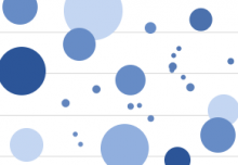
Big Data Visualization
The trick, of course, is to present the data, no matter how massive, in a way that leads to quick summarization and trend identification.
Like most things, this is easier said than done, at least without the right tools. A good data visualization tool gives you the ability to input large, multivariable data sets, and quickly output summary breakdowns that are prioritized around certain parameters. Let’s explore a simple example:
The Big Store Example
Imagine a large retail store with many employees, many items for sale, many customers, which is open 24 hours a day. A simple goal for leadership may be to increase the value of the average transaction, but developing a plan poses a challenge. This store tracks the metrics of every customer transaction as you might expect, creating a large repository of information. The leadership, however, is having a hard time turning this information into actionable decisions.
One member suggests that the time of day is the major factor. Another suggests that the number of open registers matters more, as it affects wait time. Others suggest similar ideas, and they spend a large amount of time graphing each metric and its effect on the average revenue, only to find that there is no definitive answer to be found. Every suggestion showed fluctuations, but they were unpredictable or statistically insignificant. What went wrong?
Digging Deeper Into Data Analysis
Now imagine the same store and staff, using an intuitive tool to break down and help them visualize the complex data in front of them. They can quickly sort, filter, organize, and refine the data points in order to highlight the individual aspects that are important to them. An automated process can analyze the data, and show meaningful trends where revenue is increased, and tie in the underlying factors without the “noise” of incidental information.
This allows the team to make proactive business decisions, without compromising time and data gathering, ensuring the return on their big data investments.