While aesthetics are not the most important element of dashboard design, it is good to try and vary the look and design of your dashboards a bit, so as to make them more interesting to the viewer. One less common dashboard element is a map visualization chart. Let’s take a look at its pros and cons.
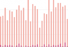
Whether data plotting by state, country, or even city, a map chart is a good way to give a general feel of how data breaks down regionally. If your data has many regions, a map chart can be a lot less crowded than other chart types. For example, whereas a bar chart with all 50 states plotted would be crowded, displaying the same data in a map is very clear and pleasing to the eye.

The downside to a map chart is that if you are breaking down data by general regions such as state or country, the standard method is to plot by color, meaning that only one field can be plotted on the chart. Also, as has been discussed in previous posts, graduations in color are not as effective for discerning subtle differences as graduations in size.
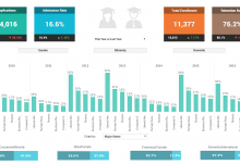
So what is the best use for a map chart? For most datasets with regional data, a map chart is a nice visual complement to an array of charts and displays which break down the data in different days. With features such as InetSoft’s radio buttons and tabs, one could even make their map chart display a variety of different dimensions and measures with a few clicks of a mouse. Here’s an example of how a map can complement other elements in an executive program management dashboard.

Keep following The Mashup for tips on how to make your dashboards better than ever.