Creating a Key Performance Indicators Dashboard
A common use of dashboards is to display KPIs or "Key Performance Indicators". A KPI is often single value, or sometimes a sequence of values, which conveys some critical facts about the way a process if operating. Typically, a KPI gives you "the one thing you need to see" in order to know if a process or business is healthy or not.
This page will show you three different ways to create a KPI dashboard indicator using InetSoft.
1. Create a KPI by using Data Mashup
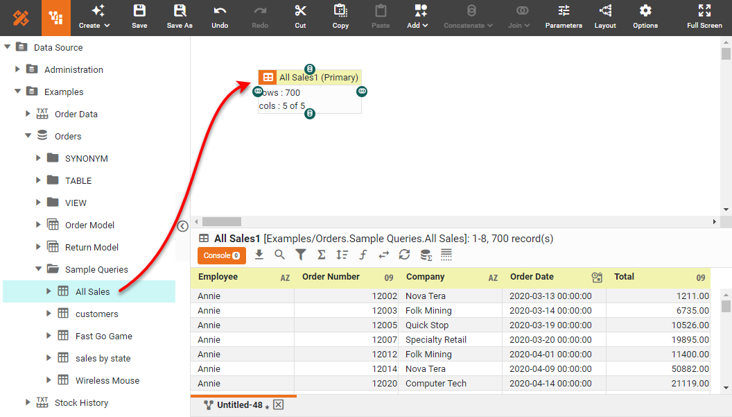
The InetSoft data mashup tool is called a Data Worksheet. You can use this tool to do all kinds of joins, filters, and other transformations on your data. In this case, we will calculate a 'Total Sales' KPI in the Data Worksheet. To do this, add a query as a data block to the Data Worksheet, as shown below.
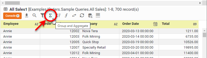
To create a KPI representing the Total Sales, press the Group and Aggregate button, and select Total as the Aggregate field.
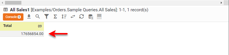
The result is a data block that returns only the summed Total Sales. You can now use this KPI in a dashboard or report.
The result is a data block that returns only the summed Total Sales. You can now use this KPI in a dashboard or report.
2. Add a KPI When You Create a Dashboard
It is easy to create different kinds of KPI displays when you build a dashboard in Visual Composer. The quickest way to do this is to drag a Text or Gauge component into the dashboard, and then drag the desired measure onto the component. This will display the aggregated measure as a KPI using the selected component, as shown below.
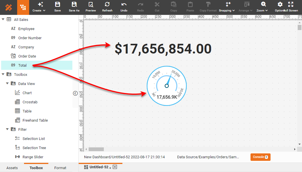
This is the most common method of adding KPIs to a dashboard.
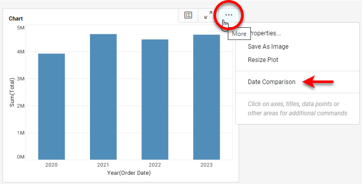
3. Create a KPI in a Deployed Dashboard
A dashboard user can also create a KPI using the Date Comparison feature in a deployed dashboard, without using Visual Composer. To do this, simply open the Date Comparison feature for a Chart or Crosstab.
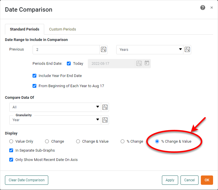
Select a desired date comparison, for example a comparison that displays the % change from year to year.
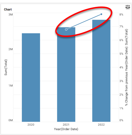
The resulting chart now displays the desired KPI, % change from year to year. You can easily make changes to the date comparison to display a wide variety of KPIs based on different date ranges and granularities.
What KPIs and Metrics Do Alcohol Distillers Track with Dashboard Software?
Alcohol distillers use dashboard software to track various Key Performance Indicators (KPIs) and metrics to ensure efficient operations, maintain quality, comply with regulations, and optimize financial performance. Here are some key KPIs and metrics typically monitored by alcohol distillers:
Production Metrics
- Batch Yield: Measures the amount of alcohol produced per batch relative to the expected yield. It helps in identifying process efficiency and losses.
- Fermentation Efficiency: Tracks the conversion rate of fermentable sugars to alcohol, indicating the effectiveness of the fermentation process.
- Distillation Efficiency: Monitors the effectiveness of the distillation process in separating alcohol from the mash.
- Downtime: Measures the amount of time the production line is not operational, helping to identify maintenance and operational inefficiencies.
- Cycle Time: Tracks the time taken to complete one production cycle, from raw material input to finished product output.
Quality Control Metrics
- Alcohol Content: Ensures that the alcohol content is within specified limits for each product batch.
- pH Levels: Monitors the acidity or alkalinity of the mash and other intermediate products.
- Contaminant Levels: Tracks the presence of unwanted substances to ensure product safety and quality.
- Sensory Evaluations: Involves regular tasting and smell tests to maintain flavor and aroma consistency.
- Microbiological Testing: Checks for bacterial or fungal contamination at various stages of production.
Financial Metrics
- Cost per Liter: Measures the cost of producing one liter of alcohol, including raw materials, labor, and overhead.
- Revenue per Batch: Tracks the income generated from each batch of alcohol produced.
- Profit Margin: Monitors the profitability of the products by comparing revenue against production costs.
- Inventory Turnover: Measures how quickly inventory is used and replaced, indicating production efficiency and sales performance.
- Capital Expenditure (CapEx): Tracks the money spent on upgrading or maintaining physical assets such as equipment and facilities.
Supply Chain and Logistics Metrics
- Raw Material Inventory Levels: Monitors the stock levels of key ingredients like grains, yeast, and water.
- Supplier Performance: Evaluates suppliers based on the quality and timeliness of raw material deliveries.
- Order Fulfillment Rate: Measures the percentage of orders delivered on time and in full.
- Transportation Costs: Tracks expenses related to shipping raw materials and finished products.
- Warehouse Efficiency: Monitors the efficiency of storage and handling processes within the warehouse.
Environmental and Safety Metrics
- Energy Consumption: Tracks the amount of energy used in the production process, aiming for energy efficiency and cost reduction.
- Water Usage: Monitors water consumption, crucial for sustainable production practices.
- Waste Generation: Measures the amount of waste produced and how much is recycled or disposed of.
- CO2 Emissions: Tracks the carbon footprint of the distillery operations.
- Safety Incidents: Records any workplace accidents or safety breaches to improve workplace safety and compliance.

More Articles About KPI Dashboards
Building Power Management KPI: Total Energy Consumption - One of the key performance indicators (KPIs) in power management is the overall energy usage. It shows the total energy used by a facility over a certain time frame and is often expressed in kWh. Organizations may establish baseline consumption levels and monitor advances in energy efficiency by keeping an eye on this KPI...
Carbon Footprint Measurement - A key performance indicator (KPI) for sustainability software dashboards is the carbon footprint of a business. The overall greenhouse gas emissions that are both directly and indirectly related to an organization's operations are measured by this KPI. Businesses may establish emission reduction objectives and find areas for improvement by using advanced analytics to help break down emissions by source...
Investment Operations KPIs: Trade Execution Efficiency - The following KPIs and metrics are constantly monitored by investment operations analysts since efficient trade execution is essential to these activities: Trade Execution Speed: The time it takes to execute transactions is measured by this KPI. Analysts monitor the amount of time that passes between placing an order and the transaction being completed, striving for quick execution to take advantage of market opportunities and reduce exposure to market hazards...
Solar Panel Efficiency KPI - The solar panels are the essential component of any solar power producing system. One important KPI that has a direct bearing on the system's overall performance is the efficiency of these panels. The ratio of the panels' energy output to their energy intake from sunlight is known as solar panel efficiency. Real-time data on each panel's efficiency are provided via a solar power generation dashboard, which helps operators quickly detect failing panels. Ensuring a good return on investment and maximizing energy output are made possible by this KPI...