COVID Deaths by Age Race and Sex
The World Health Organization declared COVID-19 a global health emergency on January 20, 2020. As of January 31, 2022, 375 million people have been confirmed to have had COVID-19 worldwide. Two years into the COVID-19 pandemic, there is no firm date yet on when it will end, especially since the Omicron variant is spreading rapidly. The COVID-19 outbreak might be one of the most severe global health crises in the twenty-first century.
Predicting COVID-19 trends has become a challenging issue. The best way to track the COVID-19 outbreak is by using data and visualization to predict the next outbreak point, forecasting peak levels and measuring the curve. At InetSoft, the powerful StyleBI solution can offer the public and health organizations various scenarios to understand the potential outcomes of the current coronavirus pandemic and implement safety measures.


Visualization helps break down important factors during COVID-19 into simplified and intuitive information for the public or health organizations. InetSoft's COVID deaths dashboard offers the solution to mashup various public health data sources to enrich and evaluate COVID death data. The functionality of Style Scope allows users to identify and select the most important metrics to visualize through flexible and rich visual components.
COVID Death Demographics
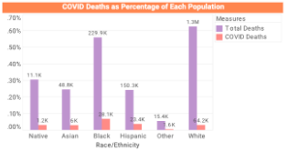
Combining different variables, like age, sex, race/ethnicity, by data mashup, this InetSoft dashboard is able to render simple and interactive charts using Style Scope, allowing users to make quick judgments about the COVID-19 pandemic by comparing different factors in COVID mortality. Public health organizations can easily explore the numbers of COVID-19 death cases or related death factors by navigating the InetSoft's COVID-19 dashboard, understanding how age, sex or race/ethnicity would affect the mortality rate of COVID by selecting different variables on the selection list and observing the change of the charts.
The COVID-19 deaths dashboard indicates the factors in serious and stable conditions with its respective colors as well. It helps the healthcare sector track the spread of coronavirus by the public and implement measures easily.

From the COVID-19 dashboard, the healthcare sector can get a sense of which age group is most susceptible to the coronavirus so that healthcare providers can make precautions in advance for people in susceptible age groups, like prioritizing vaccinations for those groups. The COVID-19 dashboard not only helps hospitals determine patients' risks of COVID death based on their age, sex, race and other factors, but can also help individual persons identify their own risk of dying from COVID and take appropriate precautions.
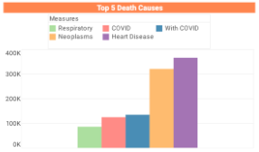
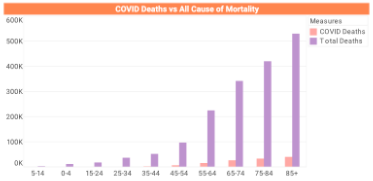
With the powerful functions of StyleBI, InetSoft's COVID deaths dashboard can also figure out the top five death causes and look at the impact of COVID-19 deaths on all-cause deaths. Through using simple script languages, like JavaScript or SQL, InetSoft's dashboard allows users to calculate the percentage of COVID-19 death cases among all-cause death causes and relate it to different variables, like age group.
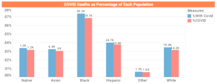
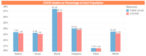
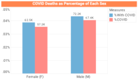
But when it comes to the controversial problems, such as what defines a COVID-19 death, the answer gets complicated. As the COVID death cases in the U.S. reach nearly 900K, confusion continues over how many people are dying of COVID-19 vs with COVID-19.

By classifying the COVID death cases into two distinct measurements - COVID and with COVID - to indicate death directly caused by COVID-19 and death with COVID-19 as an underlying death condition, InetSoft's COVID dashboard provides a more intuitive analysis of COVID death cases from these two perspectives, which help the public clearly understand the influence of COVID-19 and resolve the controversy about the definition of a COVID-19 death. Graphical data analysis on InetSoft's COVID-19 dashboard guides the health industry to explore the simplified trends, understand virus infection factors of the COVID-19 pandemic, and get a clear picture of the pandemic situation.
Through Style Scope and StyleBI at InetSoft, the health industry benefits not only from setting different colors visulazation for age group, sex, race/ethnicity and so on, but also from choosing different sections of the visualzaition based on their interest regarding the coronavirus. Application of variables on InetSoft's COVID-19 dashboard including death causes, age group, sex, and race/ethnicity offer reliable information about the COVID-19 pandemic. The COVID-19 deaths dashboard from InetSoft explores the worldwide number of COVID-19 death cases and combines various data sources into visualization charts that give the health industry an overview of the pandemic situation.