Data Presentation Tools
Are you looking for simple and useful ways to present vital information about your business in today's markets? You need the robust data presentation tools that InetSoft provides.
How Is InetSoft's Data Presentation Software So Easy to Use?
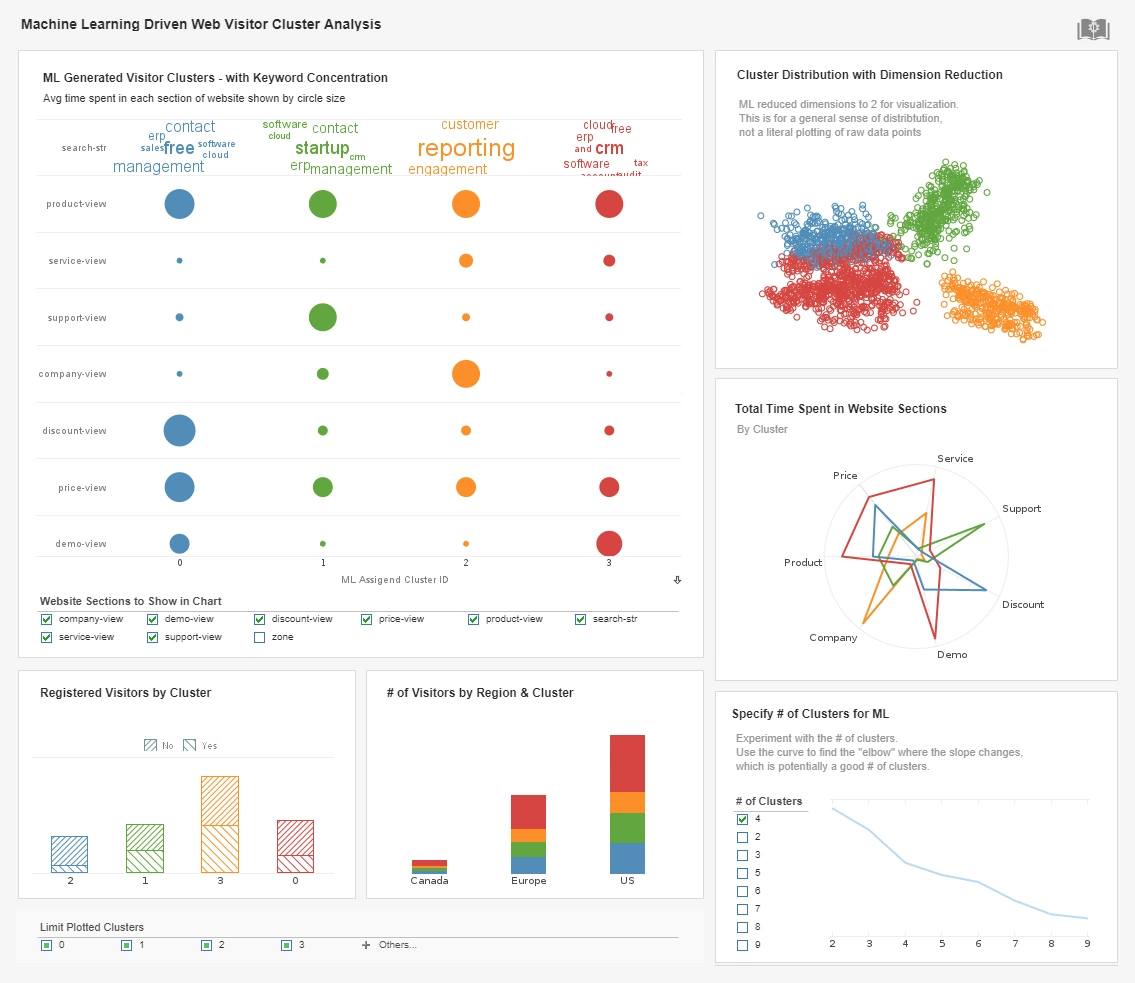
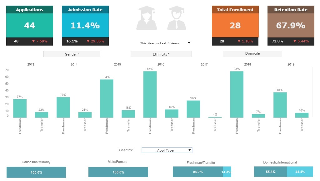
Data presentation is the means by which more and more organizations are answering key questions about their businesses. Data presentation consists not so much of presenting raw data, but of information, such as complex numbers and statistics, in a clear and beautiful way through mediums such as bar and line graphs, or pie charts.
Data presentations have advanced in the post-digital age to become much more dynamic, interactive, and present even more crucial information. In fact, data presentations deliver important stories and messages about one's business operations, trends, performance, and more, in novel ways.

How can Data Presentation Software Help Your Organization?
Data presentation enables decision makers and end users alike to sift through important information and numbers quickly, and at that, with much more ease than before when people had to read long spreadsheets and try to understand lots of complex data.
With a visual display of all that complex data, users are empowered with a better understanding of the information - numbers may look different when taken from a spreadsheet and plugged into an attractive and dynamic chart. This shift in perception allows people to perhaps see things they did not previously and therefore become more informed, spot trends, monitor key metrics more closely, and essentially become more efficient decision makers for their business.
Key Benefits of Data Presentation Software Tools
Vital business numbers and information coupled with attractiveness and interactivity suddenly bring a simple display of information to an accessible and visible way to become more successful as an enterprise. Visual data presentations provide deeper insights into key metrics, which in turn allow a business to solve their problems more efficiently and quicker - perhaps a moving gradient on a chart allows a CEO to spot a declining trend that he or she would have otherwise NOT noticed on a static spreadsheet. Now, management is making better plans for the organization's future. Plus, it did not take hours of sifting through complicated data.
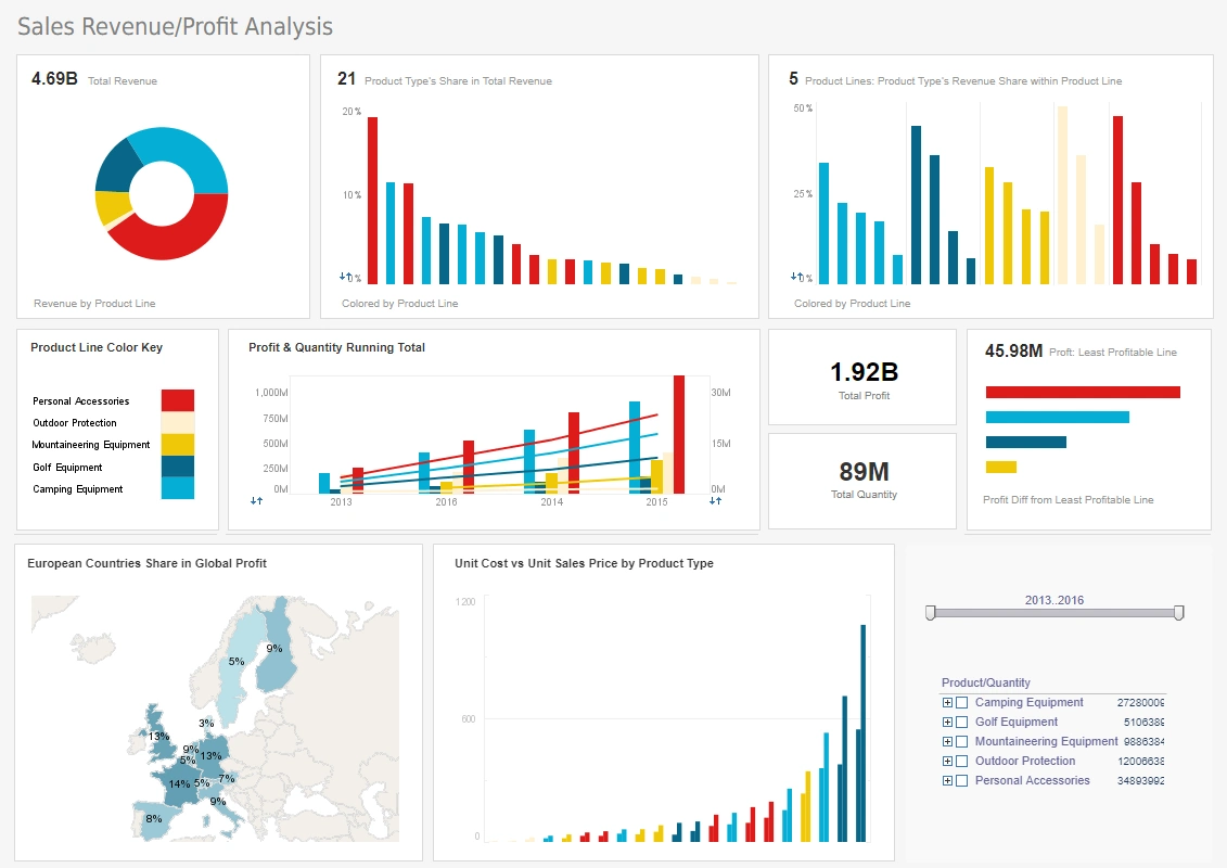
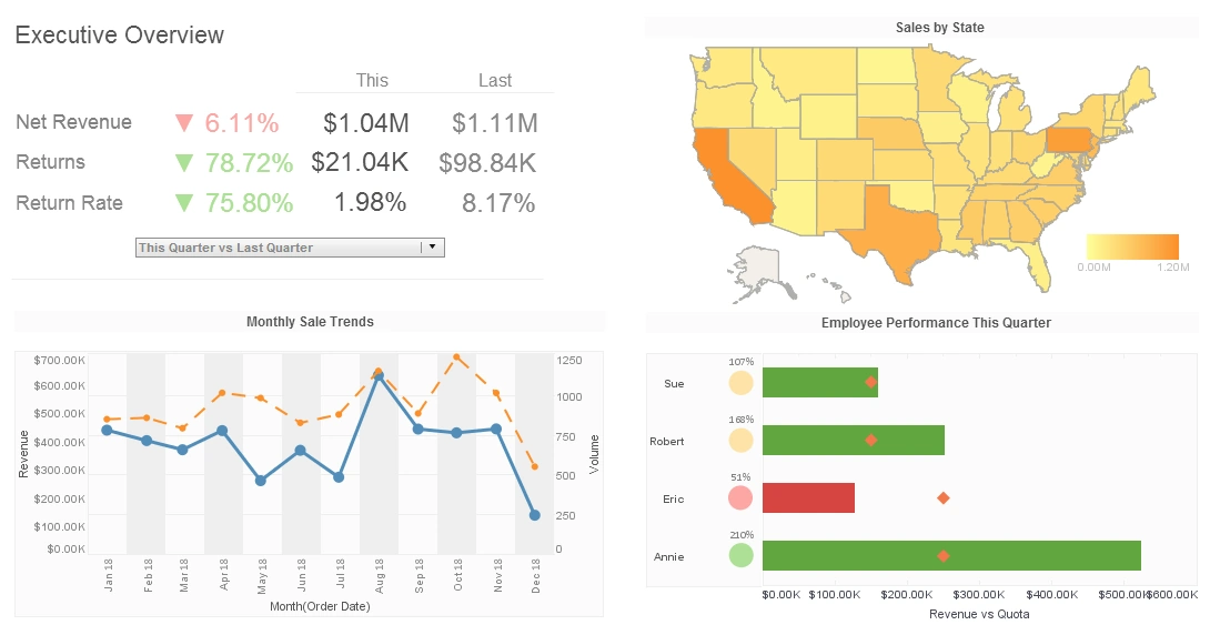
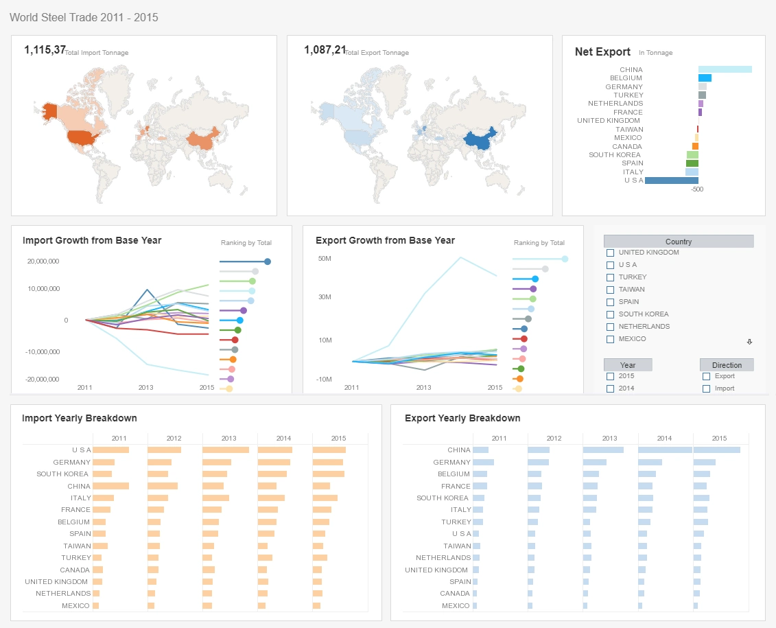
Data Presentation in Action
Data presentations are fast becoming a highly valued tool for gaining a a true sense of business performance. Previously, a manager might have been able to see how each of his sales people were doing in a quarter. With the power of visuals, that same manager may compare each quarter, each sales person, and further, find the answers to exploratory questions such as "What are the characteristics and trends among our highest paying customers?"
Further, a manager may not remember exactly how much revenue each department made in a quarter, but he or she may very well remember how big or small a visual bubble representing each department was. Presentations lead to improved management.
Data presentation tools can also:
- Reveal important patterns
- Help expose a weakness or issue in your business
- Present and compare large amounts of information at once
- Allow organizations to dig deeper in a "slice and dice" manner into crucial data.
Data Presentation Tools
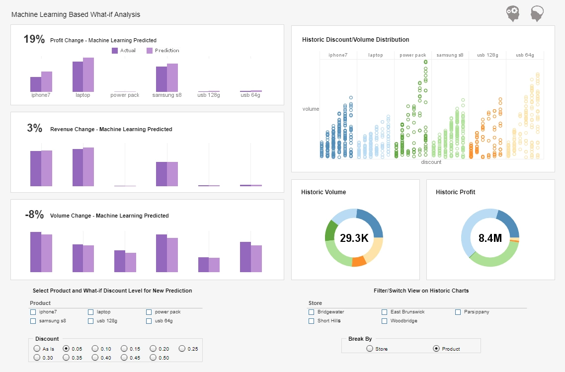
InetSoft offers data presentation tools that are easy, agile, and robust. InetSoft has pioneered the evolution from static reporting towards interactive presentations of data. InetSoft's StyleBI software is a dynamic data presentation tool for any business in need of turning complex data and numbers into a clear and useful presentation of information. InetSoft uses point and click technology for an environment meant to be driven by the end users' specific business needs.
StyleBI also has analytic capabilites that provide deeper insights into any business. Data presentation is sped up by condensing dozens of static reports into a single powerful interactive multi-dimensional analytical view, allowing users to sift through loads of data that otherwise might have taken dozens of clicks through dozens of static reports.

Why Select InetSoft?
- InetSoft's data presentations are server-based, instead of desktop based, which allows for secure and remote connections to various sources of data.
- Drag-and-drop features make creating presentations quick and easy. Minimal training required.
- Data is secure and appropriate for each individual user providing maximum efficiency for all users.
- InetSoft's data presentations are defined and controlled by users, making it a customizable and focused presentation of information.
More Articles About Presentation
-
Advanced Presentation Options
This article introduces InetSoft’s presentation and reporting software, highlighting its dynamic layout designer and rich visual elements. It supports HTML-like formatting, nested sub-reports, and multilingual output. The focus is on delivering pixel-perfect reports with interactive dashboards. -
Clear Storyline In Contemporary
A guide to management reporting best practices, this article emphasizes clarity, structure, and visual storytelling. It explores how dashboards and KPIs can be used to communicate performance across departments. Examples and templates are provided to help standardize reporting. -
Ensure Success Even If
This article discusses cloud-hosted BI and how presentation quality is maintained even without dedicated BI developers. InetSoft offers expert mentoring to ensure optimal dashboard design and report delivery. It also explains how SaaS BI adapts to growing data needs. -
Meta Templates And Report Beans
The article highlights reusable design components that streamline report creation and presentation. It explains how meta templates and report beans improve consistency and reduce development time. These features support scalable and multilingual reporting environments. -
Visually-Compelling And Interactive Dashboards
InetSoft’s dashboards are designed to enhance user engagement and data comprehension. The article showcases how interactivity and visual clarity improve presentation effectiveness. It also discusses adoption rates and user satisfaction metrics. -
Preparation And Presentation
This entry focuses on the dual importance of preparing and presenting management reports. It outlines how data visualization and narrative structure contribute to decision-making. The article also covers common pitfalls and how to avoid them. -
Production Report Design
The article explores design techniques for production reports, including expanding tables and super crosstabs. It emphasizes layout flexibility and presentation clarity. These tools help users tailor reports to operational needs. -
Rich Presentation Element Library
InetSoft’s software includes a comprehensive library of visual components for report design. The article explains how maps, images, and TOCs enhance report readability. It also highlights support for internationalization and branding. -
Digital Dashboards Will Be Examined
This article examines how digital dashboards support executive decision-making and performance tracking. It discusses integration with ERP and CPM systems. The focus is on transforming raw data into actionable insights. -
Pixel-Perfect Report Generation
The article details how InetSoft ensures precision in report formatting and layout. It covers scheduling, bursting, and customization features. These capabilities are ideal for organizations needing high-quality presentation output.