Emergency Reporting Software
The management of hospitals, ERs and emergency services all involve tracking factors such as patient complaints, nurse and employee turnover rates, and more. When using basic office programs like Excel or SQL database software, processes of analysis are often cumbersome and prone to human error.
Effectively utilizing data is crucial for delivering world class results. Healthcare also spans highly interconnected sectors such as academics, hospitals and pharmaceuticals. Data and its analysis sharing can be highly automated with data intelligence tools.
The answer for emergency reporting is adopting reporting software that can meet all informational needs through dashboards and reports, without having to rely on a professional analyst or spending copious amount of money on IT setup.
InetSoft's StyleBI offers visual analysis and data monitoring with real-time reporting capabilities and is the ideal solution for healthcare providers in need of reports and monitoring dashboards.
Along with having a significantly lower entry point than other visualization and reporting providers, StyleBI's intuitive and robust reporting tool allows nontechnical users to create dynamic and interactive reports perfect for any healthcare oriented organization.Drilling Down into Emergency Reports
With InetSoft's easy-to-use drag and drop design tools, emergency service providers can quickly build productive analytical tools that aid users in day-to-day operations, as well as help them keep track of and achieve long term goals and objectives.
InetSoft has a library of charts and visualization types to choose from, including geographic mapping, heat maps, and scatter plots. Healthcare industry executives can cater any completed dashboard to specific needs at any given time and even access them from mobile devices such as smartphones and tablets.
What Metrics Are Tracked on an Emergency Room (ED) Dashboard?
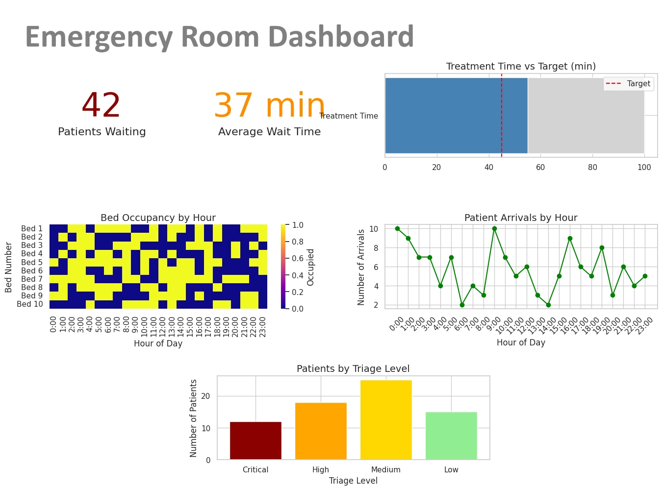
An Emergency Department dashboard synthesizes real-time and near-real-time operational, clinical, and resource metrics so leaders, charge nurses, and clinicians can make fast decisions. Below is a comprehensive, role-friendly list of the most useful metrics, grouped by purpose, with short definitions and practical notes about why each metric matters.
1. Patient Flow & Throughput
- ED Arrival Count (Hourly / Daily) — Number of patients presenting to triage or registration.
- Left Without Being Seen (LWBS) — Patients who leave before provider evaluation; a key access and satisfaction metric.
- Door-to-Provider Time — Median time from arrival to first clinician contact; a primary access metric.
- Door-to-Discharge / Door-to-Admission Time — Time from arrival to decision/transfer out; used to measure throughput and boarding impact.
- ED Length Of Stay (LOS) — Average and percentiles (50th, 90th) for all dispositions (admit, discharged, transfer).
- Time-to-Treatment for Critical Conditions — e.g., door-to-ECG, door-to-needle (for STEMI), door-to-antibiotics (for sepsis).
2. Capacity & Crowding
- Number of Patients In Department — Current census (waiting room + treatment areas + hallway).
- Available Treatment Bays / Rooms — Beds physically available vs. occupied.
- Boarding Count / Hours — Patients with admission decision who remain in ED waiting for inpatient bed; often shown as count and average boarding time.
- Occupancy Rate — Percent of staffed beds/bays occupied; helps predict crowding escalation.
3. Triage & Patient Acuity
- Triage Category Distribution — Counts by triage level (e.g., emergent, urgent, non-urgent); flags shifts in acuity mix.
- Average Acuity Score — Weighted measure of overall patient severity.
- Pediatric vs Adult Volumes — Useful for specialized staffing or isolation decisions.
4. Clinical Quality & Safety
- Sepsis Bundle Compliance — Percent of eligible patients receiving recommended steps within time targets.
- Time-to-Analgesia — For patients with severe pain; an experience and quality indicator.
- Medication / Treatment Delays — Percent of orders delayed beyond target windows.
- Adverse Events / Return Visits (48/72 hours) — Re-presentations that may indicate missed diagnoses or poor discharge planning.
5. Staffing & Resource Utilization
- On-Duty Staff Count — Physicians, APPs, nurses, techs, and their current assignment status.
- Patient-to-Provider Ratios — Real-time caseload per clinician (by role).
- Overtime / Agency Use — Hours and cost of premium staffing; flags persistent understaffing.
- Equipment / Room Turnover Time — Time between patient discharge/room cleaning and next patient placement.
6. Diagnostics & Lab Turnaround
- Lab Result Turnaround Time (TAT) — From specimen collection to result available.
- Imaging TAT — Time from order to completed imaging and to reporting.
- Percent Pending Results at Disposition — Helps understand how many discharges/admissions occurred with pending tests.
7. Patient Experience & Outcome Metrics
- Patient Satisfaction (Press Ganey / HCAHPS ED Items) — Scores and trending for wait time, communication, and overall experience.
- Complaint & Compliment Counts — Service recovery indicators.
- Mortality & Unexpected ICU Transfers — High-level safety and outcome indicators.
8. Operational Alerts & Real-Time Flags
Dashboards commonly surface color-coded alerts to prompt immediate action.
- Crowding Alert — Triggered when occupancy, wait time, and boarding exceed thresholds.
- Critical Lab / Imaging Results — Immediate notification items requiring clinician attention.
- Escalation Triggers — e.g., LWBS spike > X% in Y minutes, or boarding > Z hours.
9. Financial & Throughput Economics
- ED Revenue / Charges — Daily/weekly snapshots (useful for operational planning).
- Cost Per Visit — Average resource cost for an ED encounter (often modeled, not real-time).
- Reimbursement Mix — Payer distribution that affects revenue cycle.
10. Analytics & Trends
- 7/30/90 Day Trend Lines — Arrival volumes, boarding, LWBS, and LOS trends to detect seasonal or emerging patterns.
- Arrival Forecast vs Actual — Short-term forecasting to plan staffing (hourly forecasts for next 24–48 hours).
- Drill-Down Views — Ability to click a metric and view patient lists, timestamps, and dispositions to support rapid root-cause analysis.
Sample KPI Table (Common Targets)
| KPI | Typical Target | Why It Matters |
|---|---|---|
| Door-to-Provider | < 30 minutes | Reduces LWBS and improves timely triage/treatment |
| ED LOS (Discharged) | < 4 hours | Reflects throughput efficiency and patient experience |
| LWBS Rate | < 2–3% | High rates indicate access problems and lost revenue |
| Boarding Time | < 4 hours | Long boarding degrades ED flow and patient safety |
Design Tips for an Effective ED Dashboard
- Show real-time numbers and short-term trend sparklines (hourly) plus longer trend context (7/30/90 days).
- Use color rules sparingly (green/amber/red) and make thresholds configurable by site.
- Include patient lists with clickable rows that reveal timestamps and next action (e.g., awaiting bed, imaging, consult).
- Surface actionable suggestions, e.g., “Open surge bay” or “Call inpatient bed manager” when triggers fire.
- Provide role-specific views: charge nurse (operational), clinician (patient queue & critical labs), and medical director (quality & trends).
What Metrics Are Tracked on an Emergency Response Services Dashboard?
This dashboard supports fire, EMS, disaster response, and multi-agency emergency operations. It centralizes operational readiness, response performance, resource status, incident outcomes, and situational awareness so commanders, dispatchers, and operations planners can make fast, defensible decisions. Below is a comprehensive, practical list of metrics grouped by purpose and audience, with short notes on why each matters and how it’s used in the field.
1. Incident Volume & Classification
- Total Incidents (Hourly / Daily / Weekly) — Counts of all incoming incidents to detect surges and trends.
- Incidents by Type — Medical, trauma, cardiac arrest, fire, hazardous materials, traffic collision, technical rescue, false alarm, etc.
- Priority / Severity Breakdown — Priority 1/2/3 (or equivalent); helps triage resource allocation.
- Geographic Heatmap — Incidents per neighborhood/sector to identify hot spots and emerging clusters.
2. Dispatch & Response Performance
- Call Answer Time — Time from call arrival to dispatcher pick-up; critical for access and caller safety.
- Dispatch Time — Time from call answer to unit dispatch (radio/alert sent).
- Turnout Time — Time from unit notification to en route (crew mobilization).
- Travel / Response Time — Time from dispatch to arrival on scene (median, 90th percentile).
- Total Call-to-Scene Time — Full elapsed time from initial call to first responder arrival.
- Arrival Within Target % — Percentage of incidents reached within target times (e.g., 8 minutes for cardiac arrest response).
3. Resource Availability & Status
- Units In-Service vs Out-of-Service — Real-time count of apparatus/ambulances available for dispatch.
- Staffing Levels — On-duty personnel by role (EMTs, paramedics, firefighters, officers) and forthcoming shift coverage.
- Mutual Aid / Assist Requests — Active incoming/outgoing mutual aid, response times, and acceptance rates.
- Vehicle Location & GPS Tracking — Live positions and speeds to support nearest-unit dispatch and dynamic response routing.
- Equipment Readiness — Status of critical equipment (ventilators, extrication tools, radios) and maintenance flags.
4. Workload & System Strain
- Queue / Waiting Calls — Number of unanswered calls or incidents waiting assignment.
- Ambulance Turnaround / Hand-off Time — Time from arrival at hospital to unit back in service; key for reducing system strain.
- Average Incidents Per Unit Per Shift — Workload per asset; helps detect fatigue and need for relief.
- Peak Demand Periods — Hourly/daily windows with highest incident volumes for staffing optimization.
5. Clinical & Operational Quality
- Time-to-CPR / Defibrillation — For cardiac arrest cases; strongly tied to patient outcomes.
- On-Scene Treatment Time — Time spent providing initial care (useful to monitor for bottlenecks).
- Protocol Compliance — Percent compliance with critical care protocols (e.g., STEMI, stroke, sepsis bundles).
- Return of Spontaneous Circulation (ROSC) / Survival Metrics — Outcome measures for resuscitation cases.
- Transport Decisions & Destinations — Destination hospitals, diversion events, and specialty center usage (trauma, stroke center).
6. Safety, Incidents & After-Action Metrics
- Responder Injuries & Exposures — On-duty injuries, exposures to bloodborne pathogens, hazardous exposures.
- Vehicle Collisions & Near Misses — Safety incidents involving response vehicles.
- Post-Incident Reviews / Deviations — Number of incidents flagged for AAR (After Action Review) or QA.
- Complaints & Compliments — Citizen feedback tied to incidents or staff conduct.
7. Communications & Interoperability
- Radio Channel Utilization — Load on critical channels; indicates risk of congestion.
- Patch/Interoperability Events — Instances where cross-agency comms were established and their duration.
- System Outages — Telephony, CAD, or network outages and affected time periods.
8. Logistics, Supplies & Consumables
- Medication Inventory Levels — Critical meds (epinephrine, naloxone, cardiac drugs) and expiry alerts.
- PPE Stock & Usage Rates — Masks, gloves, gowns; burn rates during incidents or outbreaks.
- Fuel & Vehicle Readiness — Fuel levels and scheduled maintenance impacting availability.
9. Situational Awareness & Incident Command
- Active Major Incidents — Ongoing incidents requiring multi-unit/multi-agency response with incident commander, staging areas, and resource lists.
- GIS Overlays — Weather, road closures, hazardous materials, population density, and evacuation zones layered with incident pins.
- Real-Time Photo / Video Feeds — If available, live feeds from scene or drones for commanders.
10. Performance Trends & Analytics
- 7/30/90 Day Trend Lines — Volume, response times, and availability trends to detect seasonal patterns.
- Forecast vs Actual Demand — Short-term forecasts to inform surge staffing and pre-positioning of assets.
- Key Performance Indicators (KPIs) Dashboard — Aggregate KPIs (e.g., % arrivals within target, average turnaround, unit utilization).
- Historical Hotspot Analysis — Heatmaps for resource planning and community risk reduction.
11. Financial & Administrative Metrics
- Cost Per Response — Operational cost estimates per incident or per transport.
- Billed Transports / Collection Rates — Revenue cycle indicators for EMS billing.
- Overtime & Staffing Costs — Premium pay trends tied to surge or staffing shortages.
12. Incident-Level Drilldowns
An effective dashboard lets users click any KPI to see the underlying incident list and timestamps:
- Incident Timeline — Call received, dispatch, en route, on-scene, depart scene, hospital arrival, unit back in service.
- Patient Data Snapshot — Age, chief complaint, vital signs, treatment performed (HIPAA and privacy controls apply).
- Resource Assignments — Which units responded, mutual aid involvement, and equipment used.
Sample KPI Table (Targets & Why They Matter)
| KPI | Typical Target | Why It Matters |
|---|---|---|
| Call Answer Time | < 10 seconds | Faster answers reduce caller distress and speed dispatch initiation |
| Turnout Time | < 60 seconds (fire) / < 90 seconds (EMS) | Short turnout reduces total response time and improves outcomes |
| Arrival Within Target % | > 90% for high-priority calls | Ensures equitable and timely service across the coverage area |
| Ambulance Turnaround | < 30–60 minutes | Shorter turnarounds keep units in service and improve system capacity |
Design & Operational Tips
- Present real-time tiles (current available units, queue size, active major incidents) at top-of-screen for quick situational awareness.
- Use color-coded thresholds sparingly: green/amber/red for response-time compliance, availability, and safety flags.
- Provide role-specific views: dispatch console (call queue, nearest unit), incident commander (resource map, staging), operations planner (trends and forecasts).
- Enable quick actions from the dashboard: pre-position units, request mutual aid, declare surge, or order supplies with one or two clicks.
- Maintain audit logs for decisions and resource movements to support after-action reviews and continuous improvement.
- Respect privacy and legal constraints: restrict patient-level detail to authorized users and anonymize for analytical dashboards when appropriate.


