InetSoft Product Demonstration:
Example of an Interactive Sales Dashboard
This is the continuation of the transcript of a product demonstration provided by an InetSoft sales engineer for an enterprise prospect interested in our business intelligence software.
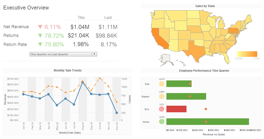
In this example of an interactive sales performance dashboard, the salesperson can play with different dimensions and measures. I can view sales. I can view returns. Anytime I have aggregated data, be it a chart or a presentation table, there is out-of-the-box functionality for drilling into your detail information. So what if I want to look at all of Robert’s sales made this year. I click on the bar corresponding to Robert. I click on Show Details, and I automatically drill into all of Robert’s sales made this year.
I can quickly export these into Excel. And I can always go back to my global view and zoom into any one of these other modules. Let’s look at another example. This is a single unit and again. I am exploring my sales, viewing it by different dimensions, by product category, by states, by sales rep, and by time period. On the left, I have my filters. Here’s a little time slider which lets me interact when we choose different time dimensions.
All Charts Update
Let's say I am going to look at all this data for Annie. Annie is my sales rep. I can simply click on Annie, click on apply, and I see all my views update themselves to only show me Annie’s data. And so I am filtering all this data for Annie. We also give you a nice visualization tool called Brushing. Brushing is basically where I can use my chart as a filter element. I can do visual investigative filtering. I can simply click on the bar corresponding to Annie, click on the Brush option.
Question: Yeah, it's really interesting. Oh, that’s very good, yeah.
I can see the distribution within the chart, within different dimensions, and I am looking at Annie sales strengths, but notice I am still viewing them within the context of the global sales. So I can make observations like all right, a good portion of sales made in California were made by Annie, or this is now Annie’s sales distributed by product category, which is pretty consistent with global sales.
And I can do this across the board. When we look at the sales strength in New Jersey, notice only Eric and Sue make sales in the New Jersey. Of course, as always, anytime I have aggregated data, I can drill down into my detailed information. My viewsheets as they are called in the InetSoft world, are interactive expository dashboards. Viewsheets can be exported to Excel, PowerPoint and PDF. The Excel export gives me not only the pictures, but actually exports every chart as an Excel chart. So I can maybe make some modifications in Excel and maybe copy and paste this into a Word doc or any other Office program.
Multi-Dimensional Visualization
Question: Okay, very good.
Let’s look at another example. This is an example of what we call multi-dimensional visualization. It shows how our application can aid an analysis. So what am I looking at here? I am looking at United States Census Data. So every little dot on this chart represents the states in America. A census takes a lot of measurements like federal spending, the median household income, and the mean travel time to work.
But I am just plotting two of these measurements on the X and Y axes. I can now change different visual aspects of my plot like the color, the size, the shape, based on the different measurements. So this way I can view a lot of information in a single visually intuitive way. I can immediately spot outliers, any sort of patterns or exceptions.
For example, I can see that the state of Alaska is an outlier in terms of federal spending. It has a very high federal spending per capita compared to other states. This kind of visualization allows me to quickly identify such anomalies and investigate further.


