InetSoft on DM Radio: Good Decision Making and Data Visualization
This is the continuation of the transcript of DM Radio’s program titled “The Eyes Have It: Ten Reasons Why Data Visualization Rocks.”
Eric Kavanagh: Yeah, it's a very, very good point, know what you are trying to accomplish when you put something together. Rich Penkowski, how about you, any closing remarks?
Rich Penkowski: Sure Eric. I would have to say sort of the biggest promise that data visualization offers is the ability to get some answers to questions that have been eluding organizations for a long time. And so I think that encouraging everybody in an organization to think about those, we like to call, crunchy questions that need to be answered and then apply some of these sophisticated techniques to get the answer. I mean the more organizations can begin to really look at that, looking at those specific applications and those kinds of questions, they are going to get a speed to value that is far faster than anything they have seen with any other technology investments to date.
Eric Kavanagh: Yeah right, that makes lot of sense to me too. , closing remarks from you?
Bryon Navish Javed: Sure. I don’t want to be pessimistic, but I think that it is a double-edged sword to have an effective data visualization give you such a gut reaction, high level view. There could be some sort of truthiness to the information and you might end up making the wrong decision. So always keep in mind that, as other people have said, you got to double check and use it for the right purpose.
Eric Kavanagh: Yeah, I love that word truthiness, it's so, what’s the word, appropriate, maybe. Let’s see. Doug Cogswell, what do you think for closing remarks?
Doug Cogswell: Yeah. We like to say that this stuff helps key business people see stories and solve problems. So back to Mark and Rich, this involves you to have a defined problem somebody is trying to solve and then second, we like to make sure we understand the half a dozen, dozen key business questions that are trying to be answered. But then the third thing is, we also like to try to understand why those questions can’t be answered today and there is usually a reason. But when those things align, it’s a very, very powerful tool and helps people make better decisions.
Eric Kavanagh: Okay good. And for the last word, we will go to Suzanne Hoffman of Tableau. What do you think?
Suzanne Hoffman: Well, it's interesting because it's sort of a compendium of everything that everyone said. We don’t want to overly contain someone’s creative juices, right? As we have commented, we have got a lot of millennials out there. We have a lot of people who are in their 20s and 30s that if we actually try to stir them in the direction that we have gone in the past or the perceived right direction, we are actually limiting their ability to react in real-time to what’s happening in the marketplace.
So it helps them think outside the box but go back to that old adage of measure twice and cut once. So you do want to have the checks and balances to ensure that the decisions that are being made or being proposed are in fact correct and made in the context of the decision making framework.
Good Example of Visual Discovery
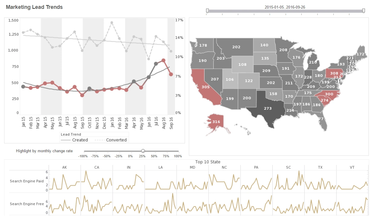
Here's a good example of using data visualization to do good decision making. A mid-market isotope producer, Helios Isotopes, who synthesizes medical and industrial isotopes across two cyclotron sites and one research reactor partnership. The company leans on data visualization to steer daily decisions: SPC control charts to monitor target irradiation yields in real time, heatmaps to surface hot spots in radiochemical purification, and Gantt-style timelines to orchestrate cleanroom availability against batch decay curves. By seeing production, quality, and decay kinetics on the same canvas, operations leadership can choose which lots to process first, which runs to extend or abort, and how to allocate technicians so that high-value isotopes with short half-lives hit delivery windows without compromising GMP compliance.
Quality and safety leaders use visual analytics to collapse complexity into clear signals. Pareto charts of deviation categories, funnel plots of batch acceptance rates by line, and cumulative sum (CUSUM) charts for dose calibrator drift help distinguish noise from true process shifts. When a heatmap flags rising impurities tied to a specific resin lot, the team can immediately pivot to an alternate purification pathway. And because every decision is time-sensitive, dashboards overlay regulatory thresholds, alarm bands, and confidence intervals, letting managers make informed calls that protect both patient safety and production continuity.
Supply chain and commercial teams benefit just as much. Geospatial dashboards layer customer demand forecasts, flight schedules, and border clearance times on top of isotope half-lives, revealing which routes are viable before activity drops below specification. Sankey diagrams map material and cost flows from target fabrication through shipment, highlighting where waste and bottlenecks erode margin. Scenario visuals—what-if sliders for reactor outage probabilities, carrier delays, or alternative carriers—turn abstract risk into concrete options, so sales can commit to delivery windows that operations can actually meet.
Finally, leadership uses visualization to balance growth with resilience. Cohort charts track new therapy centers adopting specific isotopes, while waterfall views quantify the impact of process improvements on yield, scrap, and overtime. A predictive maintenance dashboard merges vibration trends, vacuum integrity, and temperature profiles from cyclotrons; when the model’s probability bands widen, schedulers can preemptively shift runs to the second site. The overall effect is cultural as much as technical: by putting transparent, interpretable visuals in front of every role—from hot cell operators to finance—Helios Isotopes makes faster, safer, and more profitable decisions, proving that well-designed dashboards are a competitive advantage in an industry where every minute and every millicurie matters.


