Learning to Effectively Use Data Visualization
This is the continuation of the transcript of DM Radio’s program titled “The Eyes Have It: Ten Reasons Why Data Visualization Rocks.”
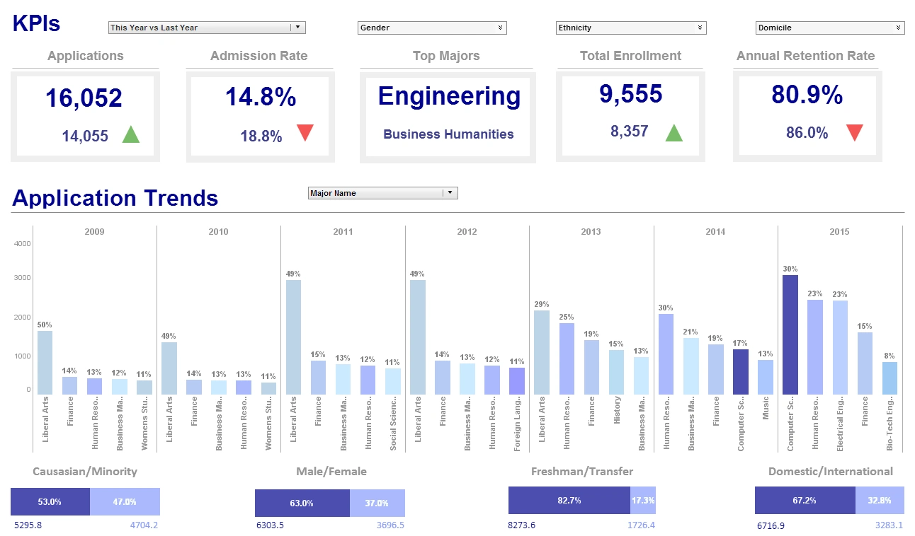
Abhi Gupta: It actually comes to my third point about collaboration. So now you take this, and a couple of examples. We have an account where one of the managers was in a board meeting recently and had a bunch of different business trends up on a visual dashboard on the overhead projector. So the board can visually see the stories and patterns in a way that would be hard in their old binder books.
But then they can ask questions and on-the-fly, in the meeting, the manager can click on things, the entire thing updates, and so they have this engaged drilldown discussion about why has this thing gone up like this. It’s unexpected. Okay this went up. Why did that go up? And this whole thought thread gets followed. And the board ends up with a much deeper understanding. The management team gets feedback.
Anticipate Other Questions
And before all this technology, that would have been a question out of the binder which would have gone back, somebody would have done something with the data, researched it and come back with an answer a week or two later. By then the board’s forgotten the question, and it's just moved on. So this coming together has just enabled these really fast collaborative facts-based decisions like that that just are incredibly powerful for an organization to be able to do.
Eric Kavanagh: Yeah, that’s a really good point. And it really does point to the value of being able to walk into a meeting with much more than just a set of spreadsheets. You want to have something that will anticipate other questions that will be asked because certainly when you are dealing with a larger organization, if you are a director or a senior manager of something, you don’t have all these different opportunities to interface with some of those people. So it behooves you to really go in there with as much ammunition as possible, right?
Abhi Gupta: Yeah. And obviously the guy that did this looked like the hero because on the fly he is answering the questions, showing the data and that’s something this board had not seen before, and it was a win-win, win-win-win, a better decision, a more connected board, and the manager ended up being a star.
Eric Kavanagh: Yeah, that’s a really good point. So I will ask you the same question as the others. What are some of the bigger mistakes you have seen people make when trying to use different data visualization techniques?
Abhi Gupta: Yeah, I would say there have been some visualization techniques that have been classified by some of the industry analysts as gizmos and doodads. And there has been fancy 3D looks. There has been some really esoteric looking displays, and some of those have not -- people have not grasped -- they look really cool, but they are not conveying data in a meaningful way.
And I think we and some of the others have adopted a more classic view to display where actually being able to see the numbers, the metrics, the sizing is more important than making it look visually exciting. So I think there has been some pull on the visualization side to do visually exciting gizmos and doodads versus classic really great display of data that’s showing and telling stories really well.
Knowing How to Use These Tools
Eric Kavanagh: Yeah, I think that makes a lot of sense. And again, it gets back to really knowing how to use these tools to your optimal advantage I suppose. What are some of the things that you try to teach people when sort of handing off some solutions? What are some of the tips you give them?
Abhi Gupta: So yeah, we try to align projects. A project would be a visual dashboard so that it's got a purpose. The purpose might be promotional effectiveness, or it might be sales effectiveness. And if it's promotional effectiveness, we lay it out with pages around themes because you probably want to look at the promotions. You probably want to look at sales by products. You probably want to look at sales by geography.
So it's important in our world to solve a problem and to align it so that the pages or the organization supports sub-issues and points, and then we align charts on the pages that address it, if it's promotional effectiveness, or it’s a set of charts that deal with that well. If it's sales, sell-through, there is a set of charts that deal with that well.
So, I think when we lay them out well, it’s got a structure to it and a workflow that makes sense. So a business user looks at this thing, and goes it’s promotions, I want to see the sell-through from this promotion. I know exactly what page and where the chart is versus it's not organized in an insightful and meaningful way. So I think that also was a way. It sometimes goes wrong, but when it goes right, these projects or dashboards have this inherent workflow to them that are intuitive to the business person, to the questions they try to answer.


